

CLIENT / PROJECT
Bluebird Montessori School brand identity
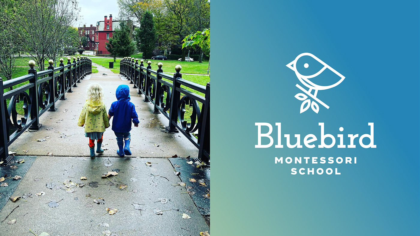
Bluebird Montessori School is a small home-based preschool offering individualized growth and play experiences for children and parents in St. Louis. The brand’s voice is one of child-centered playfulness in an environment that’s relaxed, open-minded, and oriented on the future of learning. The school’s new visual identity needed to project an image that was sincere, trusted, dependable, fun, and welcoming.
SERVICES
BrandingYEAR
2021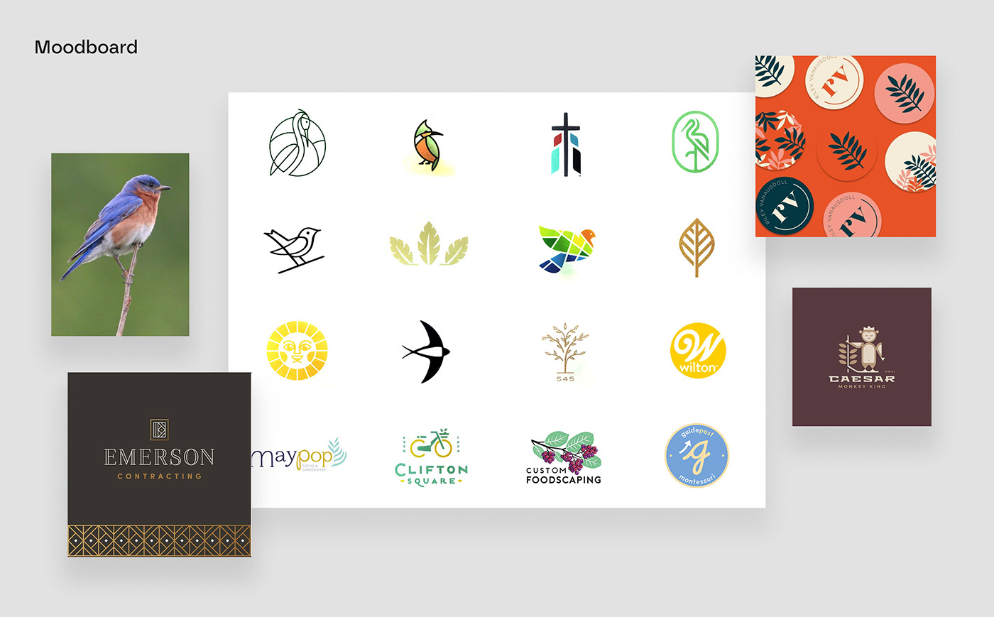
Naturally, variations of bluebird symbols were explored, but we wanted the mark to be distinctive and unique, so a lot of potential directions were considered but ultimately rejected.


Finally I landed on the right balance of sophistication and whimsy with a geometric little bird perched on a leafy branch.


The typeface choices also reinforced the brand attributes we’d identified during our brand exercise, with a distinctive, playful wordmark paired with a solid, all-caps Grotesque font.


“Mark, I am absolutely, totally, over the moon! I really didn’t know what to expect going into this process. I am blown away with your attention to detail, creative thinking, and the ultimate design. It is everything we talked about: welcoming, playful, but quite polished and sophisticated as well. YAY!!!!”
Hannah Jensen
Owner and teacher


ADDITIONAL CREDITS
Photography by Hannah Jensen, Bluebird Montessori School


