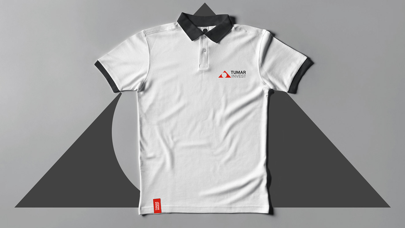
Logo and brand identity for an investment company
CHALLENGE
To develop the social media guide based on the brand identity and the creative launch campaign
One you work with finance, banking and investmcents you are quite limited by the tone of voice and approach to the identity – strict, business oriented, traditional, within the industry, like others. But it was not the issue this time. We had a chance to create something unique based on the specific Asian cultural background.
APPROACH
We combined the Asian background of the company with contemporary design approach to create solid and impressive visual identity.
IDEA&DESIGN
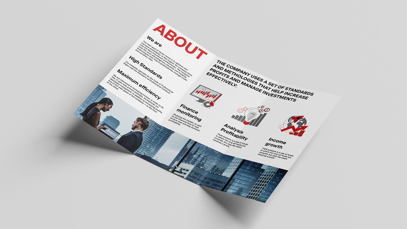
Tumar is a triangular talisman that symbolizes prosperity in Asian culture. We took its shape as a basis for the logo. The result is a meaningful graphic symbol that combines finance and confidence, as well as looking to the future through a rounded sun symbol. The identity is designed in four colors – confident red, stylish black, auxiliary gray and pure white. Business brevity is evident in the composition and fonts. The brand pattern is based on the logo. As part of the design system, clear rules were developed for the style of photographs and illustrations, recommendations were given for the development and communication of the brand in the digital environment.