Branding for a creative event cluster
CHALLENGE
Raskroi is a creative cluster, a space at the intersection of fashion, design and technology. Our task was to develop branding for it.
APPROACH
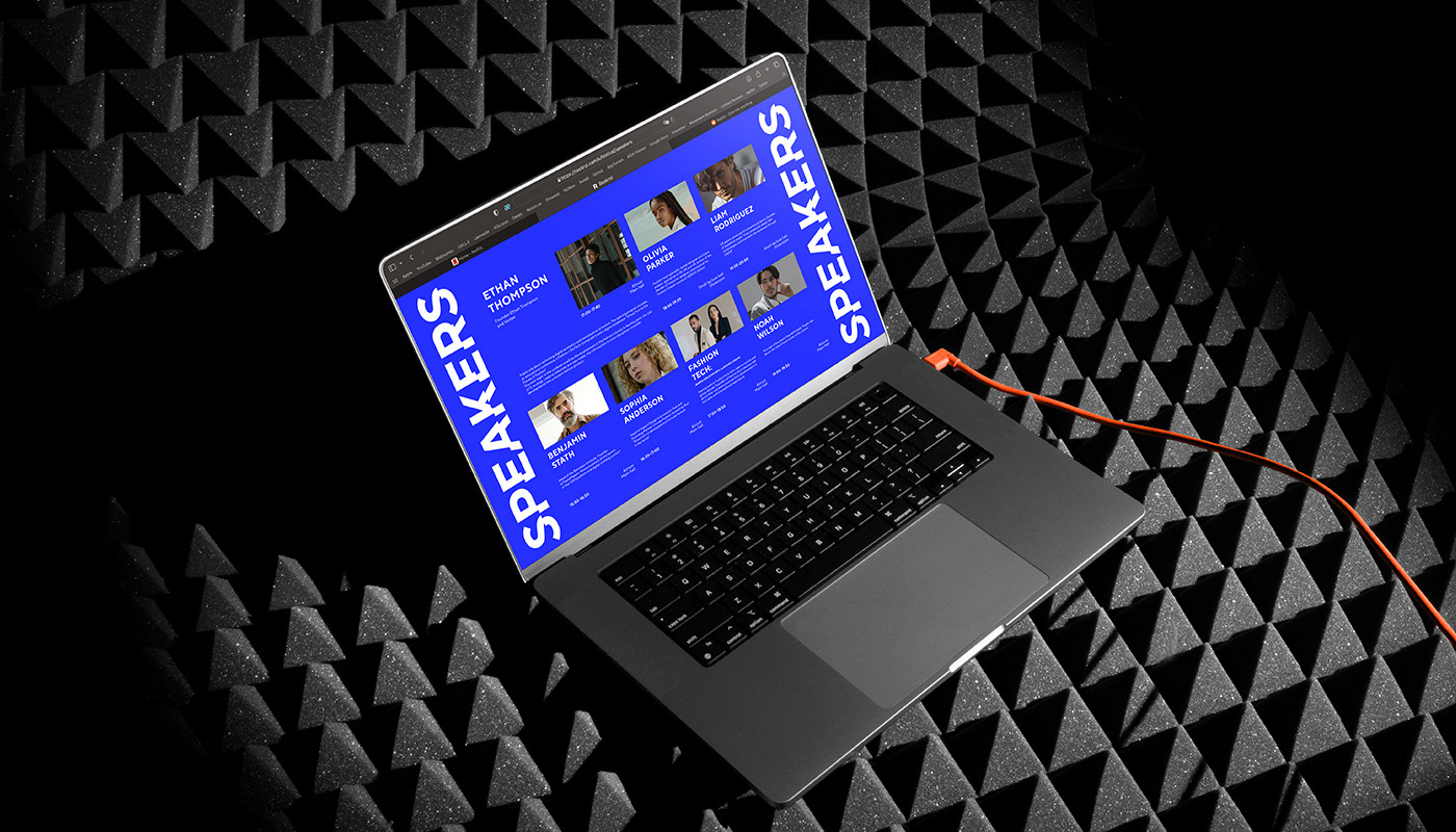
It is a place of strength and opportunities for creative people. Territory of innovations, technologies, collaborations and perspectives. It hosts lectures, coworking, shows by young designers, the library and the experimental production of capsule collections are organized.
The brand will unite designers and business, as well as will create the unique inspiring atmosphere and fundament for the community.
NAME
Raskroi is the same fundamental stage in tailoring as our space for the entire fashion industry. Therefore, in addition to the literal meaning (raskroi means tailor clothes in russian), the name hides an additional meaning: in such a professionally charged place, many talents, brands/businesses, innovations and technologies will be revealed (raskroi means discover/reveal). Raskroi is a place where talents are revealed.
DESIGN
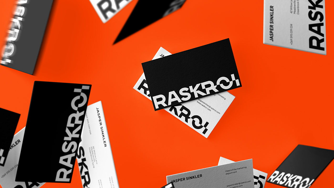
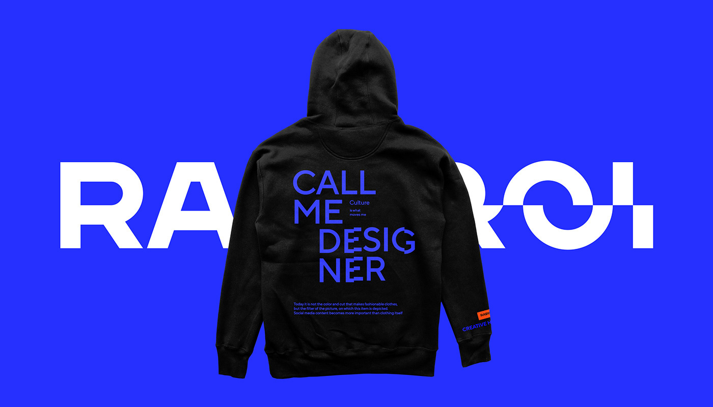
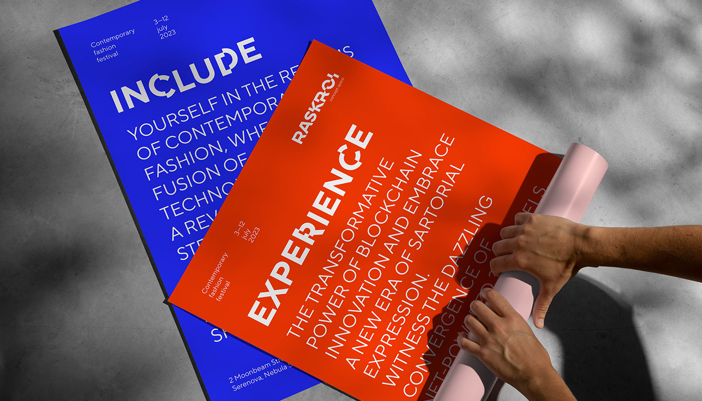
The logo visually continues the name. The text part is actually cut and half of it is offset relative to the other. Such "cutting" goes beyond just one logo and becomes a stylistic element: it can be found in photo collages, in graphic elements or in headlines. In the future, this motif can be easily integrated into different creatives, depending on the tasks. Thus, we have a powerful link between the concept of naming and the logo, which formed the basis of the entire identity. In addition to perfectly adjusted transformations, we deliberately used bright and catchy colors in the identity. A fashionable, provocative and uncompromising combination fully meets modern views and once again emphasizes the young character of the brand.