01 ––––––
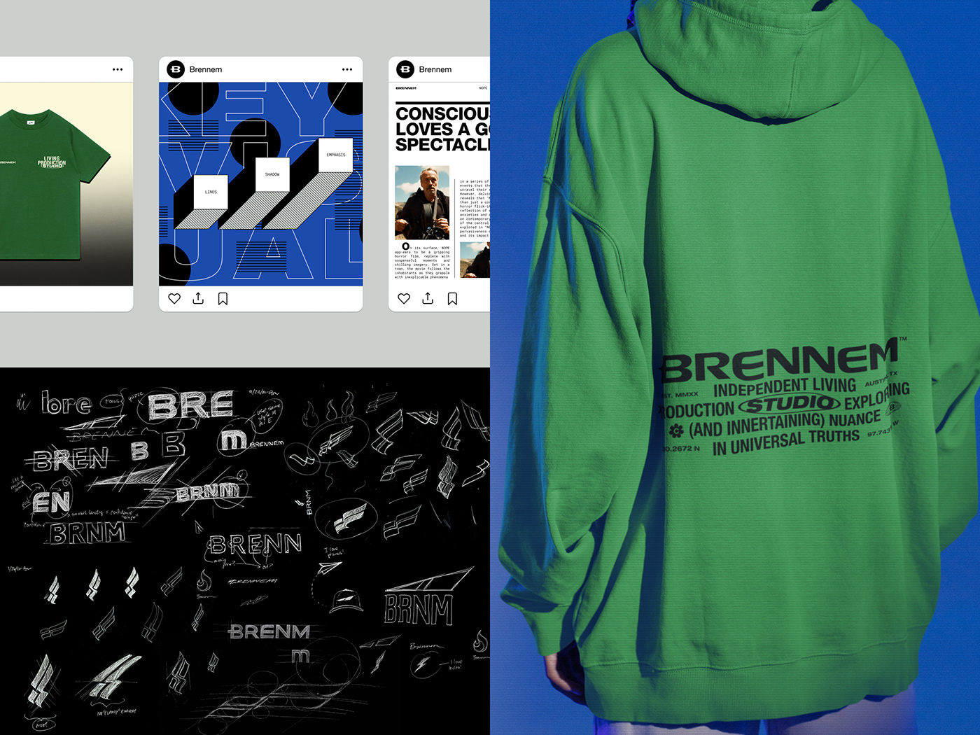
Established in 2020—by designer and creative director Brian Whitfield—Brennem™ is a multi-disciplinary studio born out of a burning desire to make sense of the world via visualized maxims. The name [Brennem] is an abstract portmanteau inspired by recurring "en" and "em" letter patterns found in words related to the studio's core values rooted in passion, progress, and perspective. These words included: incremental, movement, momentum, improvement, enlighten, embody, and potential. Think of Brennem translating to br-idging in-cremental im-provement.
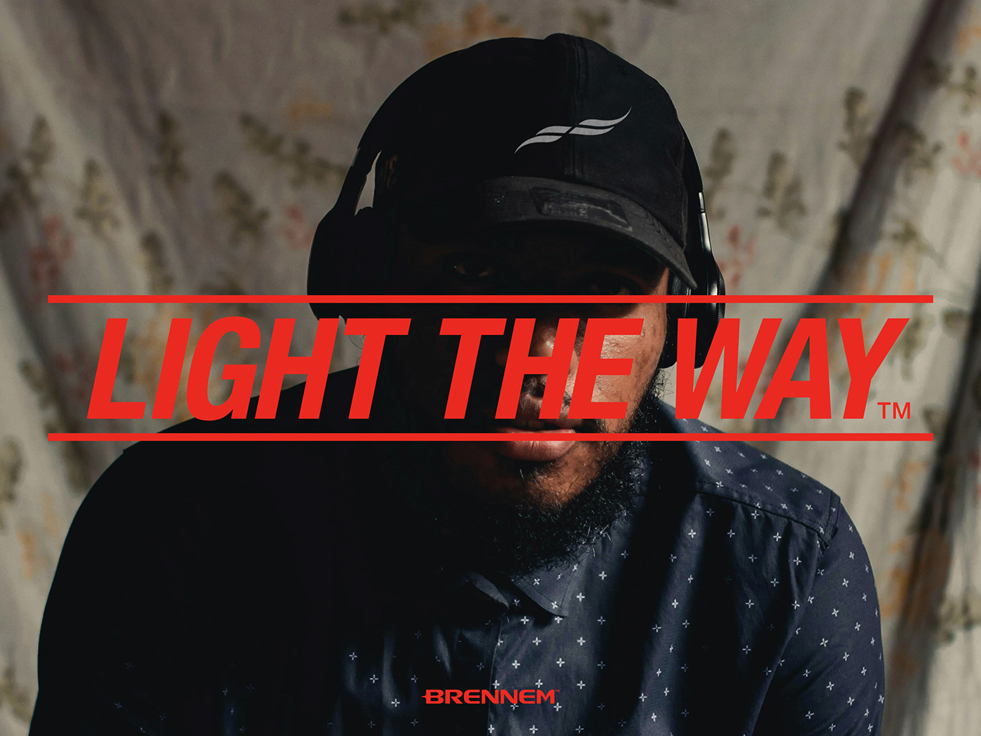
Brennem's core logo mark—dubbed The Flicker—was inspired by a double-helix, flag, and flame, representing passion and expression of life's potential. Universal and particular. The studio's candid, unorthodox, and dramatic visual language leans into its core value of making the implicit explicit by playing with juxtaposition and contrast. Using over-emphasized lines—such as hyphens—to play on the concept of continuation. As well over-emphasized focus and lighting to play into the brand's story-telling aspects.
Brennem's core logo mark—dubbed The Flicker—was inspired by a double-helix, flag, and flame, representing passion and expression of life's potential. Universal and particular. The studio's candid, unorthodox, and dramatic visual language leans into its core value of making the implicit explicit by playing with juxtaposition and contrast. Using over-emphasized lines—such as hyphens—to play on the concept of continuation. As well over-emphasized focus and lighting to play into the brand's story-telling aspects.
02 ––––––
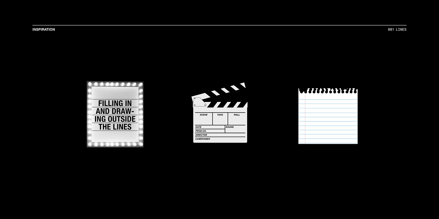
The studio features is a thematic collection of “Series” functioning as sub-branded maxims. Each one, represents unique symbolism. Organizing and engaging with thought-provoking ideas, semiotics, and narratives as prompts for discovery, dialogue, and drama.