The fundamental problem with the most accomplished film festival in India was simple - an identity that was not in sync with it's title prize.
Most festivals across the world brand themselves with the icon of their trophies (Palme D'or at Cannes, Golden Bear at Berlin etc). But Mumbai Film Festival used the logo of a rather obtuse 'dancing lady with a camera' for no specific purpose.
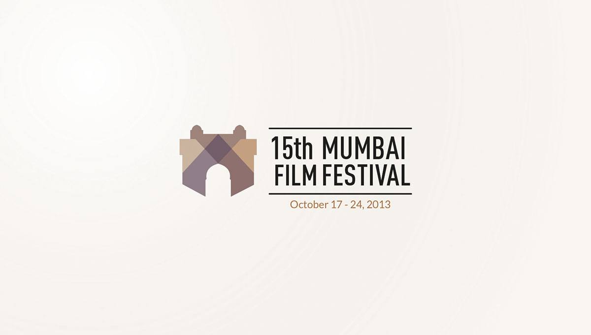
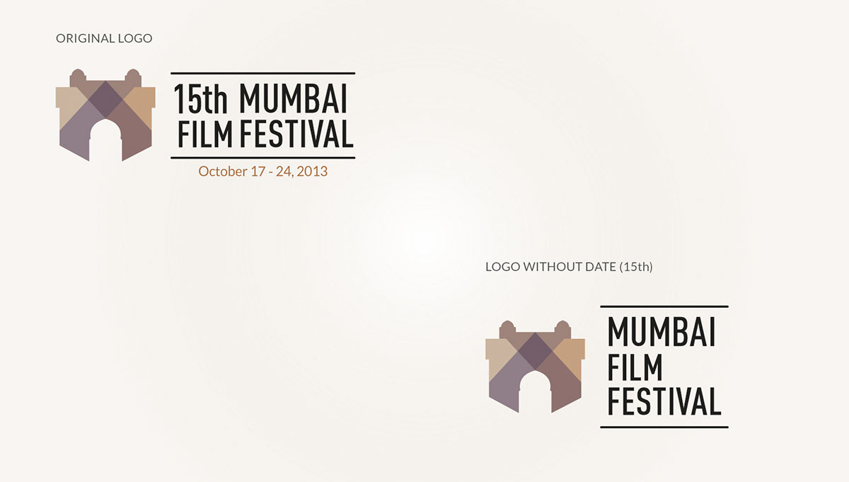
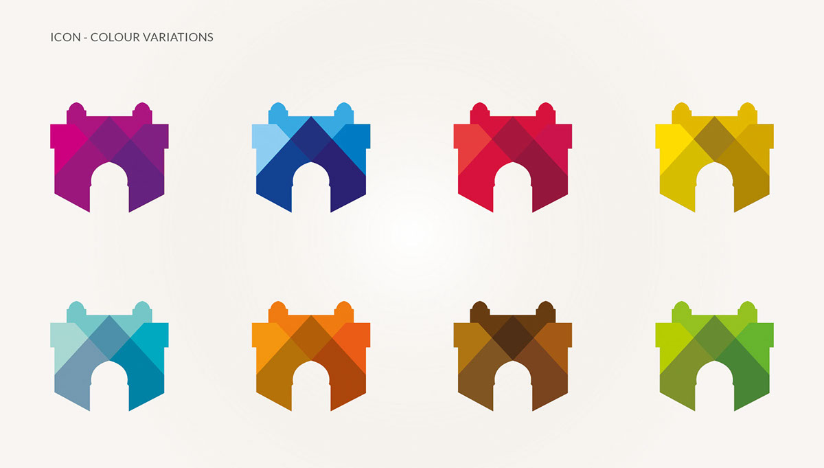
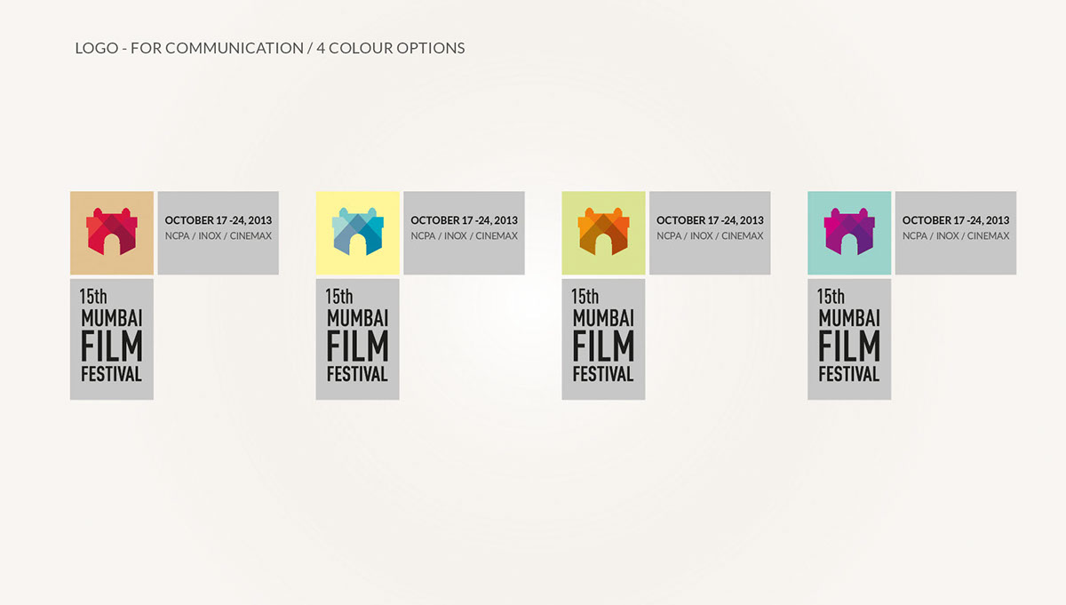
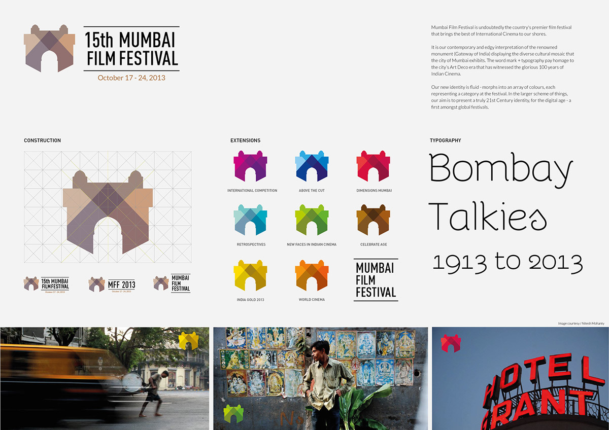
We decided to make the icon around the 'Golden Gateway' award. But the challenge was to reinterpret a monument that has been visually explored in so many ways. "How does one use the Gateway of India and yet make it contemporary without looking like just another logo with the Gateway hidden in it"
The outcome of this challenge was a vibrant, modern, cutting edge and dynamic icon that gave structure to the numerous categories and made the entire festival look like a truly International event to reckon with.
Relevant outdoor and print extensions were created in order to make the branding more consistent. See them here
The project was featured on Kyoorius Magazine.
Credits:
Brand Concept, Strategy and Project Management - Binit VASA
Designers - Trushna Billimoria + Binit Vasa (Typography)
Brand extensions - Ameya SK


Festival visual mood board.
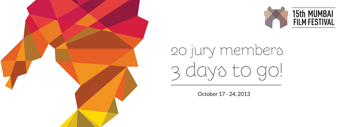
Creative extensions for the 15th Mumbai Film Festival (Social media creatives)