FF Tundra
A narrow serif typeface with stressed forms and soft contours – has already won a TDC 2011 award
A narrow serif typeface with stressed forms and soft contours – has already won a TDC 2011 award
FontFont designers have been recipients of prestigious type design awards, but few can claim to have been even before their creations were officially published. Ludwig Übele’s FF Tundra — a recipient of a Certificate of Excellence in Type Design at this year’s TDC2 competition — is now available for licensing.

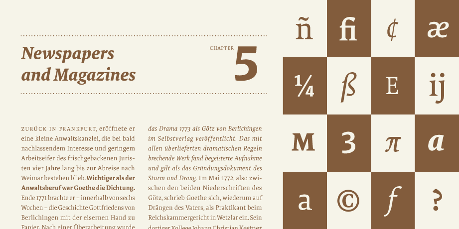
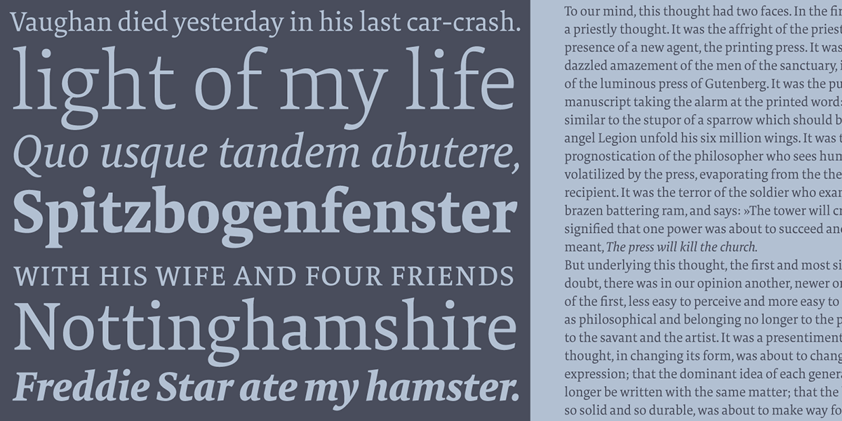
Ludwig Übele’s award-winning design FF Tundra is a narrow serif typeface with stressed forms and soft contours. The idea evolved from investigating how a narrow typeface should look for optimal readability. To avoid a fence-effect FF Tundra emphasizes the horizontal line. Ludwig Übele combined strong serifs, flat shoulders (see n) and open but heavy endings (see a, e, c) with a moderate contrast to achieve a balanced, legible typeface with a certain softness and humanity. FF Tundra has been designed for continuous text, but is also suitable for magazines and headlines (especially the Extra Light) and will surely work in newspapers as well. The family consists of six weights from Extra Light to Bold, each with Italics and Small Caps and many OpenType layout features.
FF Tundra has been selected by the Type Directors Club of New York to receive the Certificate of Excellence in Type Design 2011.
FF Tundra has been selected by the Type Directors Club of New York to receive the Certificate of Excellence in Type Design 2011.


