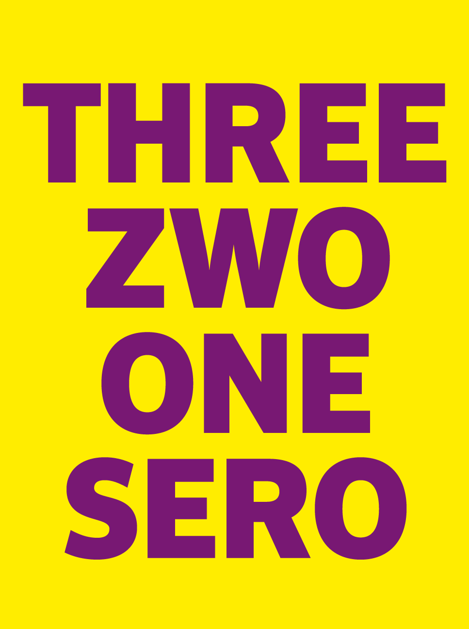
FF Sero
COMBINES THE STRIKING FORMS OF AN AMERICAN GROTESQUE WITH THE LEGIBILITY OF A HUMANIST SANS SERIF TYPEFACE

FF Sero – Jörg Hemker’s versatile sans FF Sero combines the striking forms of an American grotesque with the legibility of a humanist sans serif typeface. It has open contours, a distinct x-height and a homogeneous grayscale value. During seven years of development the classic letter forms have matured into a balanced, sovereign typeface. Eight harmonized weights and an extensive character set allow for a flexible and versatile typography. Cyrillic and Greek characters provide an extended language support.


For a limited time, FF Sero Medium is available for free download in OT, Offc and Web formats. Download it on FontFont.com.
