
Childhood in Scandinavia
Previously, the Finnish children's clothing brand Lassie was represented only in wholesale sales and online stores, but the company entered the offline DTC channel (D2C, Direct To Consumer). Scandinavian technology and decades of experience allow Lassie to create clothes in which children can actively explore the world, following their natural curiosity. At the same time, parents remain calm, because they are sure that their children are completely protected from cold and windy weather.
The Lassie team applied to LINII branding agency for a comprehensive development of a retail brand, starting from the creation of a brand platform and identity to a detailed retail concept for the stores.

The agency's strategists proposed the Explorer archetype for the brand, because Lassie looks at the world through the eyes of children, open to everything new.
The character of the brand is curious, surprised, but not naive. It charges with optimism and curiosity. It is reliable, it will always come to the rescue, you can rely on it. At the same time, it is kind, understanding and supportive, like an older comrade.
The essence of the brand is for children to be children, exploring the world around them comfortably and safely. As part of this positioning, LINII developed the brand manifesto.
The tone of communication is in line with the essence of the brand — Lassie speaks to the audience energetically, joyfully, dynamically, clearly and concisely, but always with imagination. It explores the world and is not afraid to ask questions.

LINII designers deliberately did not develop the expected bright children's identity, but emphasized Scandinavian aesthetics and character, relying on minimalist geometric graphics.
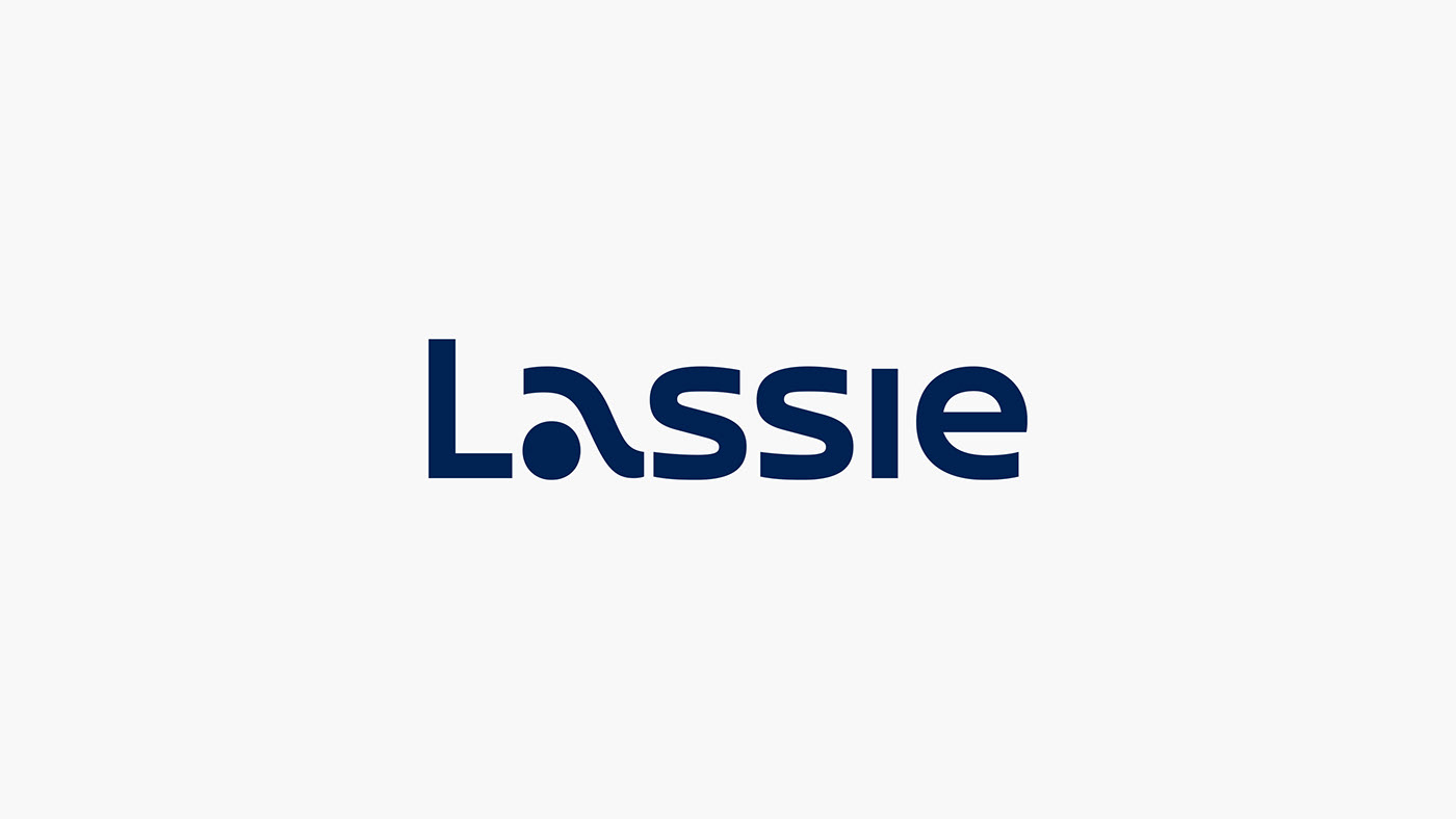
The new logo reflects Lassie's many years of expertise and love for active leisure in the fresh air. In the letter “a” you can see swimming, playing snowballs and sliding down a hill. The laconic forms of the remaining letters refer to Scandinavian minimalism and tranquility. The diversity of Scandinavian nature and the wide range of the brand prompted a rethinking of traditional Scandinavian flowers.
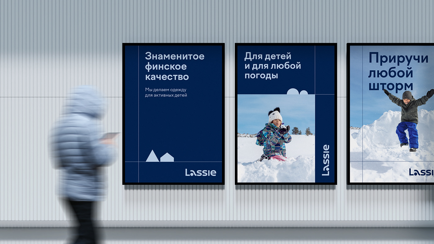
Lassie's signature colors were dark blue Blue Gulf, which symbolizes the crystal clear lakes and fjords of Scandinavia, and light blue Iceberg, which is the embodiment of numerous glaciers and clear skies. Together they convey the aesthetics of the landscapes of the northern countries, their open spaces and tranquility. Additional brand colors are light green Green Sprout, salmon Salmon and graphite Silver Sand. They serve to differentiate communication layouts—image situational and product ones.
To prevent the children's brand from looking too dry, in addition to the main elements, small geometric illustrations were developed. They can be used to create stories on the theme of the endless Finnish landscapes and nature: mountains, houses, forests, rivers, fields and the soft northern sun.

To highlight the Finnish roots and thoughtful technology of the Lassie brand, the agency's designers created a series of graphic elements in the form of lines that subtly refer to the blue stripes of the Finnish flag. They may be used to make a constructor for designing various communications.


The photographic style is based on absolute naturalness. Children do not notice that they are being filmed, and therefore behave accordingly, exploring the world around them. This reflects both the brand's Scandinavian roots and the Explorer archetype.
Naturalness, expressed through endless open spaces, natural street lighting, sun rays or home light, was chosen as the basic constant of the photographic style. The result was a rather restrained and cool photographic style about children, but without bright spots.


LINII retail specialists conducted an extensive study of international benchmarks of children's and adult activewear, conducted CX research based on interviews with target audience, developed zoning and shopping routes, a retail concept, a preliminary and detailed design project for stores in the Central Children’s Store and the Europolis shopping center.
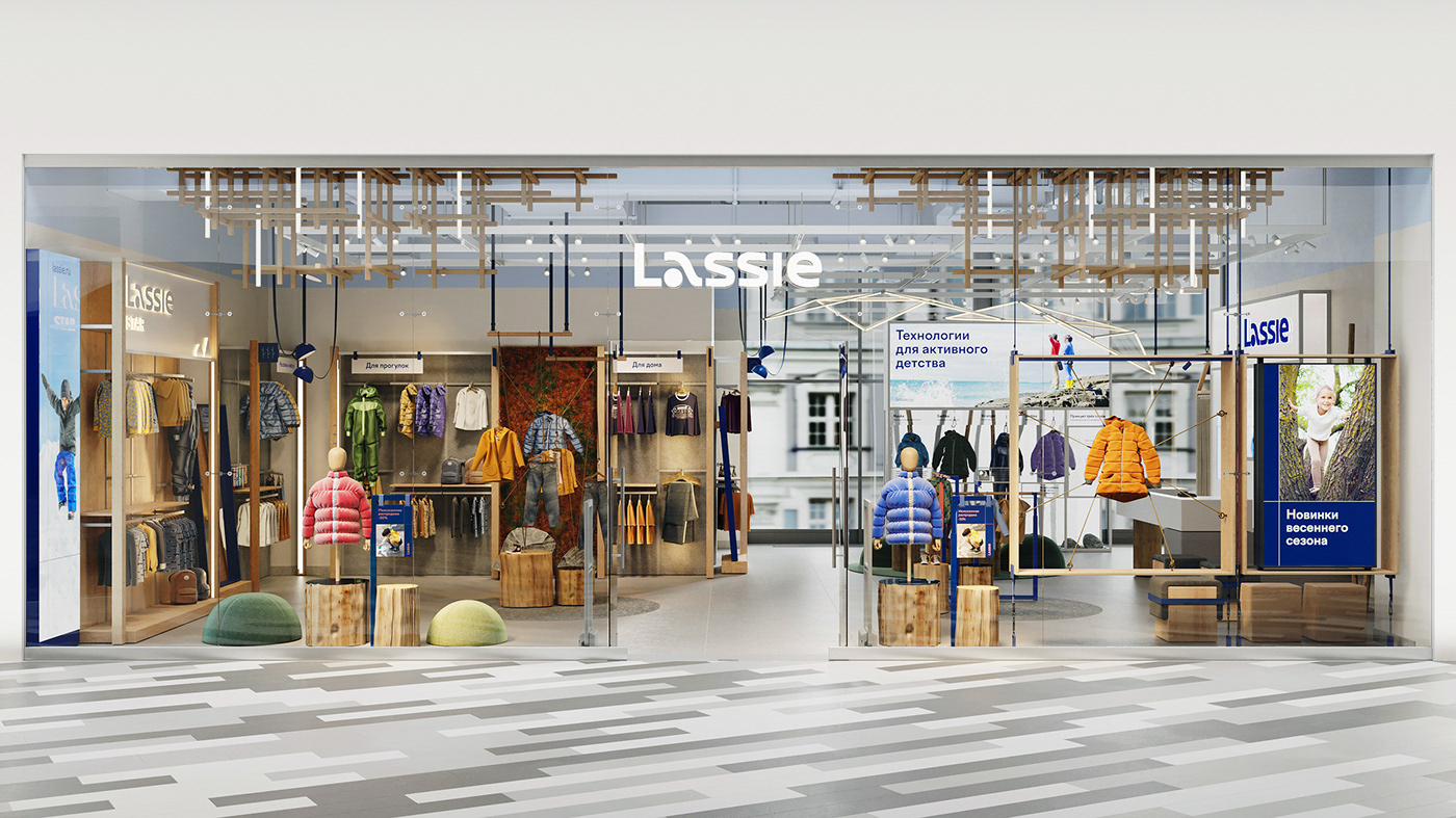

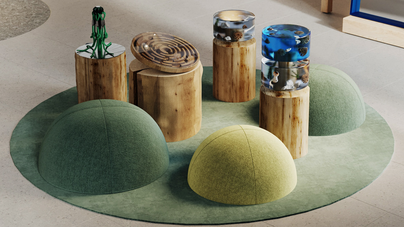
The designers conveyed the atmosphere of a hike and the spirit of adventure inherent in the Explorer Archetype with the help of tents, carabiners and sports equipment. Modernity and technology are expressed through lighting, equipment shapes and natural textures.
The breath of the north is conveyed through a combination of cold shades, textures of stone, ice, metal, and frosted glass. To prevent the space from looking overly harsh and unfriendly, we added textiles in “cozy” warm tones, wood in the equipment, warm lighting and other decorative details. The designs are formed by a system of collections, adjusted to the type of clothing, all signs are organically integrated into the space. All trading elements are softly illuminated. Technological screens are integrated into natural shells – wood or ice rocks.


General Director — Mikhail Gubergrits
Client Relations Director — Taisiya Denisova
Project Manager — Alena Razzhivina
Project Manager — Maria Sorochenko
Development Director — Dmitry Burenko
Strategy Director — Polina Vasilyeva
Strategist — Angelina Sorokina
Strategist — Inessa Genkina
Creative Director — Tema Semenov
Designer — Polina Savina
Designer — Anton Andreev
Designer — Sofya Vychuzhanina
Art Director — Nikolay Demin
Designer — Ilya Savonkin
Type Designer — Tanya Cherkiz
Copywriter — Natalia Chetverkina
Retail Design Creative Director — Katya Kolotilova
Leading Architect — Marina Kharisova
Retail Designer — Ksenia Sapozhkova
Architect and Retail Designer — Daria Veseneva
Industrial and Retail Designer — Natalya Alekseeva
Lighting Consultant — Artyom Voronov


