Far East Trading House is a leader in logistics solutions in the Far East region, supplying the whole of Russia, CIS countries, MENA regions and major European hubs.
As part of the project, a positioning was developed - "a brand that defines logistics standards", which reflected the idea of using the world's most advanced practices and technologies in logistics and warehousing services.
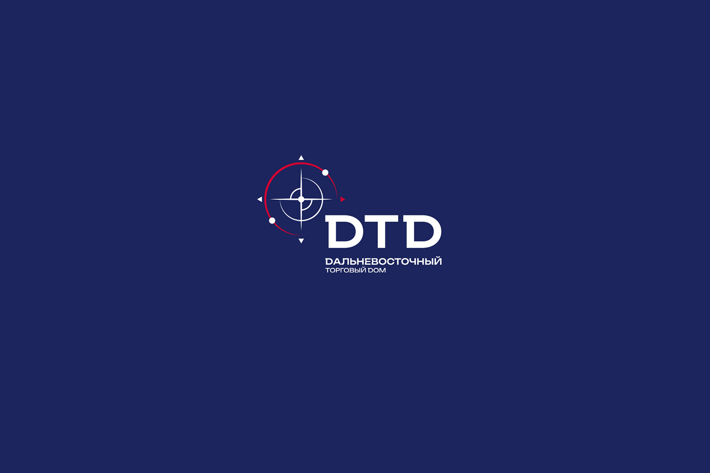
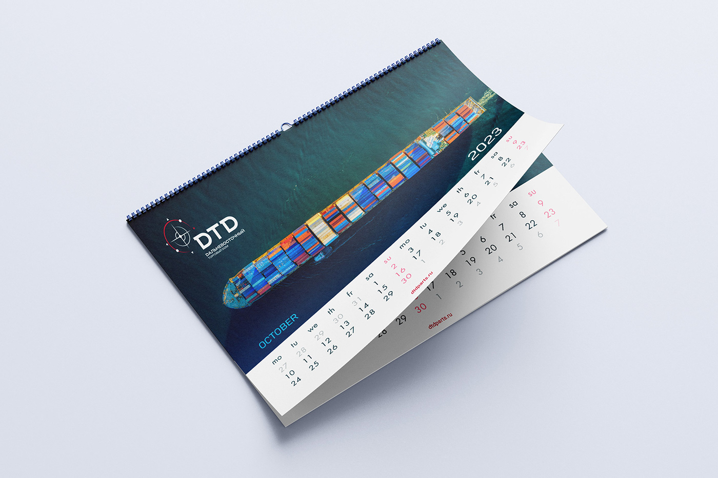
The main graphic element of the company was the symbol of navigation - a compass pointing to the East, as a sign of respect for the main direction of the company's activities and routes.
Deep dark blue color, reminding of the boundless ocean and cloudless sky - the main logistic routes of DTD, is harmoniously complemented by bright red - a color that emphasizes the geographical peculiarity of the region and reflects the cultural notes of the Far East.
In addition, the color duo reminds of the Russian statehood, emphasizing the belonging to the domestic business.
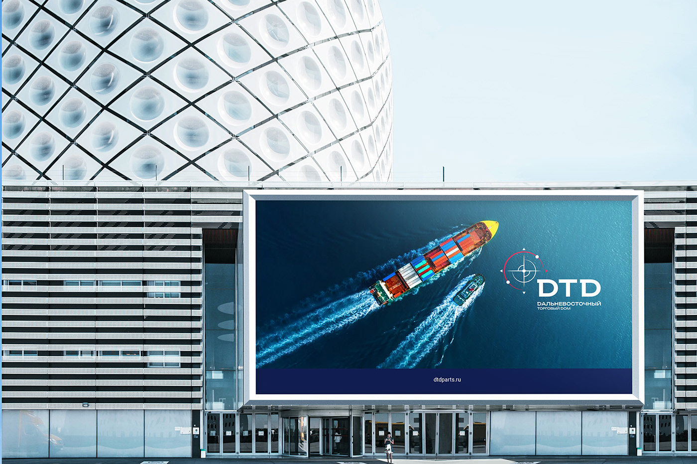
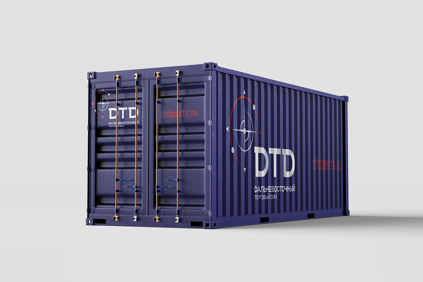
Laconic and strict design and modern graphic elements emphasize the status and scale of the company, creating a coherent and recognizable brand image
