IDENTITY GUIDELINES / PRIVATE BRAND PRODUCT / FACADE & SIGNAGE DESIGN


Space Dot Kids is a nursery for employees working at the branch of Daum Communications in the beautiful island at Jeju in Korea.
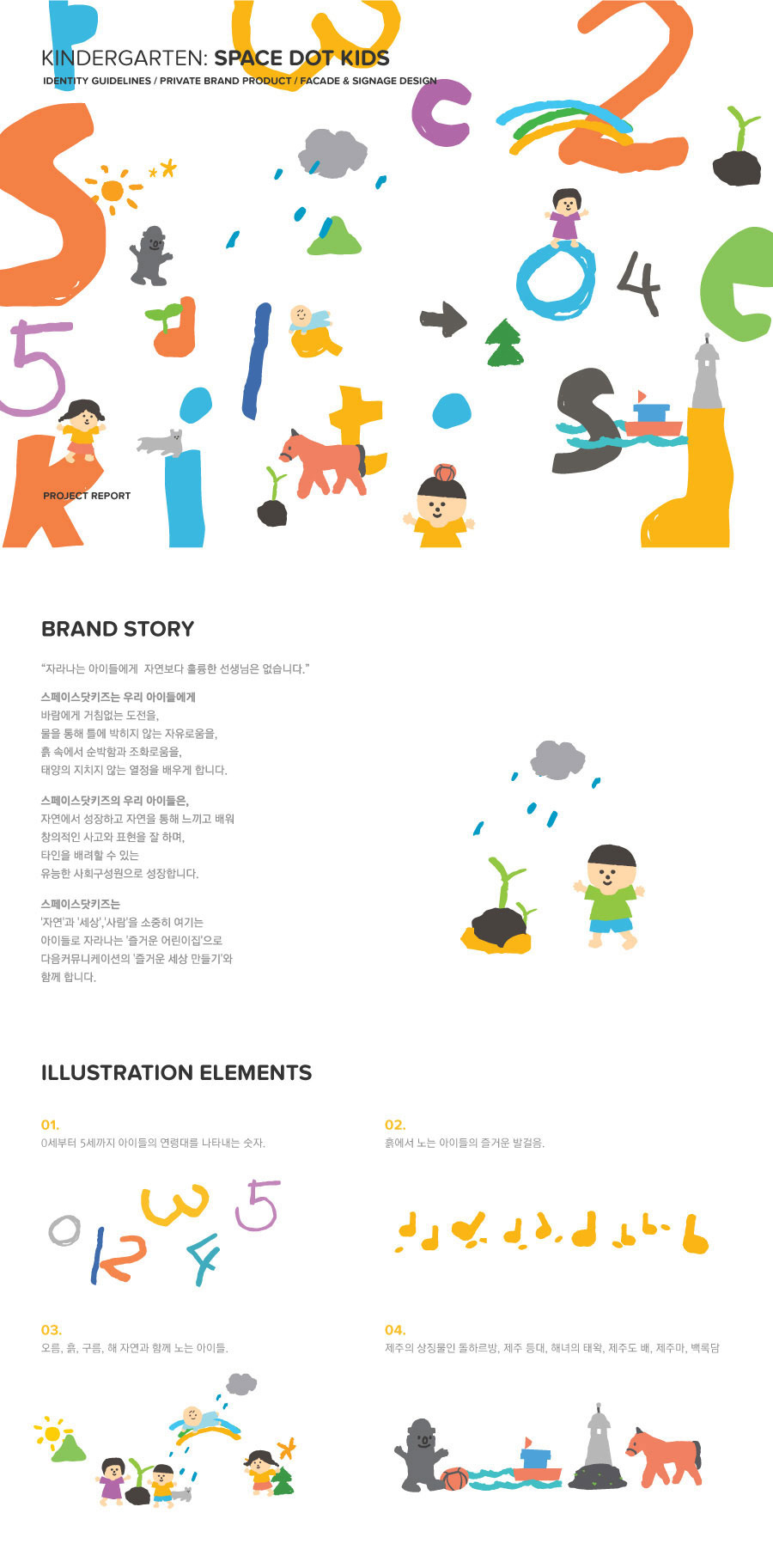
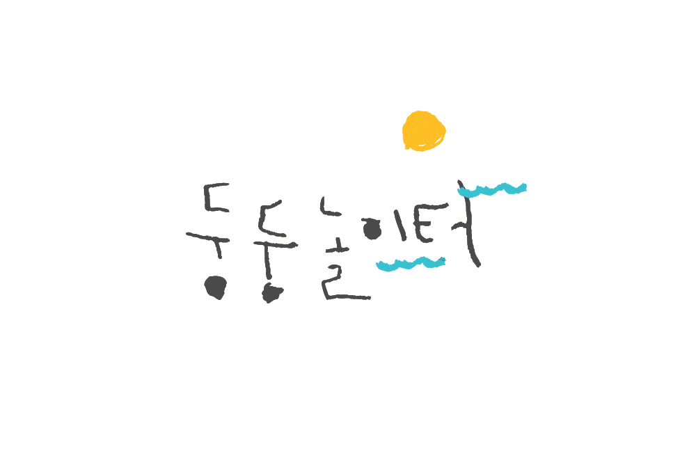
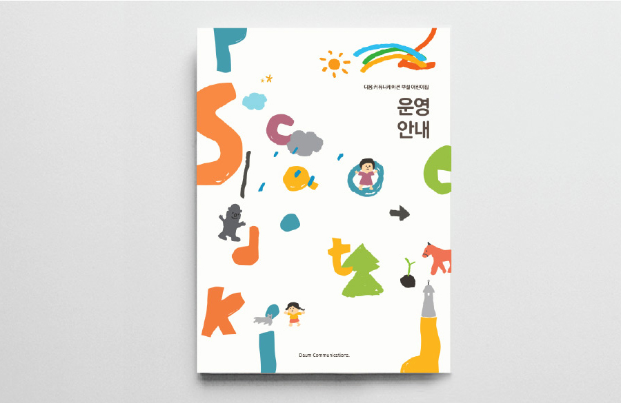
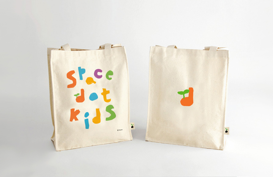
Space Dot Kids’s logo was designed to alphabet represents a flexible line scribbled by children with vivid and various colors so that children can develop an unlimited wealth of creativity and critical thinking skills.
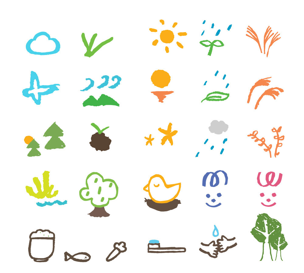
Graphic elements of the children interacting with natural element such as wind, clouds, rain, sun and grass are harmonized with iconic symbols of Je-ju such as Dolharbang, the Volcanic Cone and Halla Mountain.
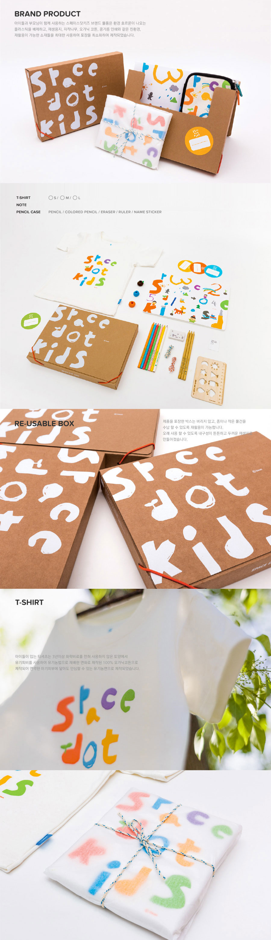
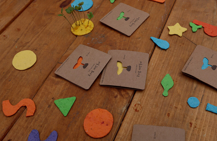
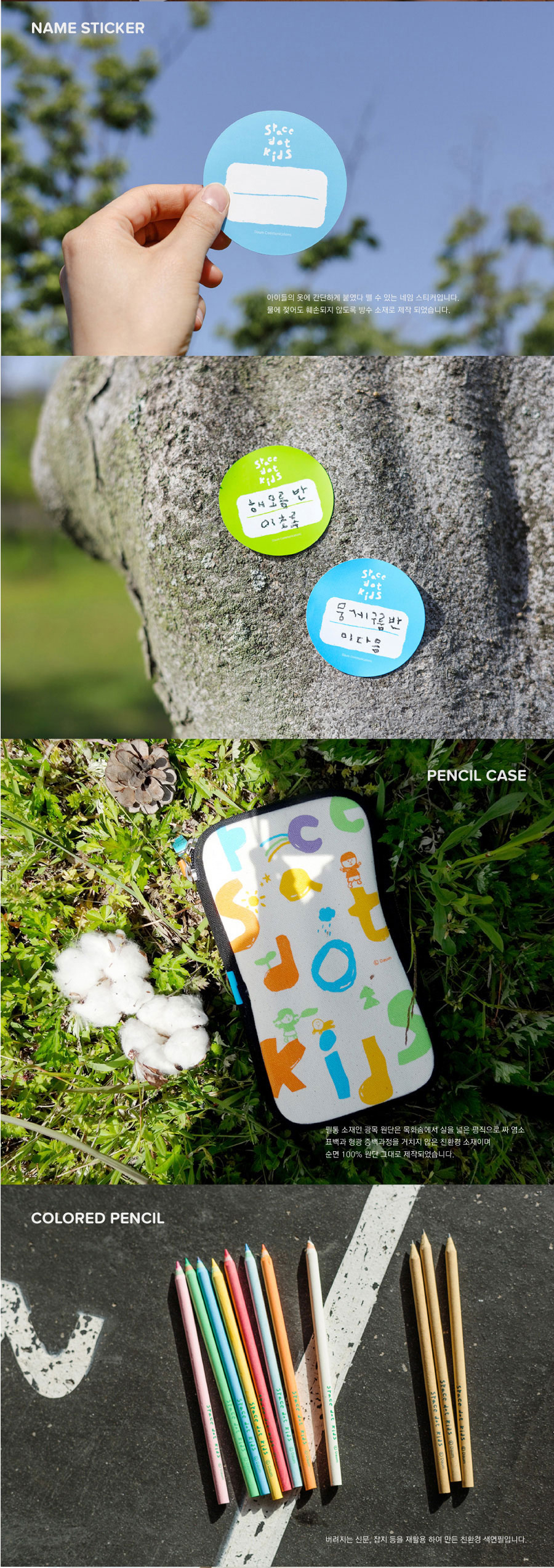
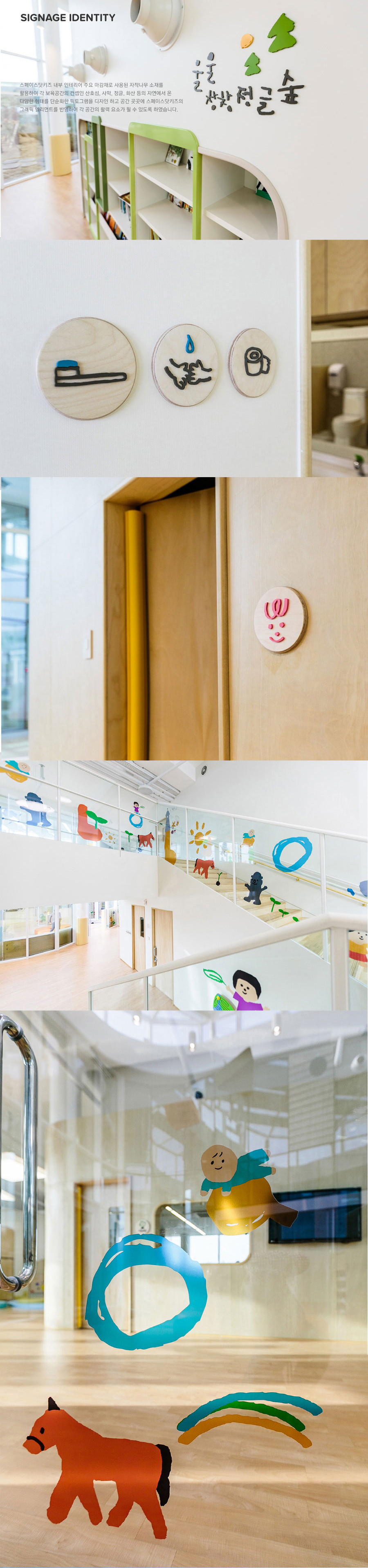
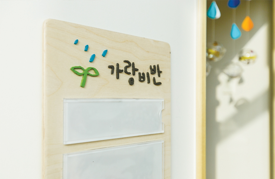
The graphic elements breathe together with nature and the children of Je-ju, arranged freely forming a pictogram with simple and active characters. Space Signage was made with nature friendly materials, recycled paper, and green products of minimized packaging, and produced from white biroh tree and organic cotton.
Space Dot Kids’s logo was designed to alphabet represents a flexible line scribbled by children with vivid and various colors so that children can develop an unlimited wealth of creativity and critical thinking skills.
Graphic elements of the children interacting with natural element such as wind, clouds, rain, sun and grass are harmonized with iconic symbols of Je-ju such as Dolharbang, the Volcanic Cone and Halla Mountain.
The graphic elements breathe together with nature and the children of Je-ju, arranged freely forming a pictogram with simple and active characters. Space Signage was made with nature friendly materials, recycled paper, and green products of minimized packaging, and produced from white biroh tree and organic cotton.
Children of 'SPACE DOT KIDS' grow and learn with the nature of Je-ju.


