

Utopian, A Study on Type and Hierarchy
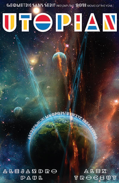
I wanted to do a study on hierarchy just as a refresher, and chose to do so in the form of a movie poster. This gives me the flexibility to be creative in my narrative, and movie posters have a clear visual design of where we want our viewers to look first. The main things that needed to be conveyed in the hierarchy were: The title (Using the typeface Utopian), the theme (space), and starring actors (in this case I used the creators of the typeface).


I started with some rough sketches to get a variety of ideas down for my Utopian poster. I started with what I thought Utopian as a word meant- a state of perfection, or ideal circumstances. To me this fit into a few categories, like unity, cooperation, peace, etc. I also looked at the typeface itself, which in its multiple versions feels futuristic, and relies on the 3 primary colors. I sketched a few ideas stemming from these.
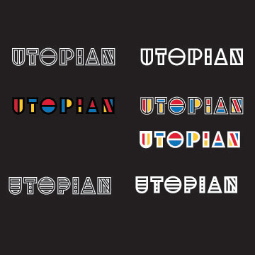
After sketching, I landed on the futuristic space theme: a Utopian future. In Illustrator, I began to play with the typeface, changing the borders and colors, to see what looked right on a dark background, as I new I wanted it to look right over a dark space themed image. To add more contrast to the typeface I changed the individual strokes to white for higher visibility.

And the final result ended as a mockup of the movie poster on the wall of a theatre to see how it would look at scale. Utopian, the title, should be the first thing people see. The space theme is clear, the "actors" are secondary. Tertiary information (release dates, etc, would be placed as the smaller, less involved fonts at the top and around the planet in the center.


