/branding
Erbert Identity
Ready to make you feel good.
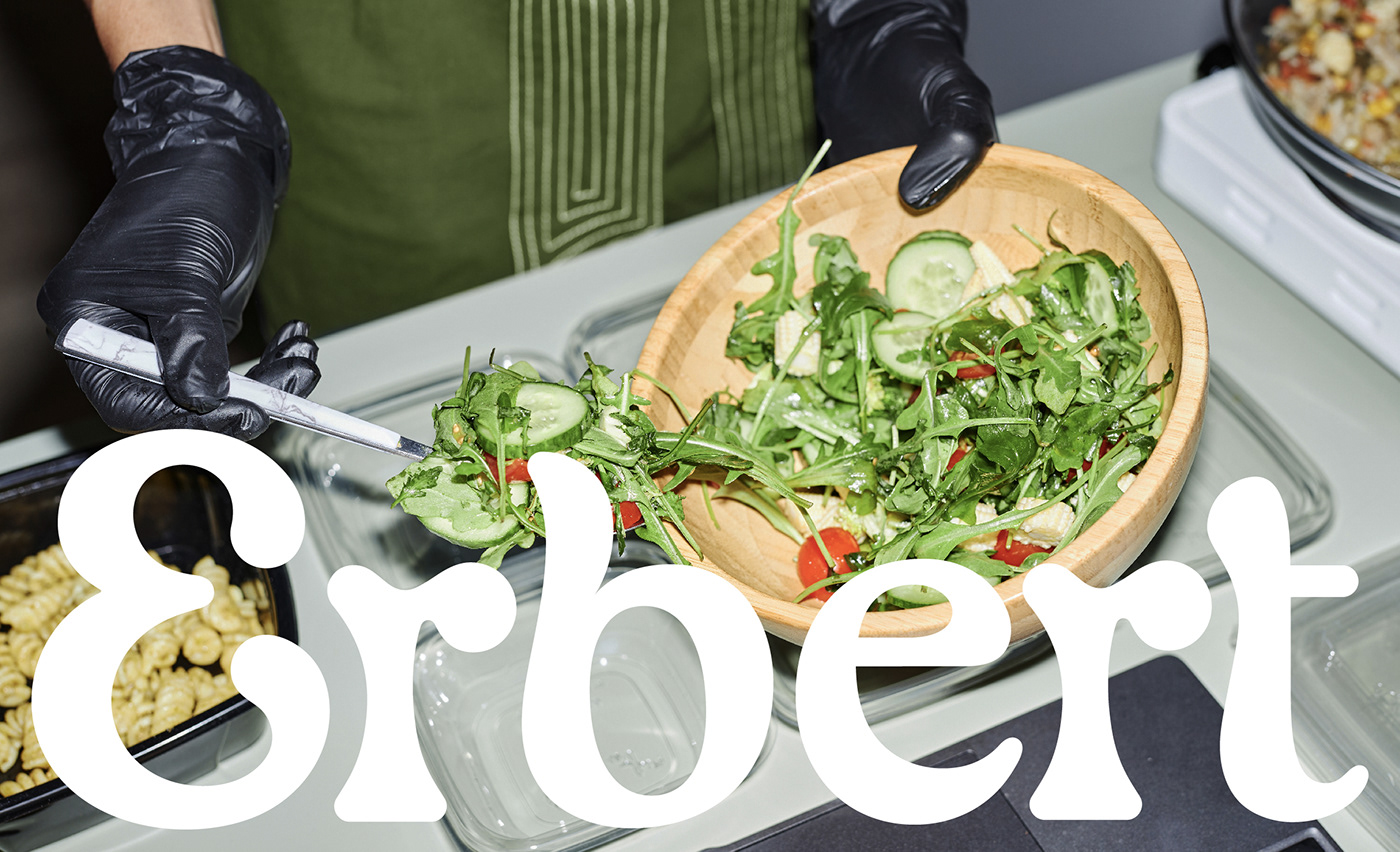
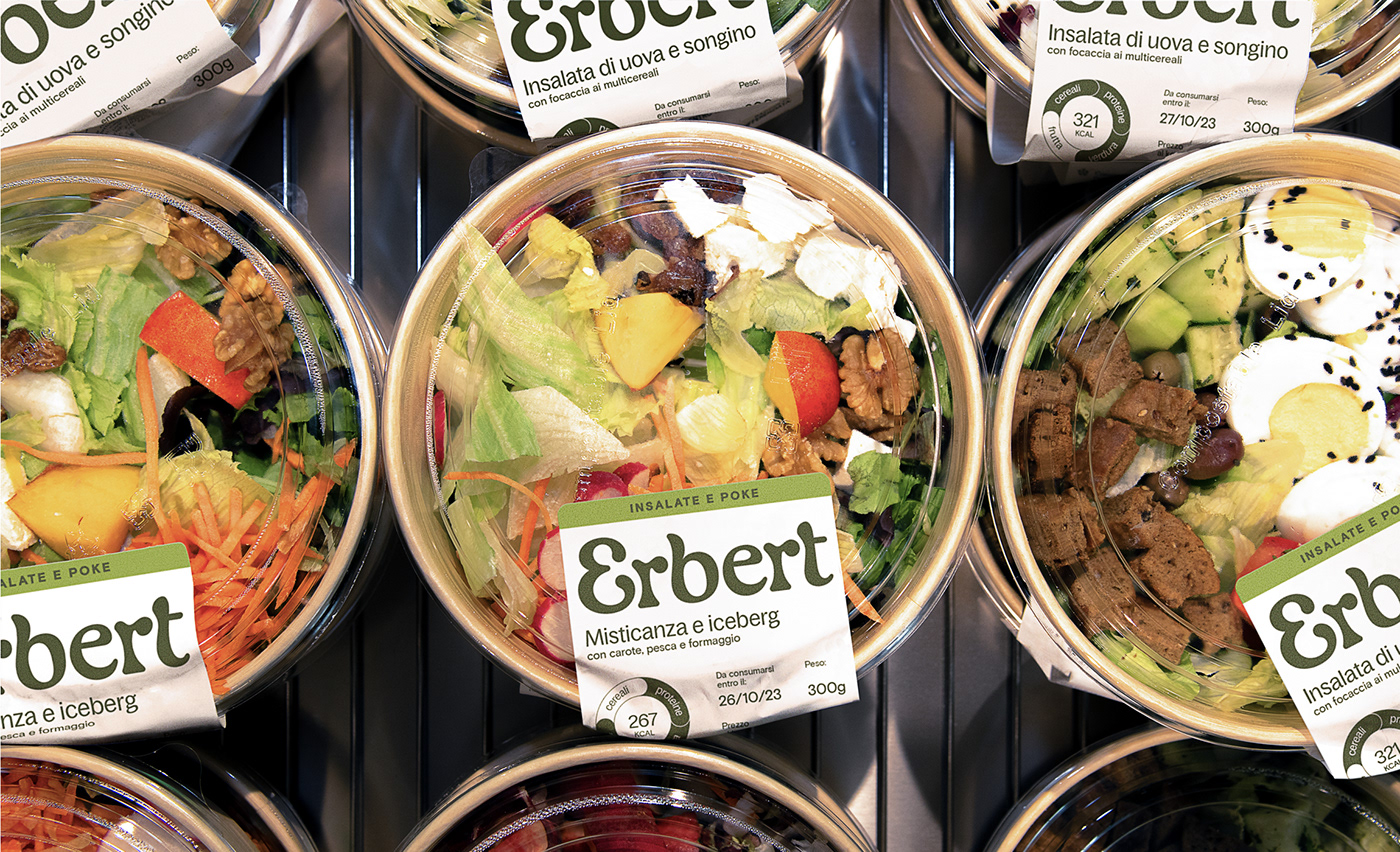
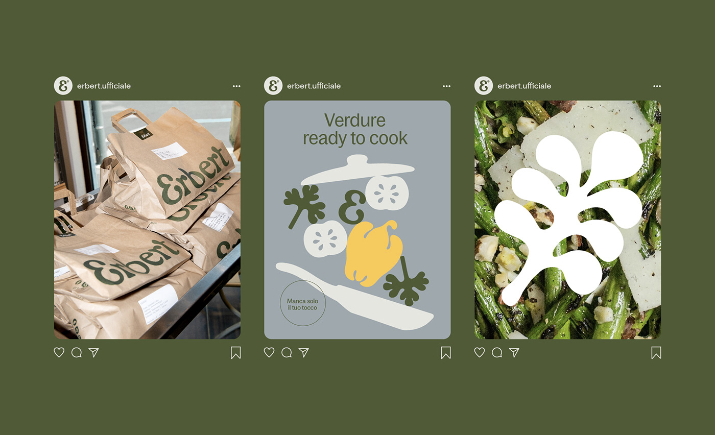
CLIENT Erbert is the first Italian food chain dedicated to healthy eating. With 5 shops located in Milan, the brand is growing fast thanks to its laboratory where more than 100 ready-to-eat meals are prepared everyday. Every dish is a collaboration between chefs and nutritionists; a system that brings healthy, tasty and varied food into everyone’s daily life.
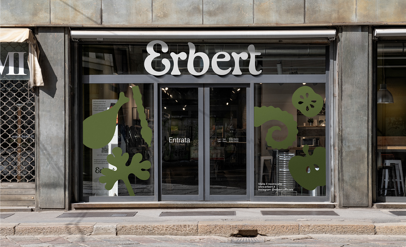
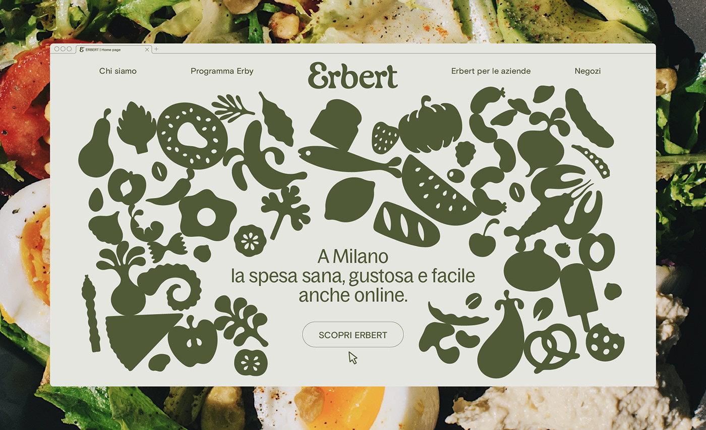
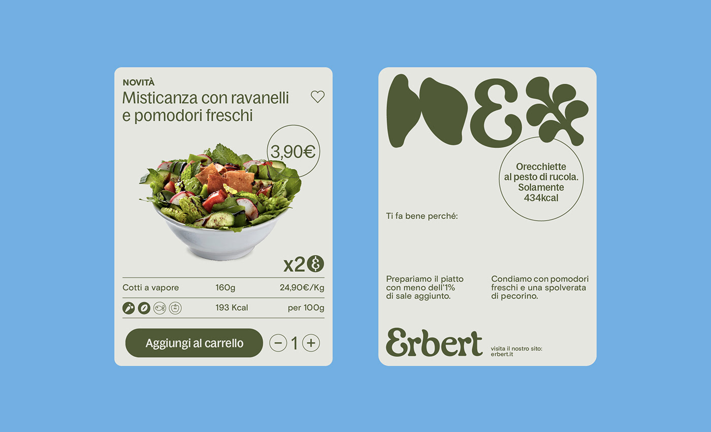
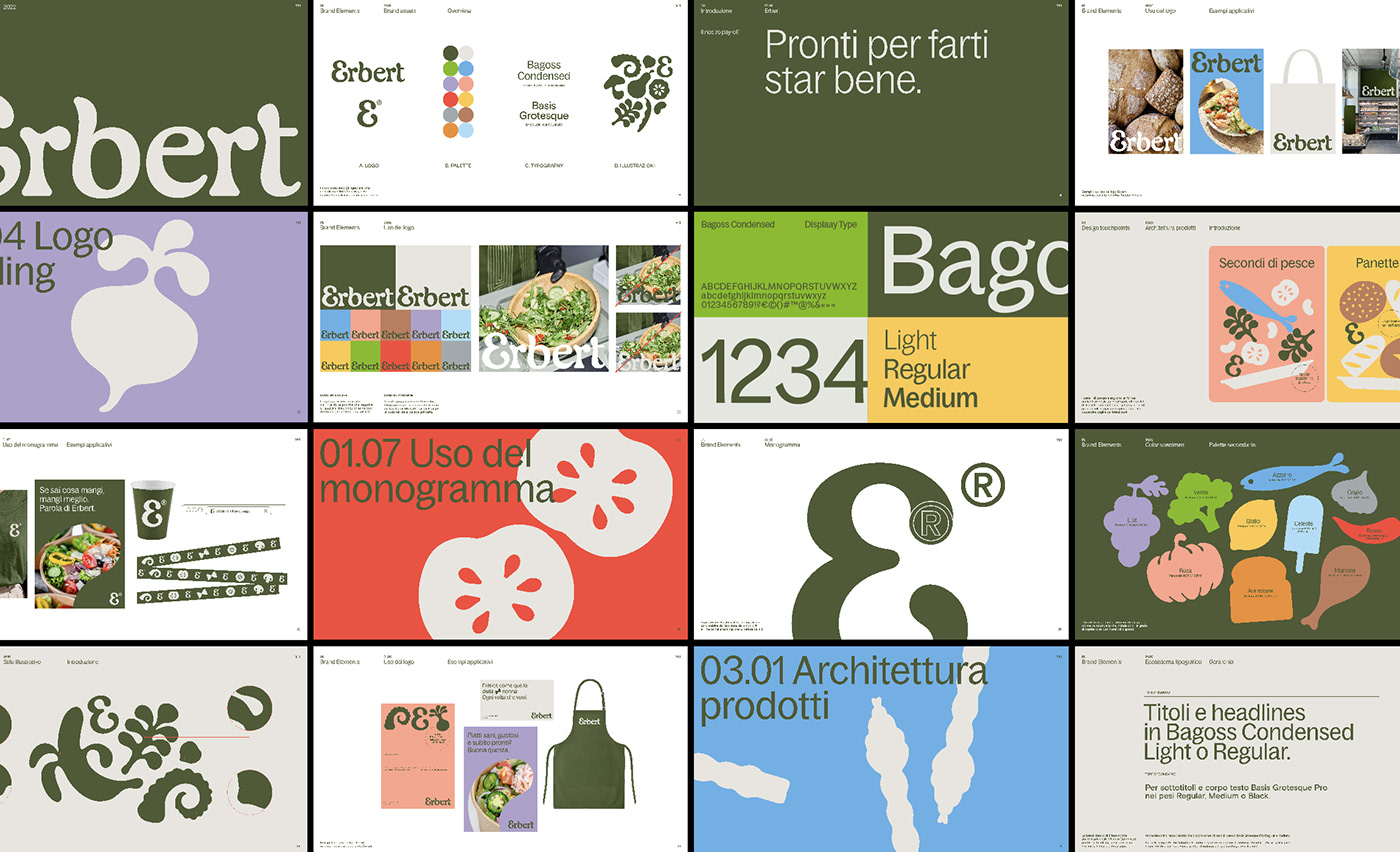
ASSIGNMENT Repositioning Erbert from a supermarket offering healthy and fresh products to a unique new format: a fast food restaurant serving ready-to-eat healthy and affordable food willing to educate and help people become knowledgeable, ready to embrace a varied and balanced eating style. The whole scope of work includes the design of a renewed brand identity that include several touchpoints such as a new logo, typographic ecosystem, product labels, shopping and shipping bags etc.
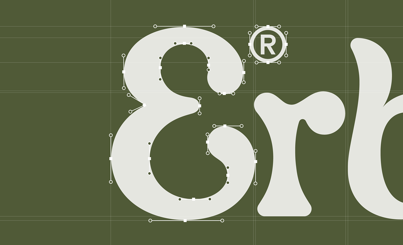
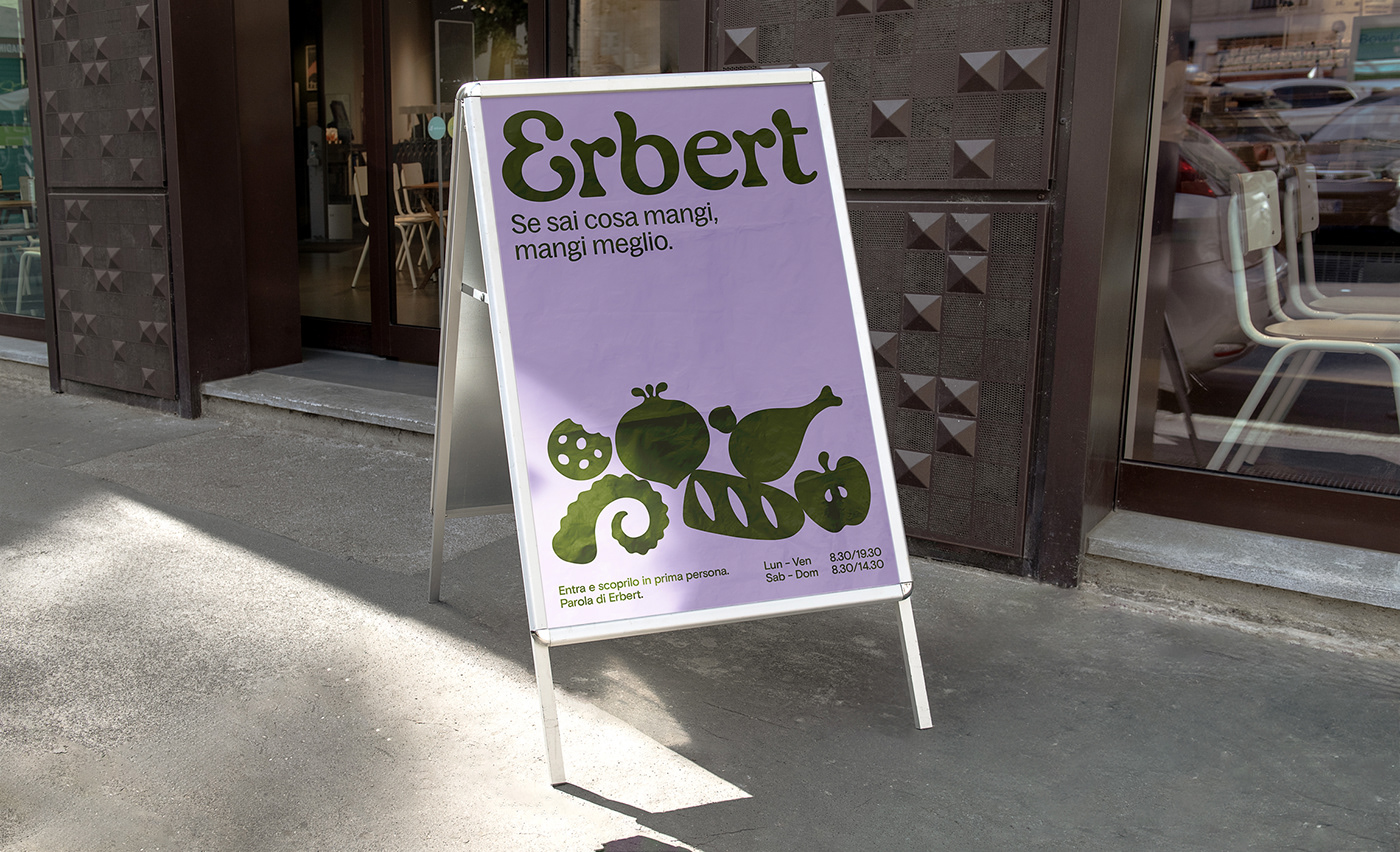
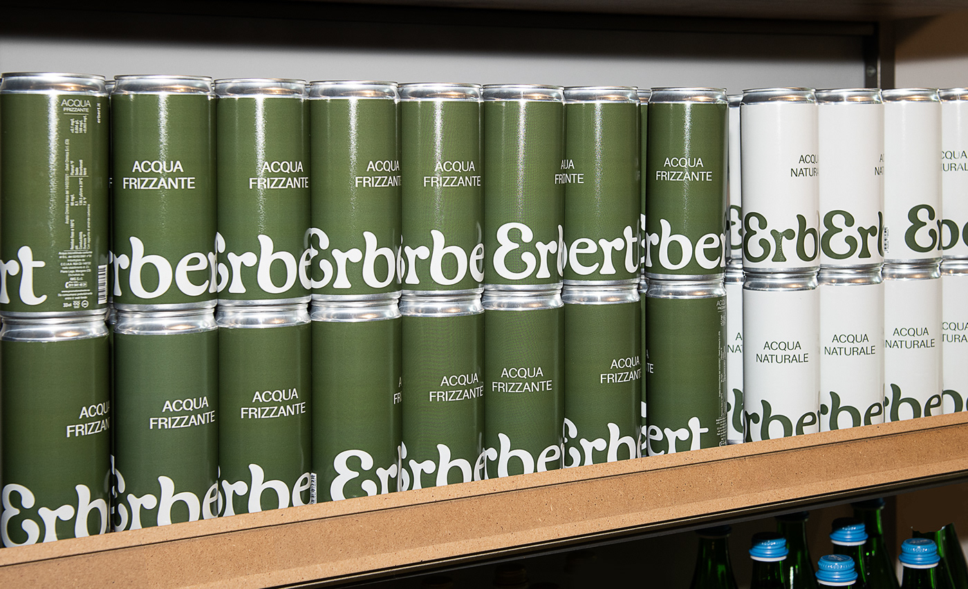
SOLUTION & PROCESS We designed a visual identity based on a custom logotype that describes freshness and healthiness of the products Erbert produces through the usage on typography of smooth curves and rounded serif terminations. The whole v.i. adopts a color palette where green is the main protagonist, both on printed materials and in retail.
---
Executive Creative Director: Davide Mosconi
Creative Director: Andrea Mastroluca
Design Director: Giovanni Stillittano
Design: Carlo Quaranta
---
YEAR / 2023