

Concepts
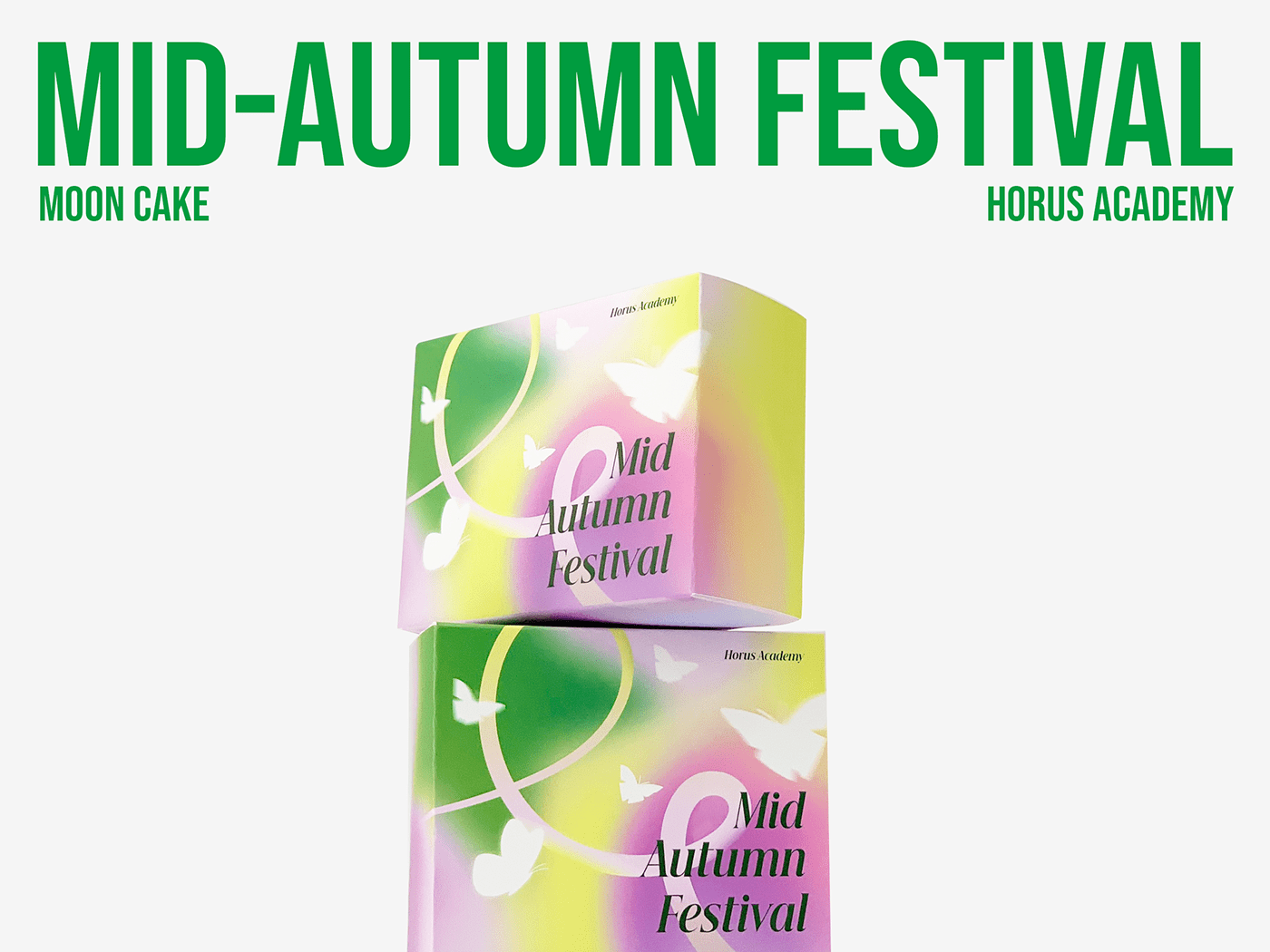
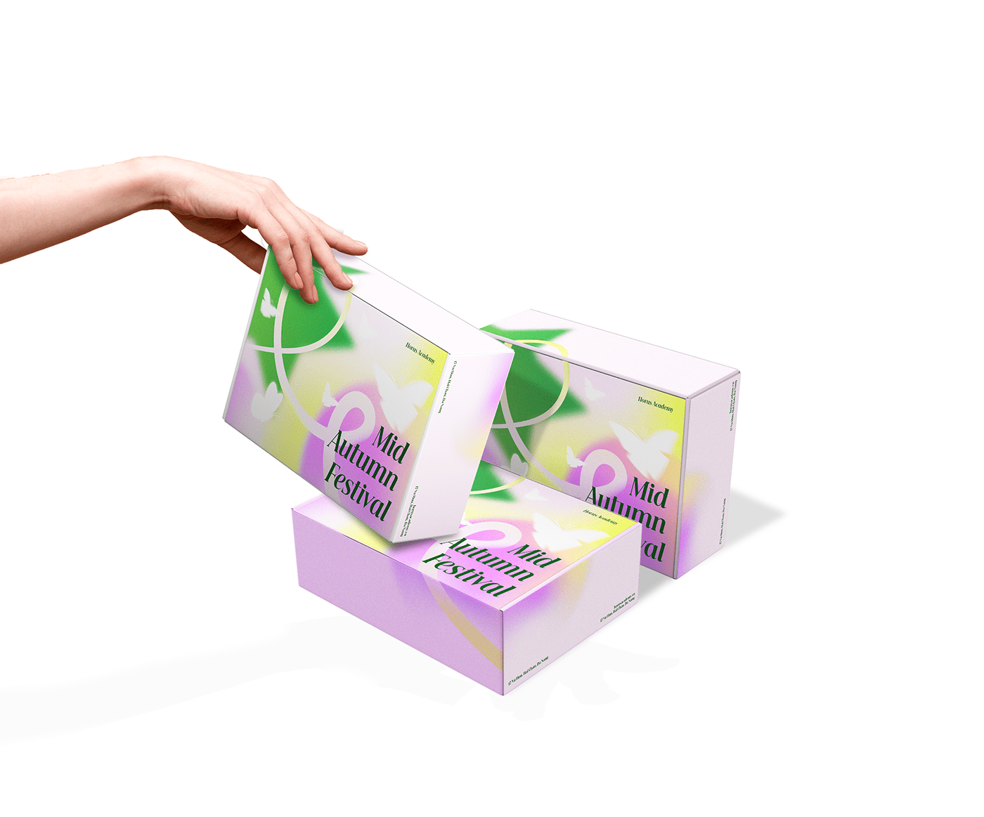
The patterns on the box were inspired by familiar images of the Mid-Autumn Festival, the image of a star symbolizing the star lantern associated with youth. Combining the star image that is the moon cake, we use a circle to symbolize the filling and also symbolize the full moon. The use of gradient colors brings out the highlights of stars and full moons. All of these factors contribute to enriching the visual beauty of the Mid-Autumn Festival season. Butterflies show the image of us being free, flying freely, not thinking too much, we are not alone. What could be happier than on Mid-Autumn Festival night when we can be with our family and loved ones. Let's create memorable moments this Mid-Autumn Festival.
With gradient colors, it is necessary to accentuate the image, create a highlight for the background and not drown out the image of the butterflies. Along with the prominence of graphic images, the delicate and impressive combination of the typeface is indispensable.
We chose the Beautique Display font for this combination, the typeface has a solid structure, breaking away from tradition and conveys contemporaryity creating the perfect combination for this packaging.


Credits
___
Client: Horus Academy
Location: Da Nang, Viet Nam
Art Director: Phuoc Thien
Creative Designer: Phuong Thao, Phuoc Thien
Motion: Phuong Thao
©2023 by Ceris Creative
Thanks for watching, if you like it, appreciate below


