


Lisura
- Crema de Pisco
The request consisted of designing a brand, creating a name and packaging for a pisco cream that would be sold in the international market. It had to be competitive with other liquors in the same category such as Amarula or Baileys, with the disadvantage that pisco is not as recognized as whiskey.
Objective:
That the product is perceived as an alternative to Baileys or Amarula in the international market but that refers to its origin, Peru. The packaging had to transmit history and class but at the same time it had to feel accessible.
Solution:
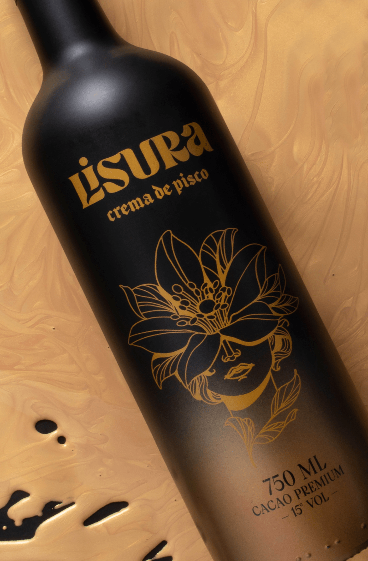
We took as inspiration Chabuca Granda's song “La Flor de la Canela”, since it was an expression that was formerly used in Peru to talk about exquisiteness. Within Chabuca's verses we find the phrase "She shed smoothness and in her walk she left the aroma of a mixture that she carried on her chest..." to express grace, which is why we named the product "Lisura."
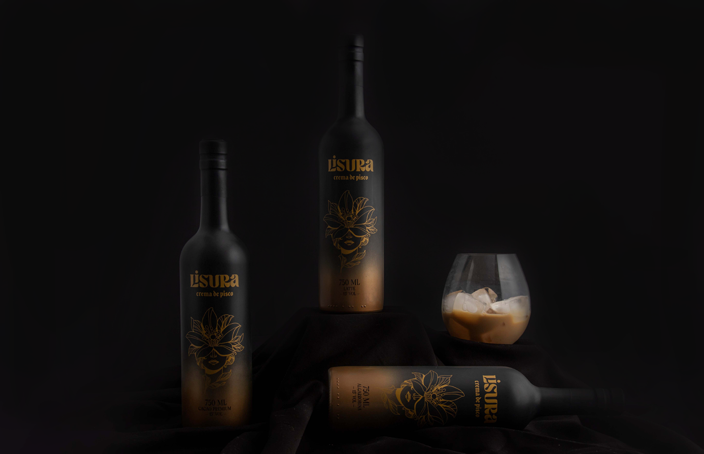
For the packaging design we painted the bottles black and created a flower-woman as a character that represents the silkiness of the cream, done by the renowned tattoo artist @anaartesanatattoos
All information is printed with serigraphy. We also painted the base of the bottle with a gold airbrush so that the bottle has two colors and emulates the mixture of the cream with the pisco.
FIBRA
BRANDING & PACKAGING @
@fibra_branding


STUDIO: FIBRA BRANDING
IG: @fibra_branding
CREATIVE & ART DIRECTION: Andrea Gálvez
GRAPHIC DESIGN: Andrea Gálvez, Ruby León
ILLUSTRATION : @anaartesanatattoos
PHOTOGRAPHY: Daniela Barrio de Mendoza
PROJECT MANAGER: Mariela Alata


