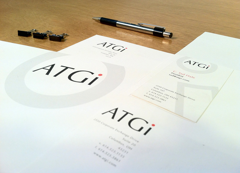
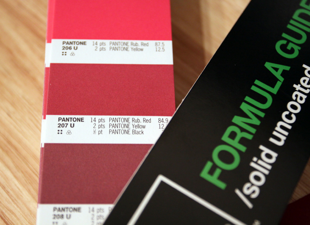
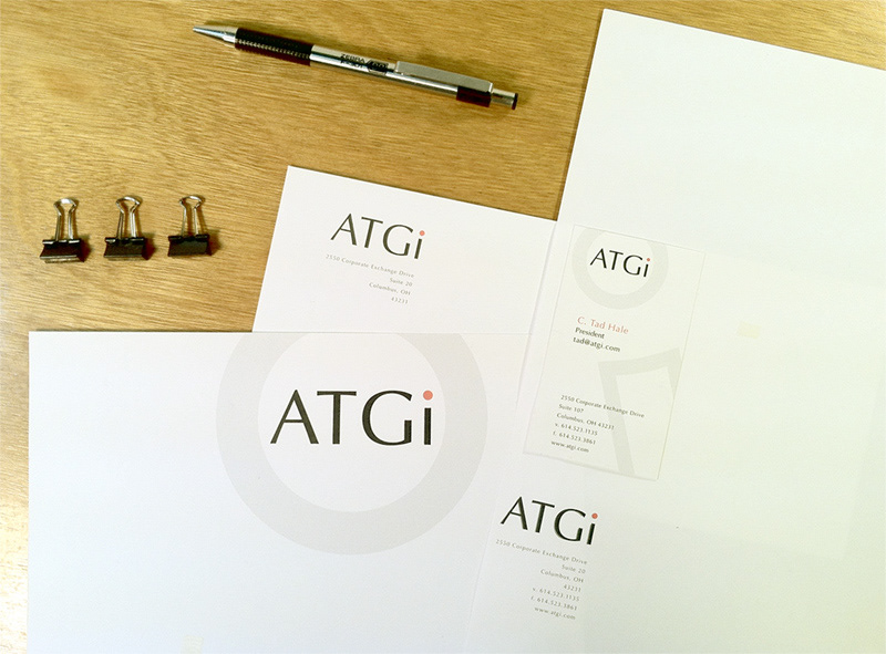
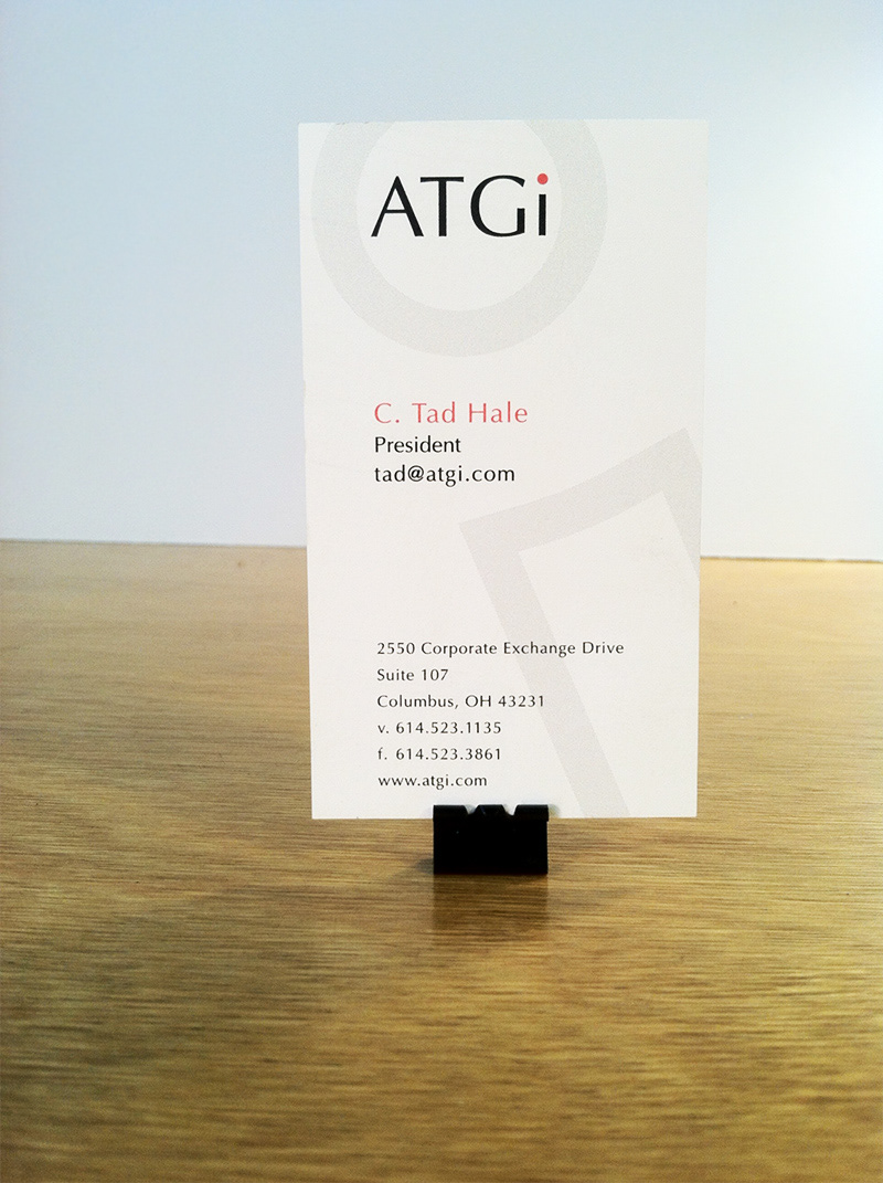
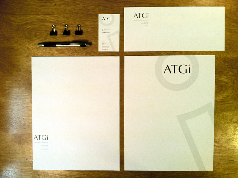
Choosing a color that reflected what the brand stood for was really hard. In the end, choosing something had "a confident energy" became the direction to follow.
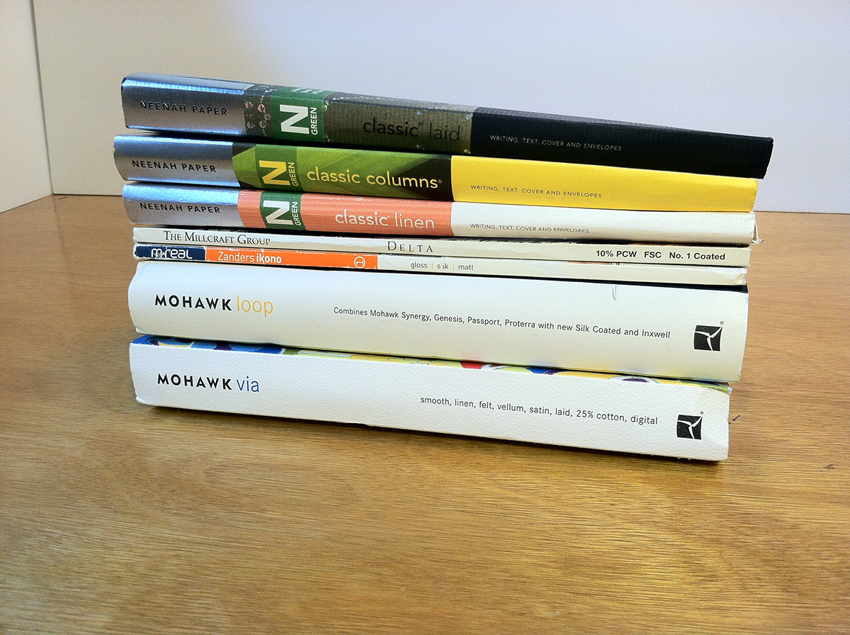
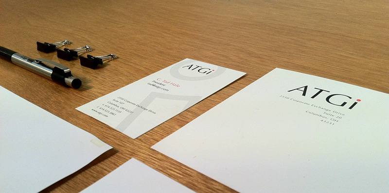
I selected Neenah Classic Super Smooth because of brightness and in-hand performance.
Thanks for looking :)
Join Behance
Sign up or Sign into view personalized recommendations, follow creatives, and more.
or
Join Behance
Sign up or Sign in to view personalized recommendations, follow creatives, and more.
Re-branding for ATGi (Active Technologies Group) that focused on thin and easy-to-read letterforms. The design had to look enduring, modern, and Read More