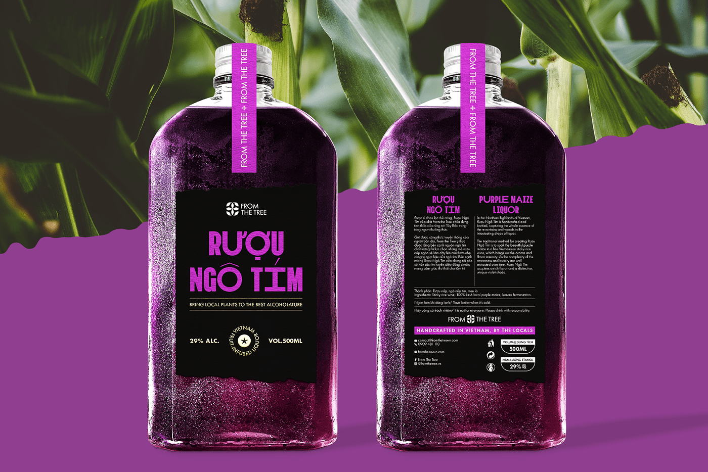
From The Tree is a Vietnamese local brand whose products are made from natural ingredients in the North West mountainous area of Vietnam. In their launching stage, they had two types of alcohol that would be sold online for the target market of young adults and given to their business partners.
My mission was to highlight the natural origins whilst making the brand look formal and young. It also needed to suit their future products, such as their snacks and specialties.
The logo idea came from the brand name “From The Tree”, with the leaves icon. There were two hidden number 3’s, which represented the three founders of the brand. Joint with the icon was a formal and modern geometric sans serif font. This logo was then developed to fit the different types of labels.


The identity was inspred by the origins of thedentity brand’s products “the mountains”. The rugged lines were an abstract illustration of the mountain’s slopes. It symbolised the quality and authenticity of the products creation, as well as the artisanal touch. The unique lines became the brand signature and was applied to packaging design.
The brand took a typographic approach with the simple black and white colors. Some green shades were added to imply the natural aesthetic. Each product will have its own color which will be inspired by its main ingredient.


