This is a project I began while studying graphic design at Kingston College—a mock exhibition showcasing the work of Arne Jacobsen. Recently, I've decided to revisit and remake everything to gauge my progress and learning over time.
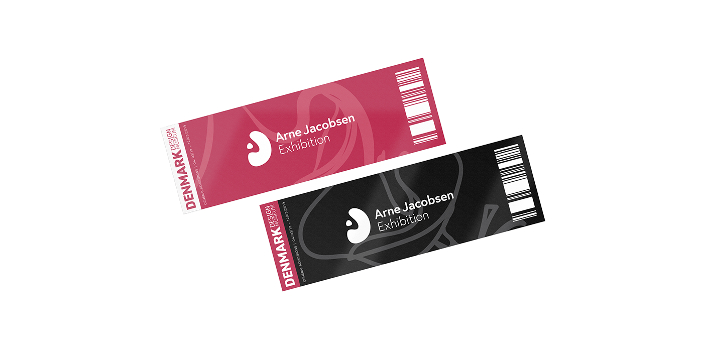
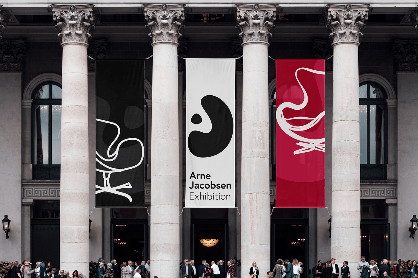
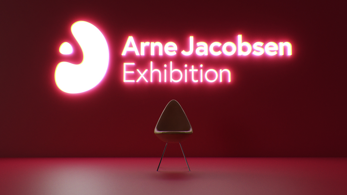
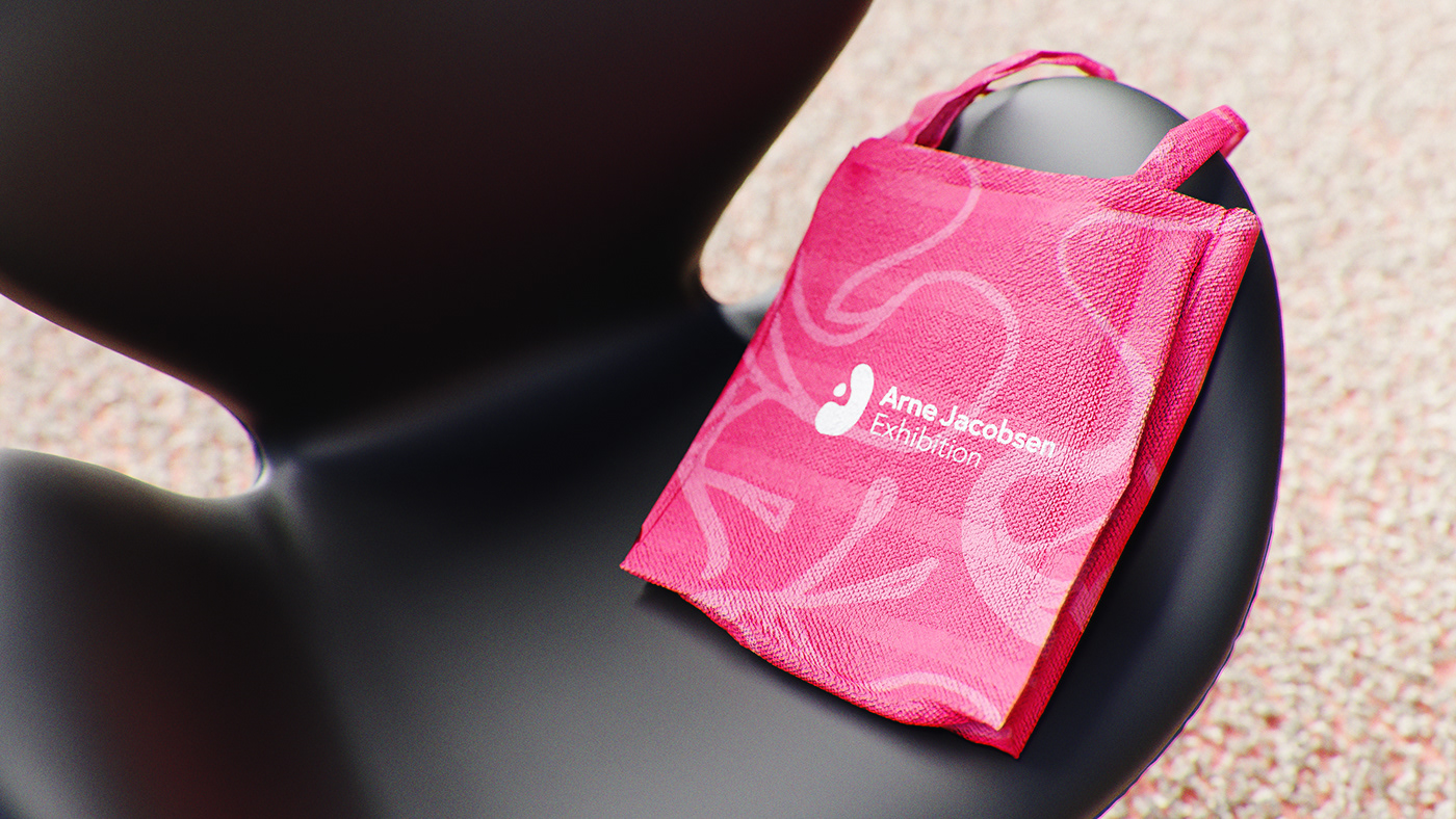
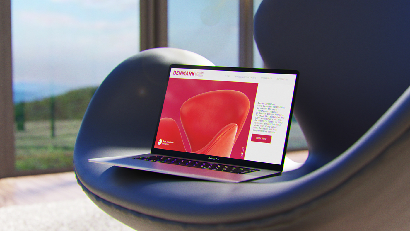
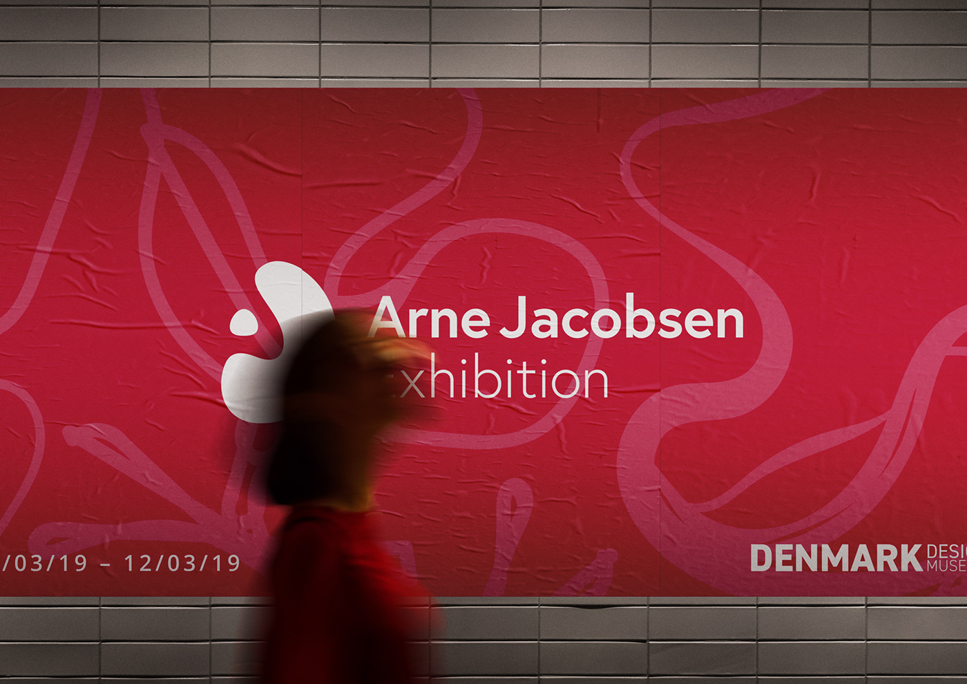
The concept behind the logo incorporates the shape of his renowned Egg chair and a dot symbolizing a lamp, forming a scene. The logo integrates the letter 'J' in the shape of the chair and the letter 'A' in the negative space, representing Arne Jacobsen's initials.
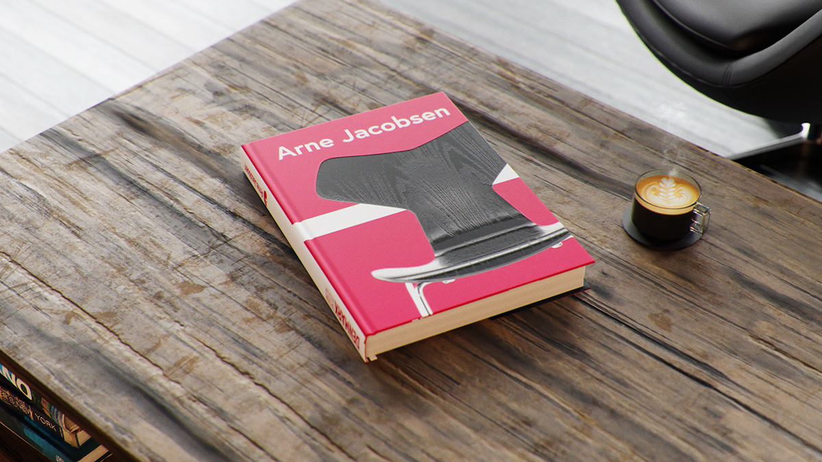
The brand uses the shapes of the chairs and the colours of the Danish flag,
representing his nationality.
The brand uses the shapes of the chairs and the colours of the Danish flag,
representing his nationality.