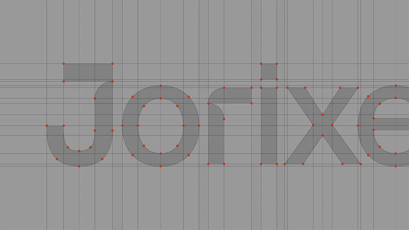
Jorixent
The 3D Architectural Visualization Studio embarked on a transformative journey to define a brand identity that defies convention. The result? A logo that's not just clever but a masterpiece in its own right. Crafted ingeniously from 1/4 ellipses, it conceals the letters "J" and "r" within its elegant simplicity, ensuring it lingers in memory, adding to the studio's unmistakable allure. But we didn't stop there; we carefully engineered a name that seamlessly harmonizes with this iconic symbol, enhancing its inherent style while standing tall on its own.
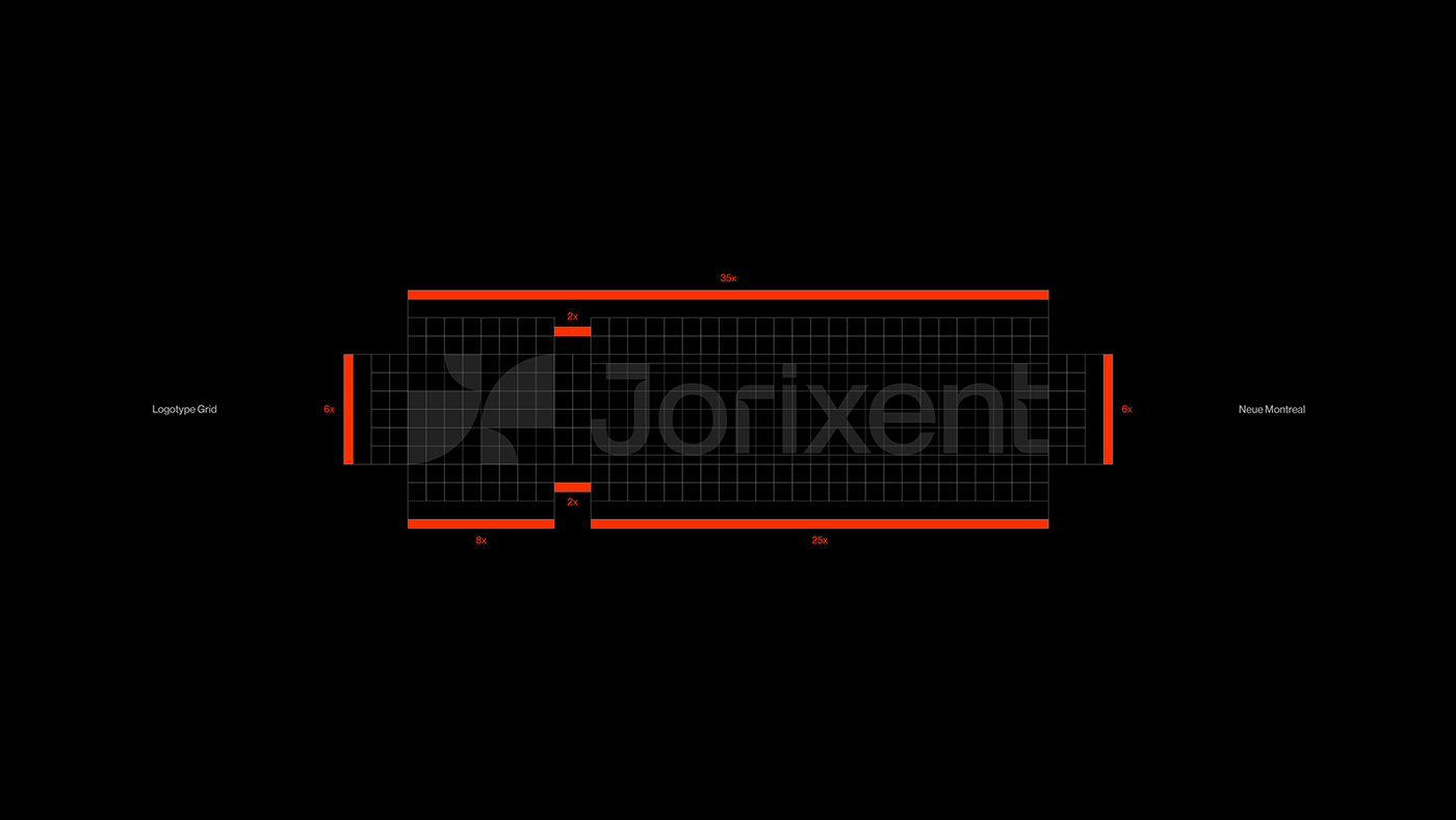
To truly distance Jorixent from its competitors, we boldly embraced a contrasting color palette, a symphony of Red Orange, White, Grey, and Black that resonates with distinction. And in the realm of typography, the choice was unequivocal - Neue Montreal. Its versatility shines brightly on both printed materials and the website, establishing a unified and visually captivating brand presence that sets Jorixent apart in the architectural visualization landscape.
—