The main idea: to develop a corporate identity for the hiking club «Przewalski's Horse» - to create an interesting image of eco-tourism that can attract the target group (active, curious, sociable people, large Russian cities' residents in the age of 20-35 years).
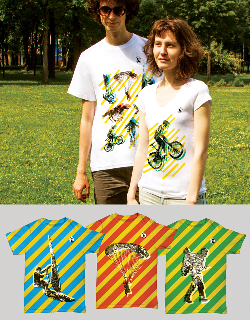
Corporate Identity. The main elements of style are the travelers' silhouettes that personify the different kinds of activities. The main technique - the connection of old engravings texture inside the silhouette and the bright geometric pattern on the outside. So we've accentuated the feature of the club - the unity of Russian traveling traditions and the current trends in the active tourism industry.


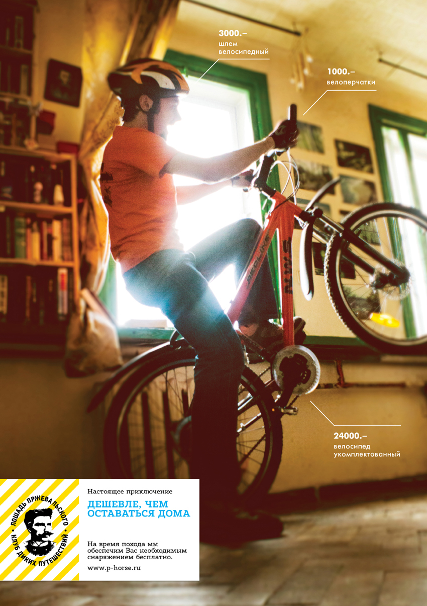
Advertising. 3 posters were created. Tagline: «It's cheaper than to stay at home».
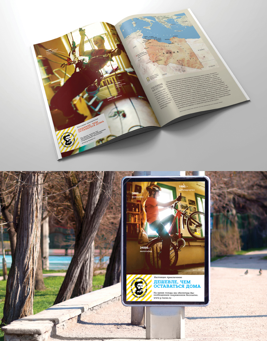
The posters can be modified for print or out-of-home advertising.
Art-directing, photo shooting, retouching, copywriting, idea and design are my own work.
The posters can be modified for print or out-of-home advertising.
Art-directing, photo shooting, retouching, copywriting, idea and design are my own work.


Project presentation


