Retro brand for ice cream – behind the curtain.
«Udmurtsky» cold-storage facility is the oldest enterprise in the Udmurt Republic (Russia) whith a rich heritage from the Soviet era. Then the enterprise developed its own ice cream sorts well-known on the local market. Ice cream in wafer cups, ice cream scoups and eskimos on a stick in a chocolate glaze original recipies are used hitherto.
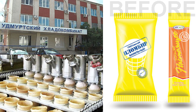
The problem was that company lacked a strong brand image. The product was sold in a simple yellow package that didn’t change much since soviet times. Anyone could easily make something similar and take an advantage on the company’s good reputation. «Udmurtsky»’s reputation could be under the threat in this case.
A unique comony’s heritage was a basis for the new brand communication.
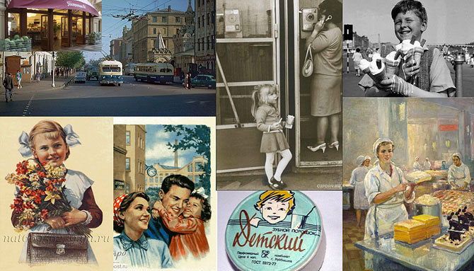
Compony’s history begins in 1938 - the factory is well-known to the children of many generations. And that what we wanted in a future brand communications: everyone who was a child at that time whether its parents or parents of the parents, they all remembered overwhelming happiness which they had when they had the best delicacy on the Earth and shared this happiness with children and grandchildren.
Сomplex brand creation process started with logo and corporate identification development which the company never had before. The style had to communicate "keeping traditions" company image therefore to remind Soviet logos of those years. Logo and identics were developed in two executions – for corporate use and for use on packing and marketing materials.
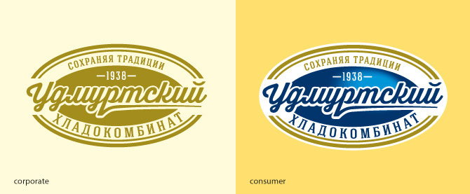
Corporate logo is made in one paint. It is printed bronze which looks very strict and goes well with retro style as well. Dark blue color on the old paper is a «new old” identity creates a unique image of an enterprise with rich traditions from the Soviet past when all products were natural and tasty when GOST food standarts were developed. It was expressed well that the compony is a carrier of those traditions.

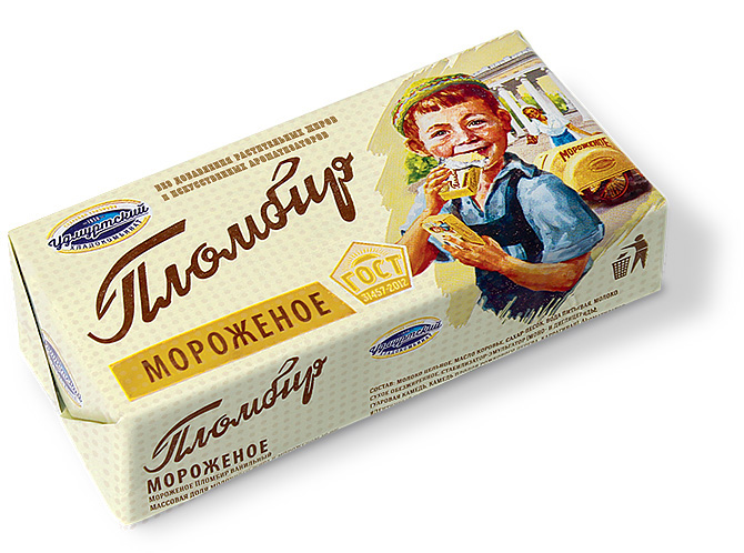
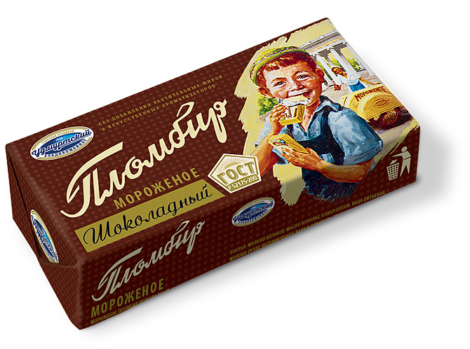
The colored logo is used as a consumer identity in packaging design, which is solved in the best traditions of the Soviet era by means of hand-written and type-set fonts, natural colors, illustrations painted in realistic manner. The illustrations are happy scenes from the childhood— a schoolgirl, a boy cycling and protecting the ice cream from a cheerful puppy who strives to jump up and bite off a piece of it, a redhaired little boy with a bunch of ice creams.


Retro brand identity works well for the enterprise which kept the quality and the range of authentic products. We had no doubt in this. Interest to this era is a lot among the younger audience, those who never was a grown up in Soviet era and everything connected to it looks like a perfect picture from the movies where were only natural healthy products with no junk. We hope the company will take good positions and retro brand will be a succssess both on local and national market.


