


Guangzhou Restaurant fried dumpling brand dumpling packaging upgrade
广州酒家煎饺品牌包装设计升级
▲ CLIENT
Our client is Guangzhou Restaurant, a long-established Chinese restaurant founded in 1935. Guangzhou Restaurant is famous for its traditional morning tea culture and is known as "the first restaurant in Guangzhou". As the representative program of Guangdong Intangible Cultural Heritage "Canton Tea Drinking Customs", Guangzhou Restaurant is committed to preserving the traditional tea drinking culture and innovating in terms of product and service experience. Our mission was to upgrade the brand packaging of Guangzhou Restaurant's Pan-fried Dumplings, presenting consumers with authentic cuisine with a long history and deep heritage, and realizing the inheritance of delicious flavors from Guangzhou Restaurant to every family.
我们的客户是广州酒家,一家始创于1935年的中华老字号。广州酒家以其传统早茶文化而闻名,被誉为"食在广州第一家"。作为广东省非物质文化遗产代表性项目"广府饮茶习俗"保护单位,广州酒家致力于保留传统的饮茶文化,并在产品和服务体验方面不断创新。我们的任务是对广州酒家煎饺的品牌包装进行升级,将历史悠久、底蕴深厚的地道美食呈现给消费者,实现从广州酒家到每一个家庭的美味传承。
▲ ASSIGNMENT
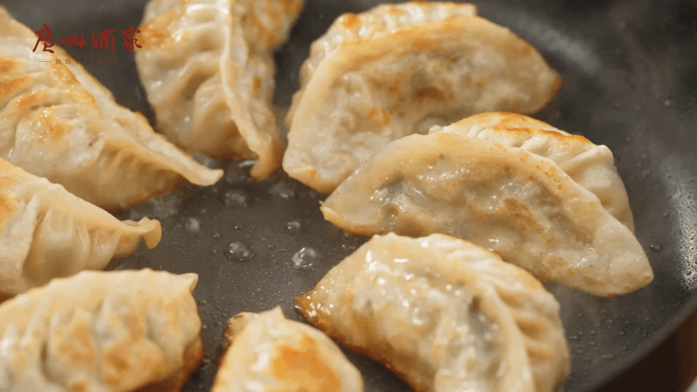
Our mission was to improve the presentation of the selling points of fried dumplings, the visual effect of the package, the sense of appetite and the expression of the way of consumption through the packaging upgrade. The product is positioned as a national mass-market product, and the design tone needs to emphasize the sense of appetite and refinement. Our design goal was to convey a stronger sense of appetite and sophistication while retaining traditional elements to help consumers understand the Guangzhou Restaurant brand image and drive sales growth.
我们的设计任务是将传统的煎饺包装进行现代化的改造,以提升产品的品质感和食欲感。我们在包装上运用了鲜明的色彩和简洁的图形,突出了煎饺的香脆和鲜美,同时也体现了广州酒家的品牌形象和文化底蕴。我们的目标是让消费者在看到包装时就能感受到煎饺的美味,从而增加购买意愿和品牌忠诚度。我们的包装升级是为了让广州酒家的煎饺产品在市场上更具竞争力和吸引力,打造全国大众化的美食品牌。
▲ SOLUTION
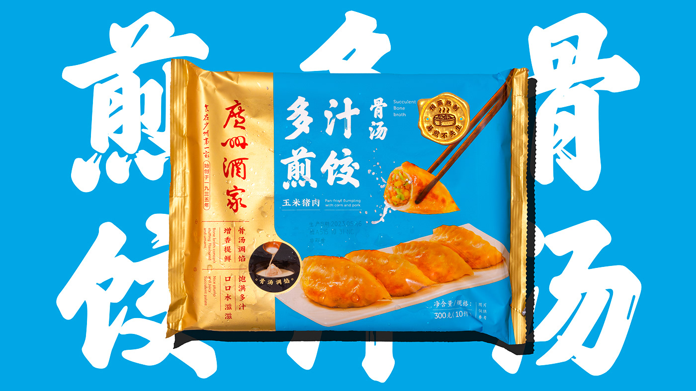
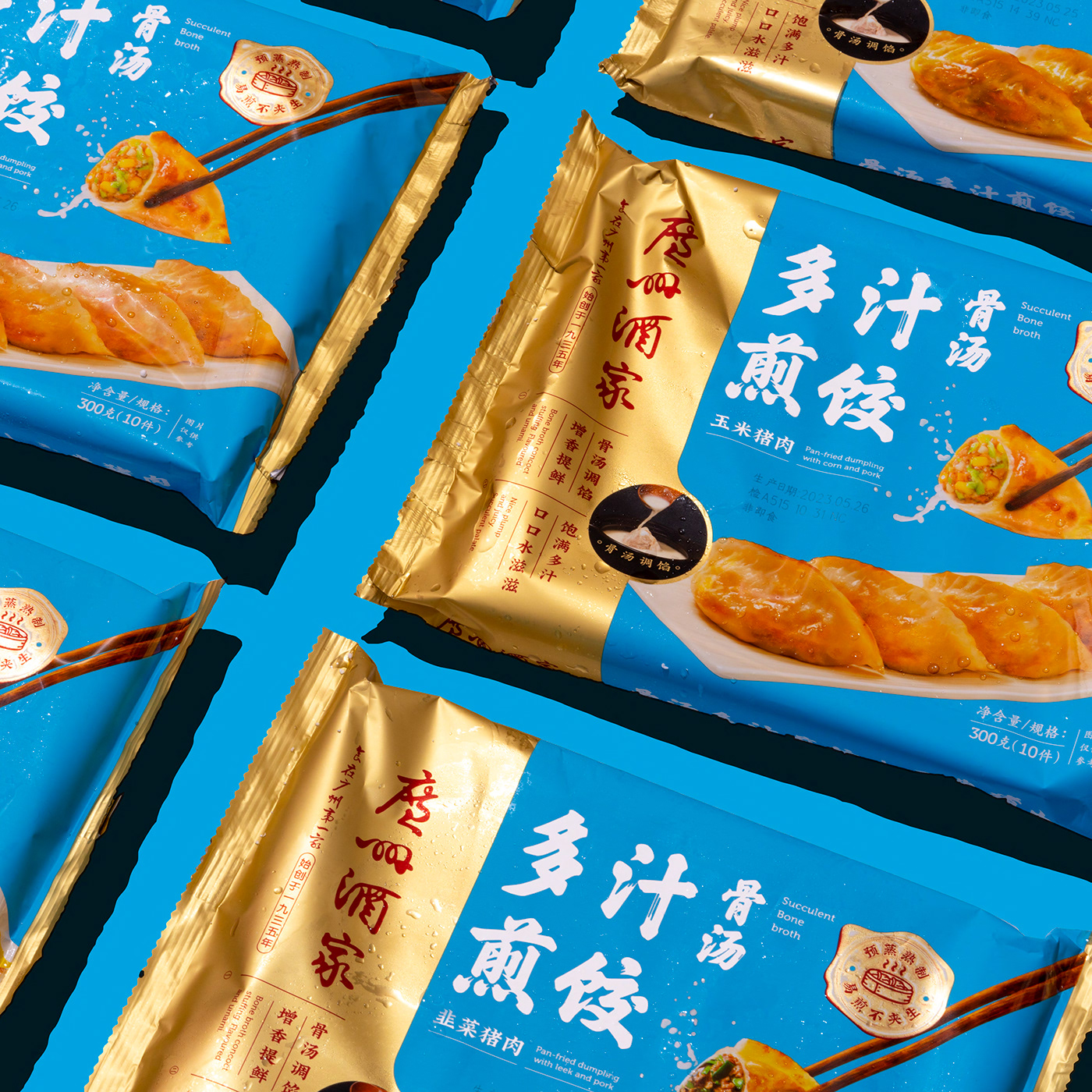
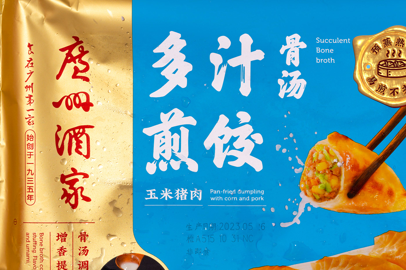
✺ Updated brand packaging identity system with enhanced appeal
We will display the product name on the packaging in a bold and innovative design to enhance the readability and attractiveness of the product name. We will utilize the traditional Chinese list of books, retaining the traditional elements while injecting more attractive expressions, and consider the balance between the traditional elements and youthfulness in order to attract the attention of consumers.
✺ 更新品牌包装识别系统,吸引力提升
我们将在包装上以大胆、创新的设计方式展示产品名称,增强产品名称的可读性和吸引力,运用传统中国榜书,保留传统元素的同时,注入更具吸引力的表达方式,考虑传统元素与年轻感的平衡,以吸引消费者的注意。

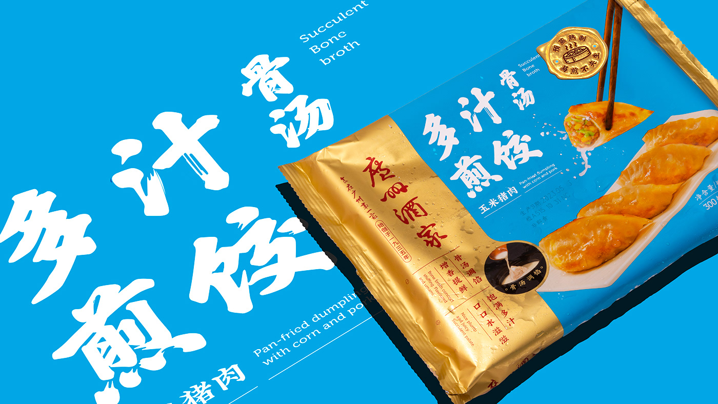


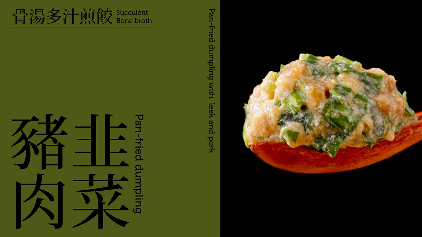
✺ Enhance the visual appeal of packaging and sense of appetite
We will use a high-purity color palette and sophisticated image design to enhance the sense of design on the front of the package, making it visually more outstanding and compelling on real consumer shelves with complex lighting, and enhancing the sense of appetite. Through the use of beautiful food photography and color combinations, we will showcase the deliciousness of the product and enhance the consumer's sense of appetite.
✺ 增强包装的视觉吸引力和食欲感
我们将采用高纯度的颜色搭配和精致的图像设计,以增强包装正面的设计感,使其在复杂灯光的真实消费货架上视觉更加出众和引人注目,增强食欲感。通过运用精美的食物摄影和色彩的组合,展示产品的美味,增强消费者的食欲感。


✺ Inheriting the brand's rich heritage, each word and design detail on the packaging has been meticulously refined.
In packaging design, designers usually focus only on the front image and ignore the importance of details. However, paying attention to details is what really deserves attention. We put a lot of thought and effort into making sure every aspect of the package is visually appealing and sophisticated. From the choice of colors and fonts to the placement of font sizes and graphics, our designs are designed to enhance the overall aesthetics and perceived value of the product.
✺ 传承品牌历史底蕴,包装上每一个文字和设计细节都反复打磨。
在包装设计中,设计师通常只关注正面画面,而忽略了细节的重要性。然而,注重细节才是真正值得关注的。我们花费了很多心思和精力来确保包装的每一个方面都具有视觉上的吸引力和精致度。从颜色和字体的选择到字号和图形的放置,我们的设计都旨在提高整体美感和产品的感知价值。


✺ Simplify graphics to increase readability and enhance selling point presentation
We redesigned the selling points on the packaging and distilled the key messages that would attract consumers. At the same time, we took the design of the selling point icons to a higher level, making them clearer, more attractive and easier to understand. We created a differentiated point-of-sale icon that highlights the "pre-steamed and cooked" feature.
✺ 简化图形,增强可读性,加强卖点表现
我们重新设计包装上的卖点,并提炼出能够吸引消费者的关键信息。同时,我们将卖点图标的设计提升到更高的水平,使其更加清晰、有吸引力和易于理解。我们设计了一个差异化的卖点图标,突出"预蒸熟制"的特点。


▲
Our goal was to create a unique brand visual identity by upgrading the packaging to quickly convey the product's selling points and visual appeal to consumers on the shelf. We wanted to stand out in complex supermarket lighting conditions, presenting a strong sense of appetite and sophisticated character. We believe that this upgrade will further consolidate Guangzhou Restaurant's position in consumers' minds, passing on the authentic taste of morning tea and making the culinary tradition of Guangzhou Restaurant accessible to every family.
我们的目标是通过升级包装,打造独特的品牌视觉形象,快速传递产品卖点、在货架上吸引消费者的视觉效果。我们希望在复杂的超市灯光条件下脱颖而出,呈现出强烈的食欲感和精致的特色。我们相信这次升级将进一步巩固广州酒家在消费者心中的地位,传承正宗的早茶味道,让每个家庭都能品尝到广州酒家的美食传统。


