I began with creating a titling type. The base was Futura Medium because of it's incredibly popularity at the moment and a personal love I have for the typeface. I wanted this type to be beautiful but also to make you feel as if you were on pins and needles, much the way Lisbeth Salander would. After developing it for about two months by itself, I was satisfied with the layout, the type design, and the overall mood and style.
After that I began to make hand made collages of this type design to create a rawer, more punk feel. I made about two dozen before settling on handful for the poster and motion design.
Then I took a completely different approach to the type to pair the two together, while producing the motion. I used both of these designs to create billboard style title posters, teasers to really draw attention in a subtle way.


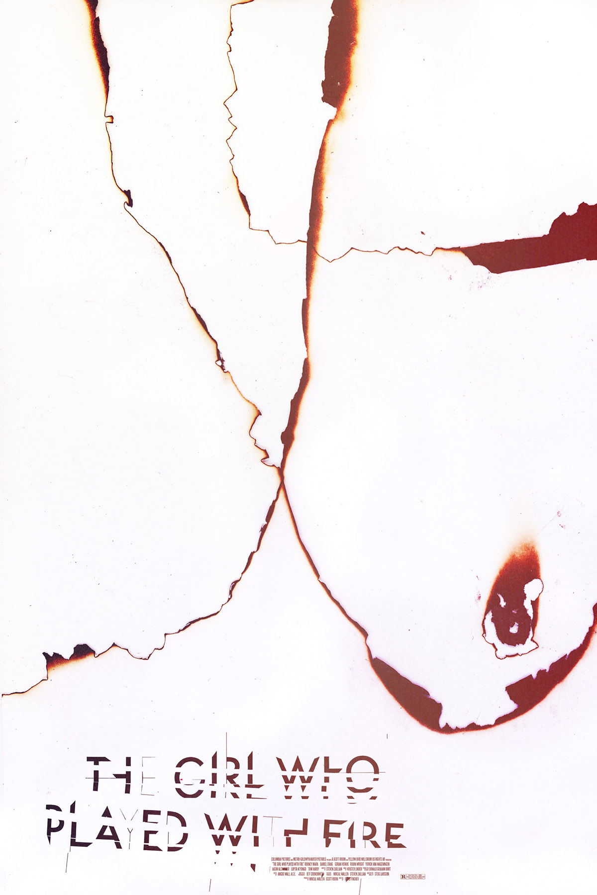
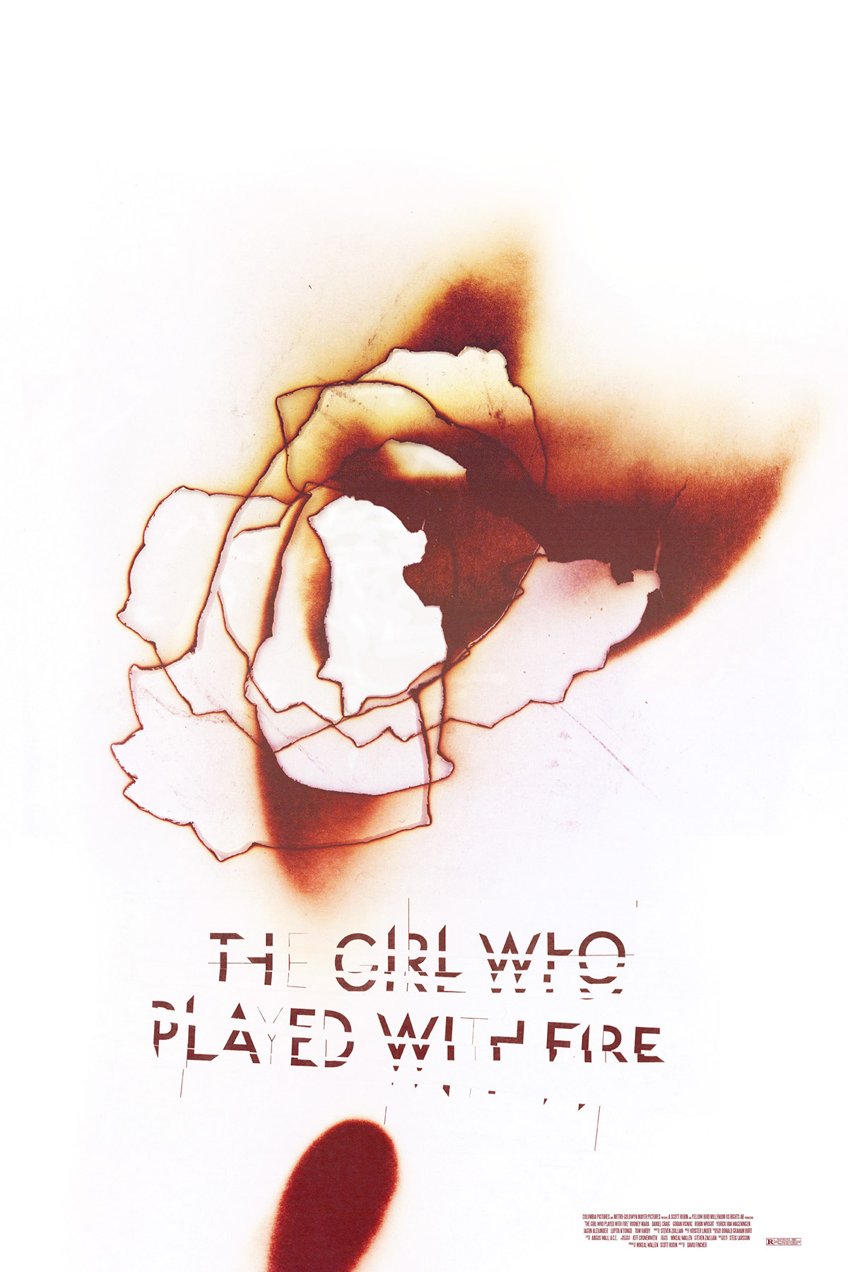
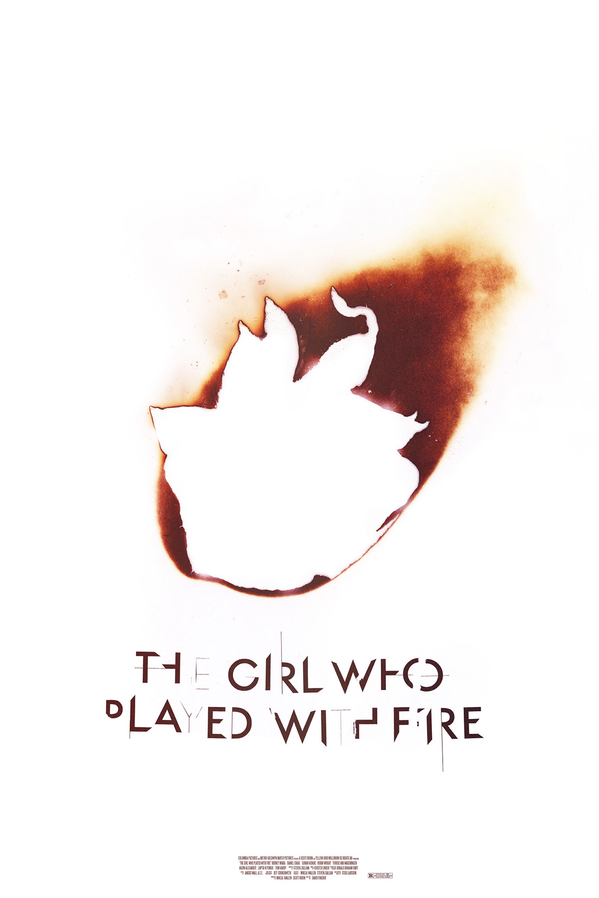
After finishing the type design, I began with the teaser campaign. Again, I wanted the work to be beautiful but anxious, almost threatening. After several false starts and experiments, I started burning printer paper outside. I would let the paper burn and then stomp the fire out once it had been partially engulfed. I scanned these and created ten diffrent poster variations (all 24x36) , the three displayed here being the final three chosed for exhibition.
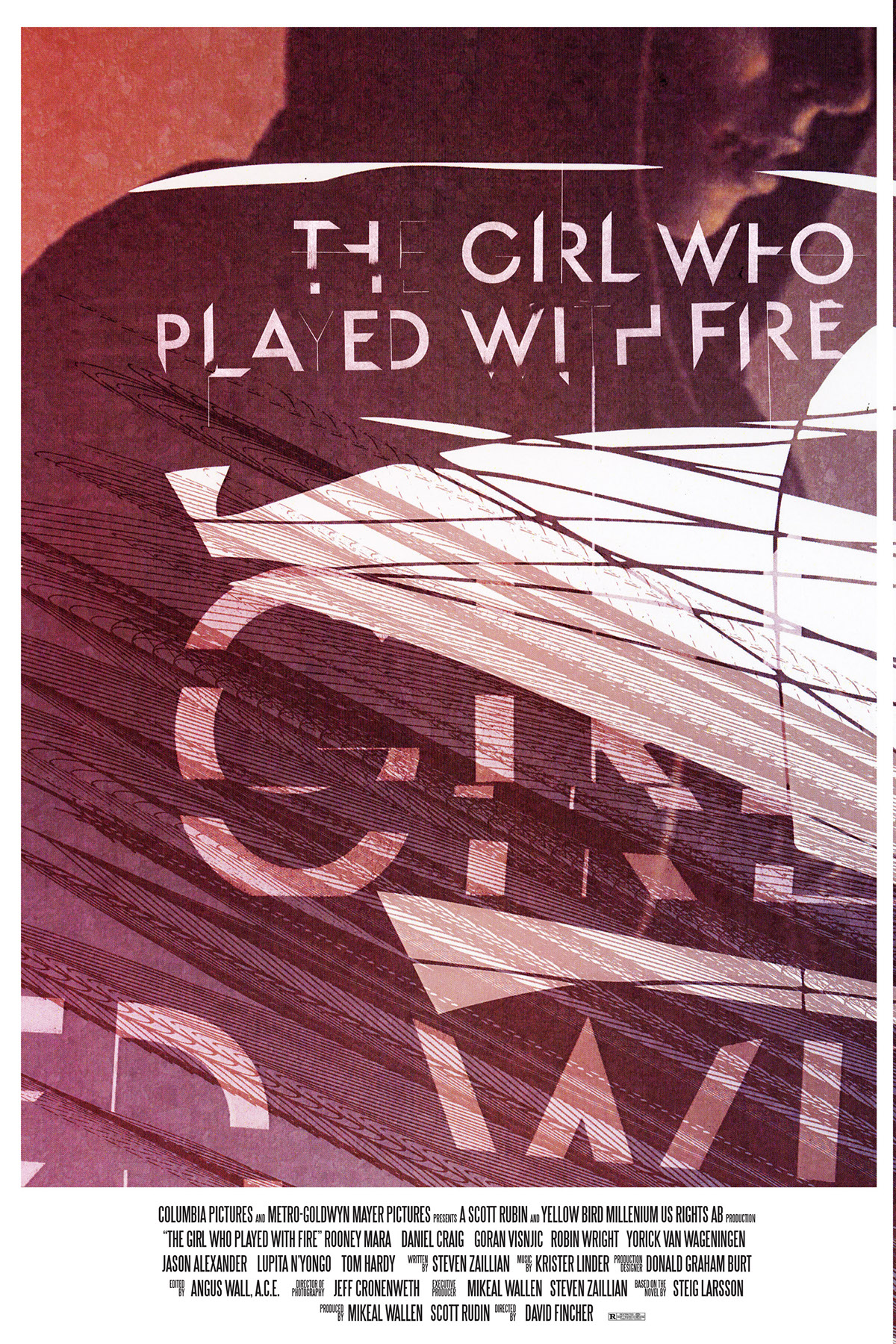
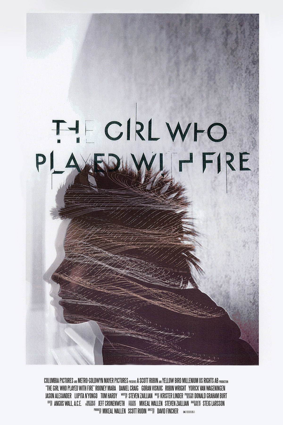
Next I created a series of theatrical posters. This is where the fact that this film has not been made yet and has no content began to be an issue to work around. Using older publicity photos of Rooney Mara found on the internet and then edited to fit with the tone of the advertising and the quality of the prints (300dpi, 24x36). Here are the final three theatrical posters.

Finally, I created four unique motion pieces for the as yet unproduced film. Again, lacking any actual film to base the visual style off of, I came up with the concept based upon the plot of the novel and the original Swedish film. The concept would be very plot based, but abstracted enough not to give too much away. Sex trafficking is a major part of the novel and the Swedish film. I wanted to create an air of sadness and aggression, but still keep everything beautiful and strange. I also wanted to demonstrate how sex trafficking happens every day to young girls and women all over the world.
I recruited a diverse cast of women to model and began to build more type. I used the small photo studio in Alexis Labs to shoot footage of these women being projected upon in various states of undress. The opening titles to 'From Russia With Love' titles designed by Robert Brownjohn were a huge inspiration for the first sequence (as well as a kind of dark joke in retrospect).
The short promos were created as teasers, to accompany the 'Burn' teaser campaign. Intended for viral web use, slots before films (I love a good tease), and a slowly building presence on television, creating tension for the release of the theatrical trailer, they echo interupted transmissions, small glitches of information leaking through the knarled system of information we are saturated in.
Music: Krister Linder
"And The Sky Cried For Nancy"
From feature film Downloading Nancy
Label: Ghostfriend
www.kristerlinder.com
All Rights Reserved.
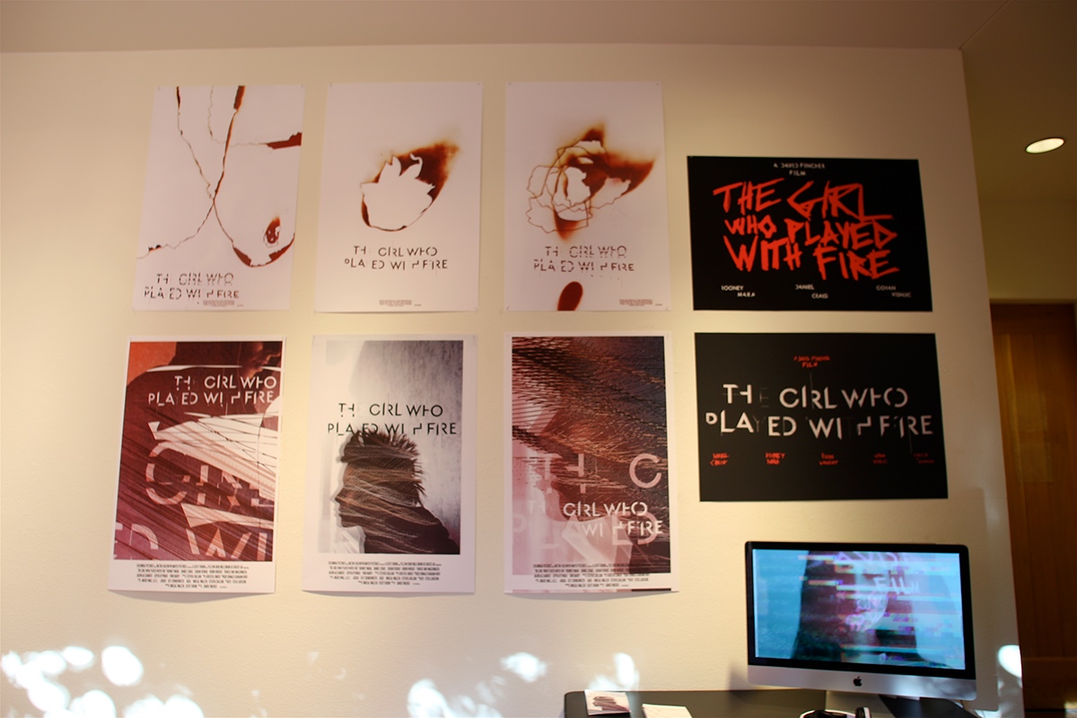
The full collection at the exhibition 15/14, May 9th in the FIne Arts Complex at Santa Fe University of Art and Design. Photography by Terry Griffin.