S ✦ Essentials to The North - Sketches
Bellow the initial "sketch guide" I've used as direction to refine the sketches later.
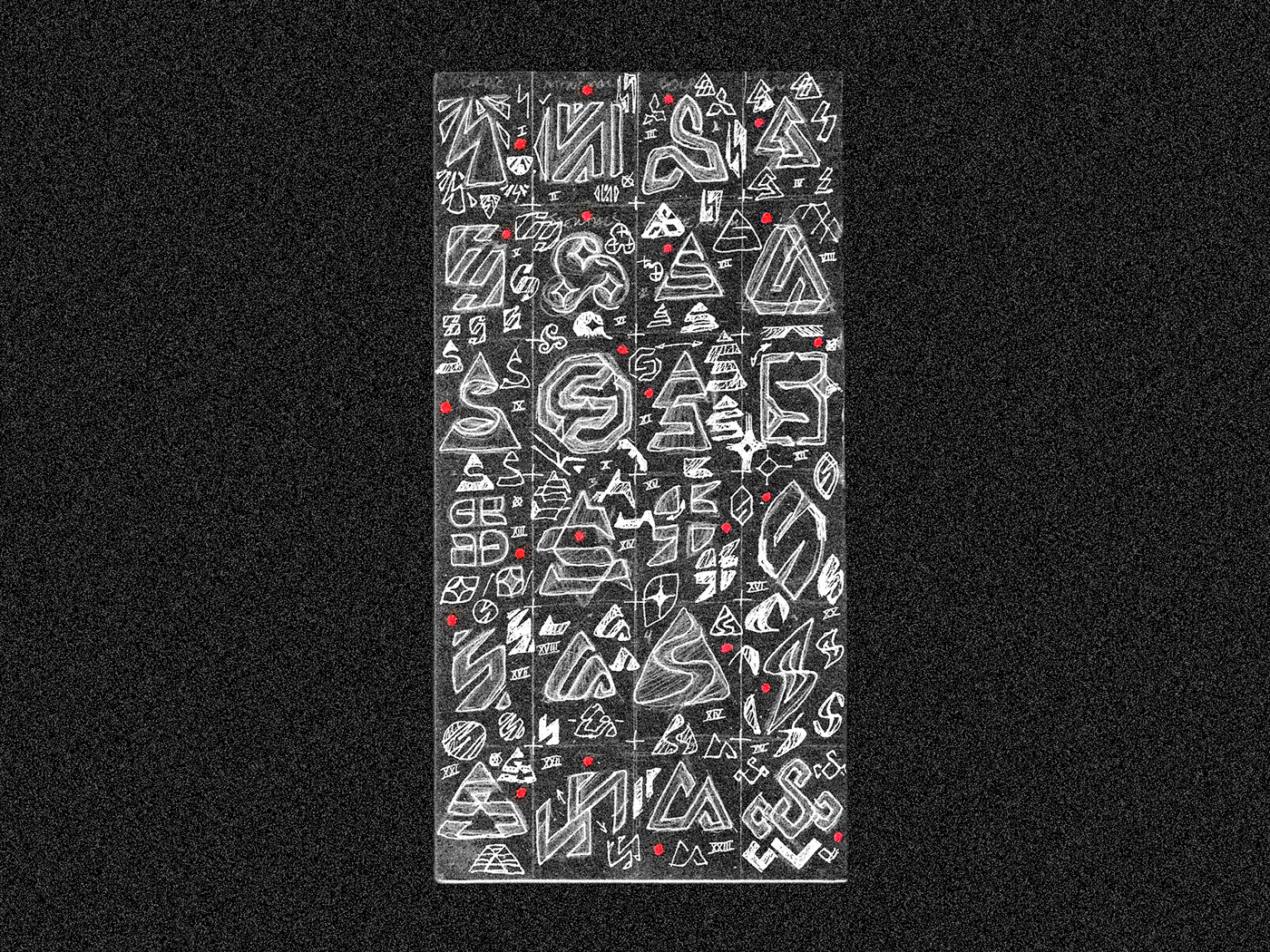
This is the initial sketches for Scandavia Logo, I'm aiming in a Appealing & Clean looking for an S, some mention to "north" and Nordic. (many of them are inspired by nordic symbols and the Runic S.
Basically, as far as the overall feel of the Symbol, I'd love for it to have a Bold, Minimal, & Nordic look to it, that isn't TOO over the top with the nordic side of things.
Client love kind of vintage/distressed looking logo marks and the idea is to have this mark be something he could slap onto products & people recognize instantly that it is the Scandavia brand.
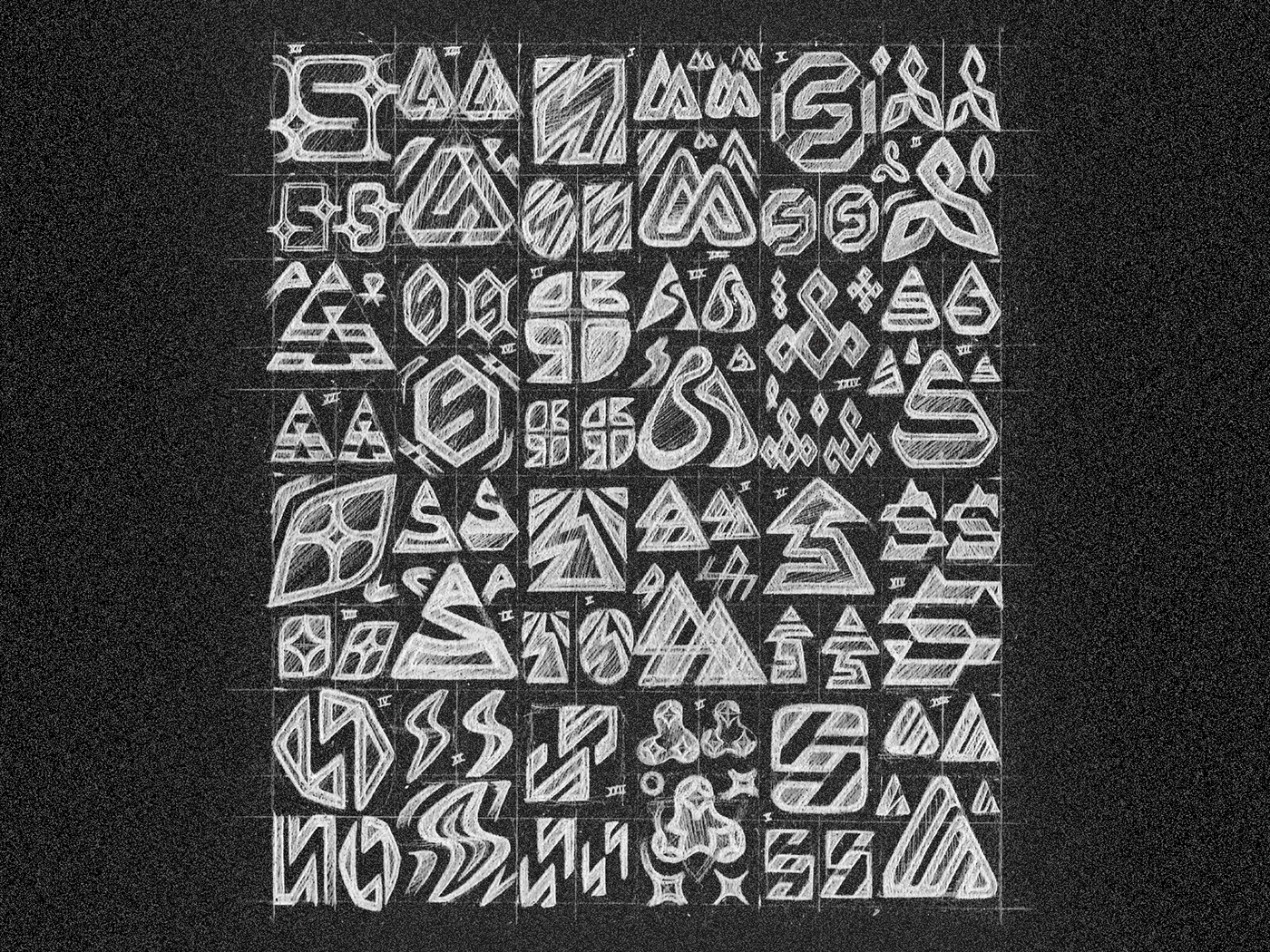
Here you can see all the ideas segmented by a pack of six concepts/ideas.


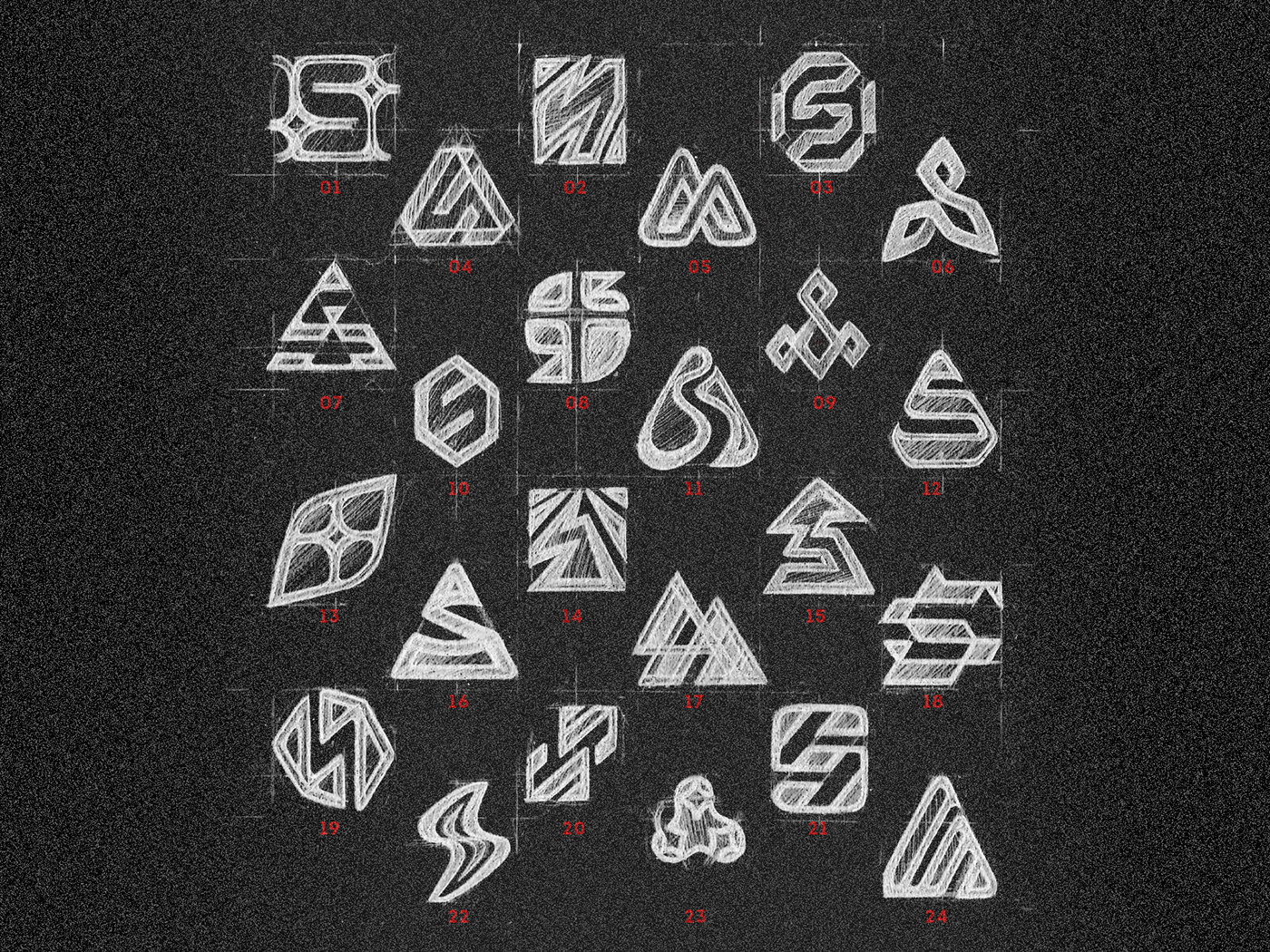
Quick guide to make easy the reference of each symbols group, let me know in the comments what is your favorite!
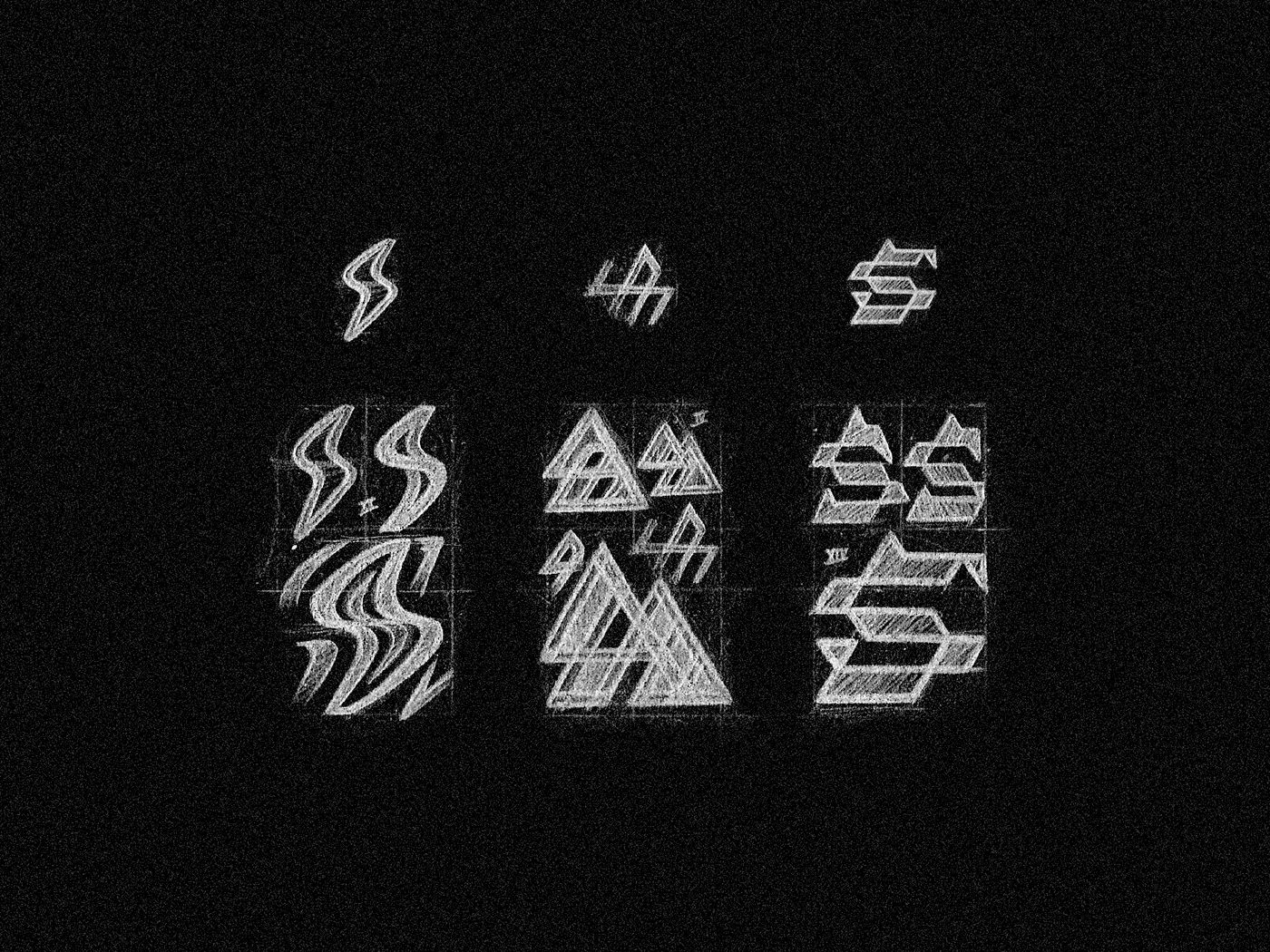
These are the three selected sketches for Scandavia Logo, I'm aiming in a Appealing & Clean looking for an S, some mention to "north" and Nordic.
Refinement process of the selected concepts, I really enjoy to watch this process; really useful to make the symbol perfect!


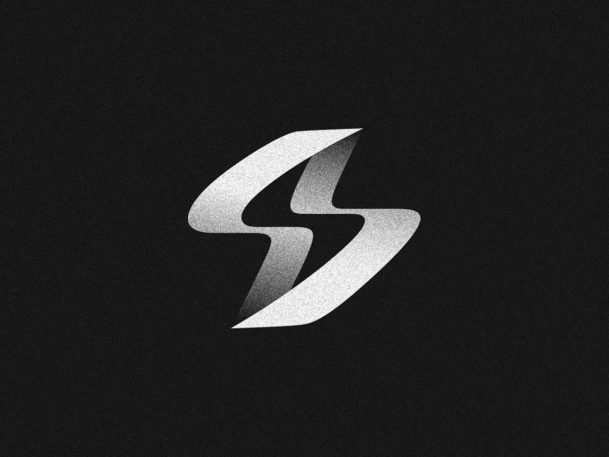
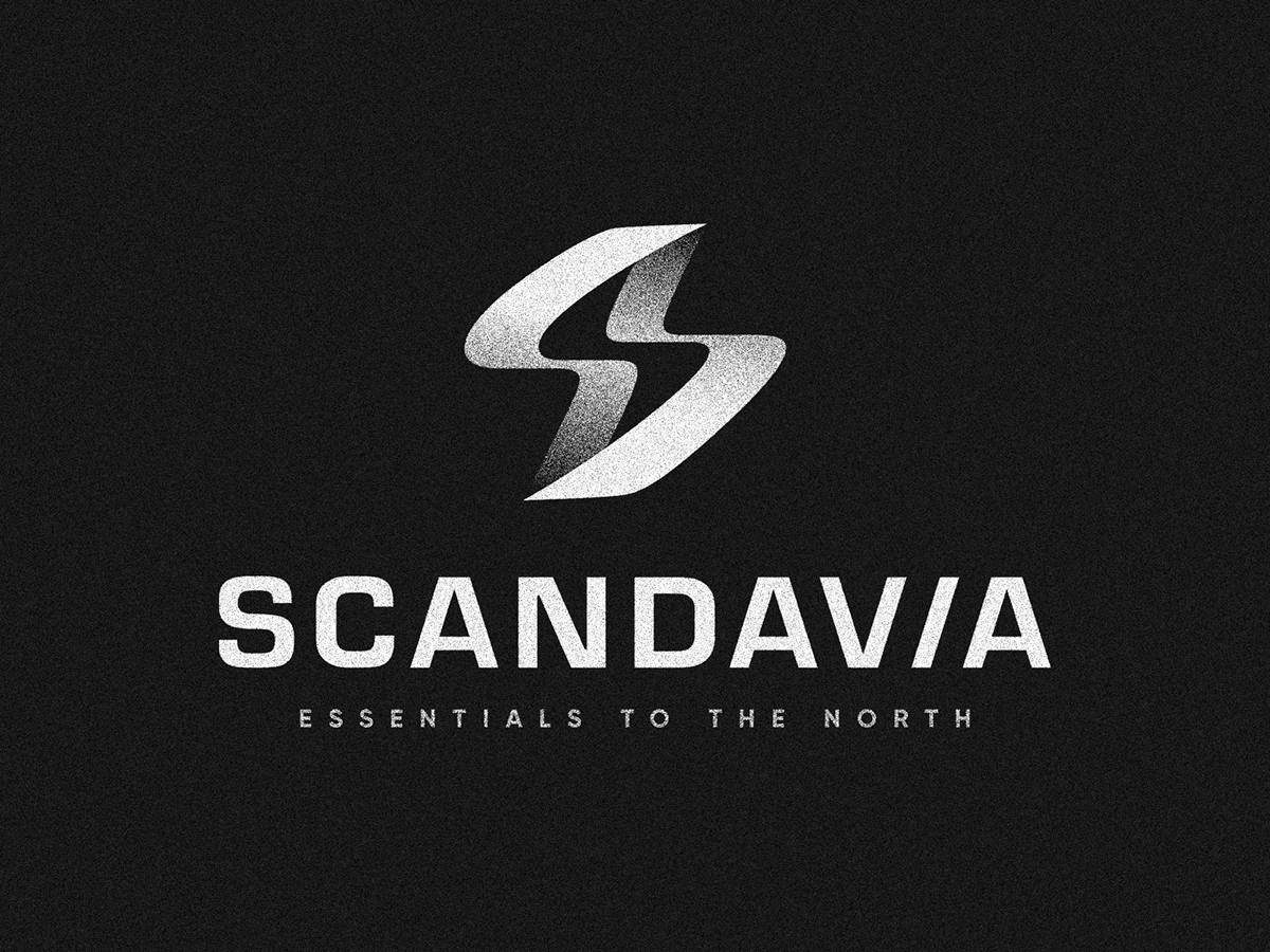
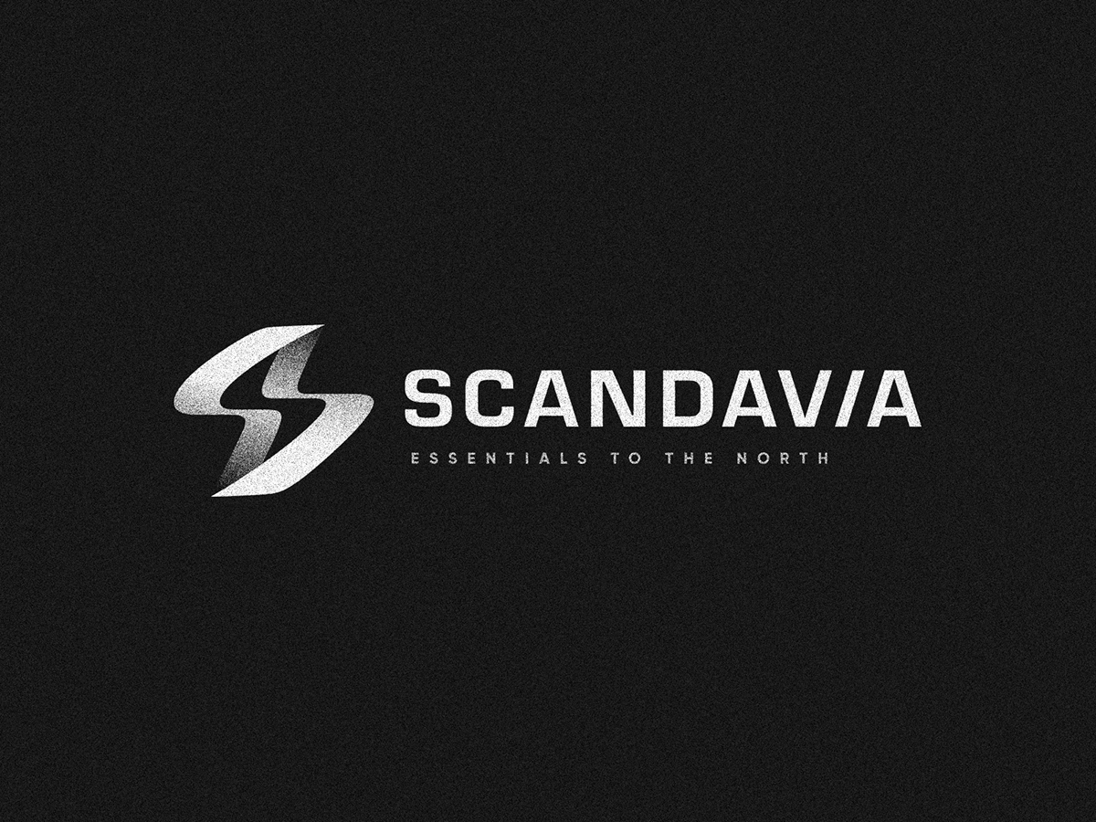
You can see the final approved one, refined as follows (with type)
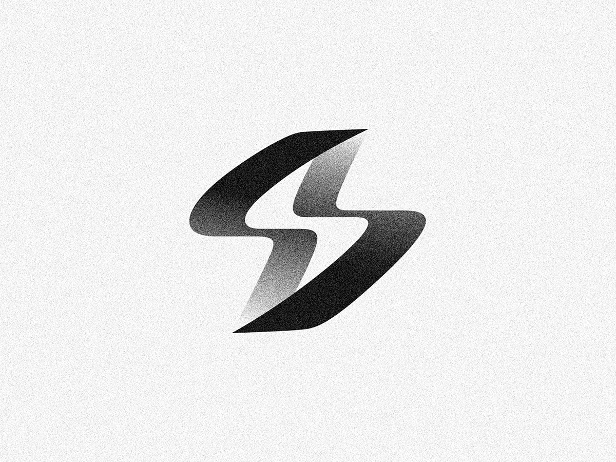
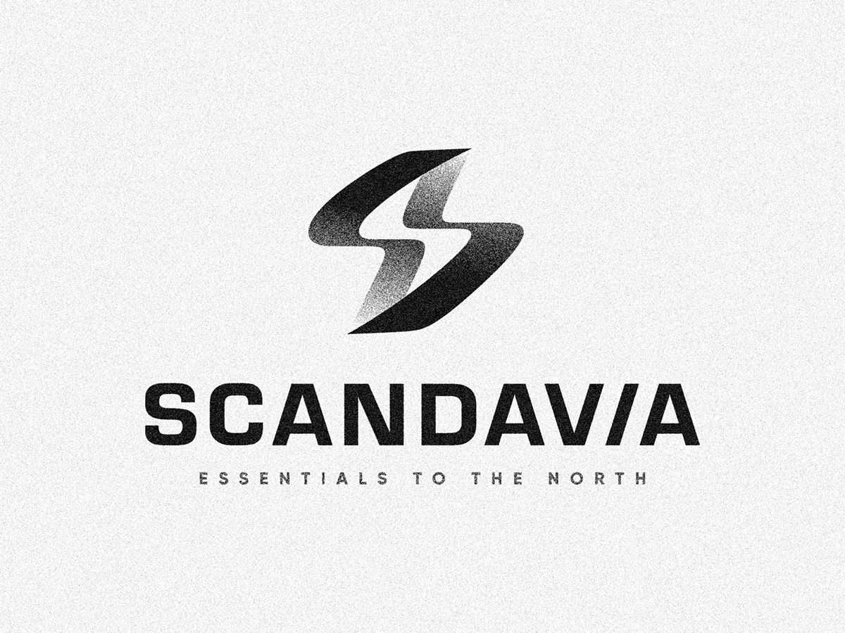
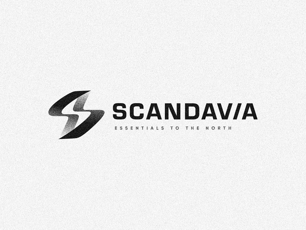

Client loved this second one, so we've included as an extra version to be used in some spacial applications in future, I hope you like it!


