


07 | User Interface & User Experience Design

Project Brief
Following on from the creation of a brand and visual identity for the Centre of Language Learning, this project required the expansion of that identity into a UX/UI digital platform. One of two options could be chosen for the project: Either a self-initiated, language related app/website could be created; or, alternatively, an app/website focused specifically on the Centre for Language Learning could be created, be it an activity, quiz app, information based app, chatroom, or other type of function that would solve a particular problem experienced by students who are part of the Centre for Language Learning. The project could differ from, but had to compliment the developed brand. Only one specific user journey had to be created and prototyped fully; however, full user testing had to occur. The UX/UI solution could be designed for any chosen device in either dark mode or light mode.

Project Deliverables
01. A specific user flow presented as frames (artboards) in a Figma file.
02. Mini design system/UI styleguide including:
- Base guidelines (e.g. typography, colour, spacing, grids, iconography, and elevation and shadows)
- Interactive UI components
03. Wireframes and structure layout of the site/app
04. Vertical narrative including:
- Problem Statement
- Styleguide
- User Flow
- App Icon
- Screen Mockups
05. Collection of process work and conceptual development

Design Strategy
There are so many things to do in and around Pretoria and her surrounding areas. The problem is knowing where to start. The Centre of Language Learning is dedicated to exposing students to the best experience of Pretoria and the university that they can have. Whilst academics and student life are a huge part of being a student in Pretoria, part of the goal is to help students, and particularly international students, really experience unique South African locations, culture, history, and events in the most natural and easily accessible way possible. The Hamba app acts as a digital extension of the branding project's Find Your Way brochure, which introduces students to Pretoria and tells them all they need to know. With this app, the centre is able to help students see the sites around Pretoria, join in with their group excursions, and really learn about being and traveling in Pretoria. A mobile app was chosen as the best platform to design as it allows students to access the functions of the app from a variety of places and while on the move, as students may not always have access to a laptop.
In terms of visual strategy, the app draws its identity from the colours, shapes, and style of the proposed Centre for Language Learning's rebrand. To align with the existing brand values, the app is bold, bright, and approachable, whilst still remaining informative and professional. The app extends the brand's proudly African identity with its unique name, Hamba, meaning go or walk in Zulu. This app is all about getting people on the go.
DISCLAIMER: This project uses both original and open source stock images. Where required, credit is referenced in my process work document.

A Peek Into Our Process
This offers an overview of the research and conceptualisation process. To view the full process work, please see here.

The Problem We Face
Problem statement and App Concept

People on the Go
Our User Archetypes


Our Vision for the Future
App, Style, and Mood Inspiration
The app follows the same style, colour, and type guidelines as the Re-branded Centre for Language Learning, created in the previous project. However, the visual approach for the app components also seek to incorporate bold, geometric shapes and icons, as well as simplistic illustrations. The tone will be bold, modern, friendly, simple, and easy-to-understand. It is important that the language used is direct, personal and simple to resonate with a limited English-speaking audience.


Stepping Towards the New
A Unique Name and Logomark
The Hamba app draws its name from the Zulu word meaning ‘walk’ or ‘go’. We’re always on the mood in search for a new adventure, and our name and logo reflect this. Our logo mark draws from the shapes of the people in our Centre for Language Learning logo and adapt them to link to the old, but also start with a unique mark for a new app.


Finding Our Flow
User Flow and Journey
The specific user journey for the app is to sign up to the app and then to book 2 spots on a CLL excursion to Gold Reef City in Johannesburg.

Going Screen by Screen
App Development and User-testing


Follow our Features
A Personalised Experience
Users can personalise their experience by signing up and creating a profile that is unique to them. Using their University of Pretoria email address prevents any non-students from using the app for excursions or liftclubs. We are looking out for student’s safety.

A Choice of Features to Explore
Users have the option of explore a variety of the app's features - all carefully designed to make the university navigating process as simple and easy as possible.


Save Receipts & Locations to View Later
Users can save their favourite locations and upcoming CLL excursions to their profile to browse through later. Also, no need to stress about emailed receipts and downloads, users can access all their receipts through their profile. By saving their locations, users can customise their browse results and interests in the kind of locations that get shown to them.


Always Feel Prepared
Users will never feel unprepared when all the information for excursions is always at their fingertips. Our slide up information bottom sheets tell users all they need to know about the trip.


There’s Always Adventure
Users will never feel stuck when there is always a new excursion to book for. We plan one excursion a month to S.A.’s cultural, historical, and unique locations. Users are free to bring along a friend and join the group. If users get bored, they can always check their saved bookmarks.


Streamline Your Booking Process
Our booking and payment process is as easy as four quick steps.


Prefer the Dark? We’ve Got You
Our dark mode is structurally the same as our light mode, but we cater for everyone - even if it’s only a small change to aid adventuring.


Guiding the Way
Our App’s Base Guidelines
Typography


Colour
System Colours
System colours are based on the Centre for Language Learning re-brand Colours.

Indicative Colours
Indicative colours are used to indicate states of being during the app process.

Grid System
The UX/UI follows a four column grid system with rows of 8px each.


Padding & Spacing Rules


Elevation & Shadows
As a general rule, elements and components do not receive drop shadows, except in the case where the element needs to be ‘above’ other elements so that they scroll underneath the element in question. Only the stated elements may receive drop shadows.
Top Nav Bar, Back Buttons

The top nav bar remains fixed whilst scrolling. All scrollable elements pass below the top nav bar whilst scrolling. The drop shadow gives the effect it is raised above the scrolling elements.Back buttons that are placed over an image or pattern are given a drop shadow to highlight their presence. The bottom nav bar remains fixed whilst scrolling. All scrollable elements pass below the bottom nav bar whilst scrolling. The drop shadow gives the effect it is raised above the scrolling elements. It also separates the white from white backgrounds.

Carousels

Carousels are given drop shadows to indicate that they are scrollable elements and to separate them from the background. The drop shadow is also used to indicate that they are scrollable elements.

Pop-Ups and Bottom Sheets
Pop ups and bottom sheets are given a drop shadow to indicate that they are positioned above the scrollable elements on the page that they open on. Additionally, to separate them from the page they are opening above a #0B082C underlay appears between the overlaying elements and the page elements.


We’re Iconic
Our Graphics Guidelines
Iconography & Construction
24px Utility and Action Icons
These icons are 24px in size with a 48px squared touch area. The icons have at least 12px padding all around Icons can implemented in archive white, rising sun orange or solid navy.


48px Utility Icons and 48px Illustrative Icons
These utility icons are 48px in size with a 76px touch area. The icons have at least 12px padding all around. These cons can implemented in archive white or solid navy. Illustrative icons are also 48px in size with a 76px touch area. The icons have at least 12px padding all around. These icons can implemented in archive white or solid navy.


Image Treatment
Images in the Hamba app are given a treatment to better match the style and colours of the rest of the app. All images used on the Hamba app should be welcoming, friendly, and show a diversity of people. All locations must be South African. When applying the standard treatment, discretion may be used with regards to the overall contrast applied. However, all photos should appear in a similar vein to those pictured here.

Illustrations & Patterning
All illustrations draw from the Centre for Language Learning branding Library. All illustrations and patterning should remain true to the original style guidelines. Illustrations and patterning should be flat vector drawings in the colours of the Hamba app.
Location Illustrations
Location illustrations are used for excursion receipts and confirmations, as well as the view my receipts page receipt components. All illustrations should be archive white on solid navy, or solid navy on archive white with rising sun used as a spot colour. Line width should be 4px at style-guide size then scaled down proportionally.

Page Header Illustrations
For general pages, the Hamba Footprints may be used for decorative effect. The Footprints may be used in either archive white on solid navy or solid navy on archive white with rising sun orange used as a spot colour. For booking and payment pages, the Shweshwe Rising Sun pattern may be used and cropped as necessary as a decorative element on the pages.


Parts of the Whole
Interactive UI Components
Buttons, Chips, and Tags
Primary Buttons
Primary buttons take up either the full or half width of the screen that they are featured on. There should only be one primary button on a screen.

Secondary Buttons

Tertiary Buttons
Tertiary buttons comprise of underlined text. The text is in the style of BODY 4.

Icon Buttons
Icon buttons can either be primary buttons with an icon, circular buttons with an icon, or square buttons with an icon.

Ticket Selector and Chips
Ticket selector boxes to select number of spots should not exceed three spaces. Chips should contain text in the Captions Bold Style. Padding on either side should be at least 16px.

Text Fields & Radio Buttons
Text Fields on Archive White Background and a Solid Navy Background
Text fields can either be the full width or half the width of the page. Icons on text fields are treated in the same manner as icons on primary buttons. All text fields have a 2px radius. Text fields are inverted when placed on a solid navy background. All active text fields have a stroke width of 2pt.


Radio Buttons on Archive White Background and a Solid Navy Background


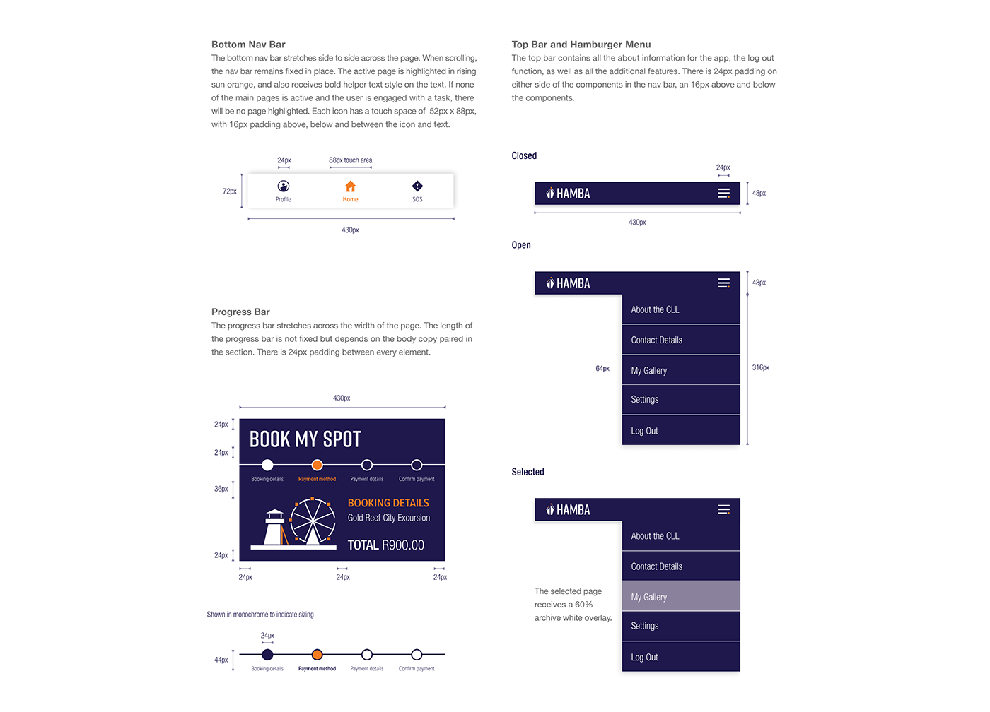
Menus, Navigation, & Progress Bars
Modals & Bottom Sheets
Bottom Sheets as Additional Information and Menus
The bottom sheets offer additional information, or can also function as specific menus.
Additional information must be presented in bullet point format to aid easy reading. If an icon is paired with the information it must be placed above the information. A drop shadow is placed on the bottom sheet to give it elevation. The bottom sheet has a margin of 24px all around. Corner radius is 16px. When a menu is offered, the selected item receives a 50% solid navy overlay. The corner radius is 10px. Drop shadows on bottom sheets give them an elevation. The bottom sheet is also paired with a 40% solid navy underlay. Corner radius is 16px.


Carousels
Carousels can include pictures only; pictures, text, and icons; or pictures, text, and sub-text. The corner radius is 6px.


