


01 | Branding and Identity
Chosen Winner of the Centre for Language Learning Rebranding Competition
2023 Loeries Finalist in the Student Logos and Identity Programmes Category

Project Brief
This project functioned as an open competition for fourth year University of Pretoria Information Design Students to re-design the Centre for Language Learning's branding. It required the creation and conceptualisation of a new brand identity and extended visual identity for the University of Pretoria's Centre for Language Learning. The Centre is home to the university's foreign language project, but had no unique identity of their own separate to the University's overall branding. At the time of this project, the centre operated as an ESL English teaching centre but wanted an identity that could expand and extend to incorporate larger concentrations of students, and even an increased offering of different languages that students could choose to do courses in. The main target market of the centre is international students from non-english speaking countries such as Angola, Brazil, China, and the DRC. The new branding system needed to be innovative, professional, and academic, however still remain true to the values of the centre: innovation, academically focused, African, authentic, and community-focused. Following the development of the brand, the Centre required the creation of a collection of branded collateral, social media posts, and on-campus wayfinding.

Project Deliverables
01. Group Research and Presentation on Existing Language Apps and Brands (See Process Work Document)
02. Brand Strategy including:
- Brand Personality
- Tone and Vision
- Copywriting Style
- Moodboard
03. Visual Assets including:
- Logo System and Grid Structure
- Colour Palette
- Graphics (imagery, illustration, iconography, photography style and treatement)
04. Design Applications: physical and digital collateral including:
- Business Cards
- Email Signature (for mobile and desktop)
- Stickers
- T-shirt
- Bag
- Instagram Post or Carousel
- Signage and Wayfinding System
- Poster
- Any Other Relevant Applications
05. Visual Identity Guide in the form of a Vertical Narrative

Design Strategy
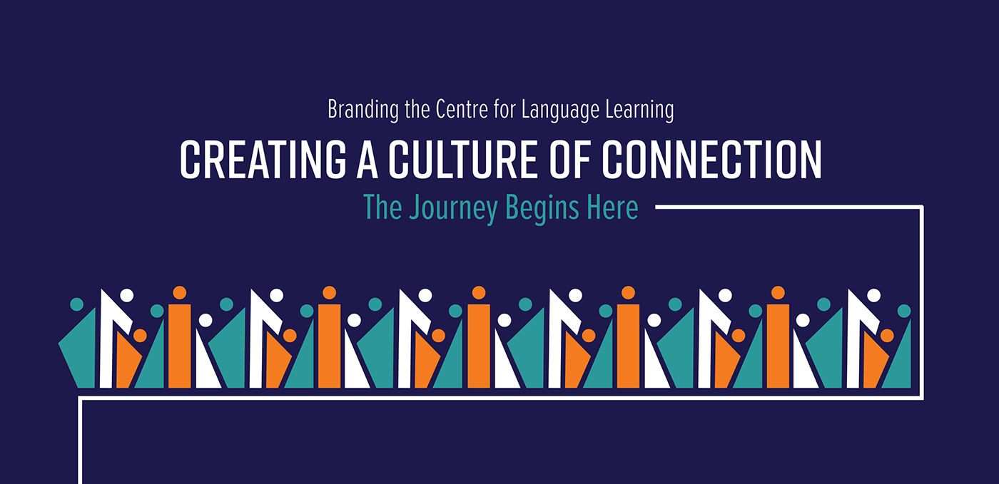
Language is more than just a communication device - it is an integral part of culture, community, location, and connection. The new logo and corporate identity was inspired by the vast multitude of South African cultures, as well as the idea of people entering into a journey of language: students are travelling to South Africa to participate in the Centre of Language Learning's courses, they are engaging in a personal journey of growth to gain new knowledge, and they are also experiencing a cultural journey of studying in a foreign country with new and different cultures, perspectives, and experiences to immerse themselves in.
The new branding for the Centre of Language Learning represents how the centre is more than just a course - it is an experience of the learning journey and all that that entails. As such, I was particularly inspired by symbols of journeys and travelling, and the idea of one making their mark and coming together with other people. I wanted the new branding to capture the people-orientated nature of the brand, whilst remaining true to the proudly African roots and African location of the brand. Many of the brand's visuals draw reference to symbols of community and pathways such as interlocking hands and people walking together. This idea of community and connection inspired the brand's new slogan which summarises the core of the brand: it is about creating A Culture of Connection.
All patterning and illustrations draw reference to bold South African cultural patterns and fabric, but have been stylised to appear unique to the brand. The new colours are sophisticated blues to communicate the brand's academic orientation, with a hint of orange that communicates the brand's energy and pays homage to its humanity faculty ties. The stylisation, flat geometric shapes, and bright colours give the brand a contemporary feel which appeals to the target audience who are mostly international students between the ages of 18-28.
DISCLAIMER: This project uses both original and open source stock images. Where required, credit is referenced in my process work document.

The Road Behind
About the Centre for Language Learning
Modern, bold, and proudly African, the UP Centre for Language Learning is paving the way for linguistic possibility and opportunity at the University of Pretoria. The Centre is focused around teaching English to foreign language students studying in South Africa, however is also growing their potential to expand beyond English to encompass teaching many different languages.
More than just a course, the Centre for Language Learning is an experience. Students are able to experience and learn about South African culture, history and experiences in addition to learning a language and experiencing student culture whilst on the university campus. This is a place to explore, experience, and gain new perspectives and understanding. This section shows a brief overview of the design process during this project. To view the full collection of process work, please see here.


The Path We Tread
Our Brand Statement and Values


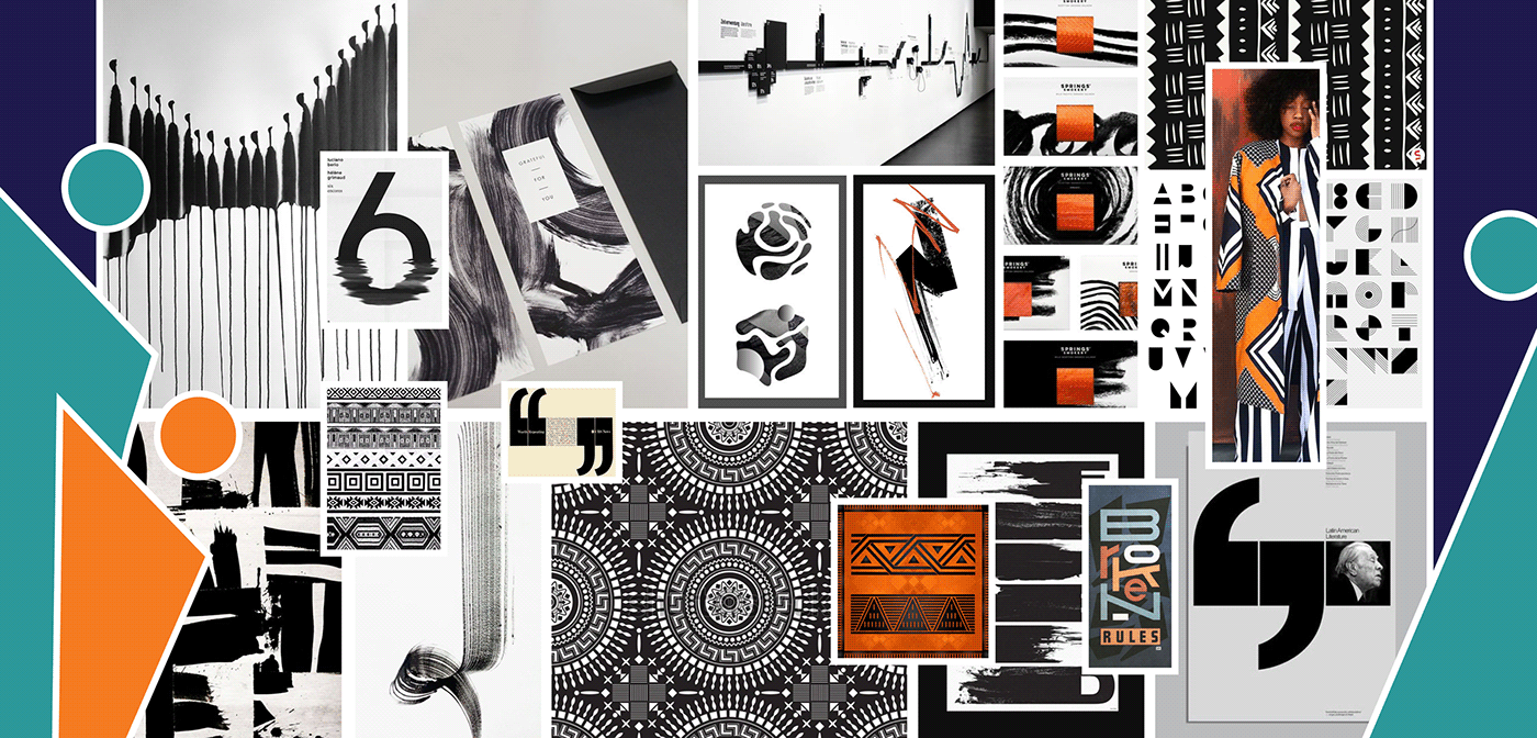
Visual Route and Inspiration
This visual approach is inspired by bold, abstract patterning, paired with spot colours and geometric shapes. Particular reference is drawn from geometric African style patterning and prints, however, the intention is to simplify and stylise these shapes into unique brand patterning.


The Map Which Directs Our Designs
Our Logo
Our logo represents learning, bold thinking, new perspectives and journeys, as well as African success. The geometric pattern draws inspiration from a variety of South African cultural patterns.


Min Print Size: 15 mm height | Min Desktop Size: 48px height | Min Mobile Size: 24px height

The Meaning in Our Mark


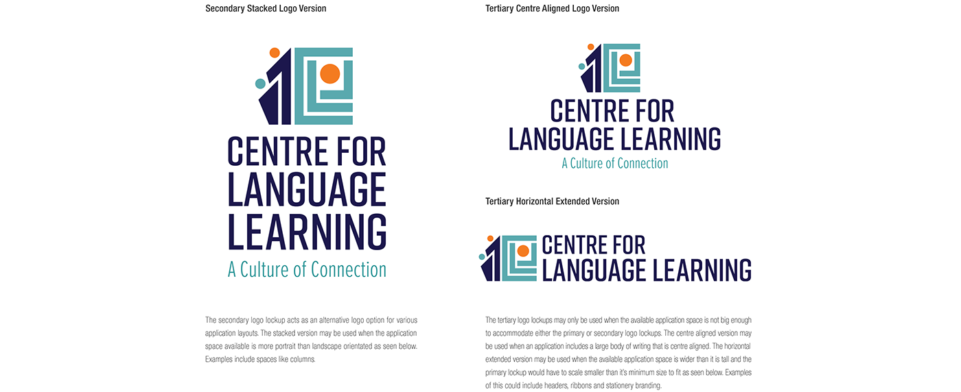
Our Logo Variations


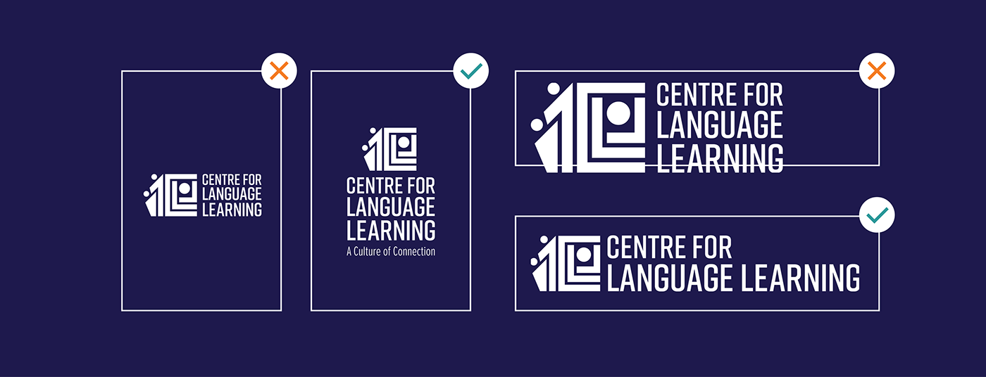


Clearing the Path for Construction


Our Digital Footprints


Staying on Track
Type Pointers
Our type is modern and bold. The block letters give us accessibility and legibility whilst maintaining the young, contemporary personality of the brand.


Palette Paths
Our colour palette is made up of calming blues that are fitting for the academic environment and speak to the professional nature of the brand. The calm tones are paired with a bright orange that adds to the youthful energy of the brand whilst maintaining professionalism. The orange also represents the colours of the humanity faculty under which the study of languages can be found.


Our Colour Borders
Strict colour rules keep the brand on track. There is no need for Bundu Bashing here!


Exploring Beyond The Main Route
Patterning


Illustrative Style
All illustrations created for the brand should comprise of stylised graphic illustrations. Only geometric shapes may be used to create illustrations. These include: Quadrilaterals, circles, and triangles. Illustrations must have a consistent stroke width of 6px. Examples of the illustrative style can be seen below.


Icons
Icons should have a consistent line width of 7px. All icons should be created with a geometric style. They should also always be solid colours. In layout, they must be aligned on the central axis. Icons may be in any solid colour; or white on solid colour.


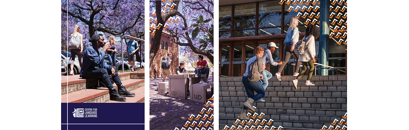
Photographic Selection
Photographic material can be posed or candid. Posed portraits should be relaxed. Candid photos should include students or lecturers busy engaged in some kind of activity. These photos should be relaxed and comfortable. Photos can be full body or cropped. Subjects can be facing the camera or turned away towards their activity. Examples of photo selections can be seen below.


Photographic Treatment
Photographic treatments should be used to create brand unity between the visuals used and the existing graphic elements. Standard treatment includes a 10% solid navy overlay over every photo to align with the brand colours.


Logo overlays should be placed on solid colour to better stand out against images. This can be accompanied by lines.
Patterning placed over images should either be placed directly onto areas of the image, extending in from the sides, or merge from a solid colour into the image. Patterning should always work around various elements within the image.


The Road Ahead
Design Collateral
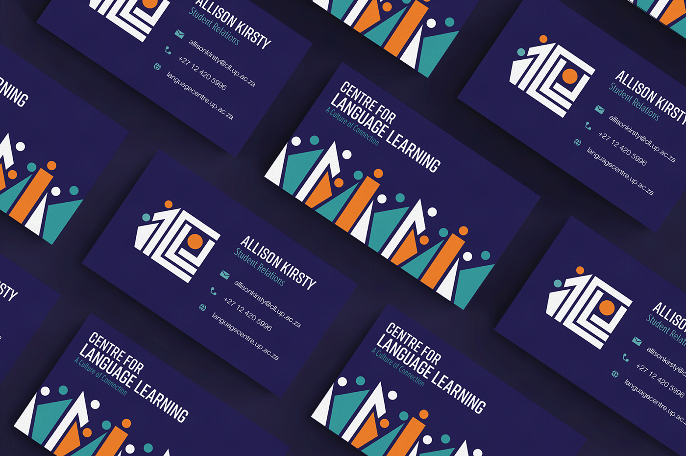
Double-Sided Business Card | 52mm x 90mm
Printed on textured paper to give the card a matte textured finish.


Email Signature | Desktop 620px x 320 px | Mobile 320px x 178 px
The email signature is one email signature that scales down to fit the size of the screen on the device it is being viewed from.


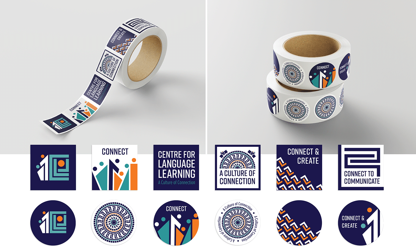
Stickers | 60mm x 60mm
Laptops, bumpers, notebooks... anywhere to stick a sticker is a good place. Two collections of stickers exist - the round stickers, and the post stamp stickers. Both are collections of the multitude of patterns and shapes linked to the brand.


What's in the Bag?
The Welcome Pack
The pack acts as a welcome pack for international students enrolled in the course. This is their survival pack for the course and excursions.
Tote Bag | Dimensions 320mm x 440mm
It’s the student's staple for holding everything together, the tote bag is the perfect accessory for outings, journeys, and even class. This is your bag for all your adventures. Made from canvas sack, it is sustainable and durable. The obverse of the first bag displays the full logo.


Notebook and Pens | 210mm x 297mm and 140mm long
For keeping track of memories (and schoolwork). The hard cover outside is durable for travel. The back of the notebooks displays the full logo and bar code. There are two diaries: The Journal your Journey diary in white, and the Connect and Create diary in navy.


Lanyard and Water Bottle | 500ml
With student cards, keys, and I.D., every student needs a lanyard to keep everything together. Our aluminium coated water bottle contains insulation for maintaining temperatures for long hours. The textured surface makes it easy to keep a firm grip, whilst the circular lid makes it easy to attach to a bag strap.


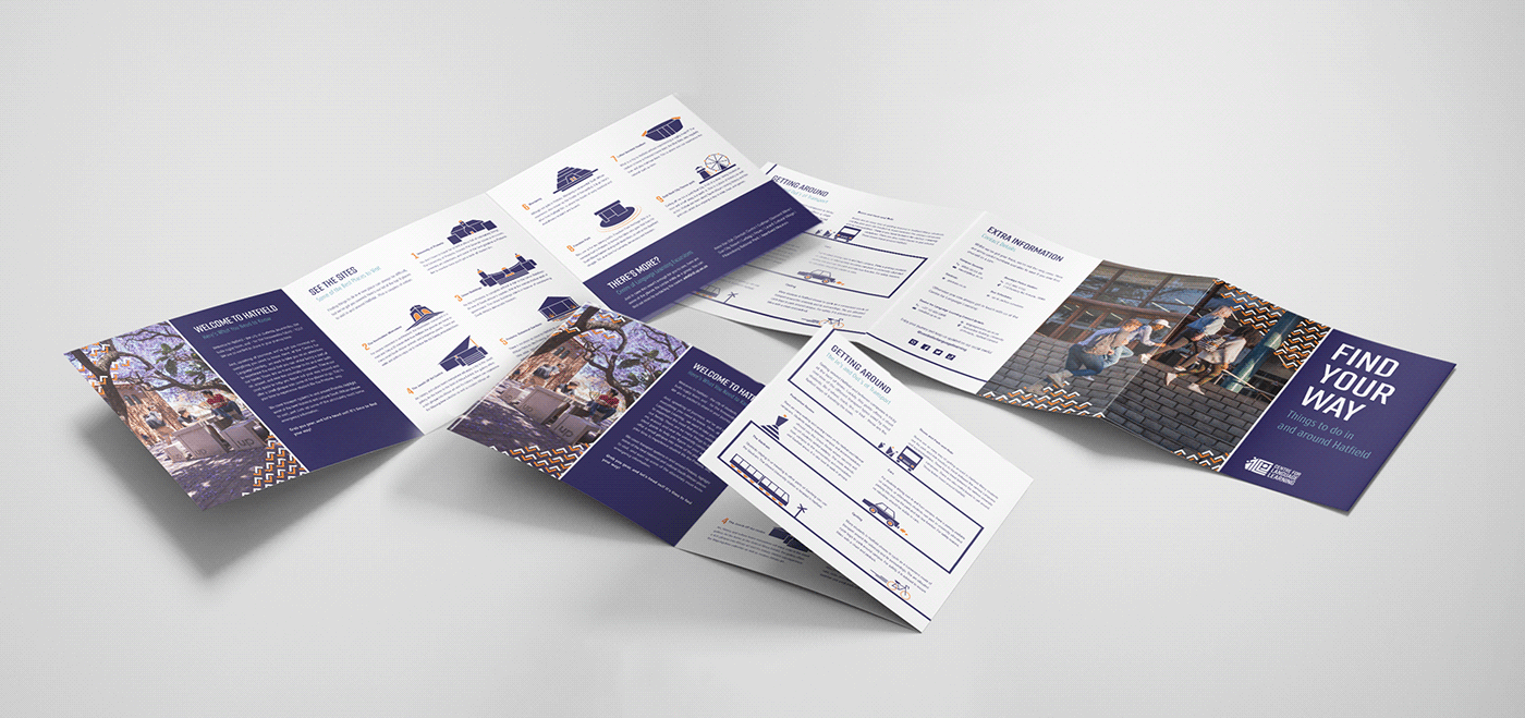
Brochure | 200mm x 200mm when closed
This is the international student’s guide to Pretoria. The brochure contains information about places to see near Pretoria, transport information, as well as emergency contact numbers.


Fit for an Adventure
Clothing Apparel
Our clothing line keeps students fit and trendy looking. On excursions, it’s easy to find the group by looking for the bright patterning and distinct colours.
Peak Cap
Two distinct patterning styles make up the peak cap collection. Students can co-ordinate their merch collections by choosing blue, white, or a mix-and-match. These caps are perfect for out-door excursions in the hot South African heat.


T-Shirt and Clothing Tags | 50mm x 80mm
Our t-shirts are modern and stylish. We have three t-shirts that all draw from the bold and graphic patterns in our brand’s collection. Our mix-and-match apparel means you will never have to worry about mismatched style. A unique clothing tag has been created for all the Centre of Learning Language Apparel. This way the centre can partner with the Tuks UP Shop and still retain a unique identity.


On the Path to be Seen
Advertising
In terms of advertising, all elements in this section demonstrate advertising for a group excursion to Gold Reef City, which is one of the centre’s destination spaces. Whilst the illustrations should lend themselves to the subject matter of the advertising, all advertising should ultimately remain true to the identity of the brand.
Instagram Carousel Posts | 1080px x 1080px
The Instagram posts act as a mini social media advertising campaign for the excursion. The campaign contains three carousel posts that follow one another. Phase one acts as an awareness launch to introduce the trip and details. Phase 2 acts as a build up with more details in posts to generate excitement. The phase three post acts as a follow up post after the trip to share photos from the trip and to remind followers to keep up to date with the excursion schedules.


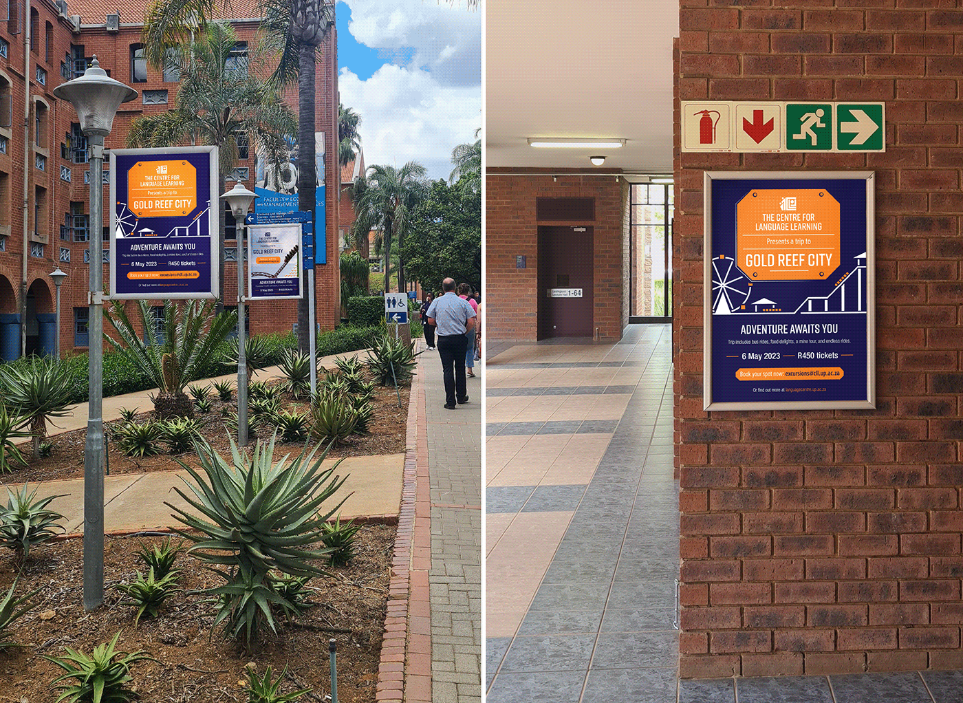
Poster | Max Size 700mm x 1100mm | Min Size 210mm x 297mm
The large scale poster highlights the bold illustrations and graphics. Amidst the busy campus grounds, this poster will not be missed. It clearly communicates the message. The two variations of the posters would be placed on campus in various sizes in the areas around the Centre for Language Learning to advertise the trip to students.


Merenski Mural | 2000mm x 2700mm
Outside the Merenski Library and opposite the Fly@UP offices, the mural wall informs students of all the major happenings going on at the university. In honour of the new brand’s launch, a mural celebrating the Centre for Language Learning will feature on the wall.

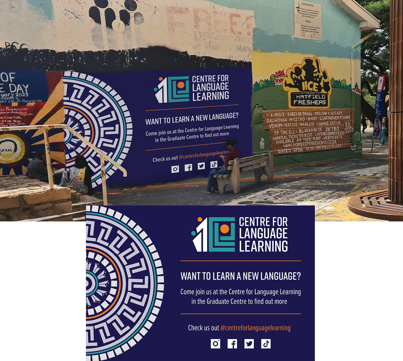

The mural would have to be hand-painted onto the wall, so for this reason all strokes are slightly thicker and the mural has been designed with minimal type in order to make the painting process easier. However, the digital version of the design could be printed and applied to various other applications. For example, large scale signage and billboards.


Finding Our Place
Wayfinding and Signage
The signage placed in and around the Centre for Language Learning acts as both a branded wayfinding system, as well as a symbol of the centre’s presence and permanence. All signage is printed on textured metal sheets for durability.
Welcome Signage
This signage is placed outside the Graduate Centre, which houses the Centre for Language Learning, to show that the Centre of Language lies within. The signage is also placed on the staircase outside the centre’s lecture halls to indicate that students are now entering the area belonging to the Centre for Language Learning.


One of the most difficult parts of navigating around the Centre for Language Learning is finding it in the first place. Although the centre is in the Graduate Centre, it is very important for visiting guests to know that they are at the right building when arriving outside. This is why a unique Centre for Language Learning sign is placed outside – to welcome guests and inform them which rooms they should be looking for.
Following this, signage within the building will direct visitors down the left passage and up to the second story. When climbing the stairs, visitors are again greeted with a welcome sign which lets them know that they have arrived at the correct location within the Graduate Centre. Individual signs indicating specific rooms will then guide their path to their final destination.


Directional Signage
This signage is placed in and around the Centre for Language Learning to direct people within and to the building.


Entry way signage is placed in the doorway so that visitors entering the Graduate Centre in search of the Centre of Language Learning will easily be able to view its information. The sign summarises all information that visitors might need. Additionally, directional signage has been created to be put up in and around the Graduate Centre to lead visitors to the Centre of Language Learning.


Indicative Signage
Miscellaneous signage may be paired with regulatory signs and placed at entrances wherein the regulations apply.


Examples of regulatory signs are the no smoking and no food or drink signs. Restroom signs appear on bathroom doors and may also be paired with regulatory signs. Restroom signs also function as directional signage when paired with arrows.

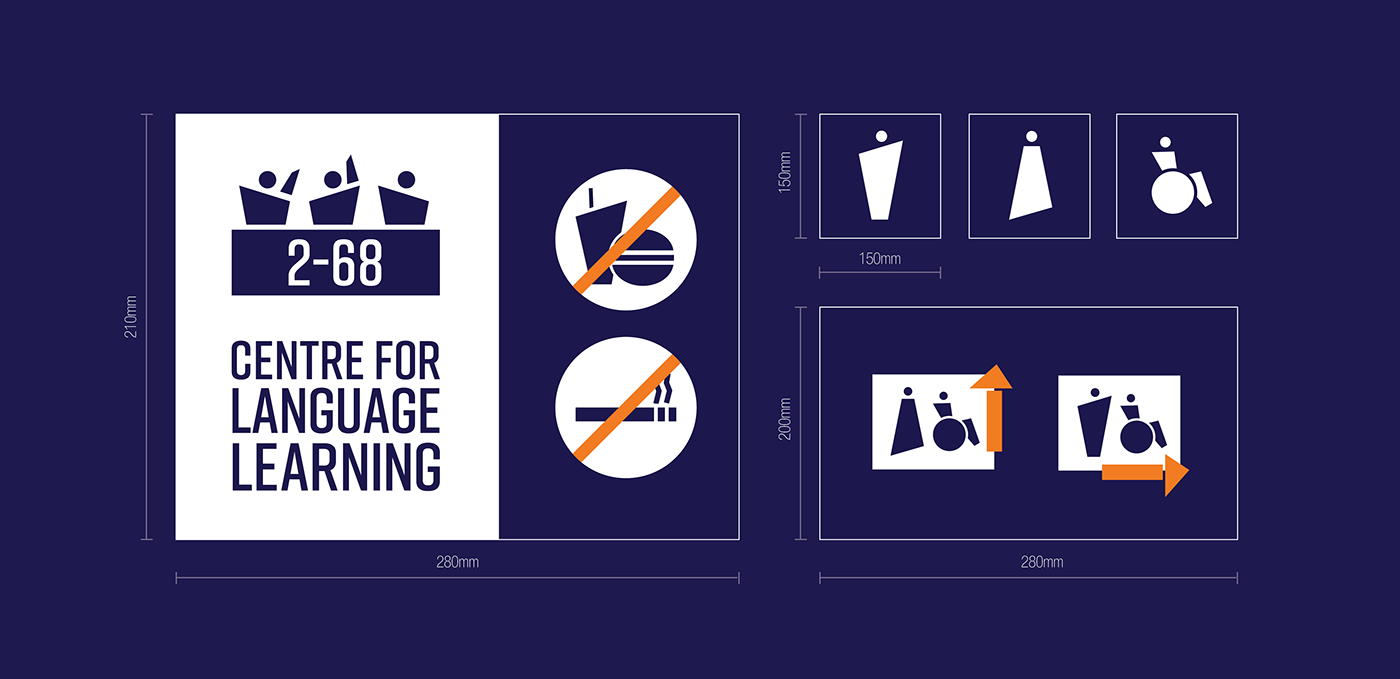

Offices, lecture venues, archive storerooms and collections, as well as cafes are marked with signs at their entrances. These signs may be paired with regulatory signs. The signs comprise of icons to aid non-English speakers, as well as add extra information about the room number or professor’s name.


