


Vesterbro Sans extends the concept of Vesterbro into a new genre.
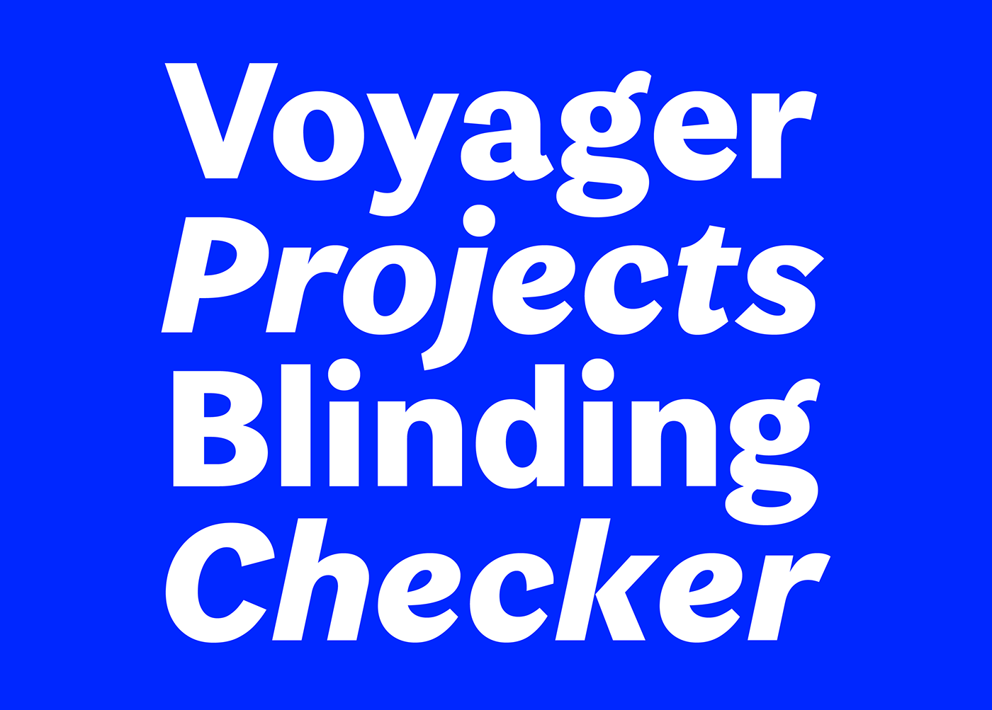
The family combines several multi-purpose weights with Poster fonts optimized for large-sized texts. Those are heavier than the bulk of the Vesterbro Sans family and spaced more tightly. The two families harmonize well, but working with Vesterbro isn’t Vesterbro Sans’ raison d’être. The sans-serif family has more than enough versatility to tackle tasks itself.
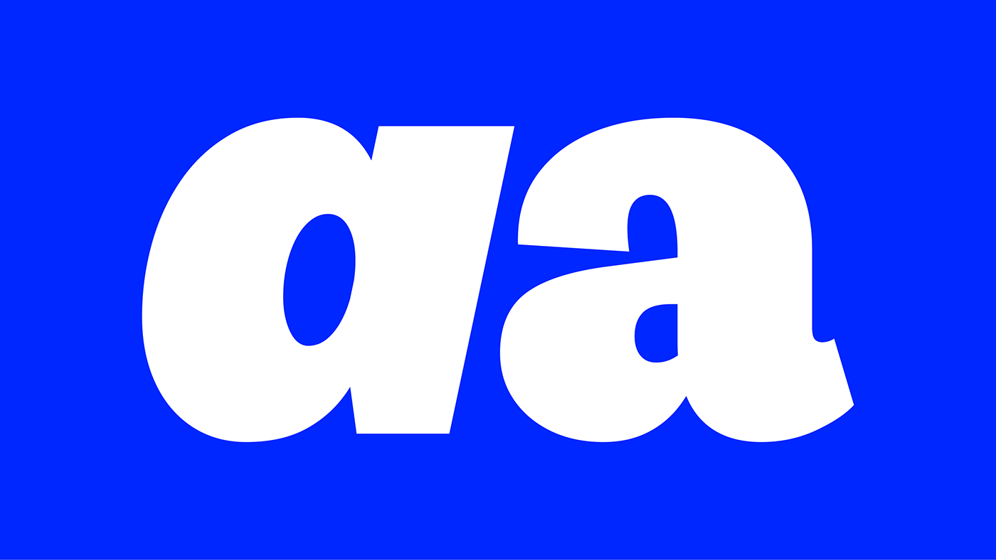
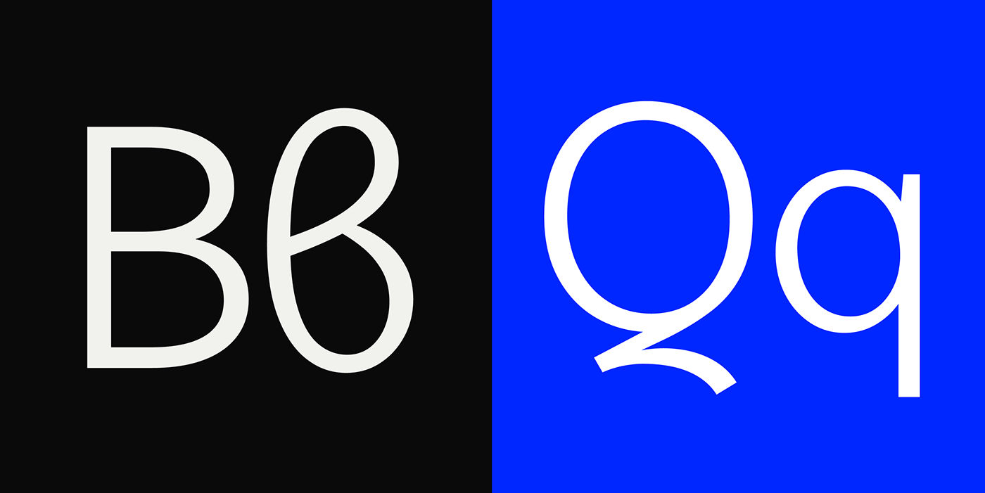
Vesterbro Sans includes letter shapes less common in sans-serif typefaces. For instance, the lowercase “g” is a two-storey design, a less common choice for sans-serif typefaces. The “C” and the “c” feature large counters and open apertures not influenced by geometric-sans principles. Many strokes end in angled terminals rather than horizontal or vertical lines – another humanist trait.
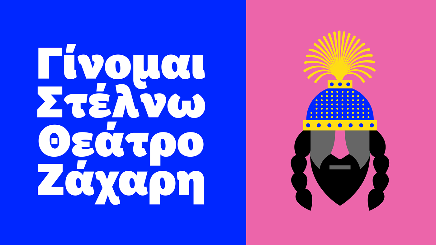
All our Vesterbro faces make typography for global communication effortless. The fonts’ comprehensive character sets include several types of numerals, ligatures, and a full complement of arrows. Thanks to the multinational team at Black[Foundry], Vesterbro Sans supports the Greek and Cyrillic scripts, just like Vesterbro.
Jérémie Hornus, Solenn Bordeau, Lucille Alepis, and Benjamin Blaess worked together to make Vesterbro Sans a reality.


You can find Vesterbro Sans on Black Foundry
Thanks for watching


