


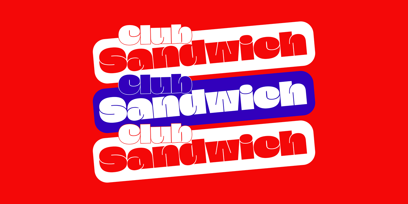
Fat: Power of Thickness
Get ready to meet Fat, the epitome of boldness in display fonts. Designed to leave a lasting impact, Fat demands attention and makes a memorable impression.
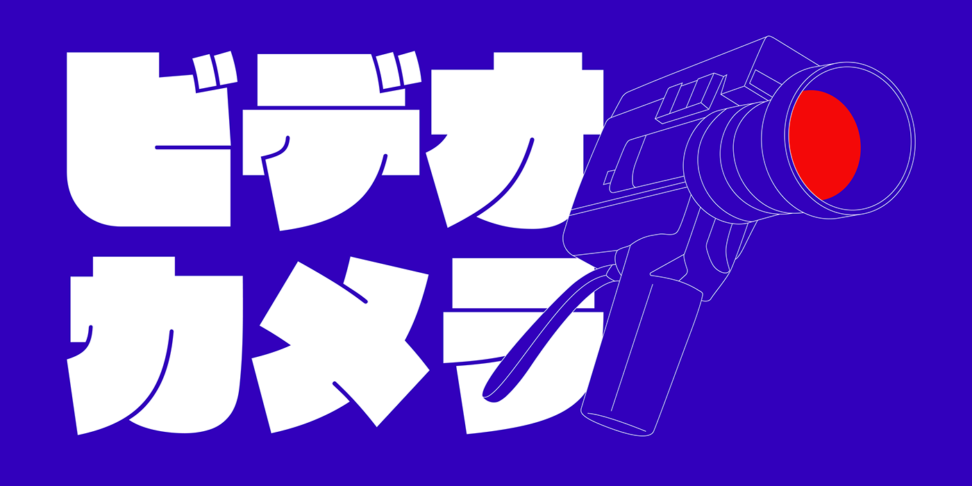
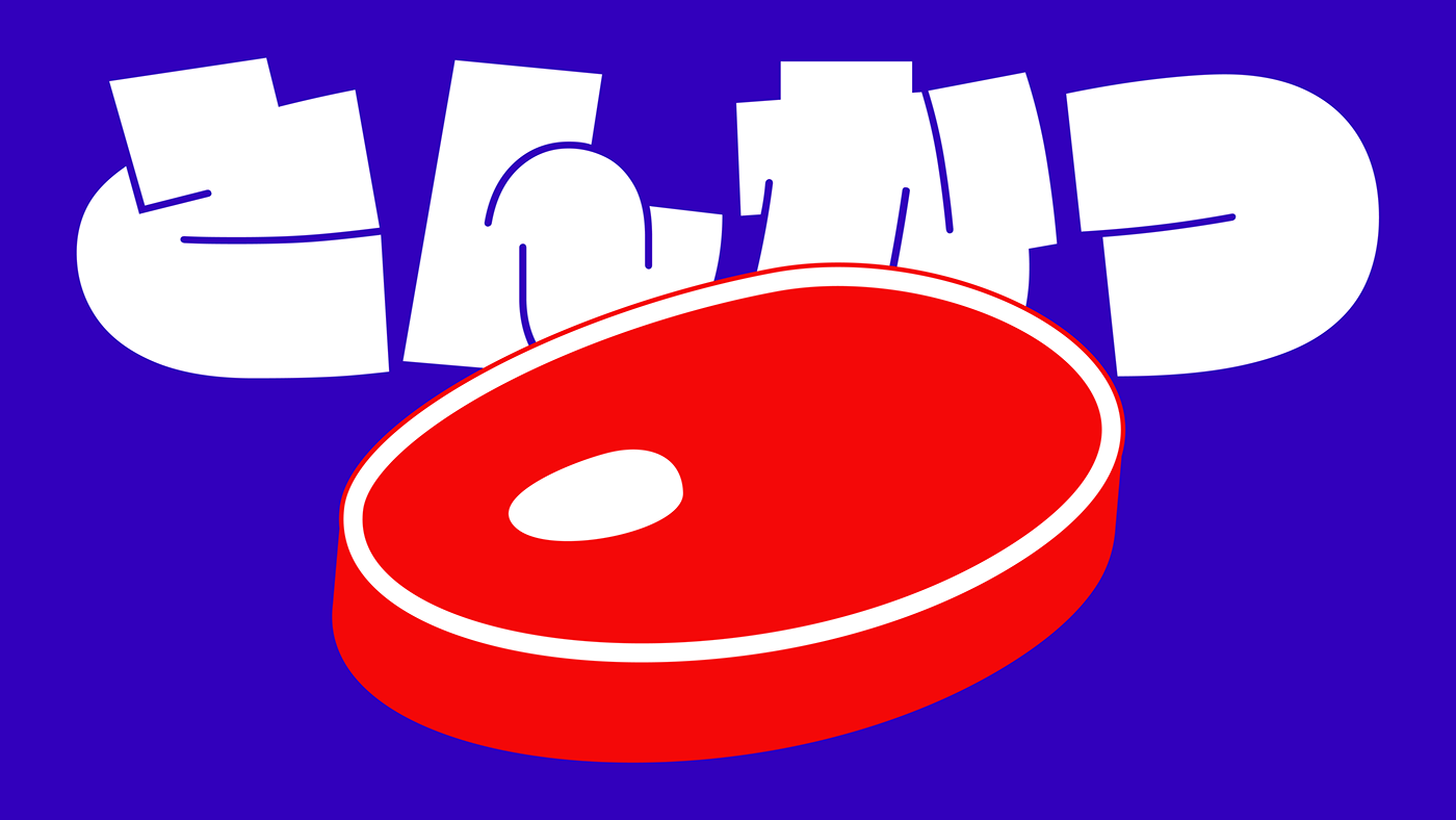
Latin and Japanese Fusion
Fat goes beyond boundaries by supporting both Latin and Japanese scripts. Seamlessly blend different languages, creating designs that transcend cultural barriers. Note: Fat does not include Kanji characters, but can be paired with fonts like Noto Sans CJK JP.
Craftsmanship and Dimensional Design
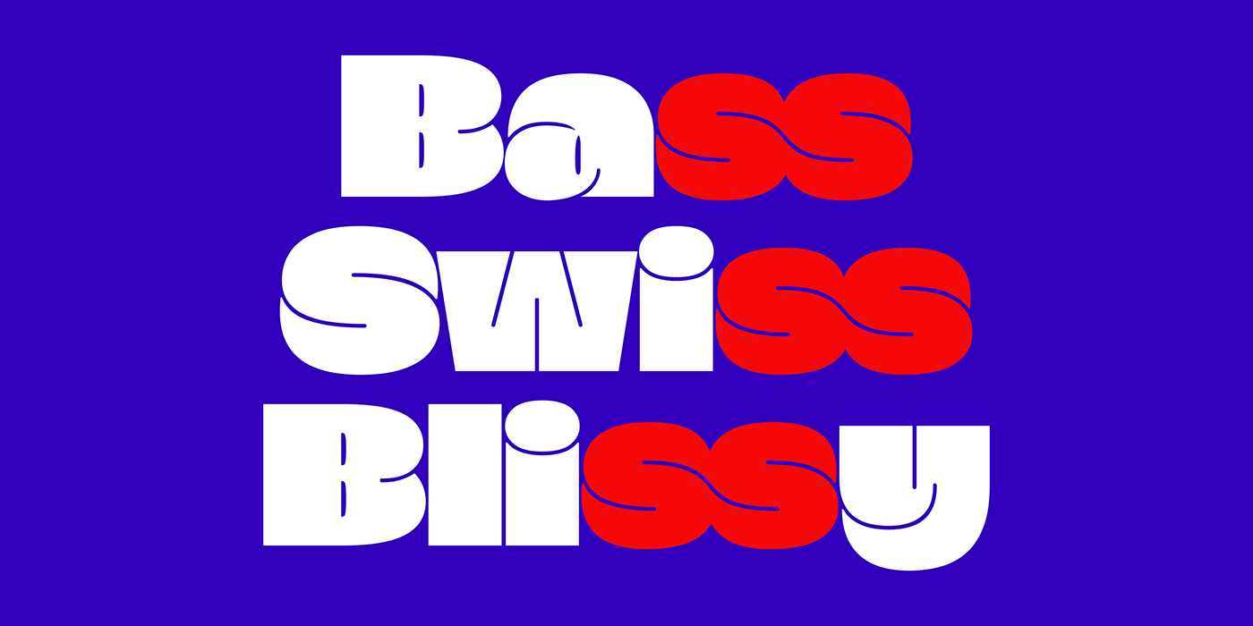
Crafted by Gaëtan Baehr (Latin script) and Li Yuxin (Kana characters), Fat stands out with extreme thickness. Letters have a 3D aspect, with elements like 'n' extending above the left stem and 'z' extending in front. Accents are integrated into each letter, creating volume and efficient use of space.
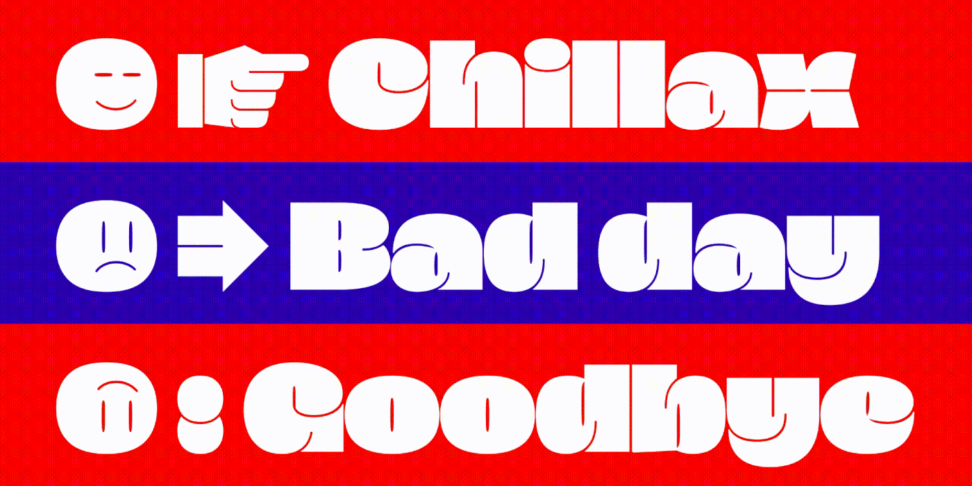
Versatility of Pictograms and Emojis
Fat offers a diverse range of arrows, pictograms, and emojis. From chess symbols to playing card icons, these elements provide creative possibilities to convey direction, meaning, or add a touch of fun.


You can find Fat on Black Foundry
Thanks for watching


