This is a personal reinterpretation in website form of Federica Fragapane's CO2 emissions project.
I wanted to change two main aspects of what she did.
First, the style: pastel colours, bubbles, serif font are not for me suitable elements to describe a dark topic like pollution.
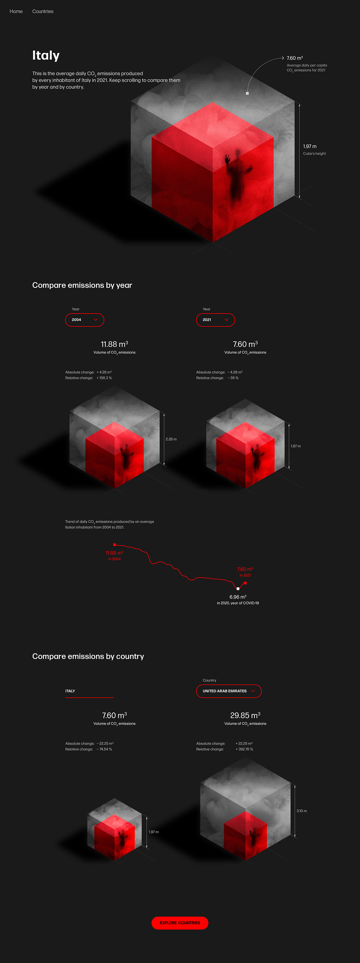
Second, the trends designed by Fragapane do not give a concrete perception of how much CO2 is actually emitted by people.
Trying to give pollution a tangible shape, I found an article that converts 1 tonne of carbon dioxide emissions into a 500 m3 hot air balloon.
Using this equation, I converted the tonnes of CO2 per capita emissions produced by different countries into cubes so that each of us can get a concrete understanding of how much we are contributing to global warming.
Cubes' animation

Home page layout

Countries page layout

Selected country page layout