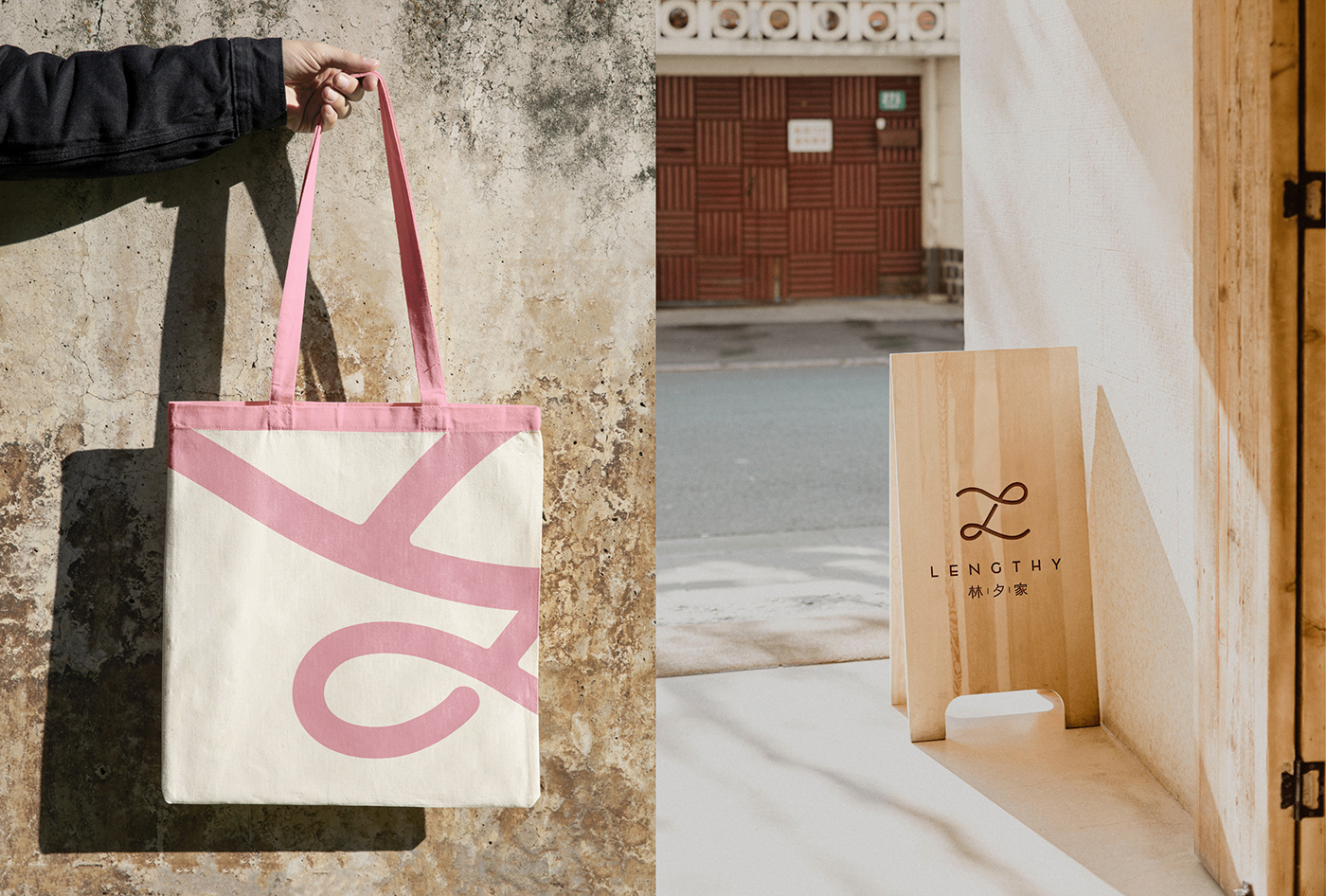
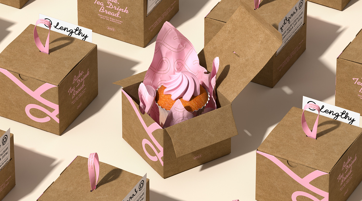
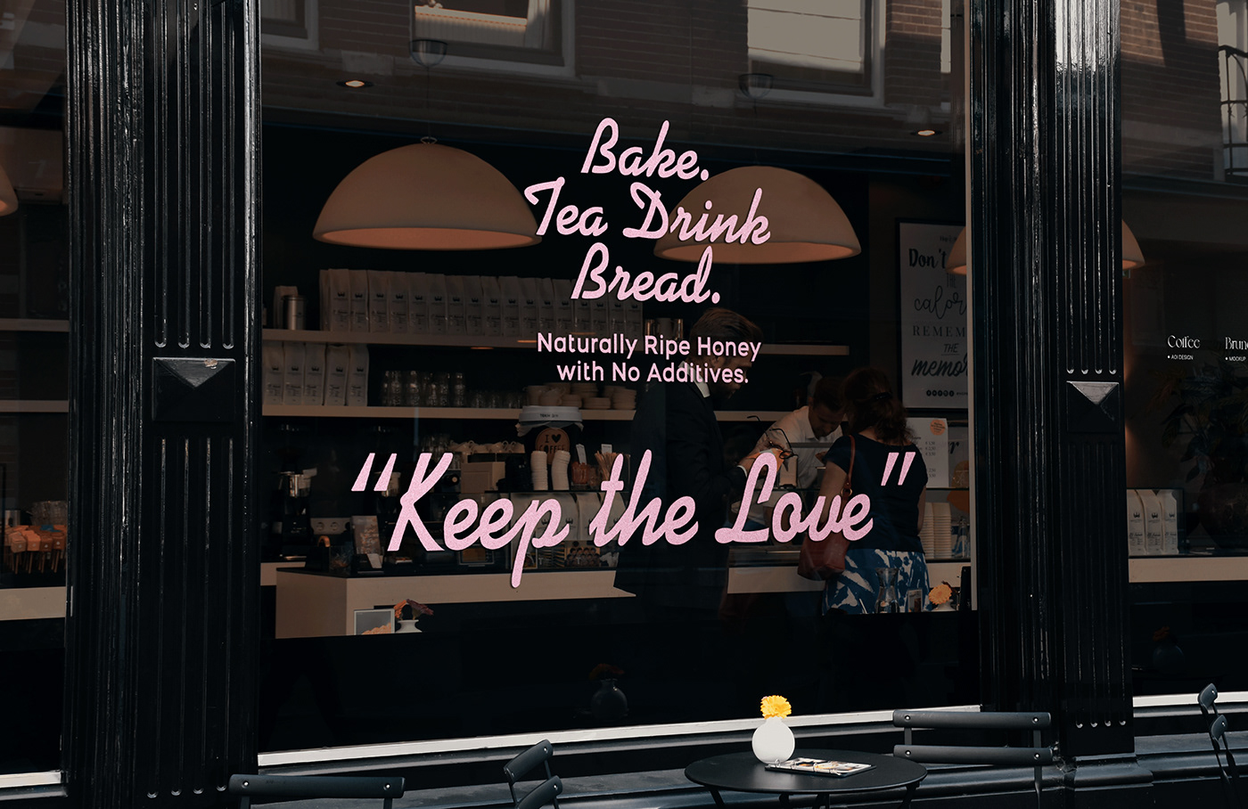
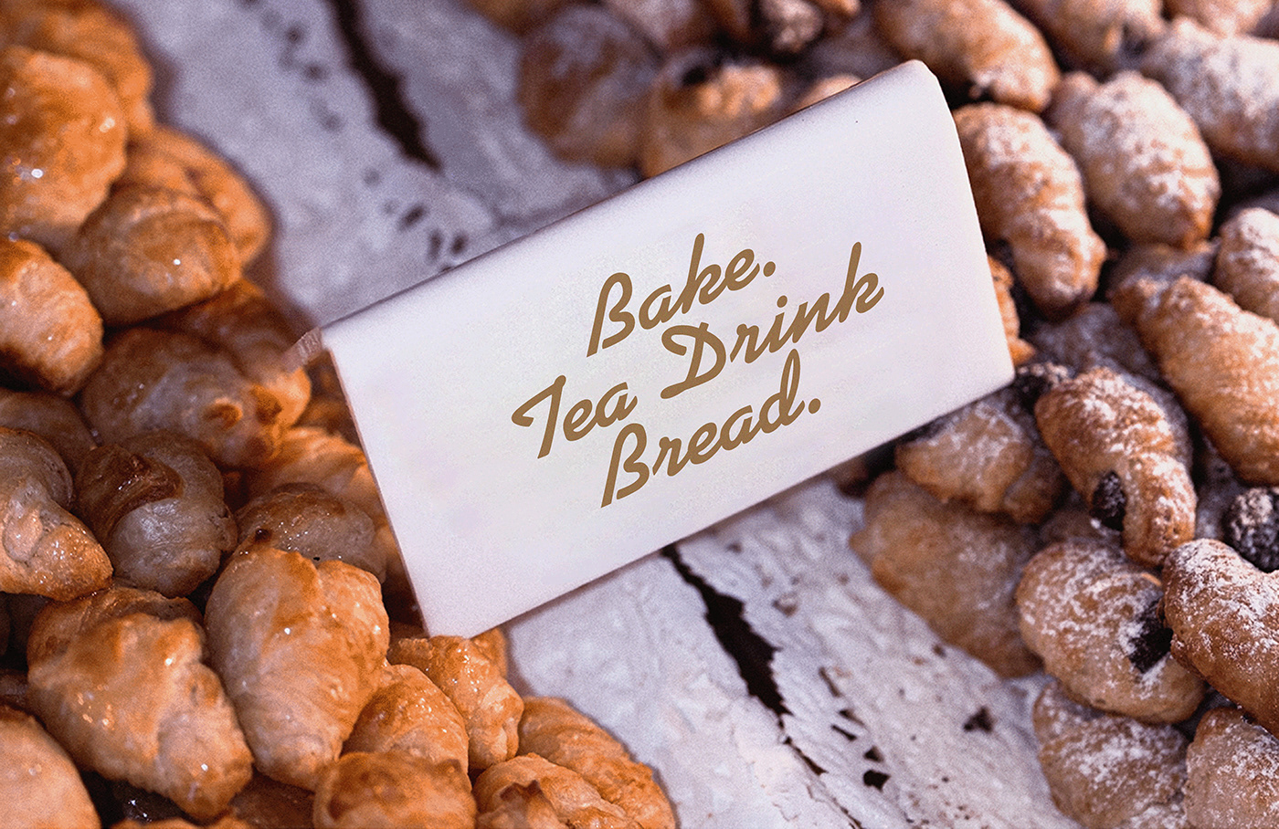
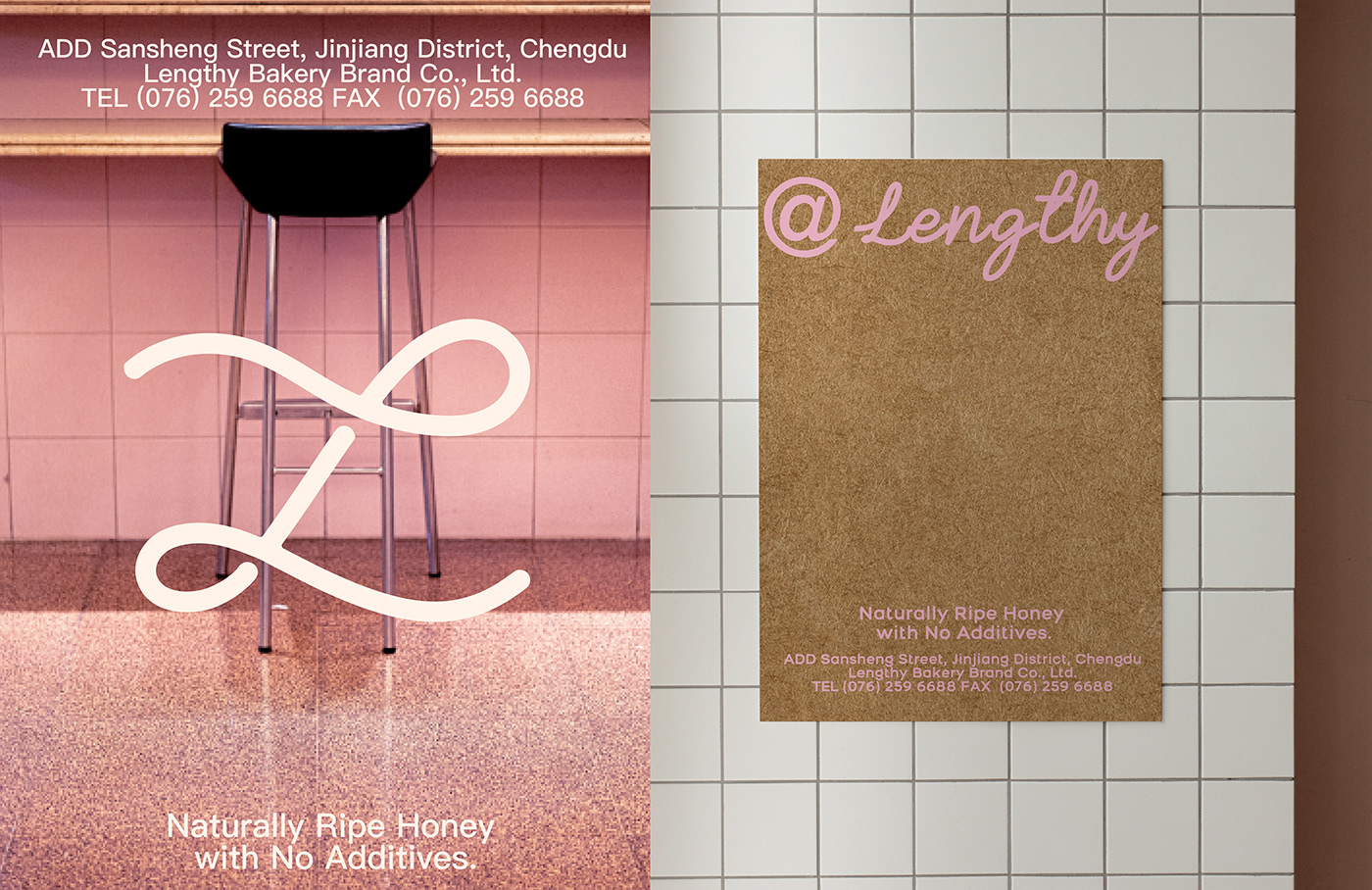
主理人李梦将自己的烘焙店命名为“林夕家”,因为她希望烘焙不仅是将烤箱的温度带到食物里的过程,更是一种把食物的温度带进生活里的态度。Resauce Design 为其设计的英文标识以笔画连贯的手写形式表达,为品牌增添了怀旧,温和的质感和个性。
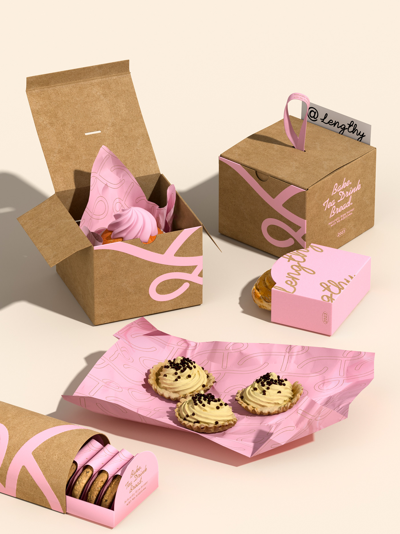
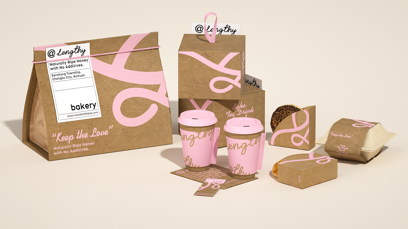
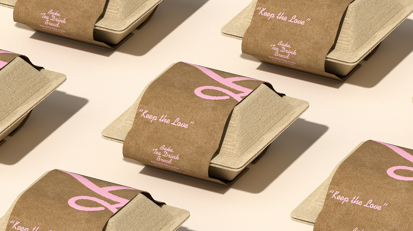
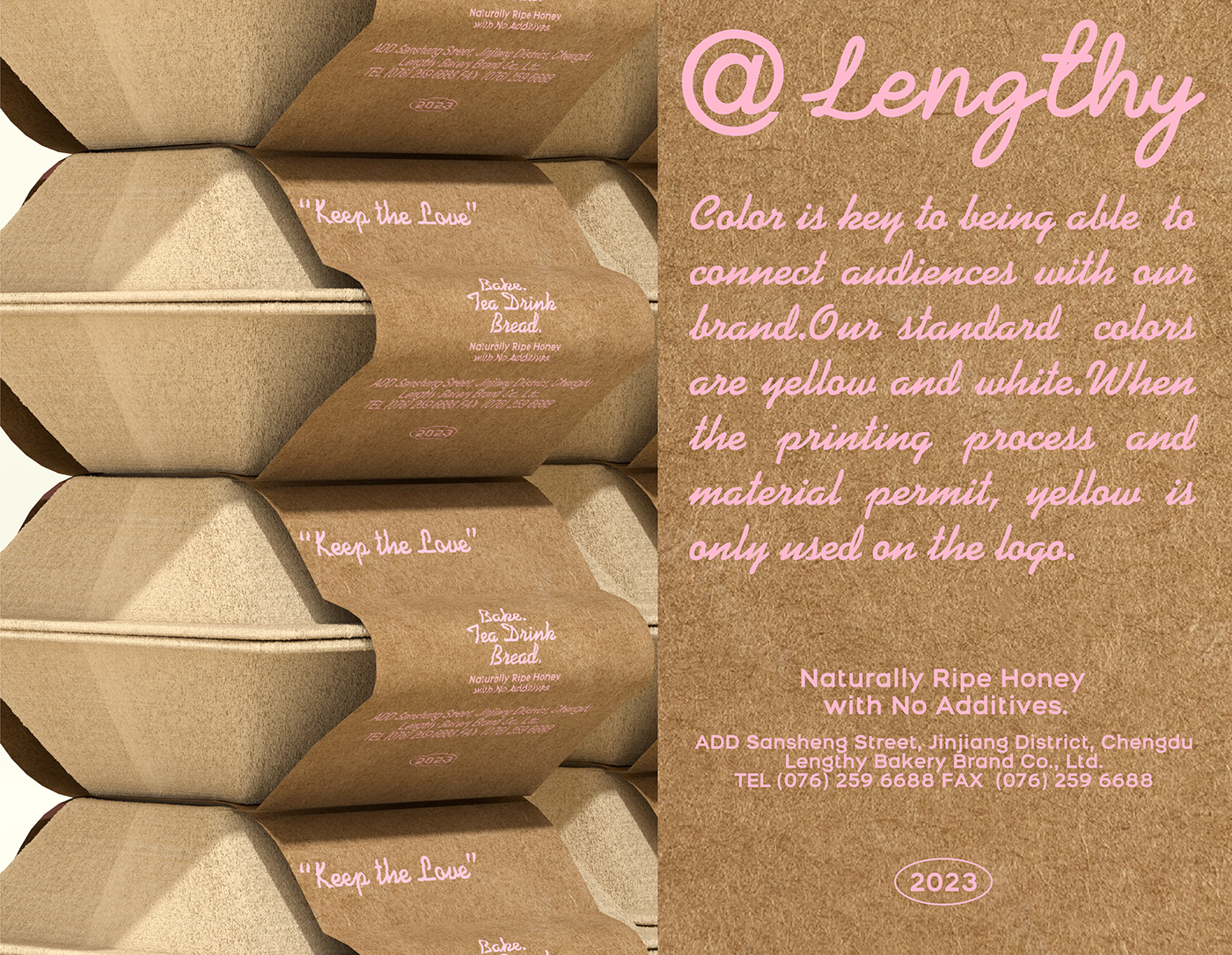
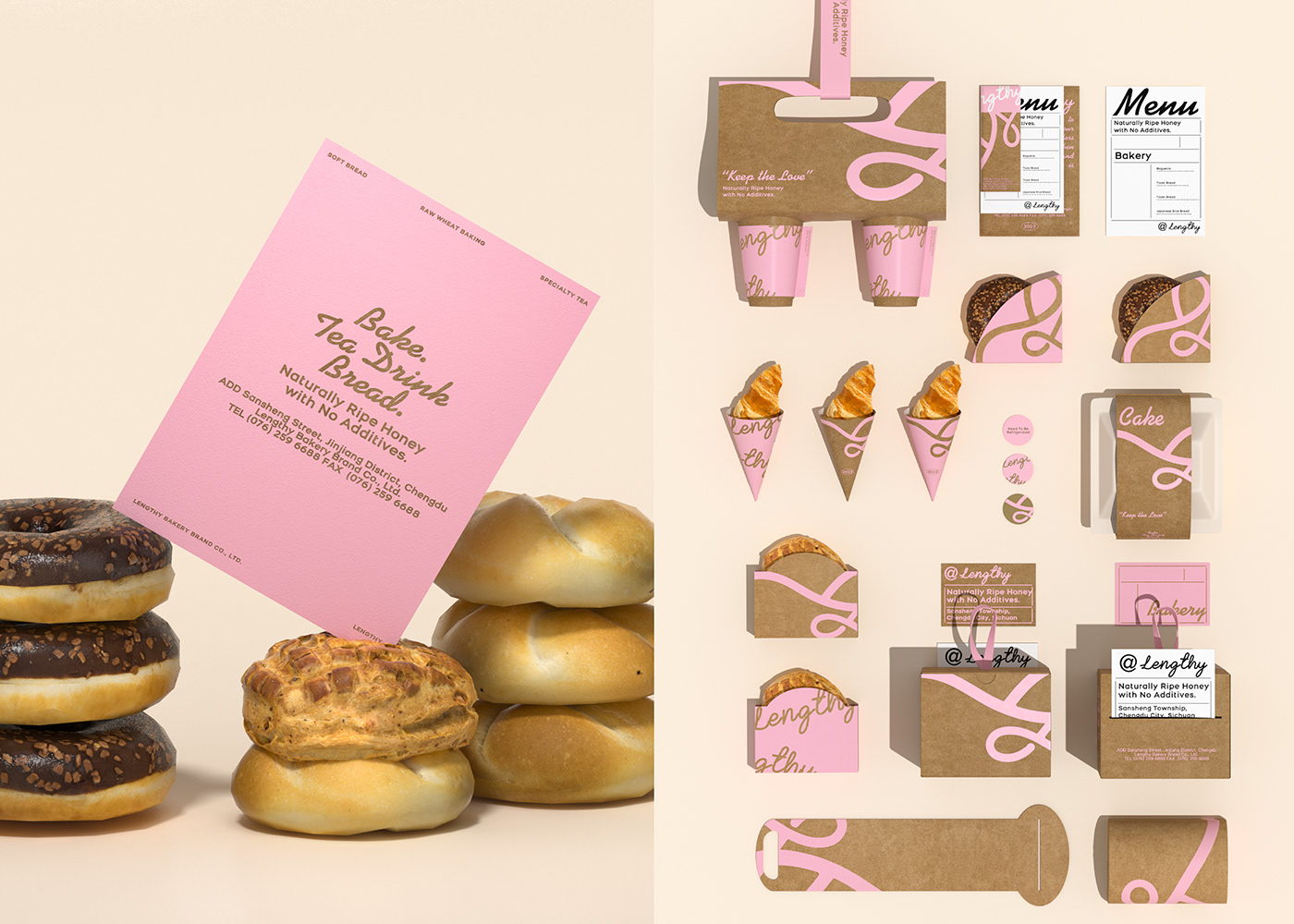
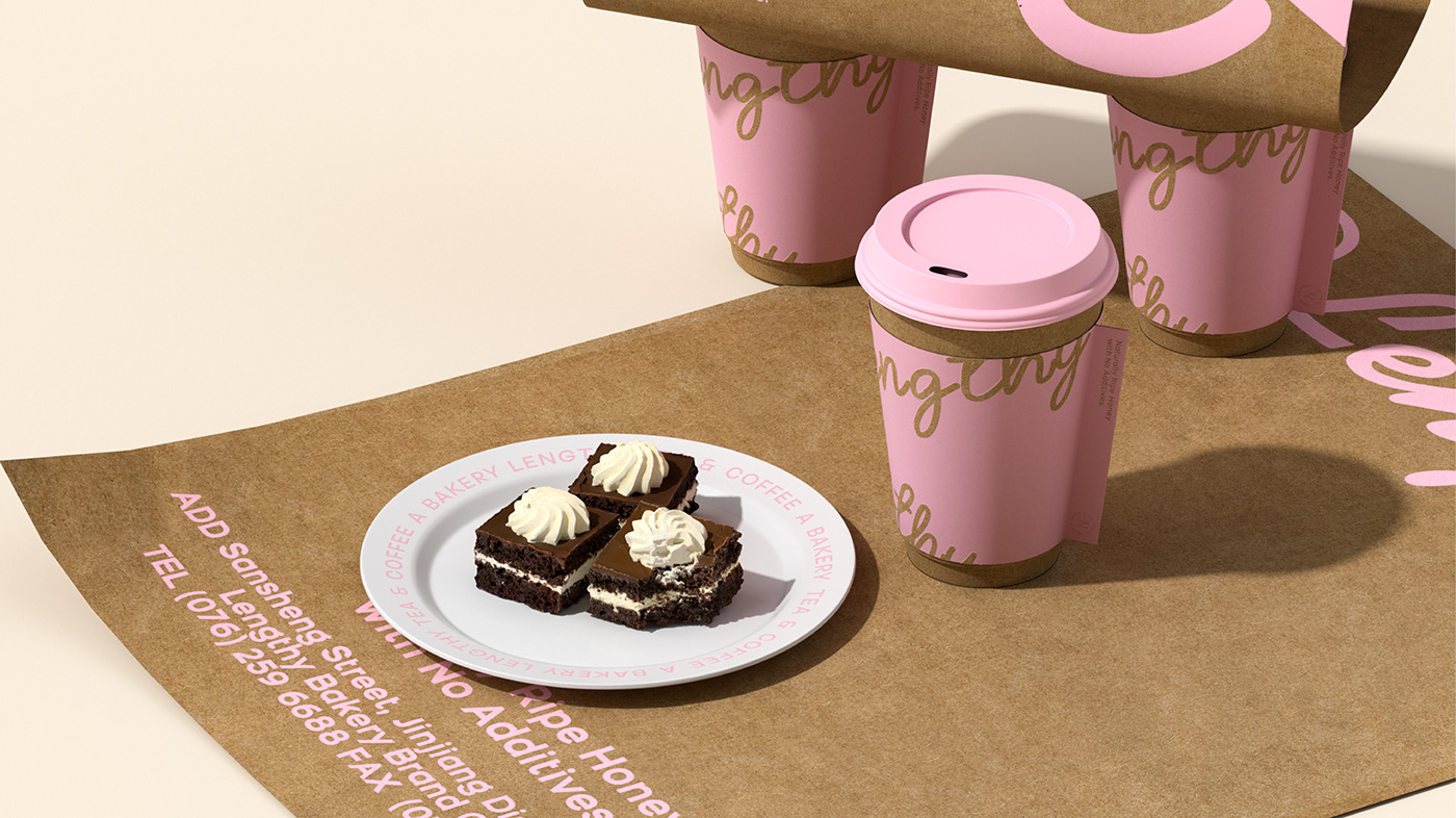
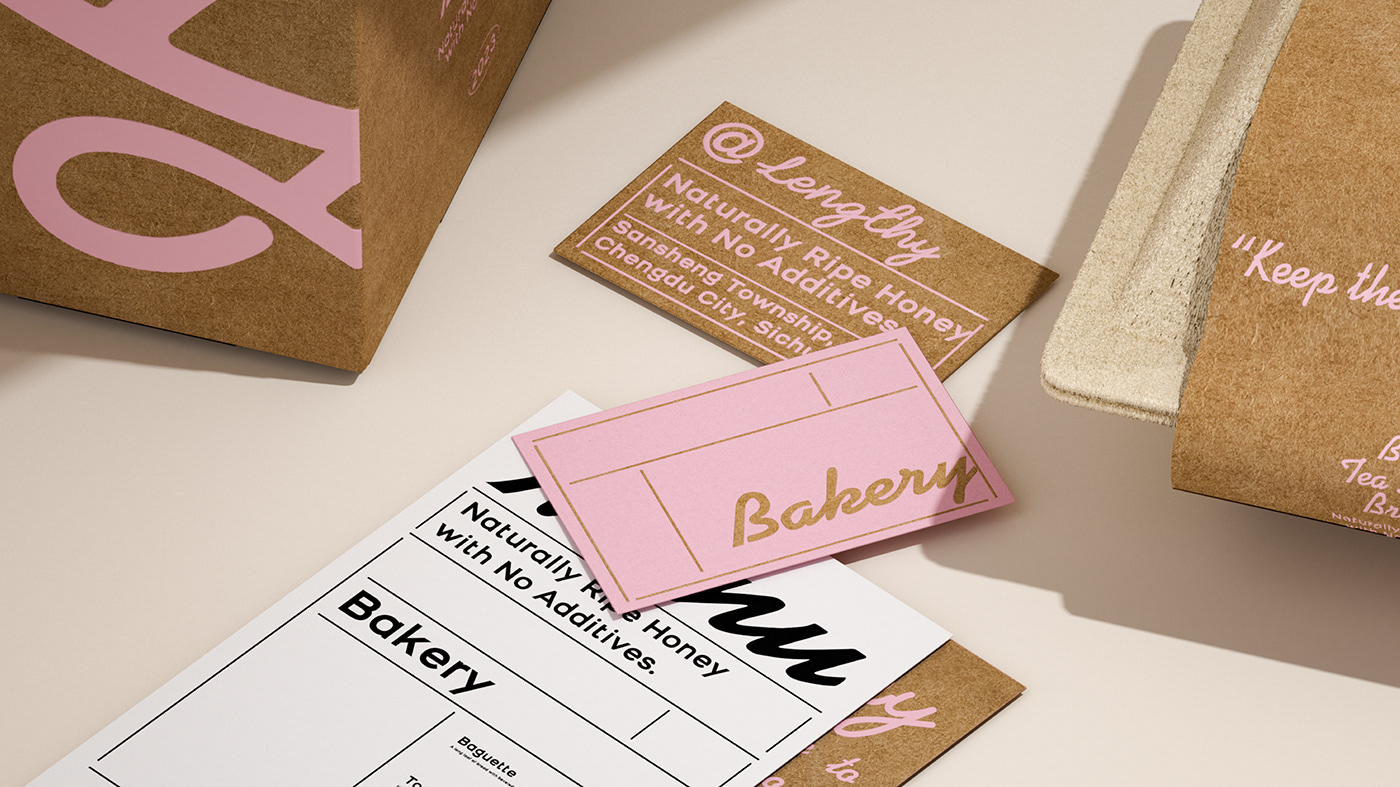
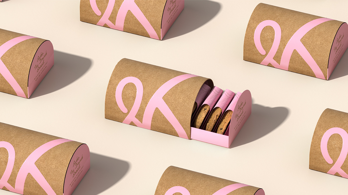
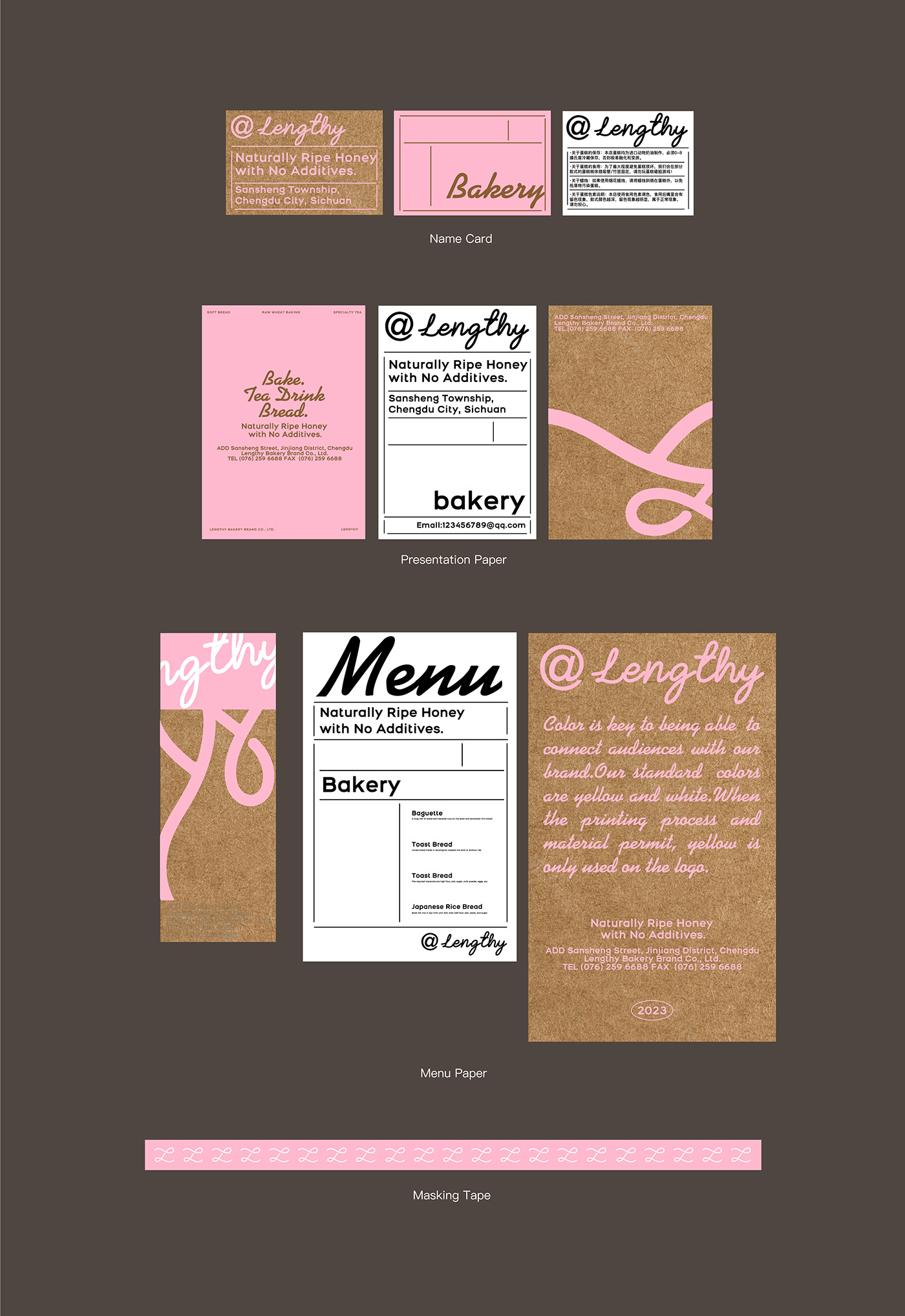
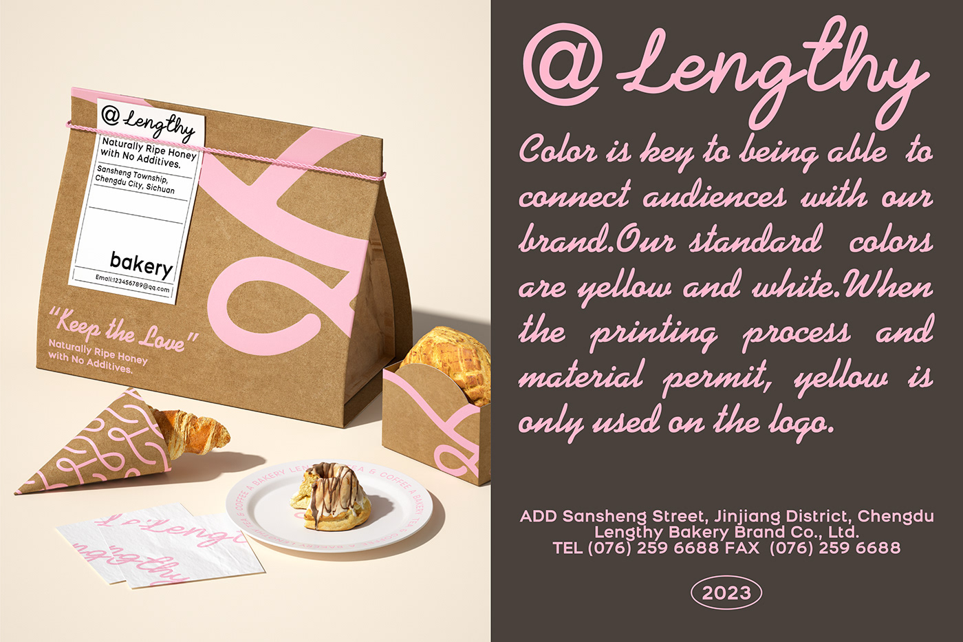
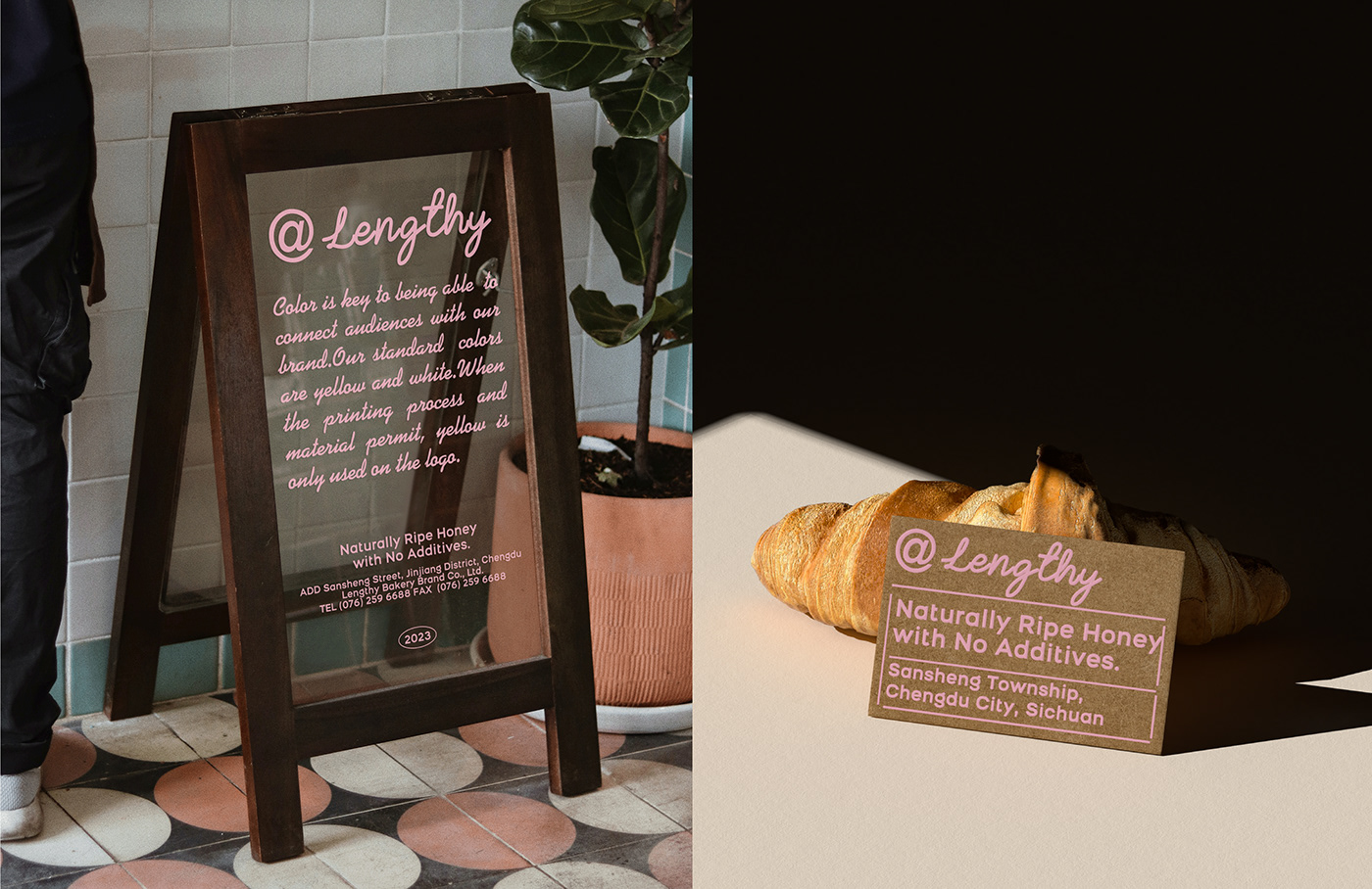
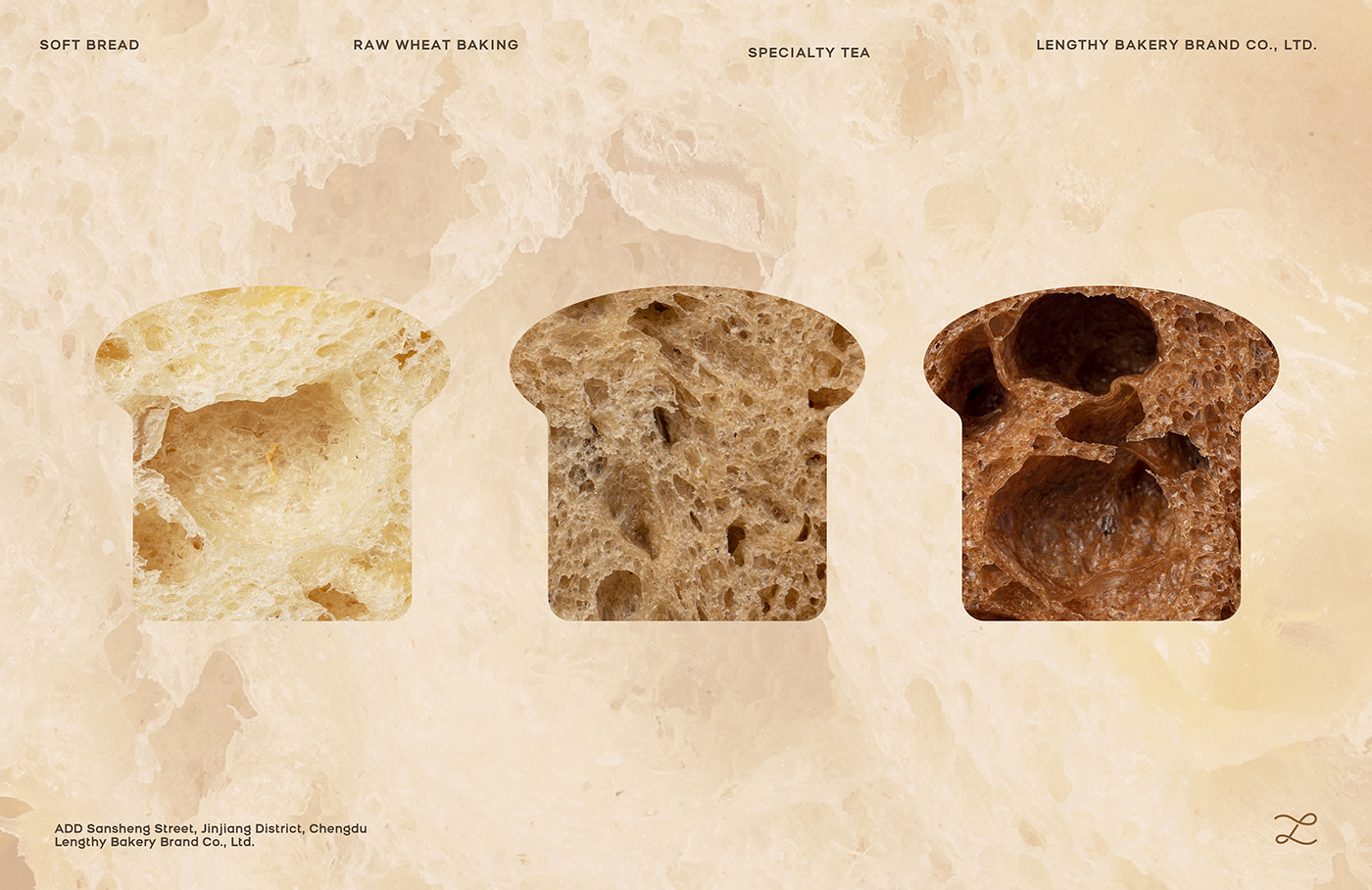
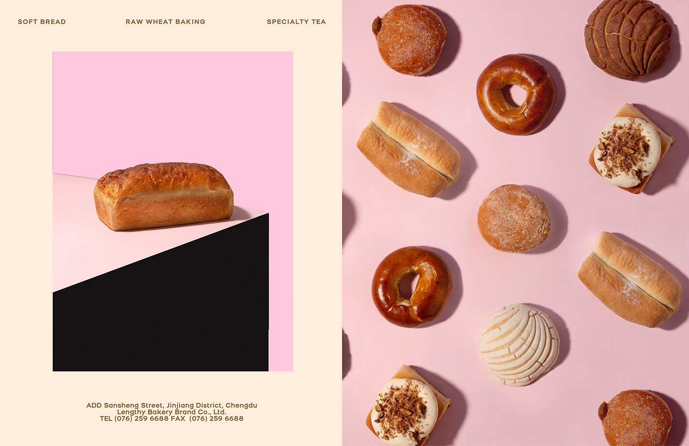
Resauce Design 在林夕家的设计中运用了大量的粉色搭配牛皮纸的原始色调,给予品牌健康、温暖的调性,自然的纹理与粉色印刷相碰撞,用视觉语言表现了品牌安静,温暖的氛围。
Baking is not only a process of bringing the temperature into to buns, but also an attitude of bringing the passionate of bake into life. The handwriting marque designed by Resauce Design is expressed the nostalgia, gentle tone of voice and a touch of personality into the brand.
Resauce Design used a lot of pink color in the design of LENGTHY Bakery with the original color of kraft paper to give the brand a healthy and warm vibe. The natural texture collides with the pink printing, expressing the quiet and warm atmosphere into the brand identity.