The project of the North America Facebook page for Acqua Panna, started from the repositioning strategy implemented by San Pellegrino Group, in order take advantage of the strong boost of San Pellegrino water and Italian lifestyle image, conveyed by the brand in the world.
At that time, Acqua Panna just redesign the bottle (introducing on the label the drawing of a Tuscany landscape) with the goal to focus on the historical heritage of the brand.
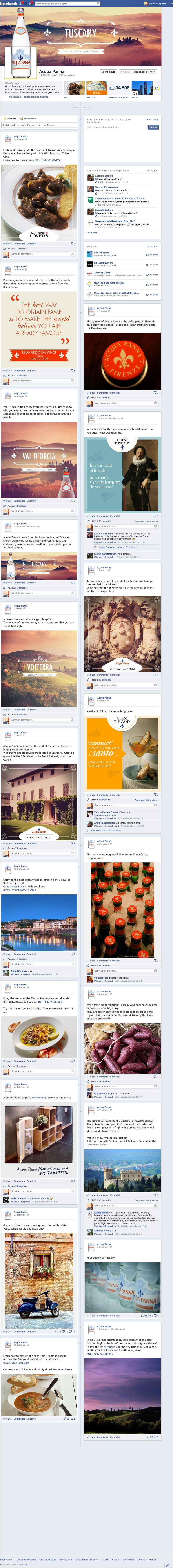
Accordingly, all the social media assets were designed starting from the guideline to communicate the Italian character of the product, in particular of the Tuscany.
The design criteria were divided into the following topics:
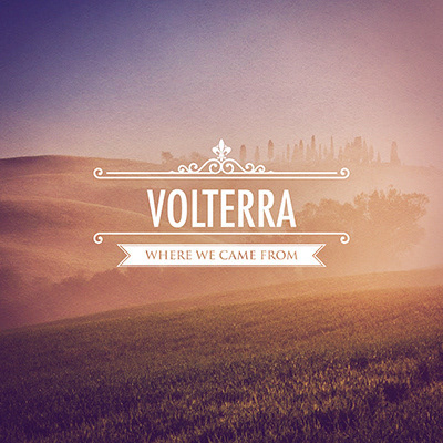
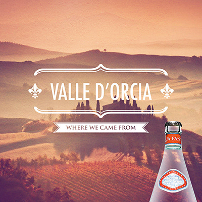
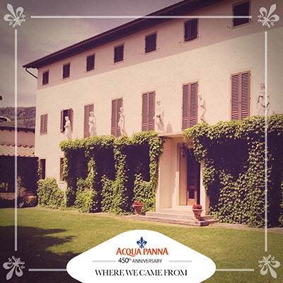
history/origins
(it was made a photographic research of typical Tuscan landscapes, by applying a vintage photo filter in order to emphasize the historicity of the product; it was also done a design work on the lettering, introducing some iconic elements typical of Tuscany, like the fleur-de-lis of Florence)
(it was made a photographic research of typical Tuscan landscapes, by applying a vintage photo filter in order to emphasize the historicity of the product; it was also done a design work on the lettering, introducing some iconic elements typical of Tuscany, like the fleur-de-lis of Florence)
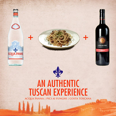
mix of dishes and wine
(Acqua Panna is proposed to the American market as the ideal water to accompany Tuscan wine and food)
(Acqua Panna is proposed to the American market as the ideal water to accompany Tuscan wine and food)
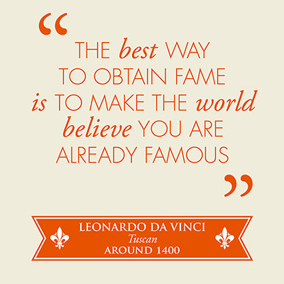
famous quotes
(phrases of celebrities related to Tuscany, eg. Leonardo da Vinci, have been paginated with a contemporary lettering and treatment)
(phrases of celebrities related to Tuscany, eg. Leonardo da Vinci, have been paginated with a contemporary lettering and treatment)
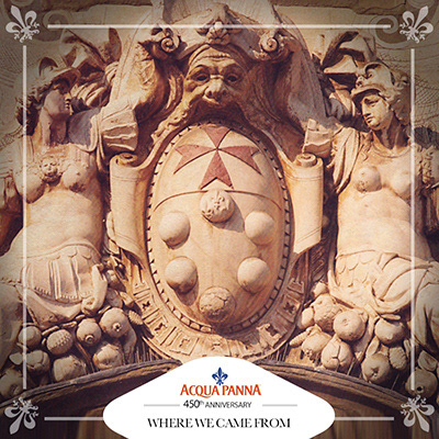
historic architecture
(it was made a research of historic architecture of Tuscany, in particular related to the Medici family)
(it was made a research of historic architecture of Tuscany, in particular related to the Medici family)
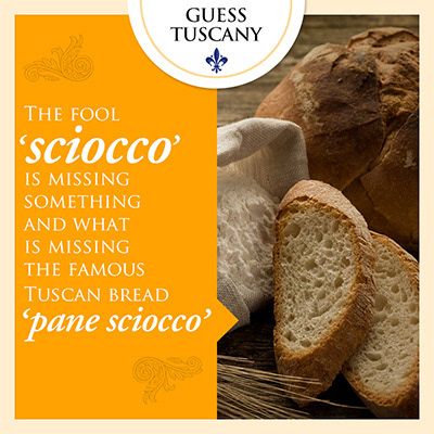
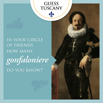
word games
(with a layout constructed with an image and a Tuscan term, we created a game with a call to action to culture and intuition)
(with a layout constructed with an image and a Tuscan term, we created a game with a call to action to culture and intuition)
client: San Pellegrino Group | studio: YAM11200