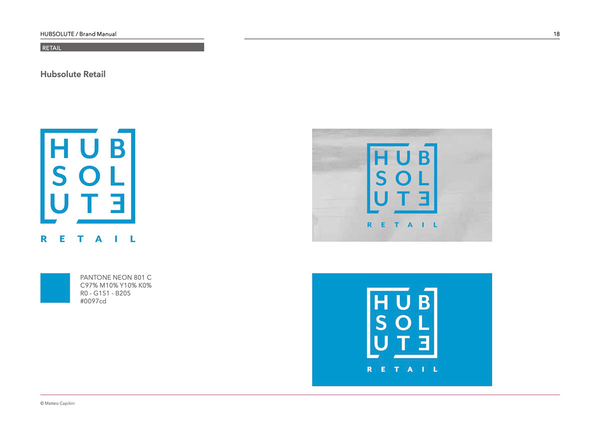
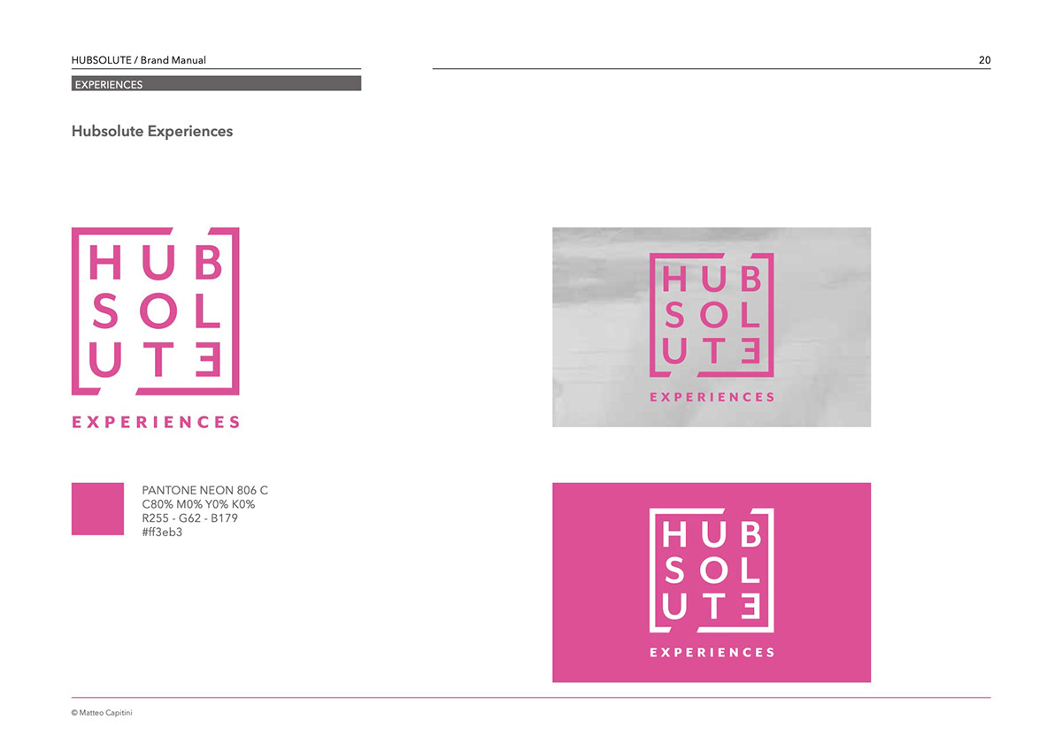
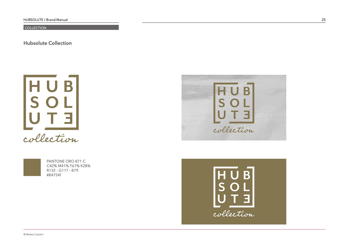
The design of the Hubsolute brand started from the meaning of the name, from the content that my customers wanted to communicate: a Hub that connects supply and demand in the world of tourism. I therefore studied the meaning of hub and identified three typical functions of the word hub: airport hub, hub as an interconnection element (mechanical) and digital hub (junction point of the web network). In fact, the design chosen represents a melting pot of the concepts just focused: a square that encloses the lettering, open diagonally up and down (transversality of the action) with the last letter E, mirrored horizontally (uniqueness, diversity). Subsequently, the brand was declined to represent the 5 areas of action (retail, hospitality, experiences, venues, services). Each area has been associated with a color taken from a fluorescent palette, to indicate the dynamism and contemporaneity of the brand. Finally, for the 'Collection' customer portfolio, gold was chosen, the most precious of metals.
client: Hubsolute