About Westerico
Allow me to present Westerico, a groundbreaking American logistics company that is at the forefront of revolutionizing transportation, handling, and storage services through the seamless integration of cutting-edge technology. With a mission to redefine the industry, Westerico is committed to delivering unparalleled efficiency, reliability, and power to its clients.
In our pursuit to visually capture the very essence of Westerico's brand identity, we embarked on the creation of a captivating logo that would become an emblem of the company's core values. Our goal was to craft a design that not only evokes a sense of speed, reliability, and power but also resonates with the target audience on a deeper level.
Drawing inspiration from the dynamic nature of the logistics industry, we carefully considered every element of the logo's composition. Through meticulous craftsmanship, we ensured that each aspect of the design is purposeful and visually compelling. The logo seamlessly merges iconic symbolism with modern aesthetics, encapsulating the essence of Westerico's brand ethos.


Logo Development
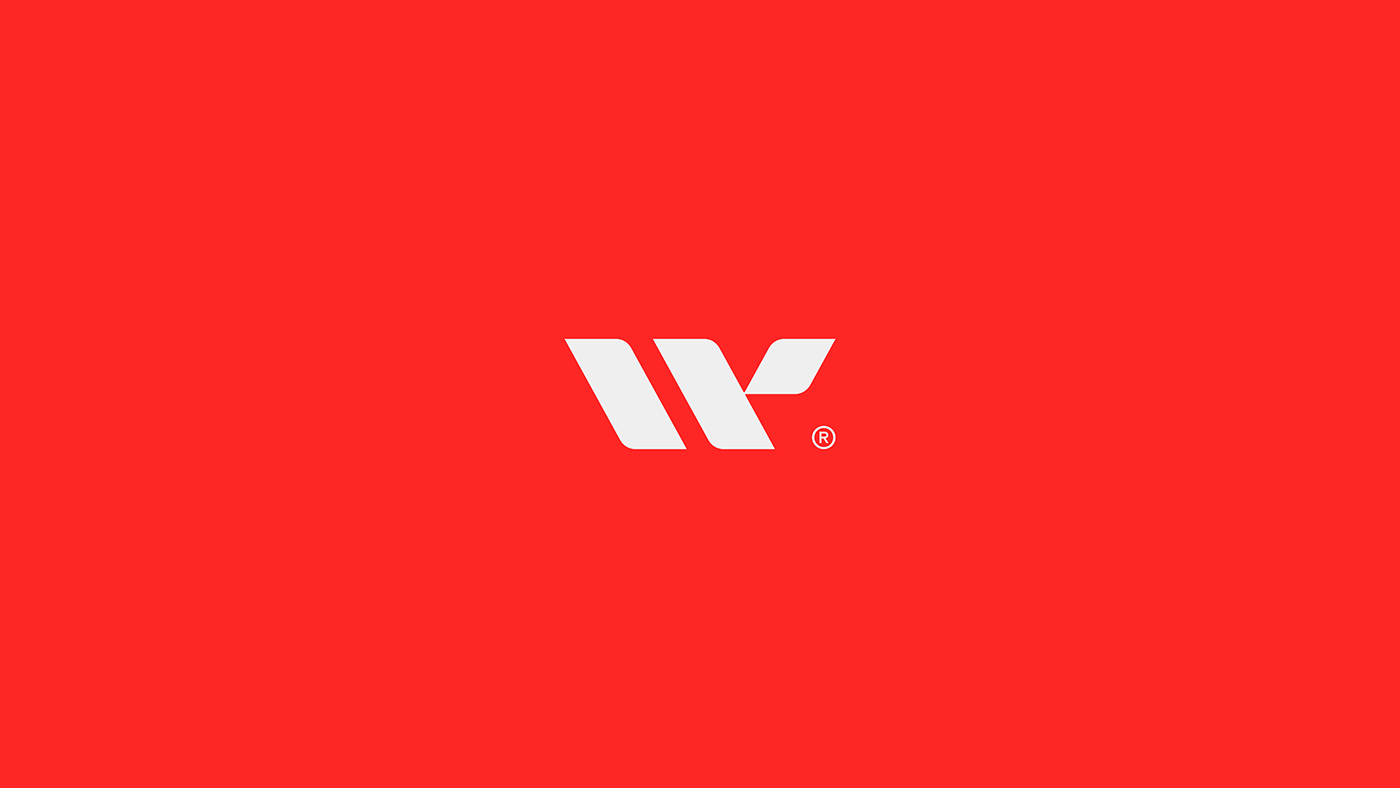
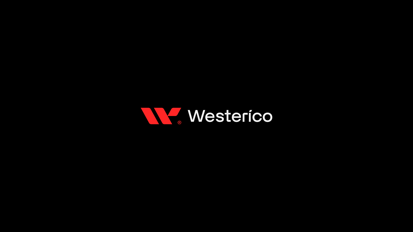
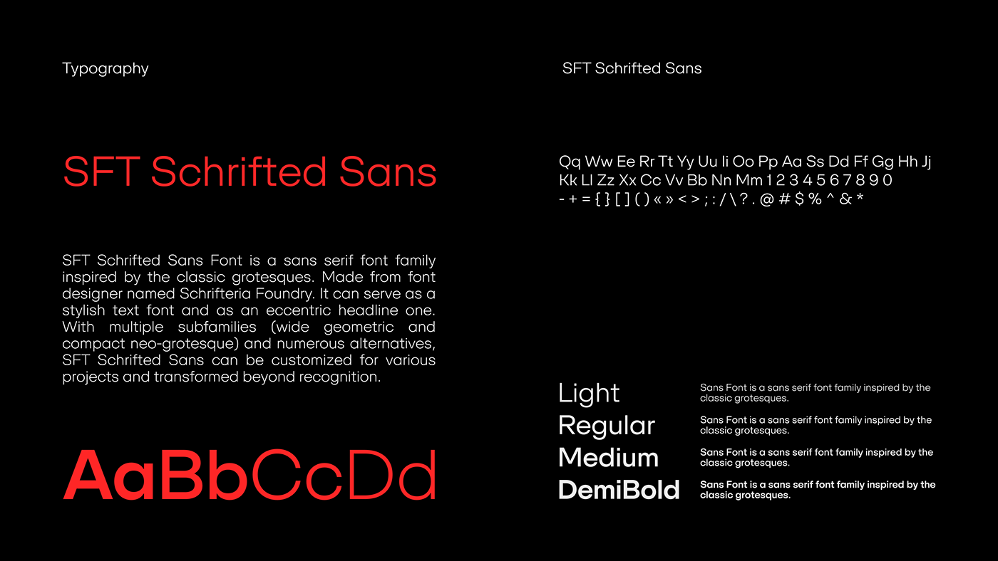
Drawing inspiration from the company's initials, the logo ingeniously incorporates ellipses and meticulously placed lines. These elements not only form the letter "W" but also convey a sense of dynamic movement. By employing lines angled at precisely 300 degrees, we evoke the notion of speed, while their robust thickness instills a feeling of dependability and trust. To complement this striking symbol, we carefully selected the SFT Scrifted Sans font for the company name. Its seamless integration with the logo establishes a harmonious visual identity, and we modified the letters "i," "t," and "r" to align seamlessly with the logo's distinctive design.


Color Palette
A bold color palette was strategically chosen to symbolize Westerico's unwavering strength. Dominated by shades of vibrant red, the palette exudes power and determination. This captivating visual identity extends beyond the logo, forming the foundation of the company's corporate design. The logo's grand shape serves as a cornerstone for all conceivable variations and combinations, allowing for a cohesive brand presence.


Brand Identity
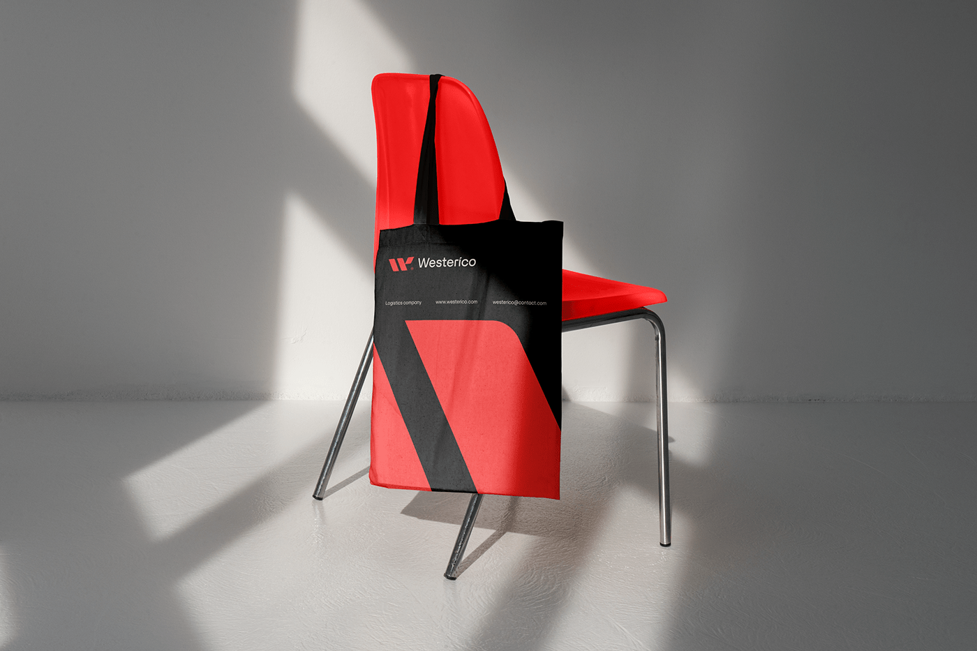
Our comprehensive design solution encompassed an array of corporate elements, including documentation, packaging, truck design, corporate uniforms, merchandising, social media assets, website design, and even flags. This cohesive approach ensures that Westerico's brand message resonates consistently across all touchpoints, reinforcing their commitment to excellence and instilling a sense of trust in their clientele. With the visually stunning logo and a comprehensive suite of brand assets in place, Westerico stands poised to make an indelible mark in the logistics industry, propelling goods seamlessly from producers to consumers, powered by innovation and unwavering reliability.