

TYPOGRAPHIC VOICE
Studio Based Project
The brief was to design a typeface which reflects a thematic interpretation of an idea. The main objective of the course was to understand, appreciate and sensitise oneself to typography as a major compositional and stylistic medium of communication design.
INSPIRATION BOARD FOR TYPEFACE EXECUTION
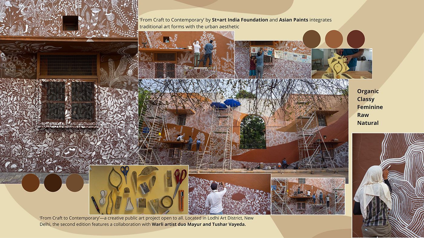
The keywords that I wanted to keep in mind for the typeface were Organic, Classy, Feminine, Raw, Natural.
The inspiration was taken from the wall of Lodhi Art District. I selected this wall because the forms and patterns that were there on this wall helped me to come up with my final outcome.
The mood board acted as an amazing tool for my inspiration because it didn't let me loose the essence of the typeface.
ITERATIONS FOR TYPEFACE EXECUTION


FINAL FORM


WORKING ON PROPORTIONS AND STRUCTURE

Working on a bigger size grid to understand the proportions of the final typeface before digitising the font.
DIGITISATION OF THE FINAL TYPEFACE


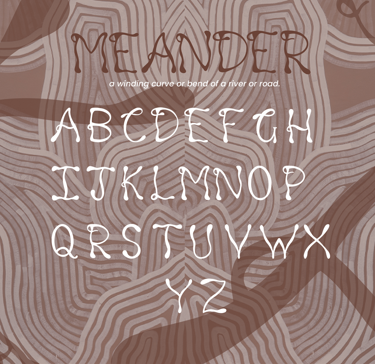
MEANDER
The typeface was named MEANDER.
The meaning of the word MEANDER is one of a series of regular sinuous curves in the channel of a river or other watercourse.
APPLICATION OF MEANDER TYPEFACE


