Dressing The Screen: The Rise of Fashion Film | British Council Brief
D&AD New Blood Awards 2014
In collaboration with Samuel Jeremiah Lim & Siti Afiqah Anuwar.
Dressing the Screen: The Rise of Fashion Film is a new international British Council exhibition. The exhibition will open in Moscow in 2014 and will then tour in Brazil, Thailand and Mexico. The exhibition brings together works by some of the world’s most famous and innovative fashion designers and filmmakers from the last 75 years.
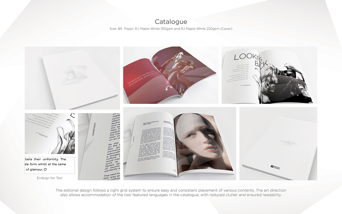
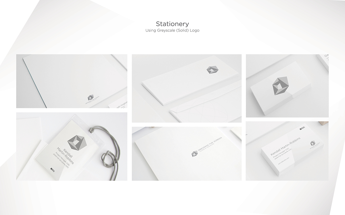
My group members and I were tasked to create a bilingual identity for the Dressing the Screen exhibition, which reflects the high-fashion and moving image nature of the exhibition through the physical graphics, way-finding, web presence, brochure and print design.
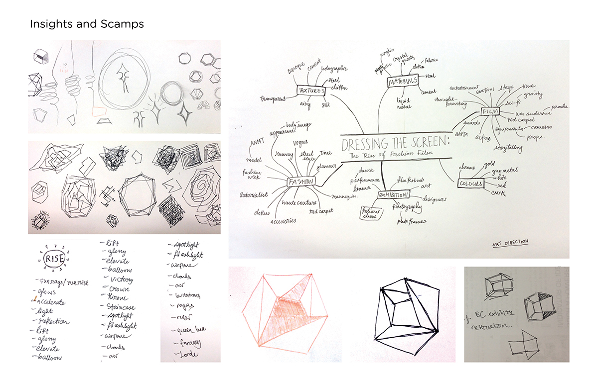
Brainstorm, sketches and insights
To start things off, the group brainstormed on possible ideas and ways to interpret the title of the exhibition. We felt that it was very easy to fall into the trap of interpreting the exhibition as something very cliché – cloth for fashion, film strip for film, Union Jack motif for the British origins of the exhibition – hence we made a conscious effort to steer away from these clichés, and worked in a more abstract direction of the moods, senses and textures we are inspired of when we think Dressing The Screen.
We also went straight into brainstorming and developing our logo for the exhibition, as we felt that the logo is the face of the exhibition, and it can serve as the signpost of our design direction in our later design processes.
Developing the logo
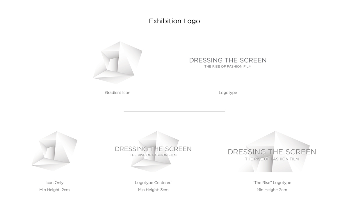
The exhibition logo is inspired by simple geometric shapes that represent both the film and the fashion industries. The square represents frames, while circle represents fashion and its freeform creations. Both shapes are amalgamated into a hexagon to symbolise the collaboration of the two fields. Facets then further enhance the logo to reflect the dynamism of the two mediums.
We first experimented with colours because we were inspired the iridescent colours in gemstones, and also the four seasons that dictates the cycles in the fashion industry. However, the group felt that the multi-coloured logos did not have a edge to it, and it could be messy to our overall concept.
Later we developed a monochrome version of our logo. A monochrome swatch is chosen to keep a neutral and classic tone in the exhibition identity. It allows attention to be placed on the vivid works of the directors and designers, yet is strong enough to carry the brand identity of the exhibition. We even experimented with
a halftone version of the logo to test it for printing.

Finalising the logo
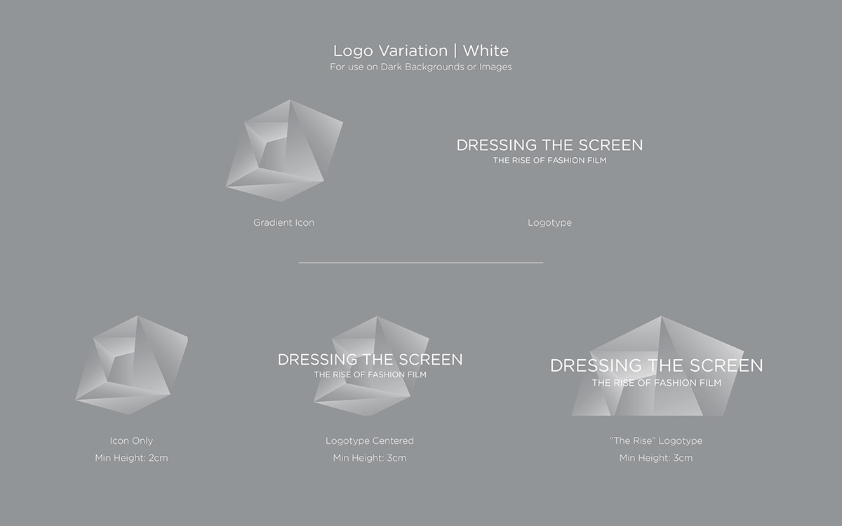
Our finalised logo features a monochrome swatch and gradient. The gradient is inspired by lights. Light is essential in both film and fashion – it is a key element in films, required to capture and develop the director’s vision, it also illuminates the creativity of fashion designers on runway shows. The translucent logo will also enable more flexible use of it alongside imagery from the exhibition.
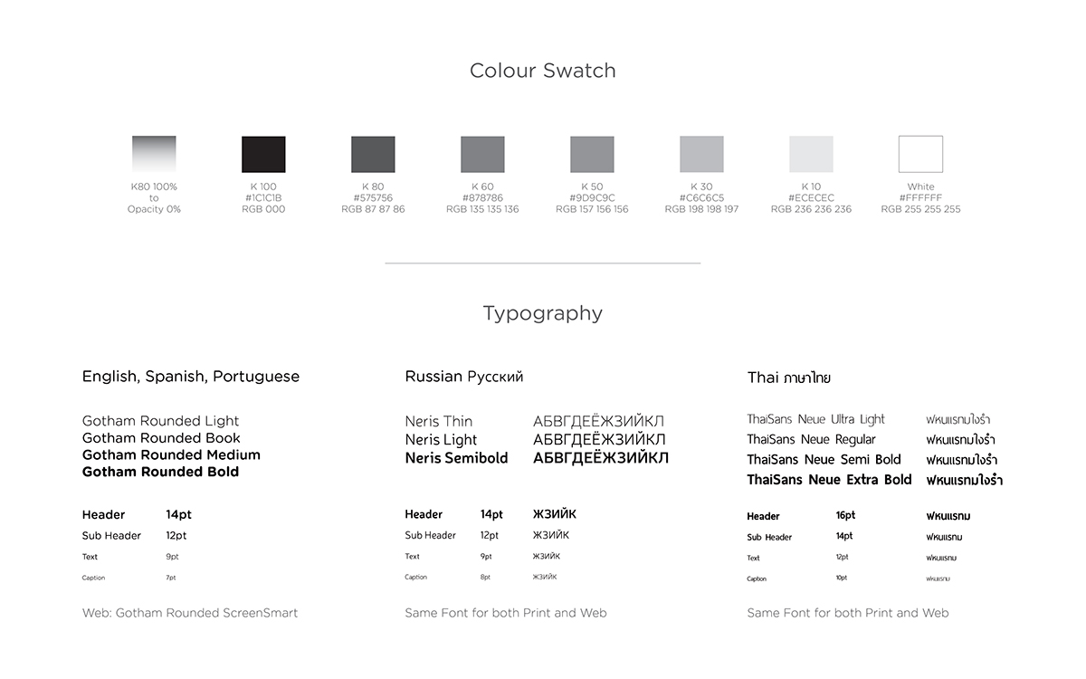
The greyscale version of the logo is one of the three versions created. Used mainly on event stationery, the solid logo will ensure ease in application and duplication of documents. With the contrasting shades of K-100 Black, the logo will still be distinct when printed at the minimum size of 0.5cm with regular office printer.
The rounded san-serif typeface, Gotham Rounded, gives a soft look and feel, balancing the contrast between the logotype and the point- ed icon. Boasting an extensive range of weights, Gotham Rounded is versatile for use throughout the entire brand identity. It is unobtrusive, yet sturdy enough to be used for the large-scale exhibition without looking excessive.

Application of concept
The application of our concept underscores simplicity and flexibility, and they can be seen in our various physical graphics, way-finding, web presence, brochure and print design.
We decided to introduce digital signages in our branding concept, be- cause it enables greater flexibility in placement. The clean typeface allows projection on angular walls and textures without sacrificing readibility. Projection, replacing traditionally printed signage, strengthens the identity of Dressing The Screen as a cutting-edge fashion film exhibition.