Drinkit
Brand identity for a food-tech startup from Dodobrands.
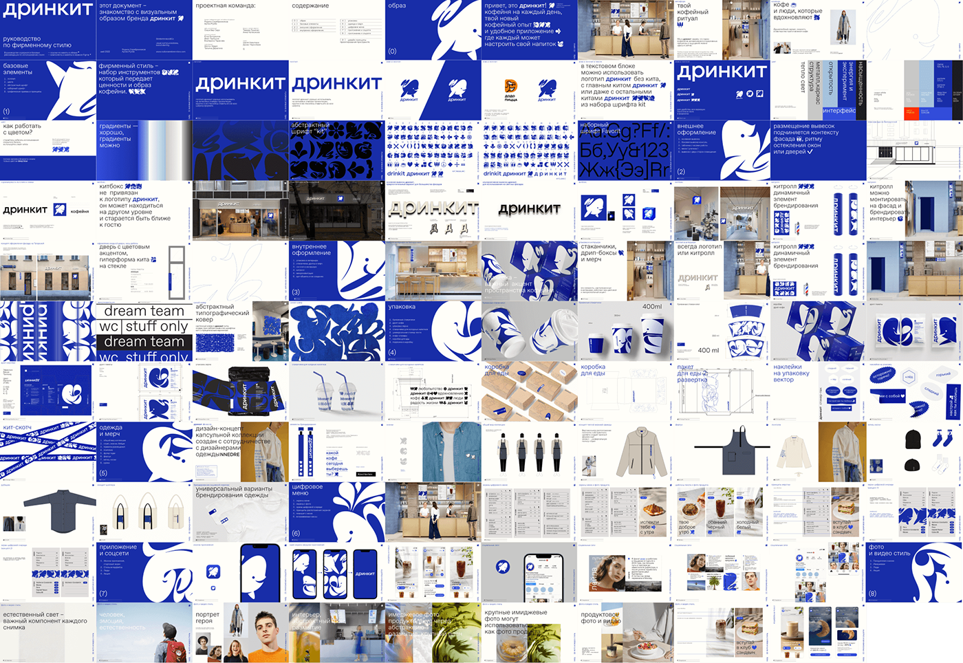
Abstract emoji-typeface as the main tool for designing brand’s visual communications.
Abstract emoji-typeface as the main tool for designing brand’s visual communications.
(brand consulting, visual communication, art-direction, graphic design, type design)
Rodion Serebrennikov
Artem Rulev
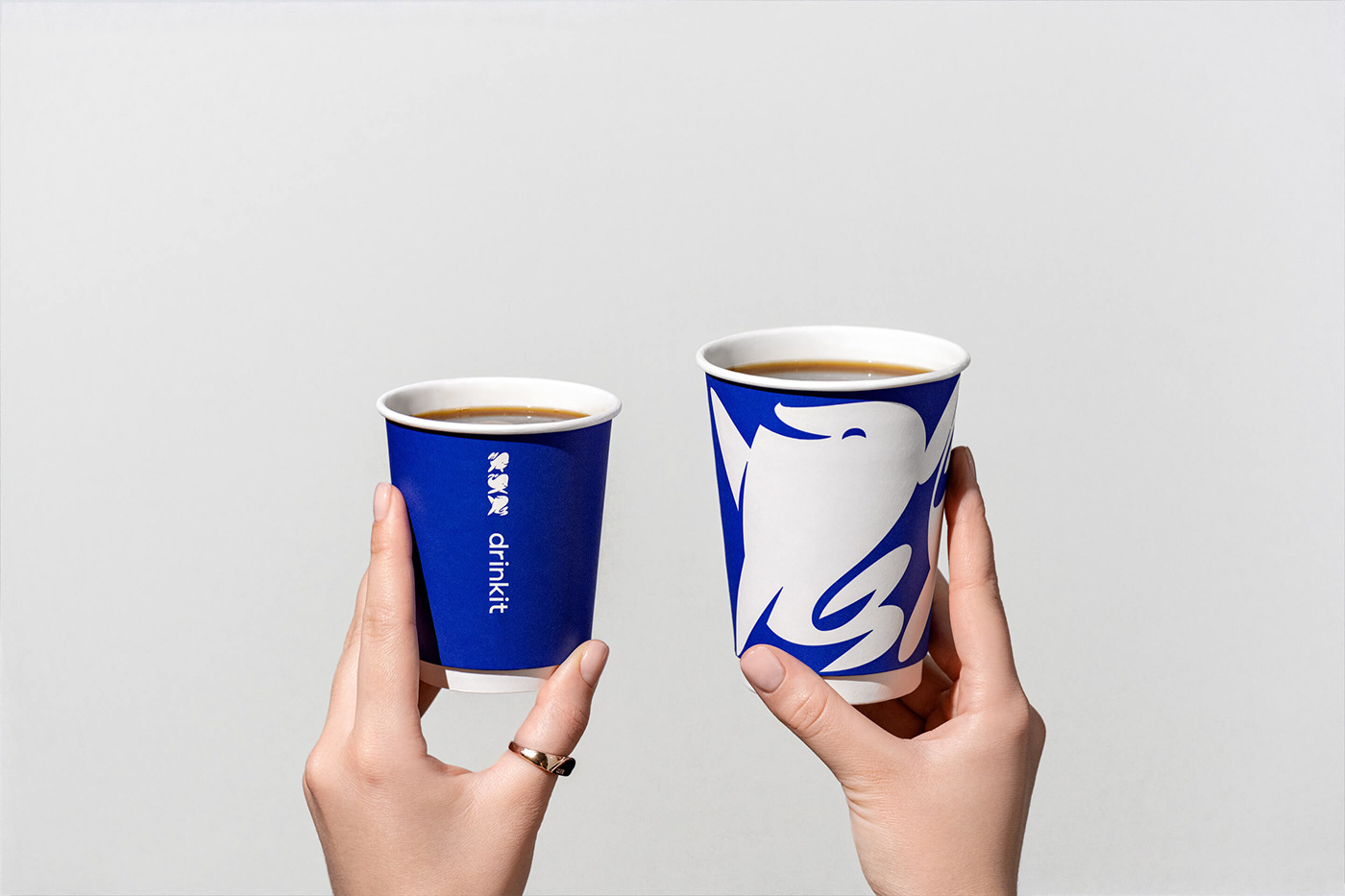
The main idea behind drinkit is to create the best coffee experience combined with an app which helps guests to do in-app orders, manage coffee subscriptions and also to customise drinks.
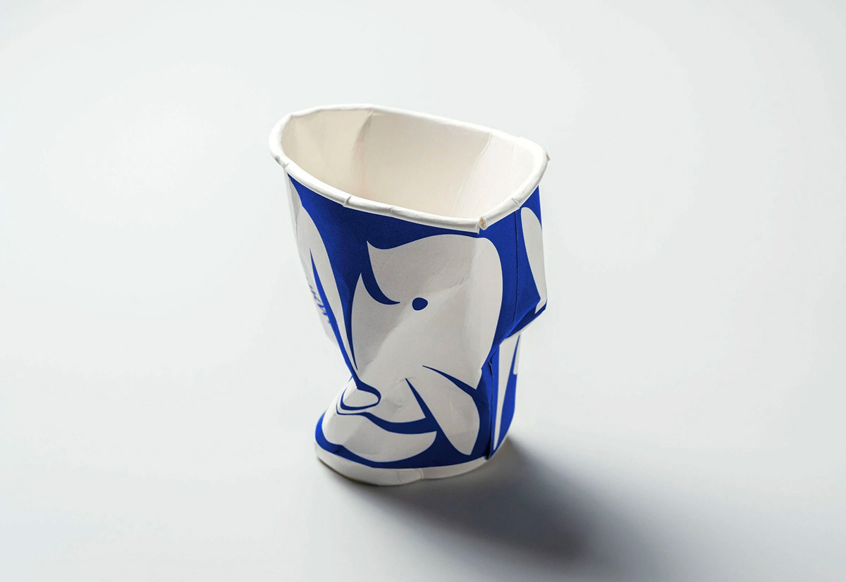
In partnership with Drinkit brand development unit, we created a new brand platform redesigning the existing whale symbol.
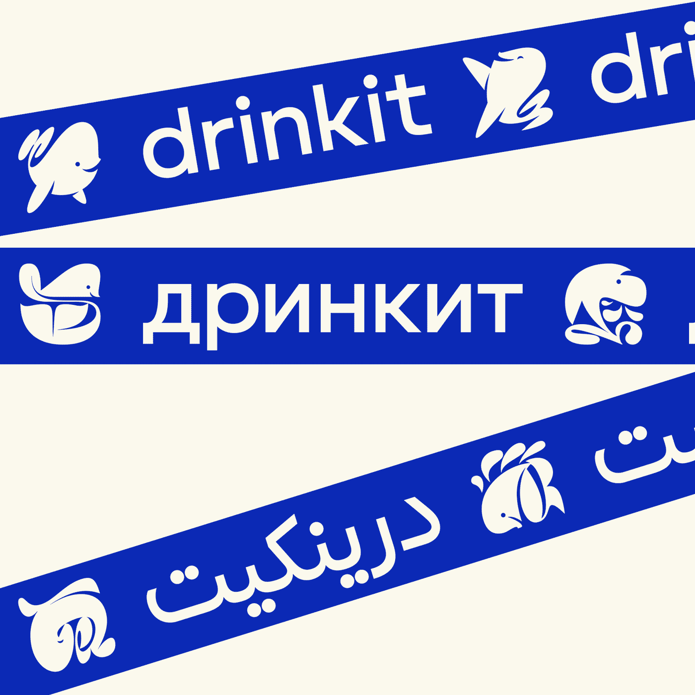
We came up not only with a single logo but
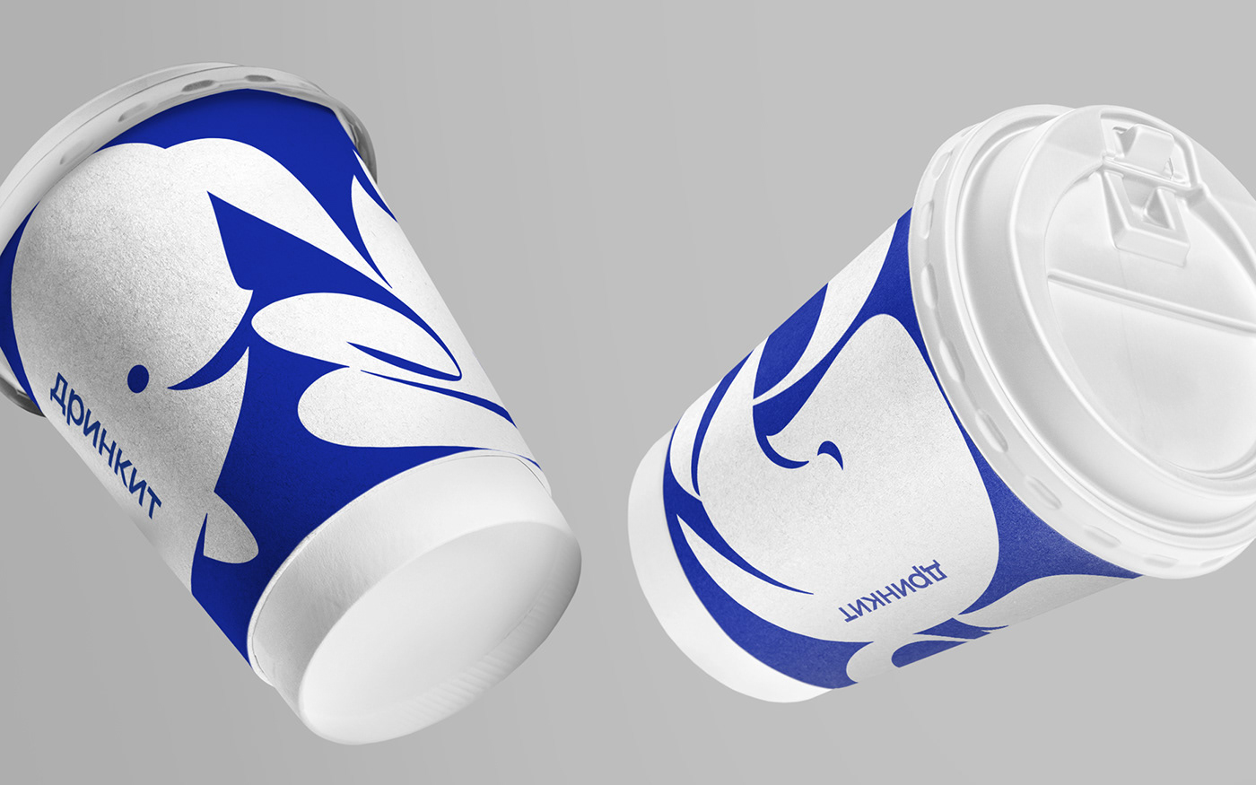
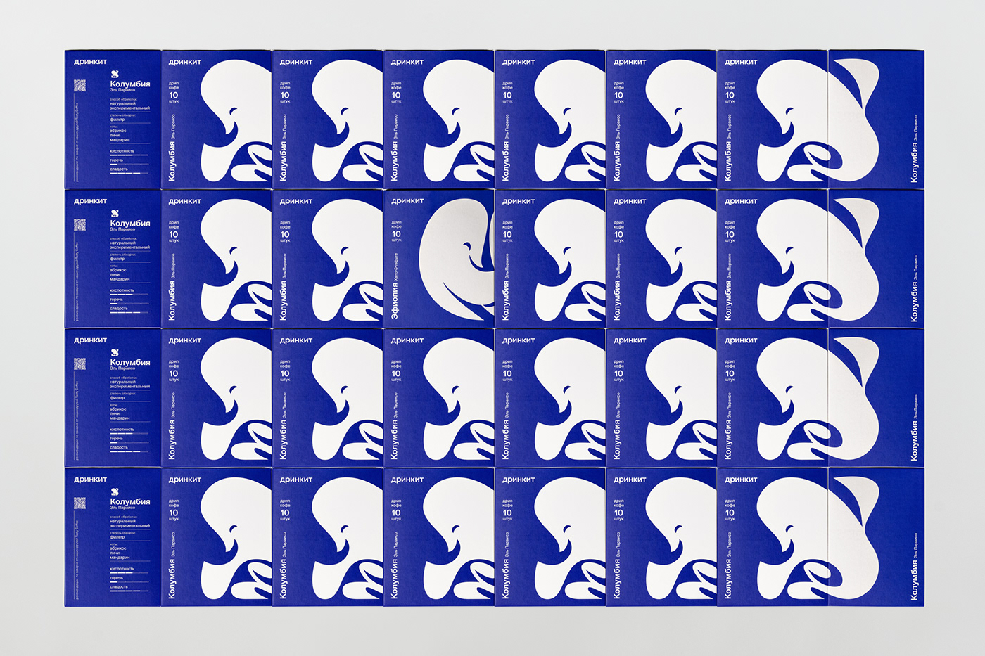
a system of logo marks which became an emoji typeface called Kit regular.

We choose ABC Favorit by Dinamo Typefaces as a basic typeface for the text messages and fit Kit regualr proportions to it’s metrics.
Kit regular is now the main tool
for designing brand’s visual communications.


Package design


Indoor and outdoor
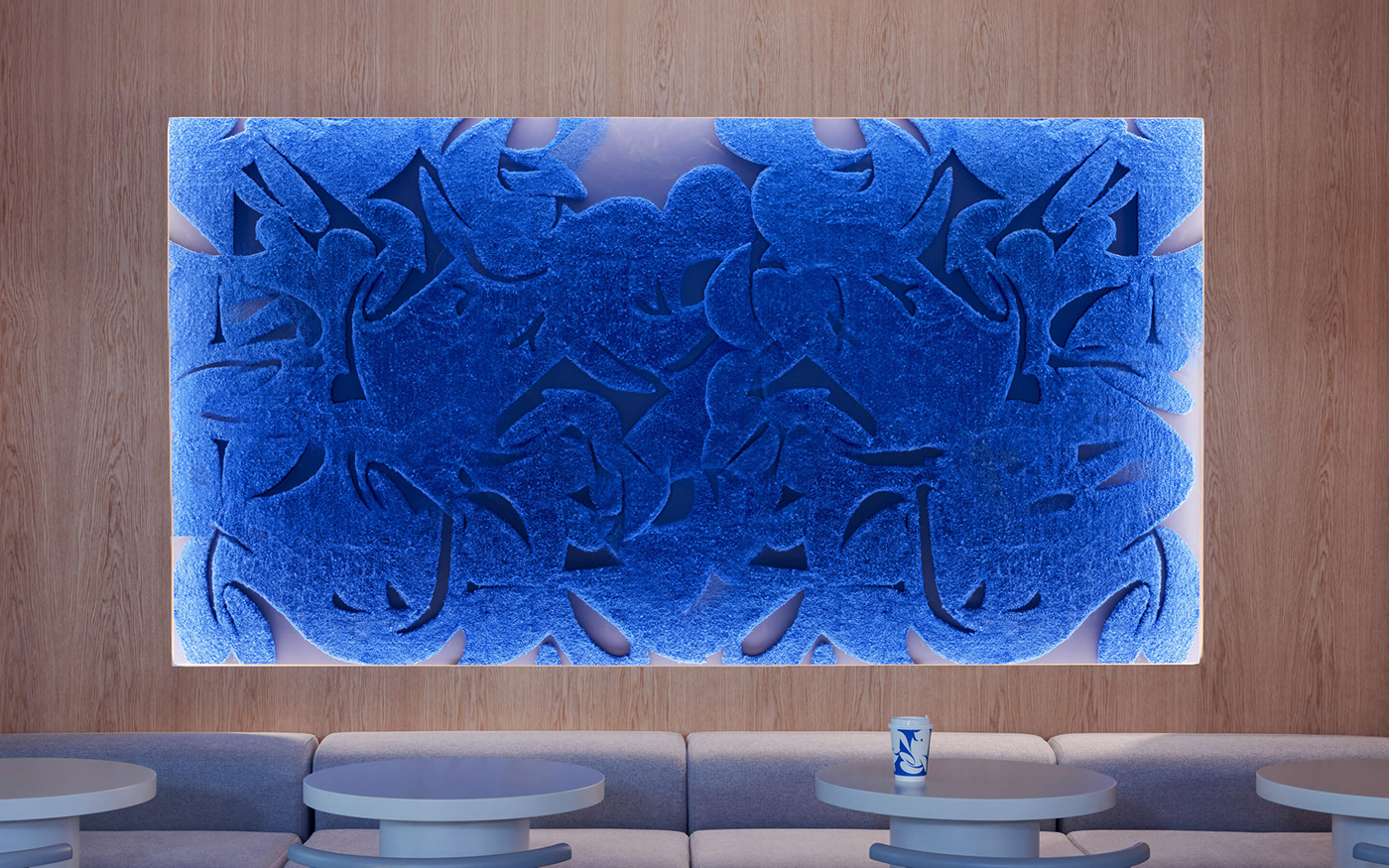
– wall carpet designed with Kit regular typeface
– interior and extrior decoration standarts
– digital menu screens


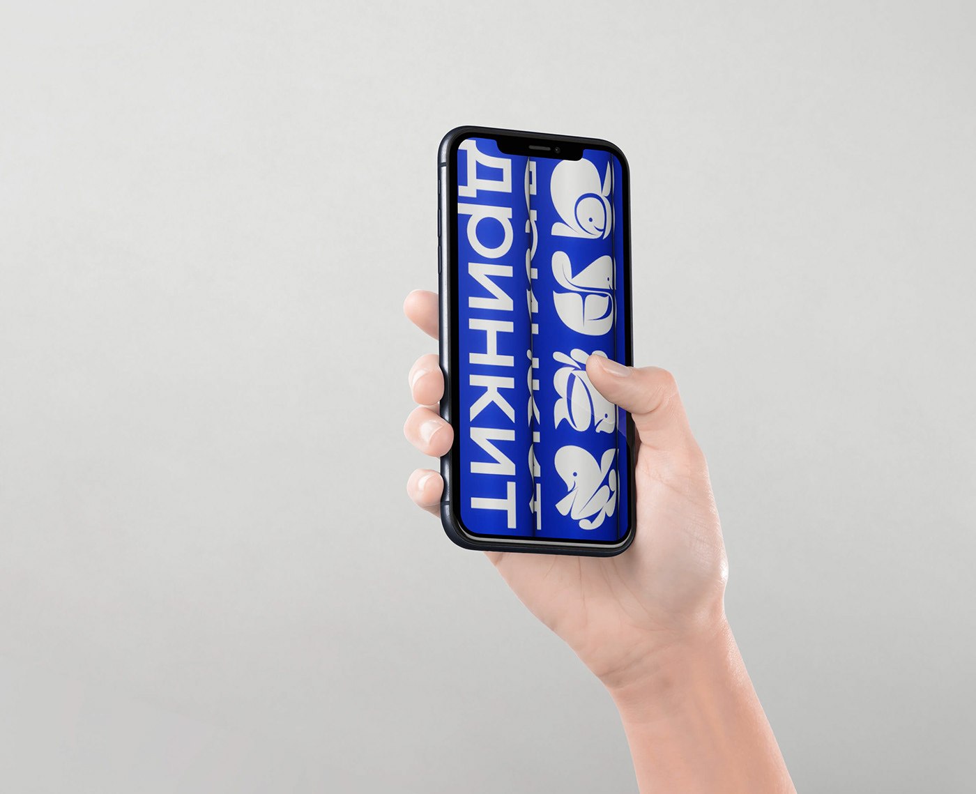
mobile application style


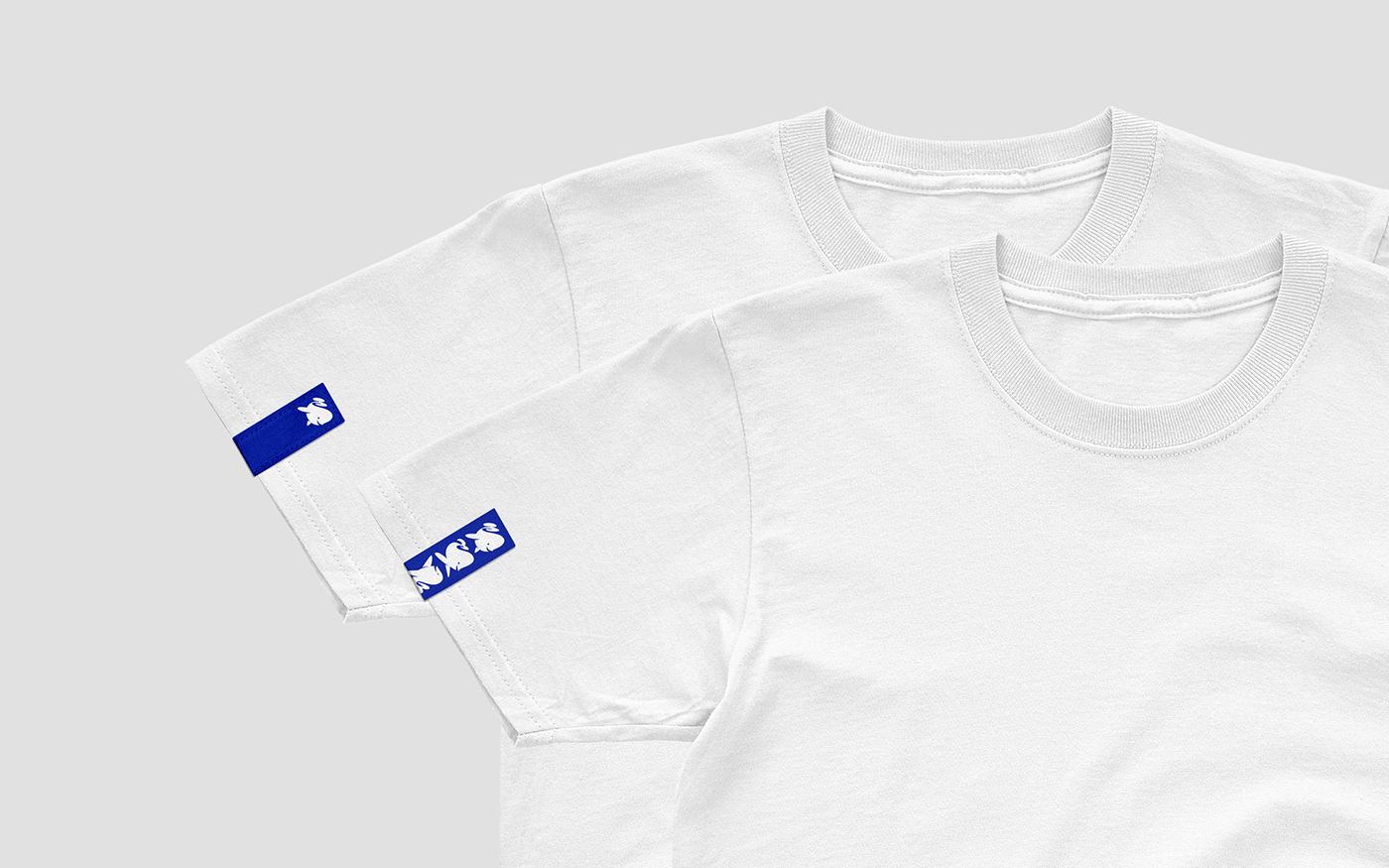
merch and outfit


Using the new logotype and Kit typeface we created an extensive guide book which conveys all possible brand experiences for customers
(brand consulting, visual communication, art-direction, graphic design, type design)
Rodion Serebrennikov
Artem Rulev
(interior)
Egor Bogomolov
Ivan Gorbunov
Ekaterina Tarasova
Julia Tsuglenok
Sonya Plusnina
Tatiana Kurochkina
(outfit)
Nelly Nedre
Tatyana Derygina
Nelly Nedre
Tatyana Derygina
(brand strategy)
Anna Kalmykova
Tamara Lutzenko
(product)
Nastya Nikitina
Denis Chernobayev
Fedor Ovchinnikov
Nastya Nikitina
Denis Chernobayev
Fedor Ovchinnikov