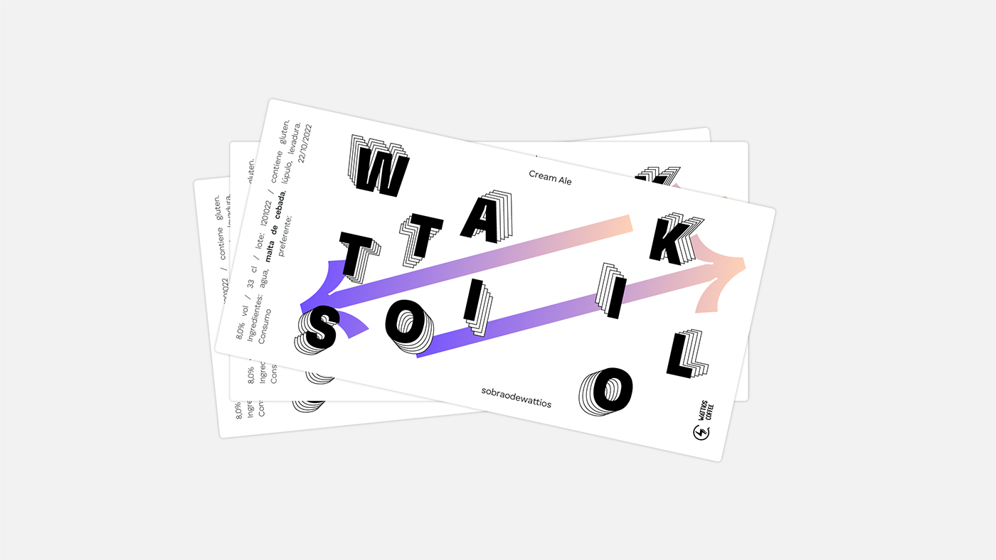
The label design for this "Wattio/Kilo"-centric beer uses contrast and kineticism to create a dynamic and engaging experience. Contrasting colours: white, black and a gradient were used to convey the energy of cycling.
The bold typography and repetitive shapes suggest movement and speed, further emphasising the active nature of cycling. It is an abstract and modern design that conveys a sense of movement and energy that seeks to appeal to both cyclists and beer lovers.
Behind this bottle there's more than just a sip.