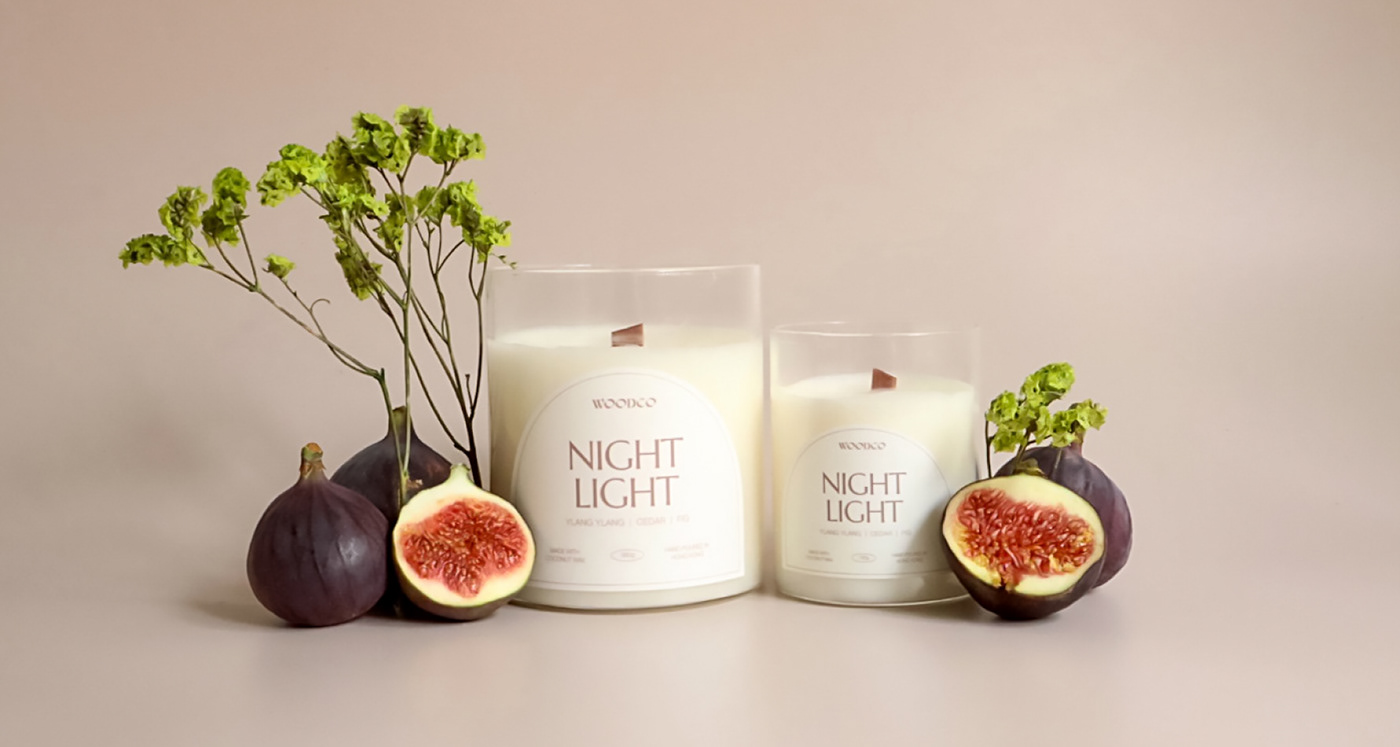
WOODCO Visual Identity & Packaging
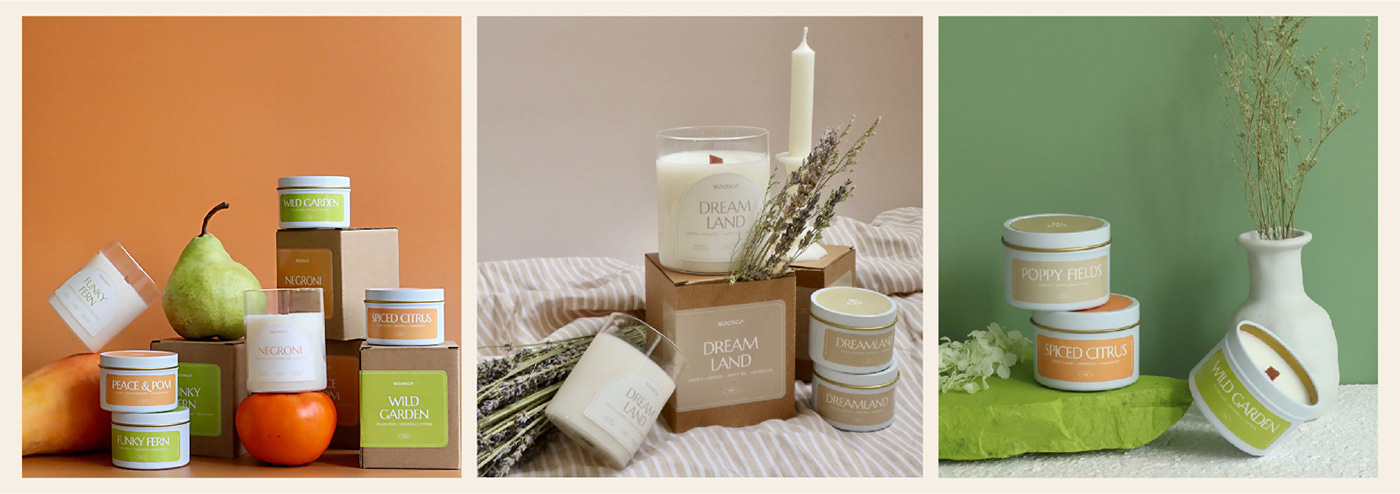
WOODCO was founded by a mother and daughter-duo. Coming from a design background, The mother is the one who came up with the candle recipe and she is in charge of production, while the daughter focuses more on business development and marketing.
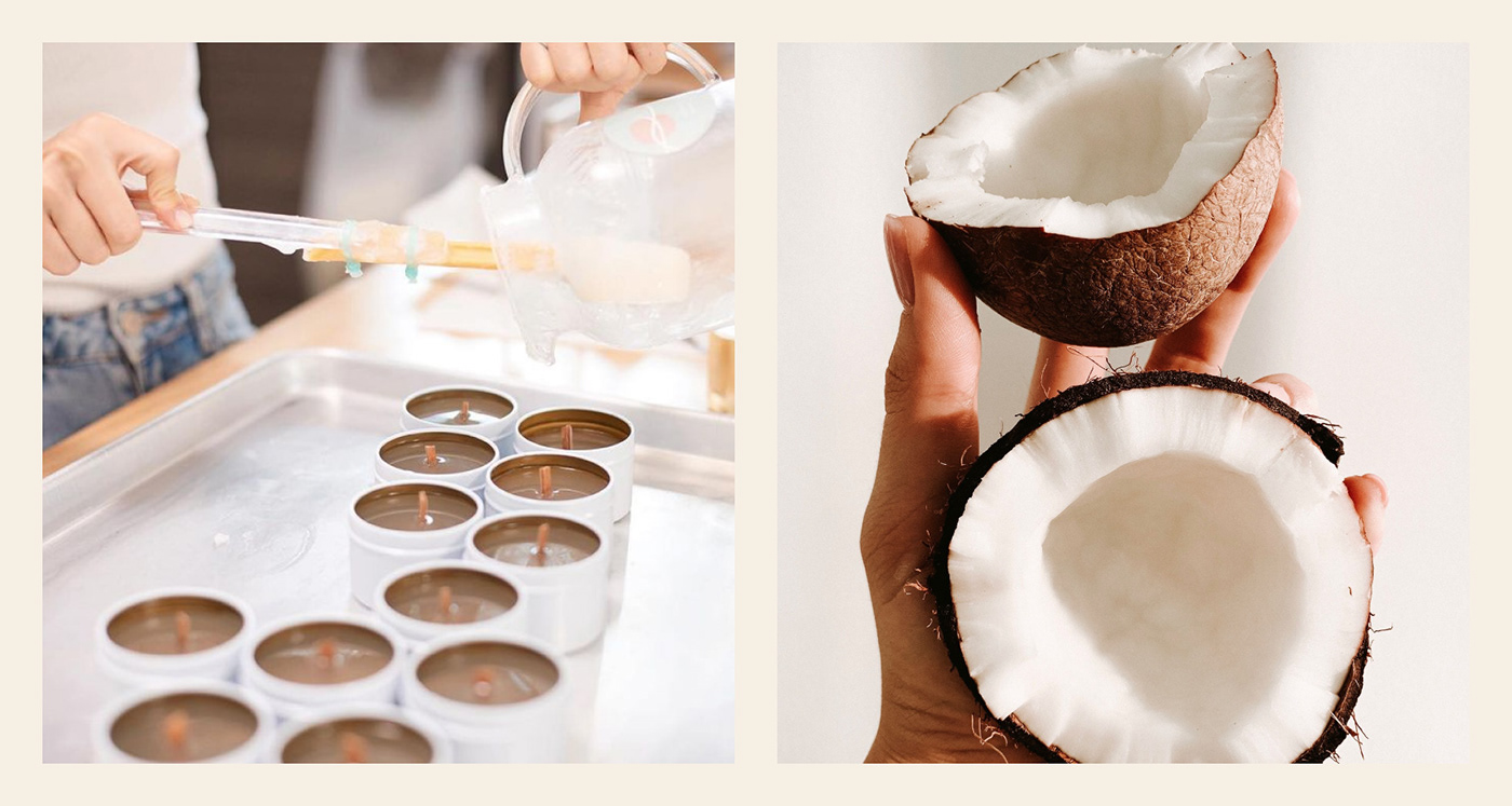
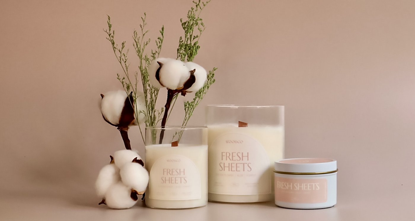
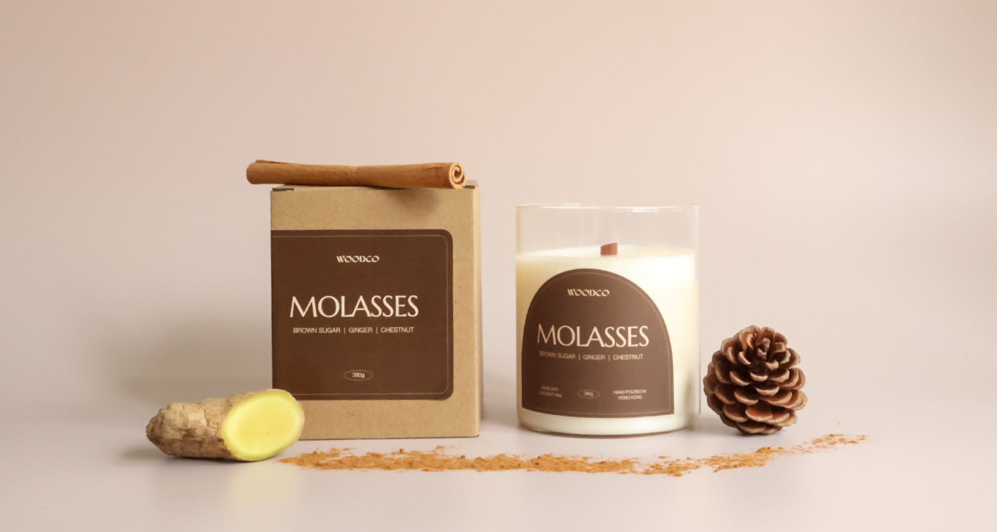
WOOD - comes from the fact that they use wooden wick.
CO - comes from the fact that they use coconut wax.
We help them to creating the most suitable visual identity for WOODCO by re-designing their logo and packaging that will directly be able to touch their targeted audience and also be able to convey joy and tranquility with a touch of eccentricity and quirkiness.
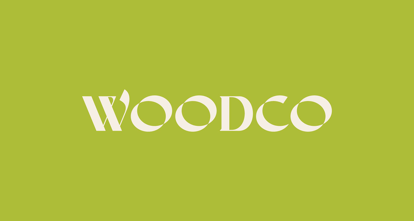
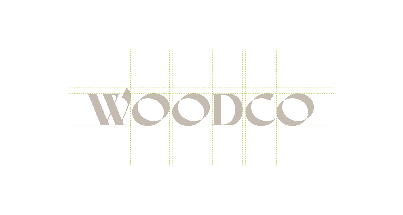
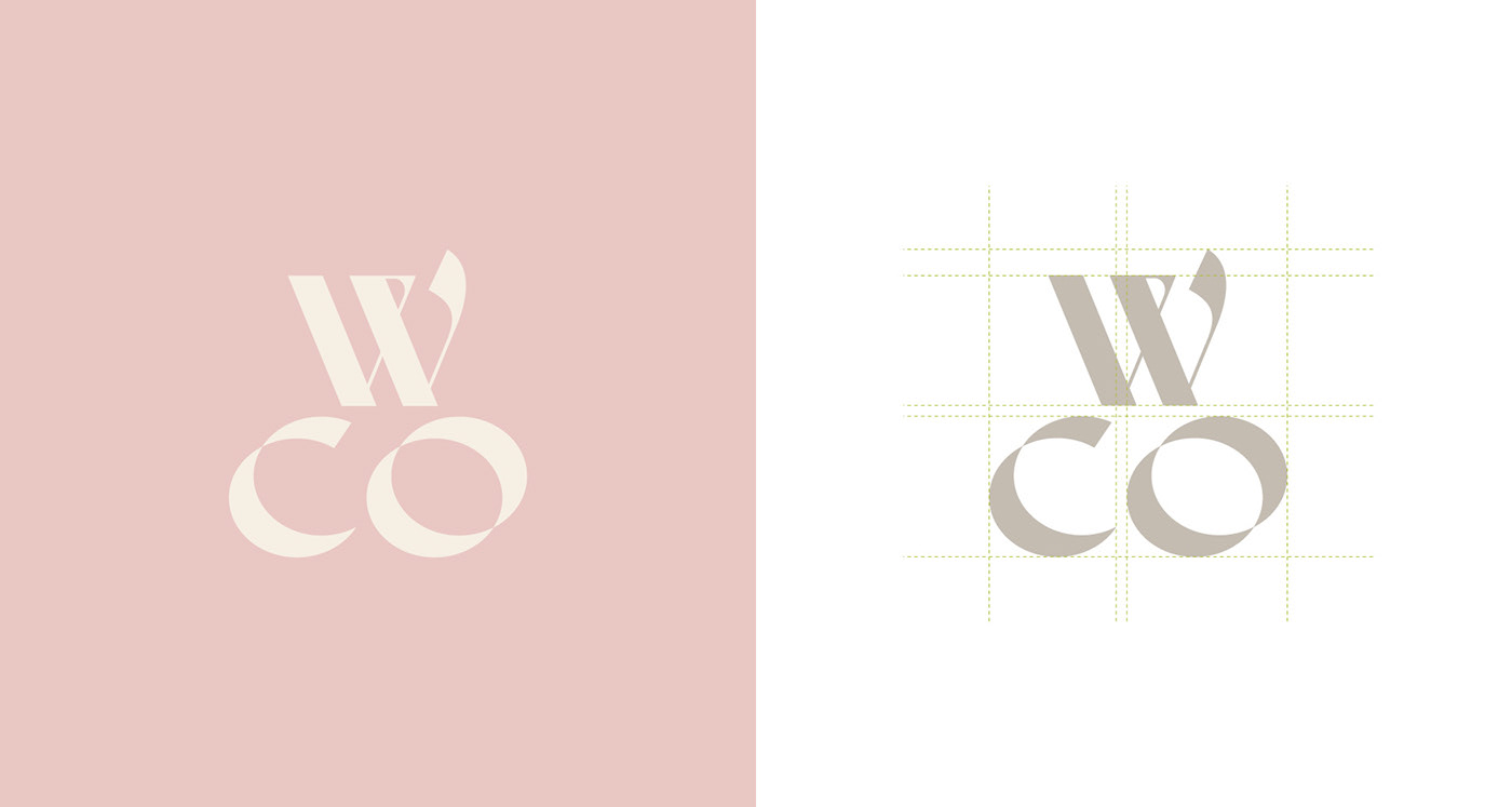
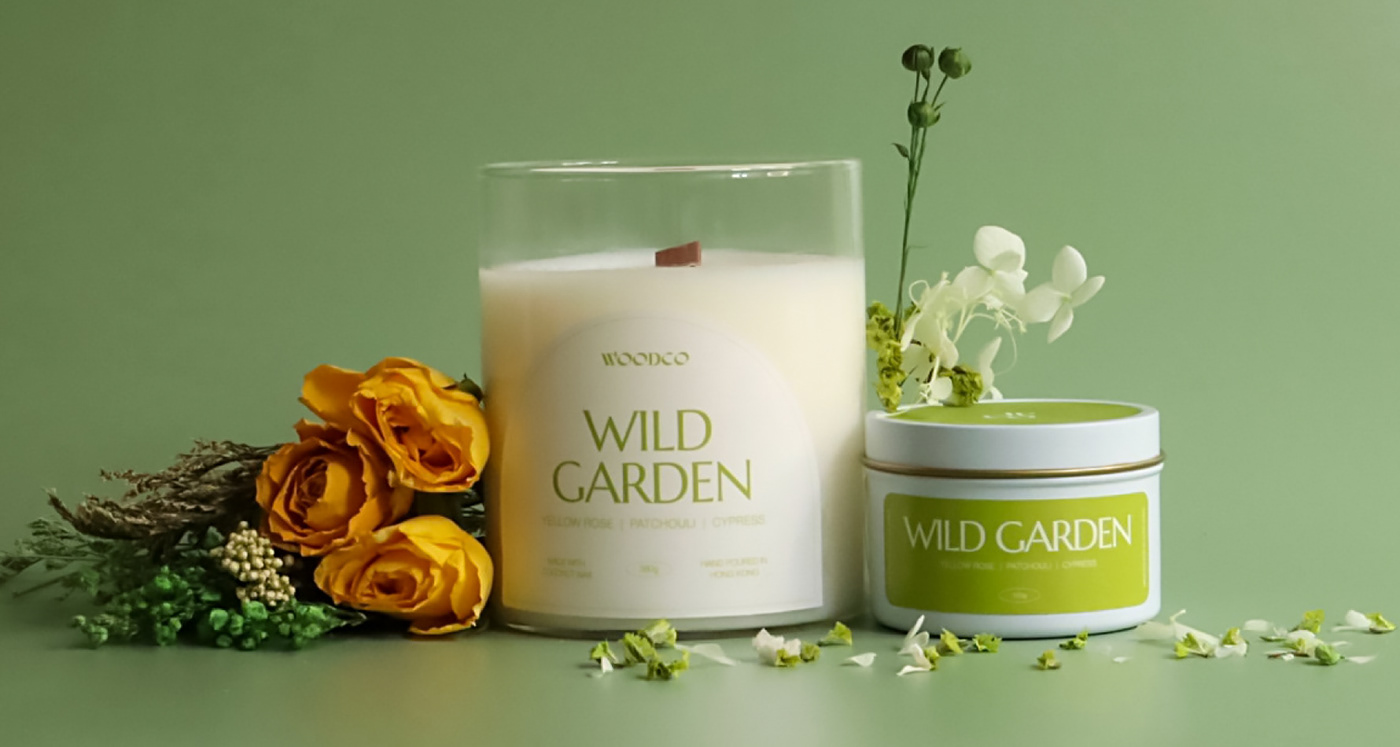
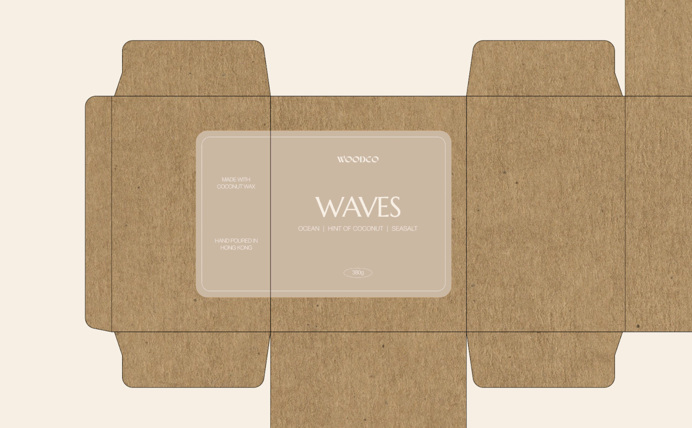
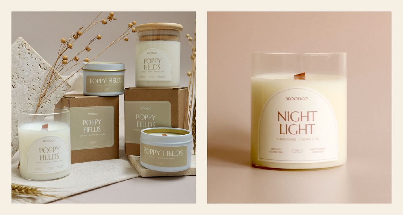
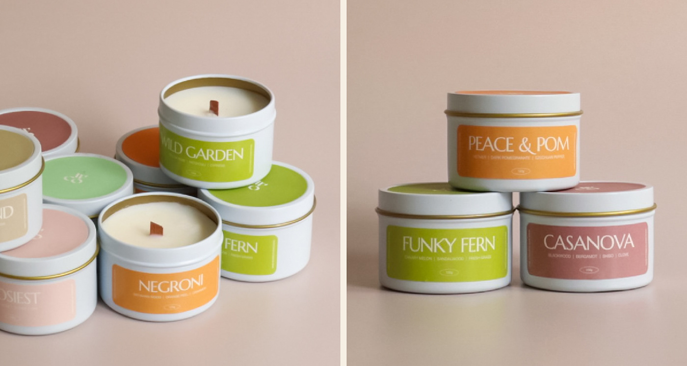
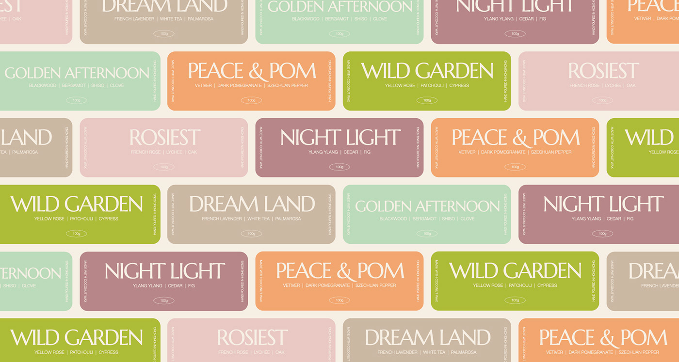
Giving WOODCO a new edge by using a unique form of typography that will give more character to the brand. Combining them with a mix of earthy tones, calm and bright colors will not only balance and compliment the quirkiness it will also convey the playfulness and elegance that need it in this brand.
Giving WOODCO a new edge by using a unique form of typography that will give more character to the brand. Combining them with a mix of earthy tones, calm and bright colors will not only balance and compliment the quirkiness it will also convey the playfulness and elegance that need it in this brand.
DISCIPLINES:
Visual Identity, Graphic Design, Packaging Design
YEAR:
2022
PHOTOGRAPHY:
PHOTOGRAPHY:
WOODCO