


Bom is a startup company based in the United States that specializes in producing loud and powerful songs, and the owners are already very passionate and long-time singers. He asked me to create a visual identity and brand. It was important to be able to cut through the chaos, so we set out to create a visual language that was simple, but powerful and carries meaning. It is shameful to help them stand out and show what is intangible and the flashes of imagination and dynamism that the brand will show.
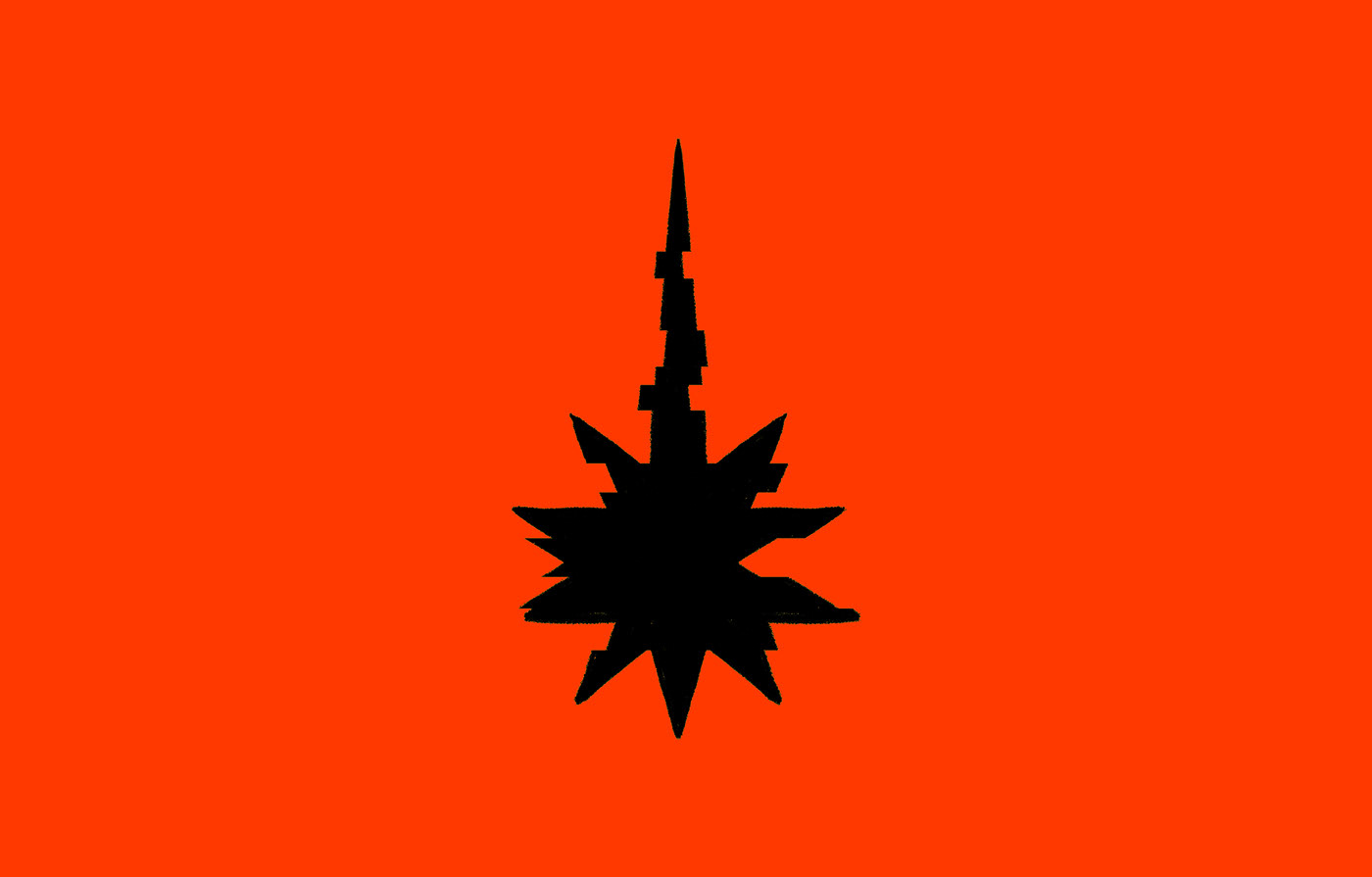
To create the Bom icon, it needed a lot of time and focus to come up with a very unique icon that carries many meanings. It does not resemble a specific shape, but it bears the meaning of explosion and noise, and finding the right balance between form and function. The logo that melted must be visual and effective in communicating the brand’s message.

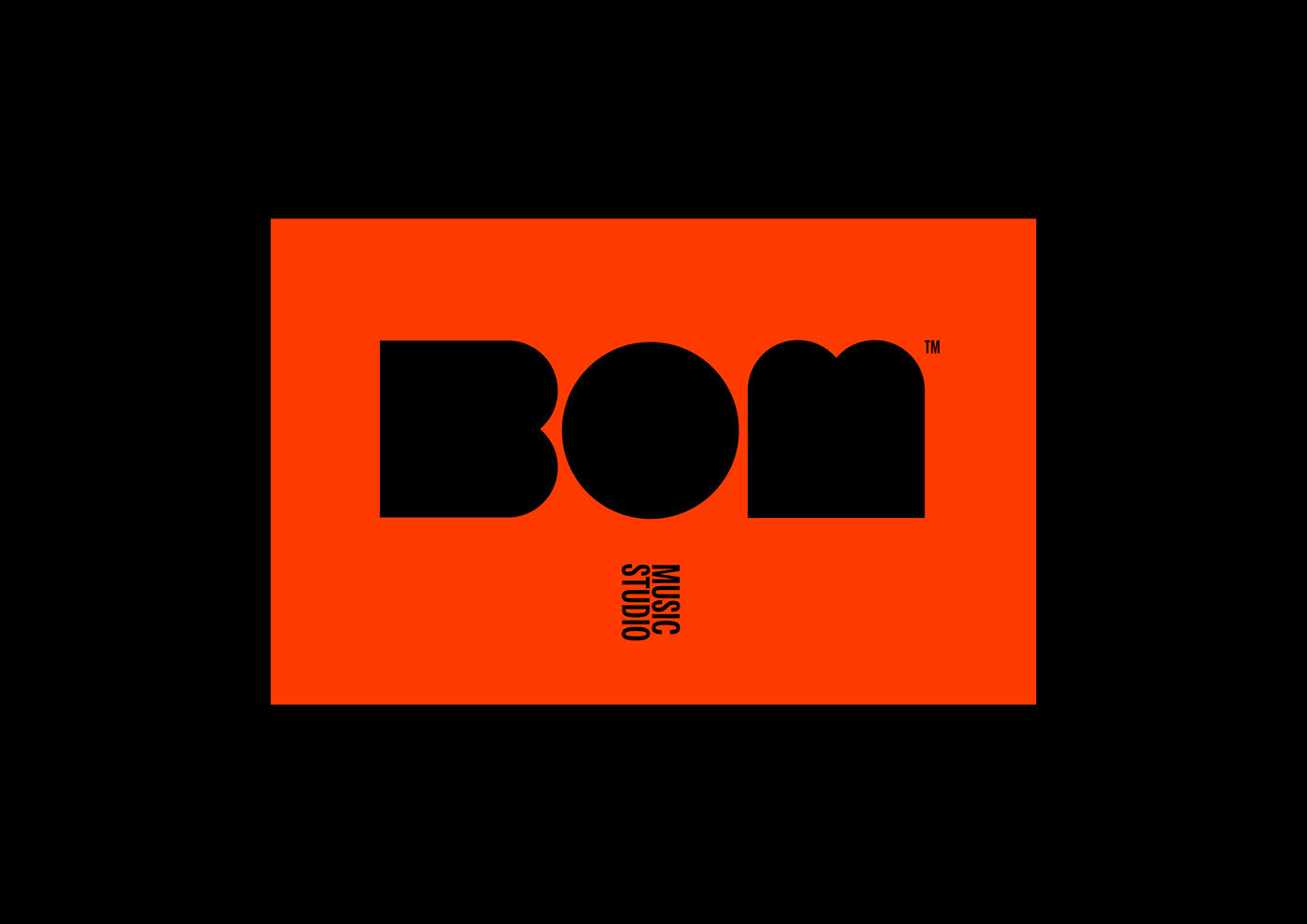
By studying the letters of the company’s name, which is very distinctive and motivates you to do something strong. This was done by drawing and designing the letters of the logo in an engineering way that suggests strength and distinction. It is distinguished by its easy remembering of repeating the first and last letter with its rotation


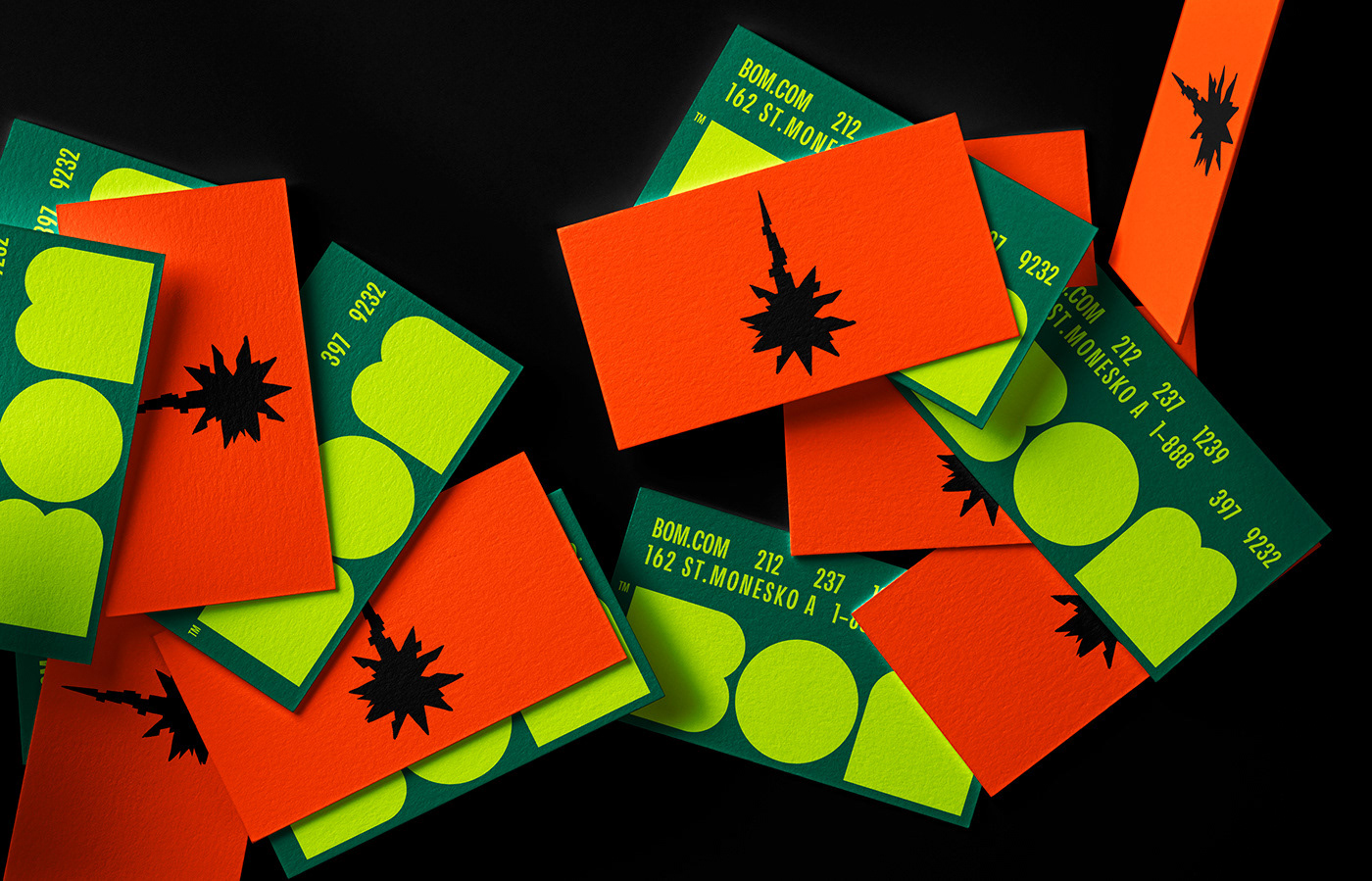
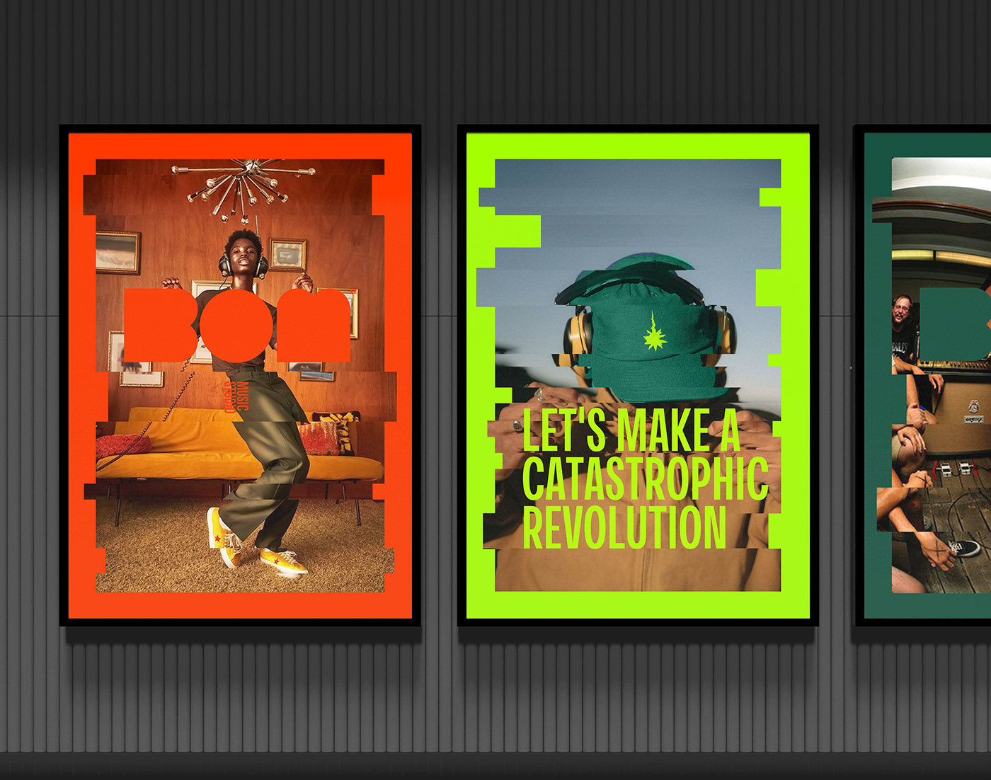
Pictures play a role in broadcasting the values of the brand, and in light of the large number of pictures that we are exposed to throughout the day, we needed a style of our own and easy to identify, so we worked on creating a flexible system that is used with pictures.
It is a translation of our trademark in the same way as drawing the mark
It is a translation of our trademark in the same way as drawing the mark


Do not hesitate to ask about anything or say your opinion,
I am very interested to know that.


