
CAIMAN: A fictional craft beer company based on the style of the manga series Dorohedoro. Each unique flavour in this series is based on a different main character and correlates to their character design (ie. Noi is a character who's outfit and mask is blue, therefore she's represented with the blueberry flavour). Caiman's goal is to draw in fans of the series as well as those with an interest in grungy, detailed art styles to try a new kind of beer. The labels can be kept by collectors or simply admired while drinking. This was less a school assignment and more a passion project for me. I designed every aspect keeping my target audience in mind and re-illustrated small details until this design came together completely. The final illustrations took 1.5 hours each and placing the other elements (labels, typography) took 1. Caiman's overall design, from logo to illustration is something that would attract a variety of people, both the target demographic and possibly others. This design is unique and compelling; perfect for a craft beer.

Digital Mock-Ups made on Adobe Photoshop

Shin's Strawberry IPA label redesign
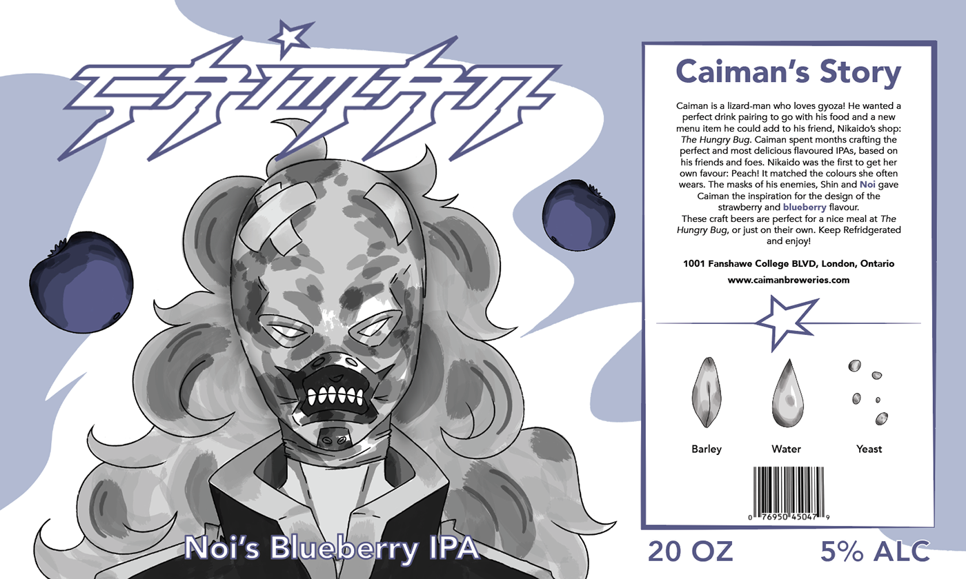
Noi's Blueberry IPA label redesign
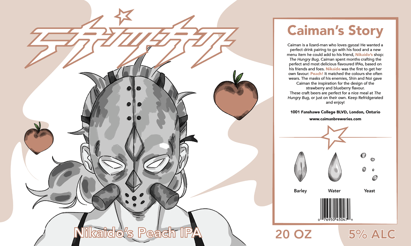
Nikaido's Peach IPA label redesign

Caiman Beer cap design
CHANGES: I was very proud with the original outcome of this project. Caiman Beer had a detailed art piece, a colour scheme that worked, and was overall a product I could really imagine seeing on shelves at a beer store. That being said, I felt there was more I could have done to elevate these designs even more. I liked the original illustration I did, but it was the same on every flavour. While that makes it consistent, it felt less creative to me. I decided to illustrate each character for each flavour they were based on. This makes the flavour name and illustration more consistent with each other so the overall design makes more sense. I rearranged some elements such as the fruits on the label to allow them to harmonize with the background illustrations better. Additionally, I added more colour to the design. I felt the original was lacking in enough colour to differentiate the flavours. I swapped the filler text on the back of the label for an actual story and highlighted the featured character’s name and flavour in their designated colour, to emphasize them and to add more personalization. These new/changed elements make this design more effective and interesting to look at. There is still a grungy and artistic side to the main illustrations, but the bright colours draw attention and contrast the bold/dark greyscale characters. The customer can now, more quickly and easily, identify the flavours because of how the colours used are bright and fruity. The fruit icons stand out among the background and foreground artwork and the main illustrations have enough detail to intrigue the customer into observing more.


