FR
•
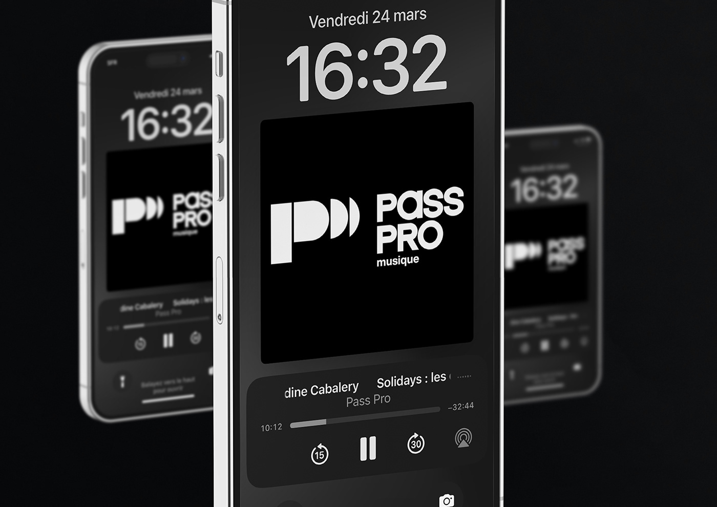
Pass Pro est le podcast qui vous emmène dans les coulisses de l’industrie musicale. Depuis une dizaine d’années, Mélodie Gambin accompagne les artistes dans l’élaboration de leur stratégie digitale. Chaque semaine, un invité vient partager les secrets de son métier : les épisodes traitent des nouveaux enjeux dans la promotion d’artistes face aux évolutions digitales, des NFT, du management d'artistes, de la production d'idées et plus encore. Le nom "pass pro" est un clin d'œil au badge utilisé dans les backstages.
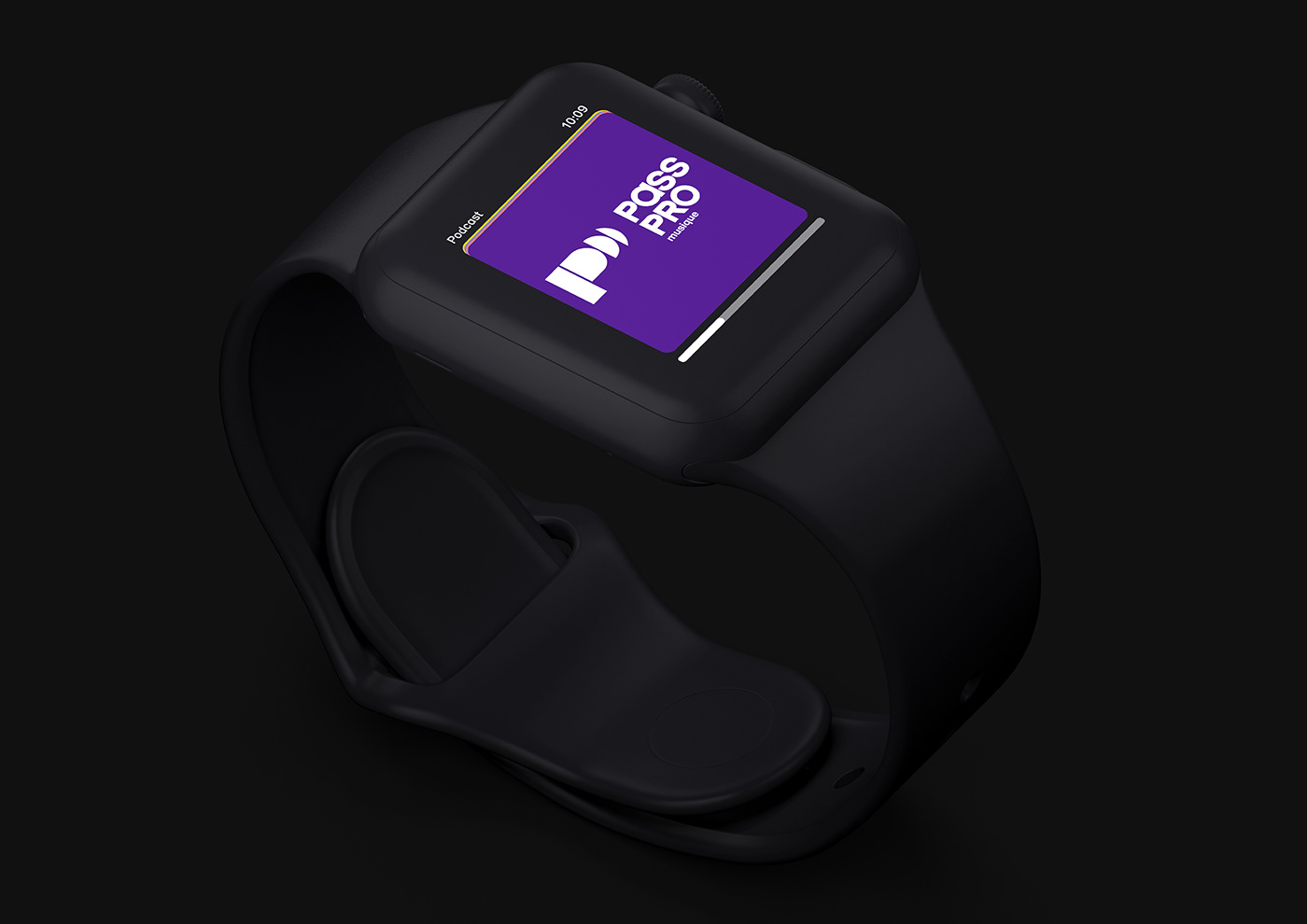
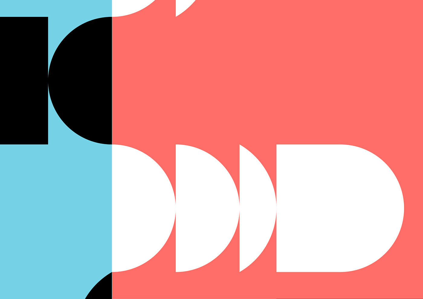
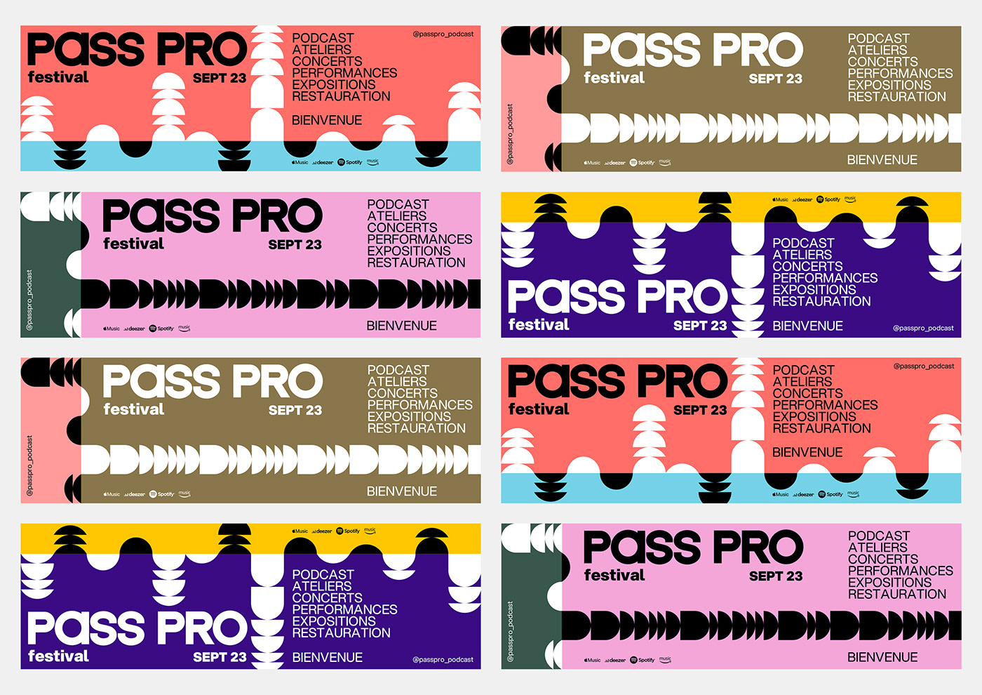
Pour cette identité, nous avons conçu un caractère spécial dont le rythme se concentre essentiellement sur la chasse des voyelles en minuscule et le traitement des consonnes en capitale. Notre approche typographique laisse toute la place à un symbole géométrique imposant. Le P de Pass Pro reprend l'idée de l'onde sonore ou encore de la conversation. Ces formes sont déclinées en un système modulaire et imprévisible à l'image d'un audiogramme. Nous avons sélectionné le caractère sans serif Aspekta (conçue par Ivo Dolenc) dans différentes graisses pour les titrages et le corps de texte et une palette de couleur évolutive, voire complètement libre. La charte graphique a donné lieu au déploiement d'une grille Instagram : de la publication classique en passant par un principe de reels et de stories.
Découvrez ce podcast sur toutes les plateformes ! @passpro_podcast
EN
•
Pass Pro is the podcast that takes you behind the scenes of the music industry. For the past ten years, Mélodie Gambin has been working with artists to develop their digital strategy. Each week, a guest comes to share the secrets of his job: the episodes deal with the new stakes in the promotion of artists facing the digital evolutions, the NFT, the management of artists, the production of ideas and more. The name "pass pro" is a nod to the badge used in the backstage.
For this identity, we designed a special typeface with a rhythm that focuses primarily on the width of the lowercase vowels and the capital consonants. Our typographic approach gives full expression for an imposing geometric symbol. The P in Pass Pro takes up the idea of a sound wave or a conversation. These shapes are declined in a modular and unpredictable system like an audiogram. We have chosen the sans serif typeface Aspekta (designed by Ivo Dolenc) in different weights for headings and body text and an evolving, even completely free, color palette. The graphic charter has led to the deployment of an Instagram grid: from the publication through a principle of reels and stories.
Discover the podcast on all platforms! @passpro_podcast