

As Mathrubhumi, the newspaper giant was entering its hundredth year, it required a logo unit that reflects all the grandeur it and the deep rooted foothold it had in the culture and history of Kerala for the past hundred years. It simply could not be another design that you pass by in your daily life.

Hence, I decided to turn to the good old traditional media- Pen and Paper, my favourite.
I felt that digital media would not be able to match the organic result
the traditional media would be able to achieve.
The form of the design had to reflect the strength of the hundred years this newspaper giant stood strong contributing the light of knowledge and information to the country.
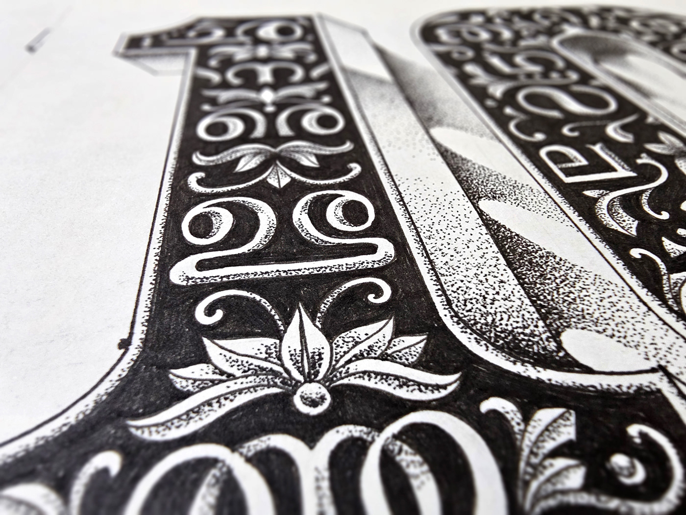
A form that is carved out of solid rock was the perfect solution.
Stippling using pen was the best way to achieve the texture such a form demanded and I decided to go with it.

Adding Malayalam letters to the form was an outcome of the team brainstorming sessions
which was the perfect visual element to add to the design.
I came up with a more apt way to do it- add upright and mirrored alphabets to the design.
The mirrored alphabets represent how they look on printing blocks
and the upright ones would stand for fine print.

Malayalam version of the logo unit

English version of the logo unit
Thanks for watching!


