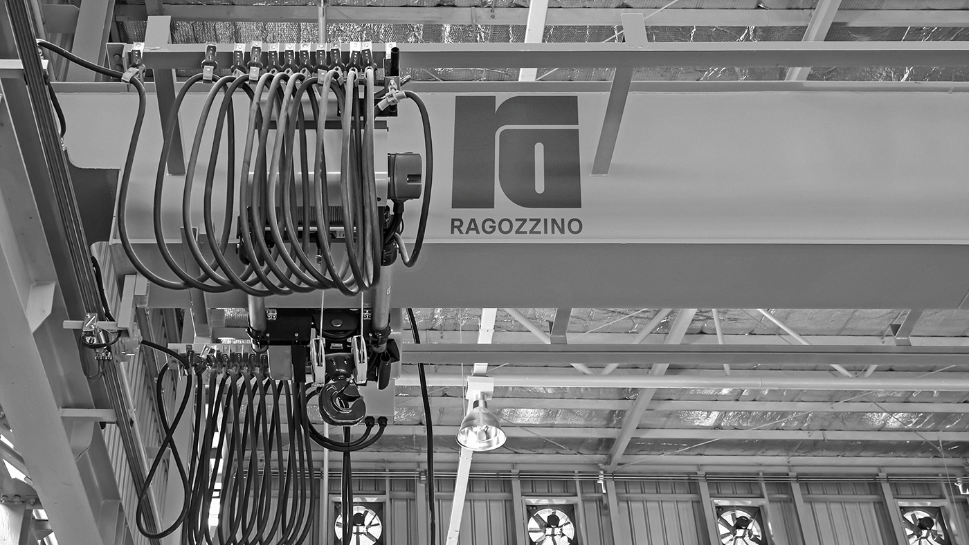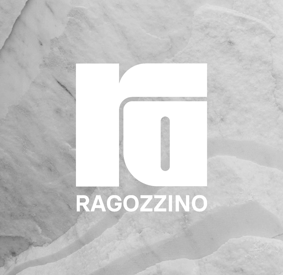
The new identity created for Ragozzino Marmi is characterized by the strong presence of its logo: a symbol that seems to be deriving from the engraving of geometrical shapes as if to replicate the carving and the transformation processes of marble.
A logo that combines the company name with its mission of shaping materials.
The color palette takes up the veins of marble and has been used, fading from darker to lighter grays, in the various applications of brand identity.
A logo that combines the company name with its mission of shaping materials.
The color palette takes up the veins of marble and has been used, fading from darker to lighter grays, in the various applications of brand identity.