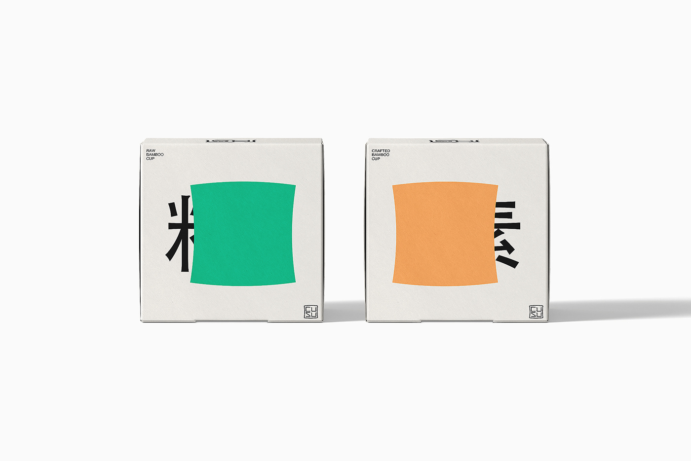
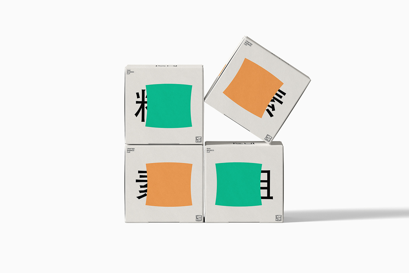
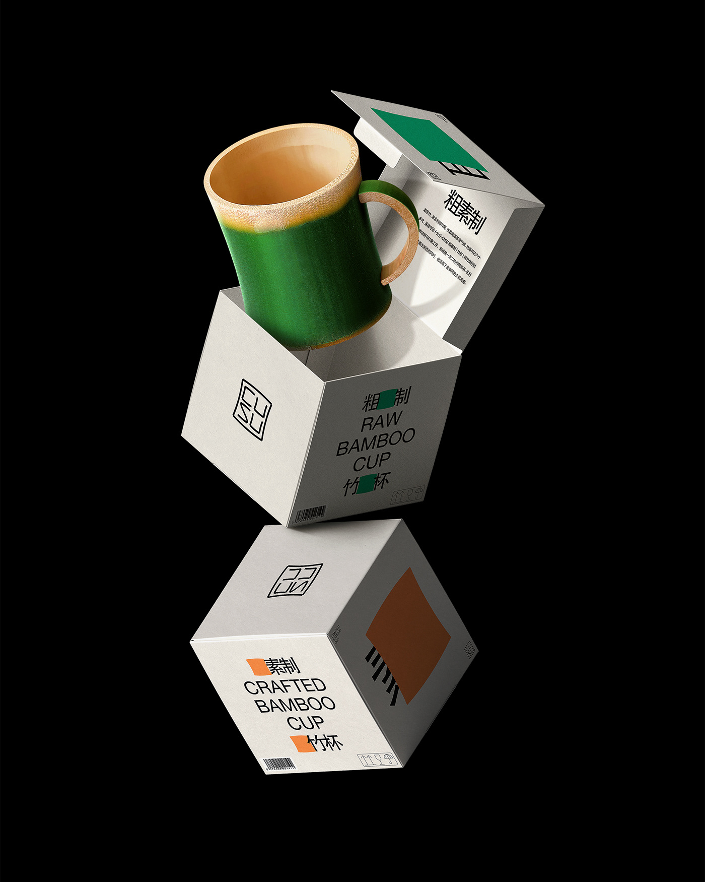
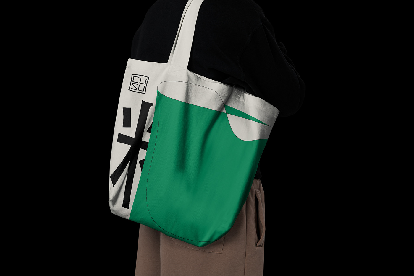
CUSU, a bamboo cup brand, has created a unified and versatile visual concept by selling both 'Raw' and 'Crafted', which are contrasting textures.
The brand logo is derived from the bamboo section, from which the square is extracted as the core symbol. The brand's text is bonded tightly and sharply, and the text is obscured by the graphics to create two different product features: 'Raw' and ‘Crafted’.
With the visual focus on the product itself, the packaging also obscures the graphics from the text to create a different shape of bamboo cup, retaining the visual uniqueness while providing consistency between the two packages. This variable and subtle expression has also become a fundamental aesthetic rule for CUSU.
作为竹制杯具品牌,CUSU粗素制将「粗」与「素」本是对立质感的产品同时推出,希望构建出视觉统一且富有变化的品牌概念。
品牌标志源于竹节,提炼“收腰”的方块图形作为核心符号。品牌文字紧密粘接,清晰锐利,通过遮挡得到两个不同的产品特点:「粗制」与「素制」。
以视觉聚焦于产品本身为出发点,包装也将图形与文字相互遮挡,形成把手造型各异的竹杯形状。在保留视觉独特性的同时也让两款包装整体更具一致性,这种可变且微妙的表达也成为了CUSU的基本美学法则。
品牌标志源于竹节,提炼“收腰”的方块图形作为核心符号。品牌文字紧密粘接,清晰锐利,通过遮挡得到两个不同的产品特点:「粗制」与「素制」。
以视觉聚焦于产品本身为出发点,包装也将图形与文字相互遮挡,形成把手造型各异的竹杯形状。在保留视觉独特性的同时也让两款包装整体更具一致性,这种可变且微妙的表达也成为了CUSU的基本美学法则。