
Estúdio HUGA is a studio specialized in visual identity that develops memorable and solid brands in its communications. The name HUGA is an onomatopoeia that goes back to the grunts of cavemen (according to popular representation). This name was chosen for the contextualization of the characters where, at that time, they communicated through visual representations of their stories on the walls, with cave paintings, not very different from us, who need to establish good visual communication to tell a story.

Target Audience
The studio's target audience is experienced or enthusiastic businessmen/entrepreneurs who want professional and exclusive communication. This need for new communication can come from dissatisfaction with the current brand, or from the desire to start a business the right way, with a well-structured visual identity aligned with the brand's values.
_______________________________________________________________________________________________________________________
The creator
For the creator archetype, developing new ideas is something as natural as breathing. Creating things, having new ideas, starting new projects and putting ideas out of the imagination is almost a physiological necessity. This archetype has the ability to always express their personality and imagination in their visual creations, showing people something new that they could never have imagined on their own.
The dreams
His biggest dream is to create something that leaves his mark on the world, shaping his vision of a certain subject, but his biggest fear gets in the way.
The fears
He is afraid that he will have a mediocre vision, or that he will not be able to reproduce his ideas perfectly, since he is a perfectionist.


Key Words
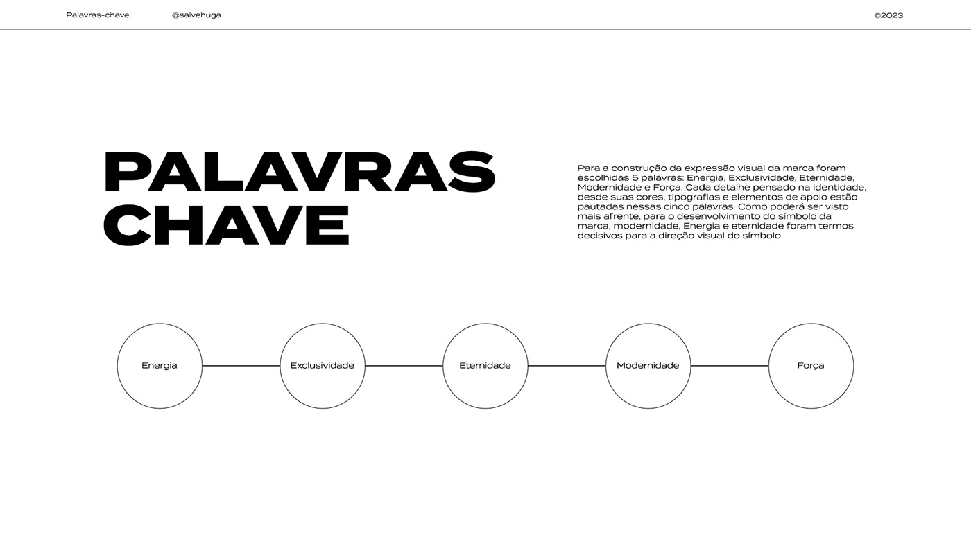
For the construction of the visual expression of the brand, 5 words were chosen: Energy, Exclusivity, Eternity, Modernity and Strength. Every detail thought of in the identity, from its colors, typography and supporting elements are based on these five words. As will be seen later, for the development of the brand's symbol, modernity, Energy and eternity were decisive terms for the visual direction of the symbol.
Energy ------- Exclusivity ------- Eternity ------- Modernity ------- Strength


For the design of the brand symbol, this moodboard was developed, concentrating the main visual references, based on the keywords and other terms found in the briefing. The determining factor for the conceptualization was to find in each visual reference what characterized it, whether by its traits, shapes, colors and meanings, and condense it into a minimalist and practical idea for the brand symbol.


