Unimed is the largest and most renowned health insurance company in Brazil. With more than 20 million customers all over the country, the company needed to update its communication and brand positioning to reflect new business goals. We were invited by Grupo Sal, the studio responsible for Unimed's branding, to redesign its iconic logotype.

The company has been operating for almost 50 years, most of them using the classic Frutiger Heavy in its logo, which has made this legacy a fundamental factor in all creations.


We decided that legacy and innovation, even though the may seem like opposite concepts, had to work together on the project, so we designed several logo options that navigated through both these themes.

As Unimed is a cooperative with thousands of leaders, breaking down the creative process to objective decisions helped get everyone involved on the same same page.

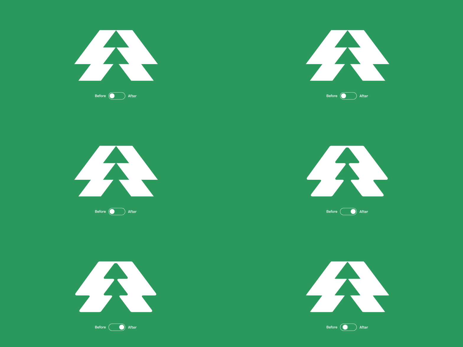
The end result was a logo that draws from the legacy of the previous iconic one but modernizes it to create a visual refreshment.


Project Credits
Branding: Grupo Sal and Thymus
Brand Identity: Grupo Sal and Thymus
Logotype: Plau
Branding: Grupo Sal and Thymus
Brand Identity: Grupo Sal and Thymus
Logotype: Plau


