Altertech
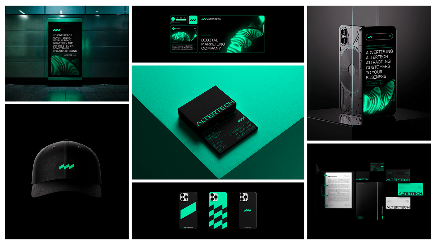
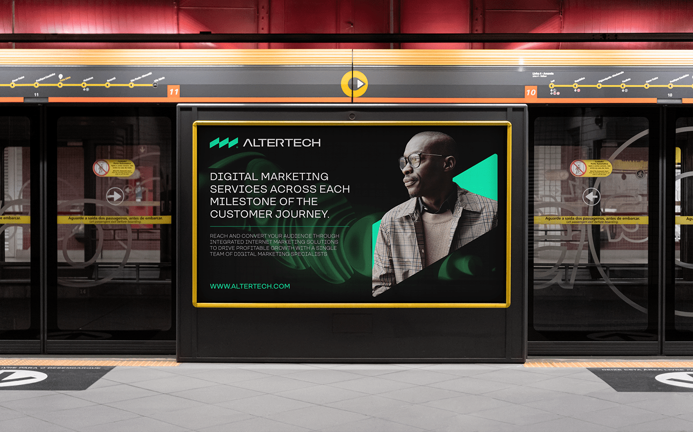
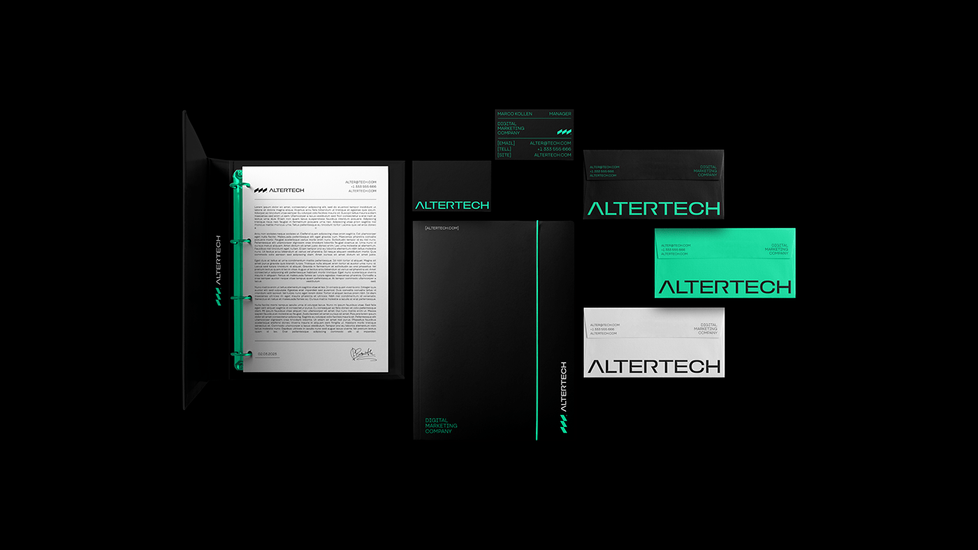
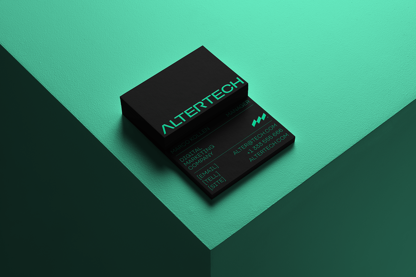
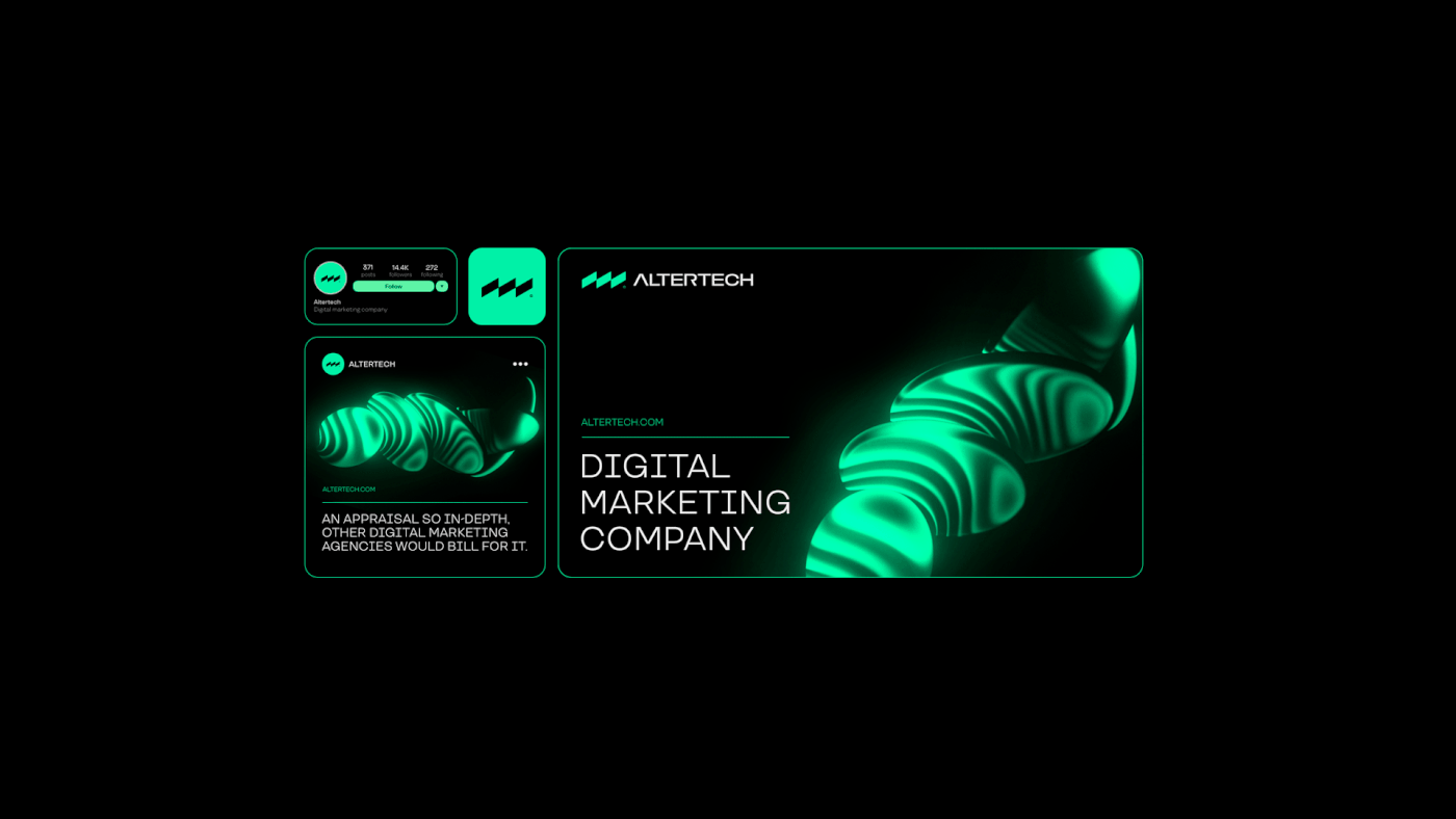
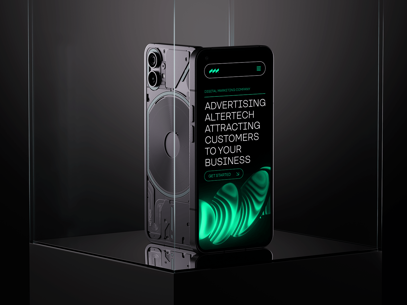
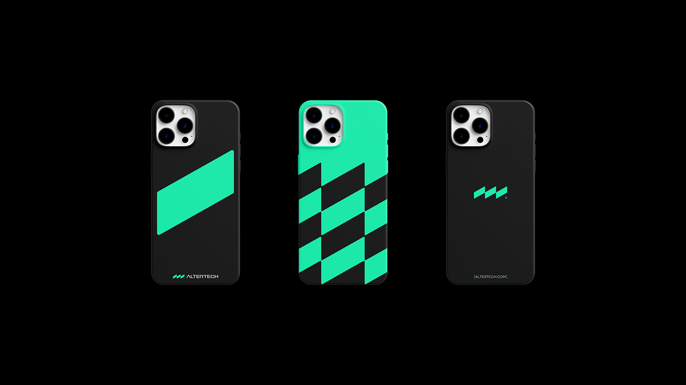
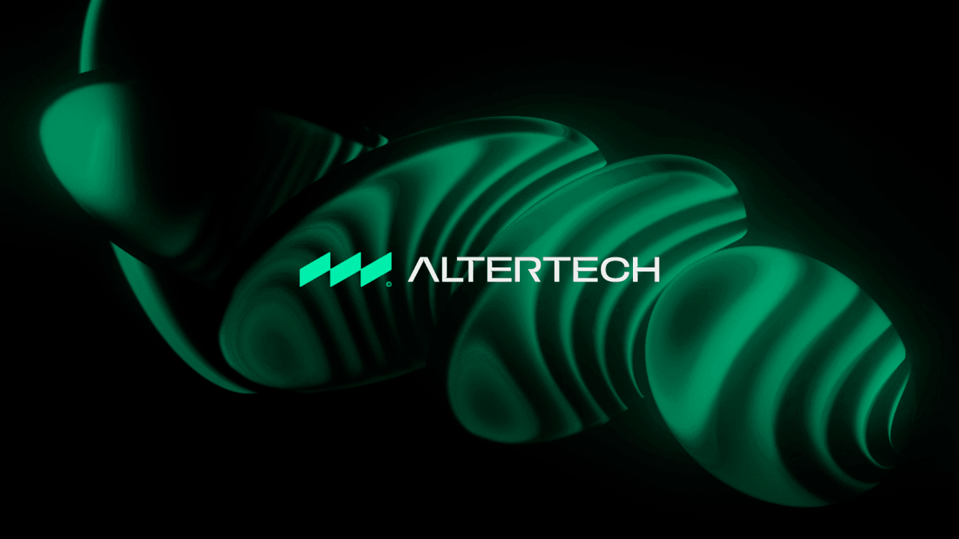
Presenting Altertech: A Digital Marketing Dynamo. Our prowess elevates diverse businesses through strategic promotion. At the heart of our ethos lies a distinctive icon-style logo, an epitome of our values and memorability. Lines converge to craft our logo, a triad of elements at an angle. This trinity mirrors our core values - practicality, technology, and unwavering client commitment. Through lines, we weave a narrative that connects and resonates. Printing breathes life into our creativity. Letters "A" and "R" transform into beacons of innovation.
Branded elements emerge - documents, banners, ID cards, wristbands, shopping bags - each a canvas of clarity, alluring in lettuce, black, and white hues. Visual harmony reigns supreme. A color palette that marries sophistication and vibrance. Lettuce, symbolizing growth; black, the essence of elegance; white, the purity of intent. And our signature font - TT Travels - a testament to our journey through the digital landscape. In this digital realm, Altertech thrives. A logo that narrates values, branding that resonates, and colors that captivate. Embark on a marketing expedition where innovation meets creativity.
—
obrazur@icloud.com | bento.me