


PEOPLE. IMPACT. PURPOSE.
THE BREIF:
"Come up with a creative solution to tell the story of what we did during COVID-19."
"Come up with a creative solution to tell the story of what we did during COVID-19."
TARGET MARKET:
Stakeholders, Shareholders, High Level Executives, Internal Employees.
Stakeholders, Shareholders, High Level Executives, Internal Employees.
OUR PROBLEM:
How do we tell a corporate story that people will actually want to engage with.
How do we tell a corporate story that people will actually want to engage with.
OUR SOLUTION:
We make it relatable. We make it human. We make it real. We make it tangible.
We make it relatable. We make it human. We make it real. We make it tangible.
Concept:
DESIGN TO EVOKE EMOTION
During the pandemic we completely lost the sense of touch. This is the reason we designed something tangible. Something that people could touch, feel and connect with. We wanted to design the emotions and experiences we all had and by reading, touching and feeling, you become fully immersed.
INNOVATION – EXECUTION:
We decided to tell a parallel story. Two books that fold into one which can be read individually and together.
We decided to tell a parallel story. Two books that fold into one which can be read individually and together.

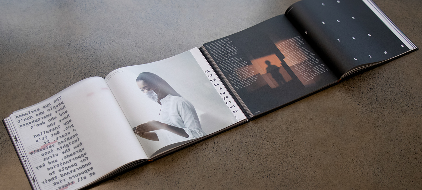
THE LEFT BOOK:
The story that the general public experienced.
The story that the general public experienced.
THE RIGHT BOOK:
The corporates response to every situation the pandemic brought.
The corporates response to every situation the pandemic brought.
We then divided the book into chapters which followed the difference phases of the pandemic.
RELEVANCE TO THE BRAND AND TARGET AUDIENCE:
The journey of emotion through chapters allowed us to position the brand as empathetic, that it was not just a big show off but rather that it understood the people as well as connect with the big execs and stakeholders because at the end of the day are; human, just like us.
The journey of emotion through chapters allowed us to position the brand as empathetic, that it was not just a big show off but rather that it understood the people as well as connect with the big execs and stakeholders because at the end of the day are; human, just like us.
QUALITY OF EXECUTION:
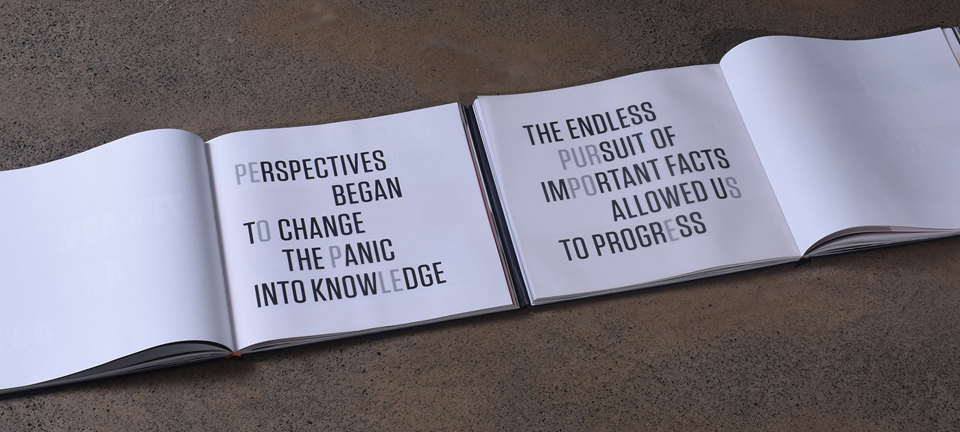
The themed chapters were divided by trace paper with copy that had double messaging. The left book has a different message to introduce the chapter and every message when you lift the trace reveals the word PEOPLE. The right book also has a different message that corresponds to the left but relates to the corporate under every different message the word revealed is PURPOSE.
The themed chapters were divided by trace paper with copy that had double messaging. The left book has a different message to introduce the chapter and every message when you lift the trace reveals the word PEOPLE. The right book also has a different message that corresponds to the left but relates to the corporate under every different message the word revealed is PURPOSE.
Typography changes, lay out changes and additional finishes and experiences throughout the book are purposefully designed to evoke the emotion of that phase in the pandemic and how the corporate responded.


QUALITY OF EXECUTION:
The themed chapters were divided by trace paper with copy that had double messaging. The left book has a different message to introduce the chapter and every message when you lift the trace reveals the word PEOPLE. The right book also has a different message that corresponds to the left but relates to the corporate under every different message the word revealed is PURPOSE.
The themed chapters were divided by trace paper with copy that had double messaging. The left book has a different message to introduce the chapter and every message when you lift the trace reveals the word PEOPLE. The right book also has a different message that corresponds to the left but relates to the corporate under every different message the word revealed is PURPOSE.


Typography changes, lay out changes and additional finishes and experiences throughout the book are purposefully designed to evoke the emotion of that phase in the pandemic and how the corporate responded.
Contents section:
Book A (Left) | Book B (Right)


Chapter 1
Designed to evoke Discomfort
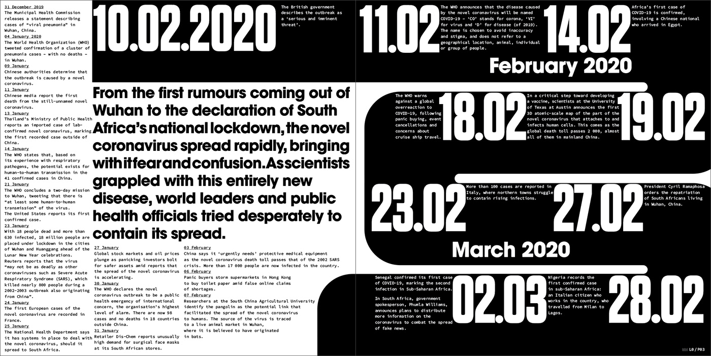
The virus arrived and we all felt it. The shock, the nervousness and the overall feeling of discomfort for the world we didn't know.
The virus arrived and we all felt it. The shock, the nervousness and the overall feeling of discomfort for the world we didn't know.


Section layout example
Chapter 2
Designed to evoke Distance
Everybody was in lockdown, separated from one another in total isolation.


Section layout example
Chapter 3
Designed to evoke Innovation
We all had to learn new ways of working, thrown into a world of technology as the only way to connect.


Section layout example


Chapter 4
Designed to evoke Participation
The only way we could fight the virus was by doing it together, following rules and uniting.


Section layout example


Chapter 5
Designed to evoke Human Authenticity
Our front line workers put their lives on the line for all of us
and they became our superheroes.
and they became our superheroes.


Section layout example


Chapter 6
Designed to evoke Safe & Sanitised.
People have adjusted to this new way of living and although it may never feel normal, somehow we have managed to adapt and try our best to carry on.


Section layout example
"Our superheroes never wore capes and it's honorable"


People | Impact | Purpose


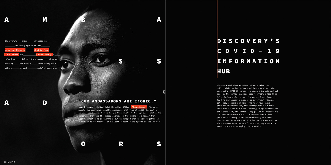
Client:
Discovery Ltd.
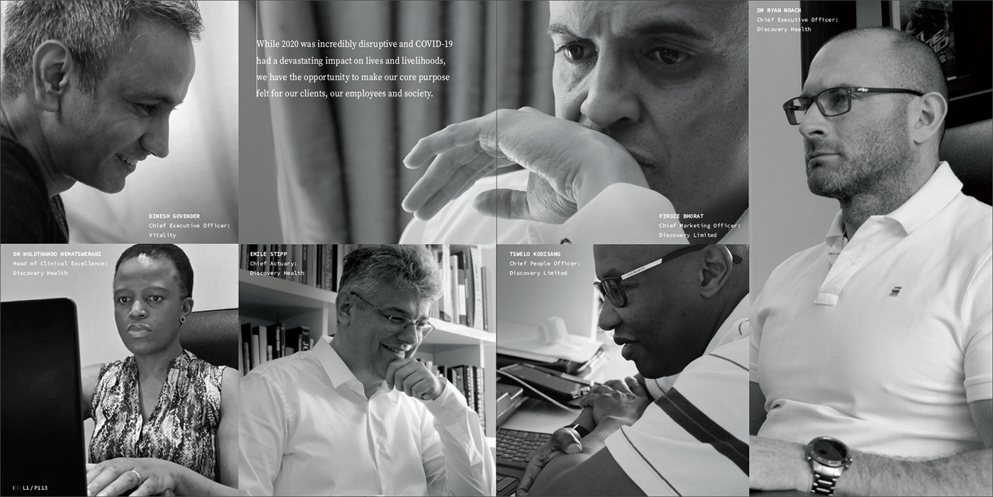
Discovery Limited is a South African-founded financial services organisation that operates in the healthcare, life assurance, short-term insurance, savings and investments, banking, and wellness markets.
Established in 1992, Discovery is guided by a clear purpose – to make people healthier and to enhance and protect their lives. Our core purpose has manifested in a globally relevant Shared-Value business model, with Vitality at the centre, which creates value for our businesses, clients and society.
Discovery impacts 25.7 million lives globally and 11.2 million lives on Vitality across all markets. We apply our Shared-Value business model in 20 countries, leveraging the expertise of over 12 950 employees globally.


Creative agency:
Røering Creative Kin | RCK.
Executive Creative director:
Ivan Kirstein.
Design director:
Marcel Buerkle.
Senior Art Director:
Selina Singh.
Senior Art Director:
Yajna Singh
Brand Head:
Carli Barnard.
Thank you for viewing.


