

Aware Bio
Context:
There is no denying that in recent years natural and organic brands have proliferated, Aware is one of them; but it is also true that many start in a rustic or homemade way and their visual identity, at least initially, does not usually have the necessary work to be competitive internationally.
Objective:
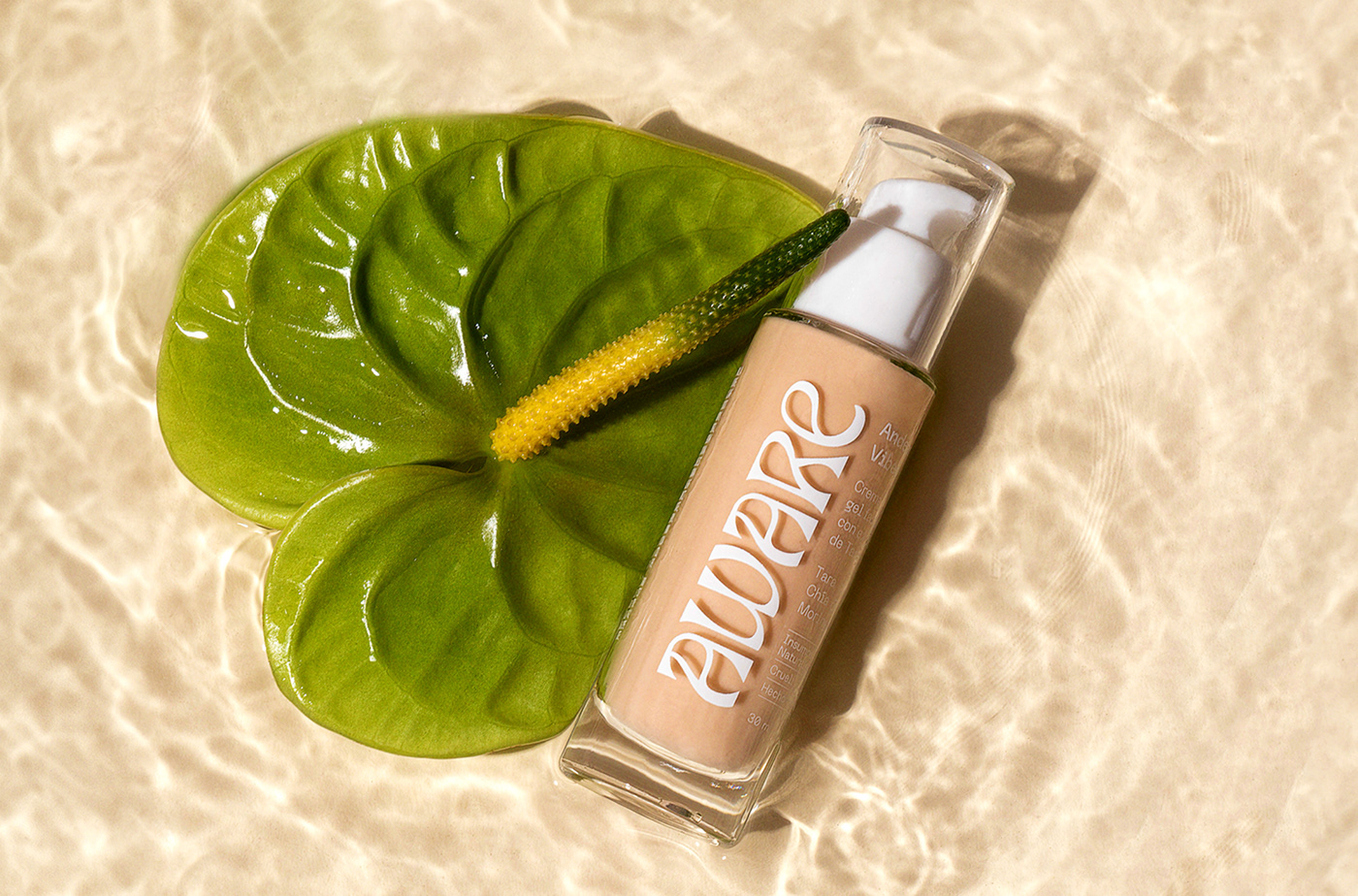
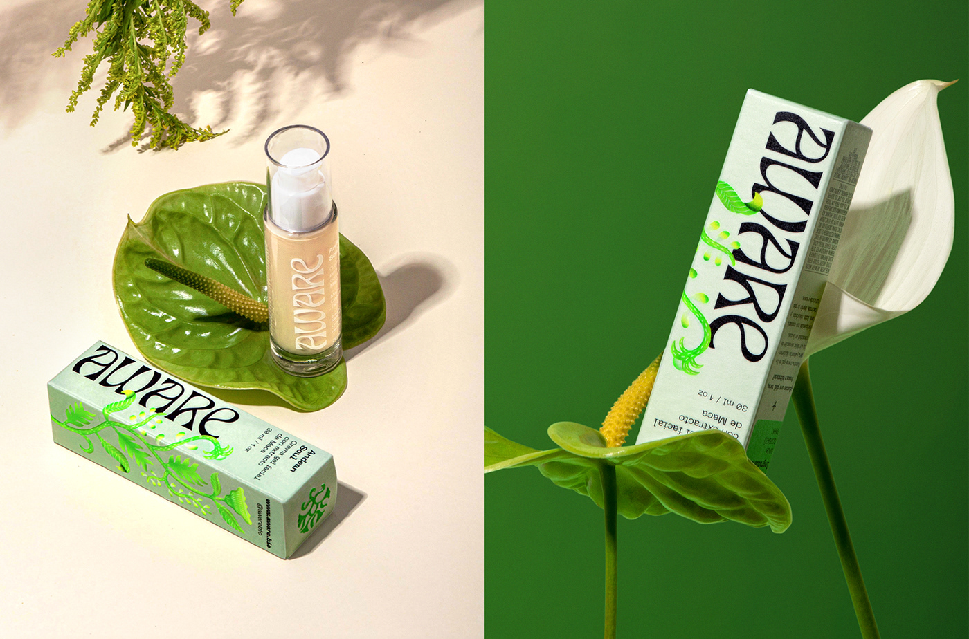
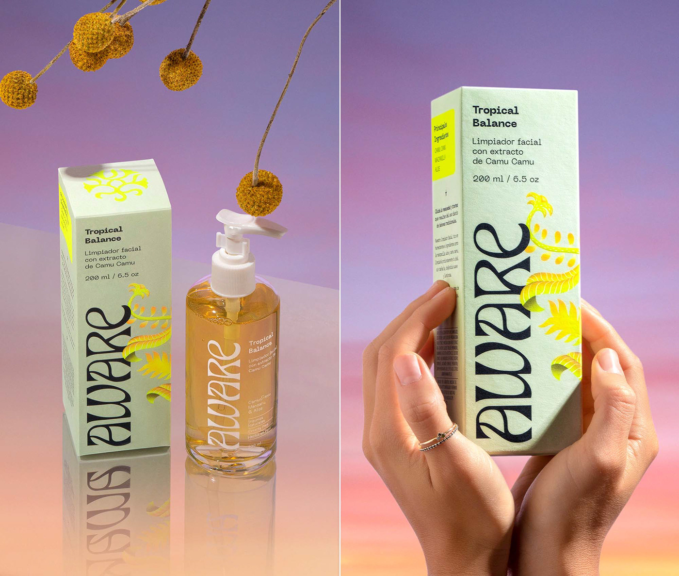
Aware comes to the studio for a rebranding, with a product that wants to compete internationally and with the request that the identity represents the necessary quality. In addition, we could not move away from the category, which is natural and organic cosmetics, but above all, we had to represent the exoticism of the natural Peruvian ingredients used in their products.
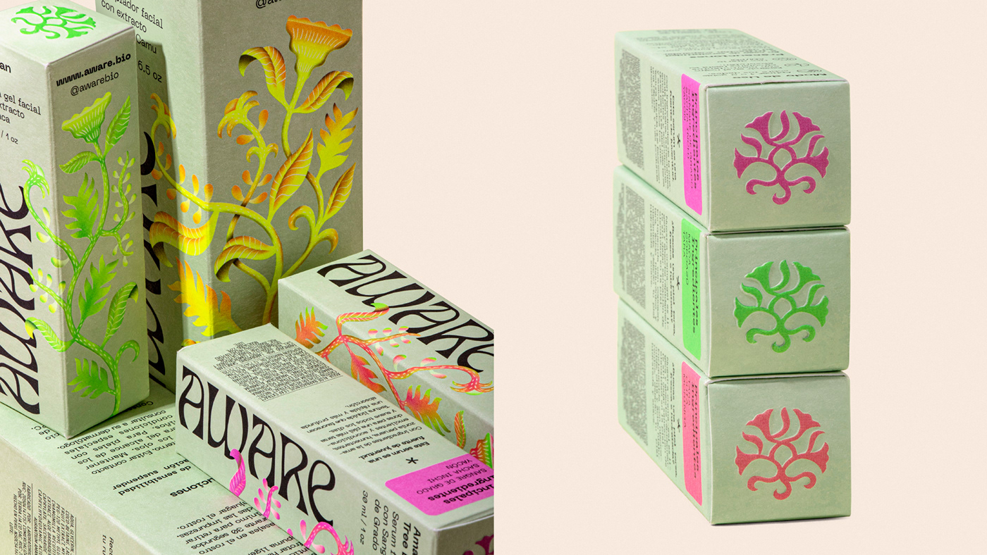
Solution:
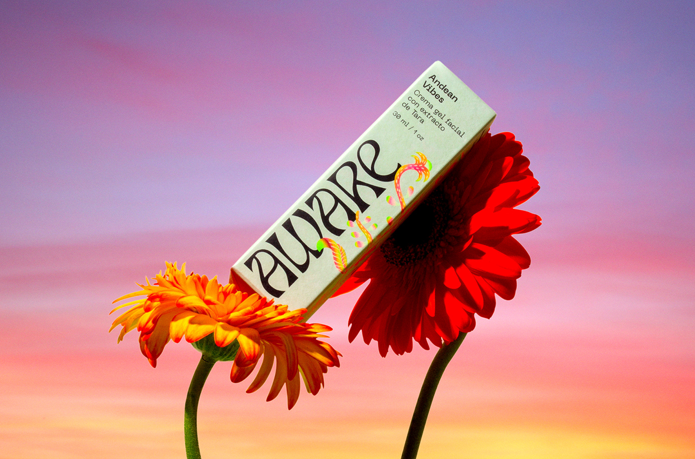
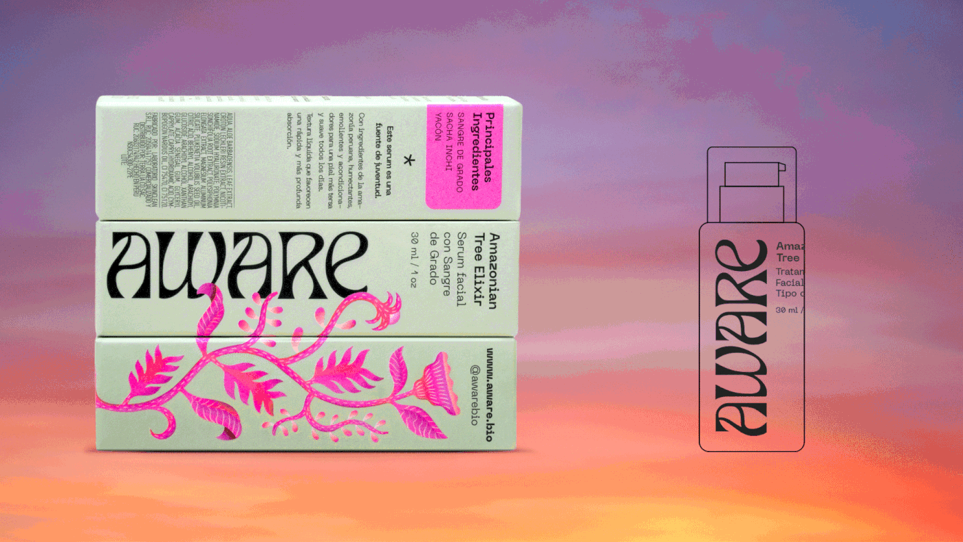
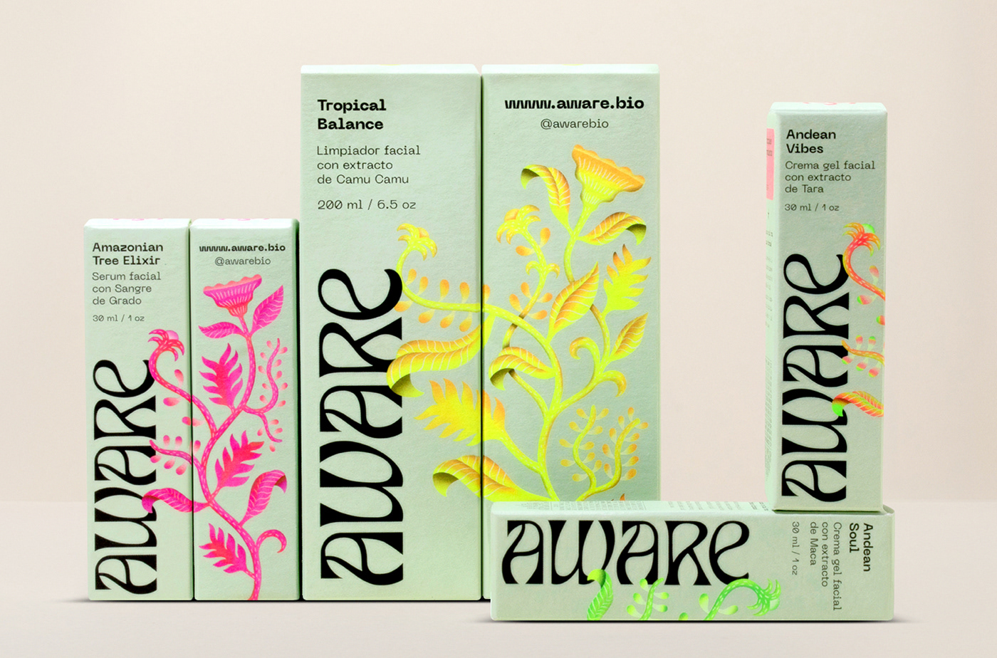
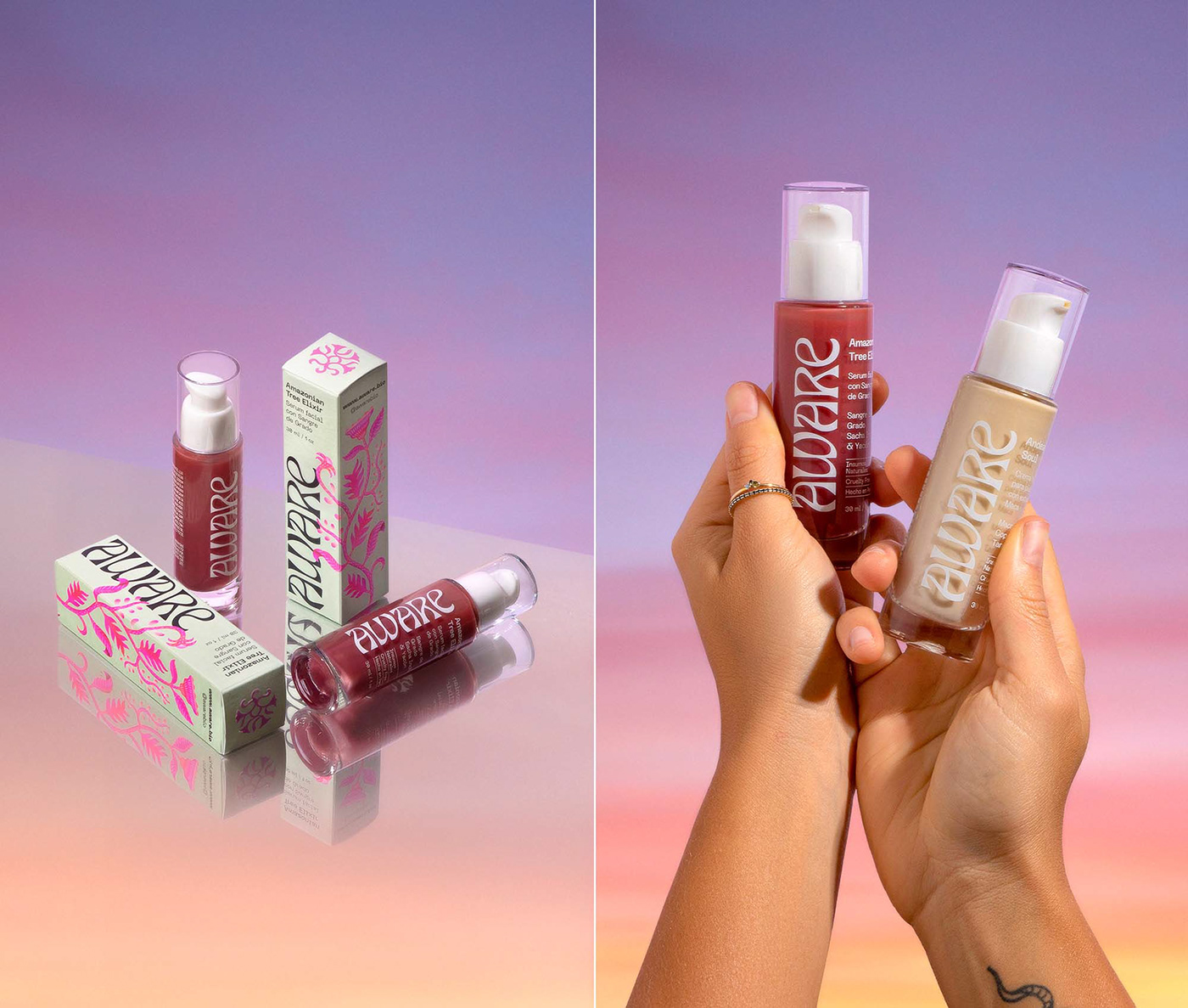
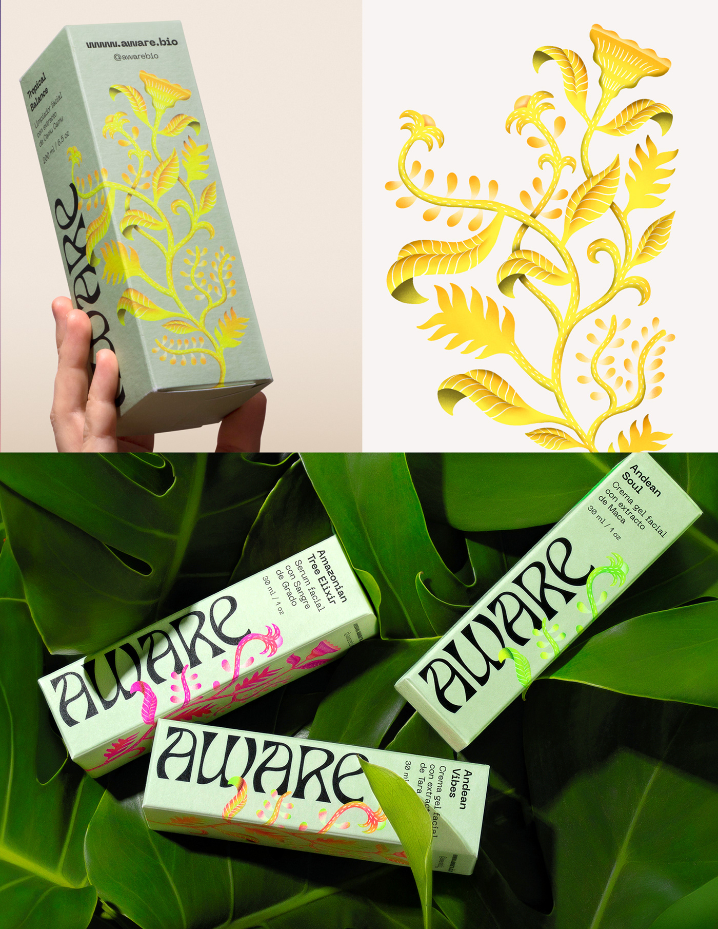
To support the creation of the visual identity system, we created an illustration that is a kind of plant chimera: a plant that does not exist in reality because it is composed of parts and characteristics of several of the plant-ingredients of the products, all in one species; the colors used, of intense shades, always represented with special inks when printing and saturated to the maximum, reinforce the rarity of this exotic chimera. Finally, its shape is that of a vine, as the illustration was designed to wrap, from bottom to top, around the brand's packaging.
FIBRA
BRANDING & PACKAGING @
@fibra_branding


STUDIO: FIBRA BRANDING
IG: @fibra_branding
CREATIVE & ART DIRECTION: Andrea Gálvez
GRAPHIC DESIGN: Andrea Gálvez
ILLUSTRATION : Ricardo Bustamante
PHOTO RETOUCH: Andres Abad, Matías Montes de Oca
PHOTOGRAPHY: Daniela Barrio de Mendoza
PROJECT MANAGER: Mariela Alata


