


ЛОГОТИП/ БРЕНДИНГ/ ФИРМЕННЫЙ СТИЛЬ/ ГАЙДЛАЙН
LOGO / BRANDING / CORPORATE IDENTITY / GUIDELINE
СТУДИЯ МАНИКЮРА "lIRATA"
Всем привет, я - Анна, бренддизайнер, графический дизайнер) Опыт работы с 2013 года. Креативная упаковка Вашего бренда!
Hello everyone, I'm Anna, brand designer, graphic designer) Work experience since 2013. Creative packaging for your brand!
БРЕНДДИЗАЙНЕР/ ГРАФИЧЕСКИЙ ДИЗАЙНЕР
E-mail: fly89@bk.ru

ЗАДАЧА:
1. Разработать логотип и фирменного стиля для студии маникюра "LIRATA" .
2. Изначально пожеланием был восточный стиль, но мы в итоге ушли от него.
Необходимо было сделать упор на девочковый стиль. Так как это студия маникюра, и клиенты в основном девушки и женщины. Но при этом чтобы не был розовым или бежевым).
3. Подумать как гармонично будет выглядеть иллюстрация в логотипе и шрифтовая часть.
4. Упростить иллюстративную часть логотипа, сделать более легкой.
Посмотреть как креативно разместить логотип на элементах фирменного стиля.
5. Проверить пропорции логотипа.
6. Оформить все элементы фирменного стиля в красивую качественную презентацию.
СОТРУДНИЧЕСТВО:
1. Знакомство с брендом, консультация по дальнейшим действиям в работе над проектом.
2. Обсуждение условий работы над проектом.
(Я работаю по предоплате 50%)
3. Если условия работы обе стороны устраивают, то далее идет заполнение брифа и подписание договора по проекту.
4. Внесение оплаты 50% по проекту. Выдается чек по внесению части оплаты.
5. Начало работы над проектом. Разработка первичных концепций по логотипу. Их визуализация для наглядности.
6. Когда концепция логотипа утверждена я разрабатываю концепцию фирменного стиля с визуализациями.
7. Согласование концепции фирменного стиля.
8. Если имеются правки по проекту я их вношу. Если все согласовано вносится остаточная часть за работу 50%.
9. Выдача презентации по проекту и выдача всех исходников фирменного стиля. Начиная с логотипа до других элементов фирменного стиля.
- все версии логотипа во всех фирменных цветах и форматах (jpg, png, eps, ai, pdf, svg). Фирменные шрифты, цветовая палитра, исходники элементов фирменного стиля. Сам гайдлайн, фирменный стиль (презентация).
10. Завершение договорных обязательств.
РЕЗУЛЬТАТ:
Качественно упакованный проект для студии маникюра "LIRATA".
Клиент получил все исходники логотипа, исходники элементов фирменного стиля и так же презентацию в пдф файле. По запросу могу скинуть исходник презентации.
Были учтены все пожелания клиента, он остался доволне на 100%. Это можно прочитать в отзыве клиента.
Заменили не читаемый шрифт из логотипа на более читаемый. Шрифтовую часть логотипа можно использовать как полноценный шрифтовой логотип.
Клиент остался очень доволен работой. Это все есть в отзыве внизу проекта)
TASK:
1. To develop a logo and corporate identity for the LIRATA manicure studio.
2. Initially, the oriental style was a wish, but we eventually left it.
It was necessary to focus on the girl's style. Since this is a manicure studio, and the clients are mostly girls and women. But at the same time not to be pink or beige).
3. Think about how harmoniously the illustration in the logo and the font part will look.
4. Simplify the illustrative part of the logo, make it lighter.
See how to creatively place a logo on corporate identity elements.
5. Check the proportions of the logo.
6. Design all elements of corporate identity into a beautiful high-quality presentation.
COOPERATION:
1. Acquaintance with the brand, consultation on further actions in the work on the project.
2. Discussion of the conditions of work on the project.
(I work on a 50% advance payment)
3. If both parties are satisfied with the working conditions, then the brief is filled out and the contract for the project is signed.
4. Payment of 50% for the project. A check is issued upon making a part of the payment.
5. Start of work on the project. Development of primary concepts for the logo. Their visualization for clarity.
6. When the logo concept is approved, I develop a corporate identity concept with visualizations.
7. Coordination of the corporate identity concept.
8. If there are changes to the project, I make them. If everything is agreed, the remainder of the work is 50%.
9. Issuance of a presentation on the project and the issuance of all corporate identity sources. From the logo to other corporate identity elements.
- all versions of the logo in all corporate colors and formats (jpg, png, eps, ai, pdf, svg). Corporate fonts, color palette, sources of corporate identity elements. Guideline itself, corporate identity (presentation).
10. Completion of contractual obligations.
RESULT:
Qualitatively packaged project for the manicure studio "LIRATA".
The client received all the source codes of the logo, source codes of corporate identity elements and also a presentation in a PDF file. Upon request, I can send the source of the presentation.
All the wishes of the client were taken into account, he was 100% satisfied. You can read it in the customer's review.
Replaced the unreadable font from the logo with a more readable one. The font part of the logo can be used as a full-fledged font logo.
The client was very pleased with the work. It's all in the review at the bottom of the project)
Видео создания логотипа "LIRATA" и некоторые элементы стиля.
Video of creating the "LIRATA" logo and some style elements.

Мудборд проекта.
Project moodboard.
LIRATА - уютная студия маникюра в г. Казань.
Здесь вы можете отдохнуть от работы.
В уютной располагающей обстановке вы совместите приятное с полезным.
Порадуете себя качественным маникюром и педикюром.
MANICURE STUDIO "LIRATA"
LIRATA is a cozy manicure studio in Kazan.
Here you can take a break from work.
Here you can take a break from work.
In a cozy and relaxing environment you combine business with pleasure.
Treat yourself to a quality manicure and pedicure.
Treat yourself to a quality manicure and pedicure.

Поисковые варианты логотипа. Никогда не ставлю перед фактом клиента и предлагаю варианты всегда.
Я считаю это очень странно делать 1 концепт логотипа, это неуважительно к клиенту.
Ему необходим выбор!
Тане понравились все варианты логотипа, но она выбрала в итоге 1)
Search options for the logo. I never confront the client with a fact and always offer options.
I think it's very strange to do 1 logo concept, it's disrespectful to the client.
He needs a choice!
Tanya liked all the options for the logo, but in the end she chose 1)


ЛОГОТИП/ БРЕНДИНГ/ ФИРМЕННЫЙ СТИЛЬ/ ГАЙДЛАЙН
LOGO / BRANDING / CORPORATE IDENTITY / GUIDELINE
СТУДИЯ МАНИКЮРА "lIRATA"
ЭТО ВАРИАНТ ВЫБРАЛ КЛИЕНТ ТАНЯ!
Логотип выполнен в минималистичном стиле.
Решили уйти от восточного стиля.
Логотип выполнен в минималистичном стиле.
Решили уйти от восточного стиля.
Данный логотип выполнен в шрифтовом лаконичном и минималистичном стиле. Он очень подошел под концепцию бренда. Он не перегружен деталями этим цепляет взгляд!
Иногда чем проще тем лучше!
THIS OPTION IS CHOSEN BY THE CLIENT TANYA!
Logo is made in a minimalist style.
We decided to move away from the oriental style.
Logo is made in a minimalist style.
We decided to move away from the oriental style.
This logo is made in a laconic and minimalistic font style. It fits the brand very well. It is not overloaded with details that catches the eye!
Sometimes the simpler the better!


Логотипы на разных фонах и текстурах в разных цветах студии маникюра "LIRATA".
Очень важно в проекте это тоже показать, чтобы клиенту было нагляднее и понятнее.
Logos on different backgrounds and textures in different colors nails studio "LIRATA".
It is very important to show this in the project, too, so that the client is clearer and more understandable.

ЛОГОТИП/ БРЕНДИНГ/ ФИРМЕННЫЙ СТИЛЬ/ ГАЙДЛАЙН
LOGO / BRANDING / CORPORATE IDENTITY / GUIDELINE
СТУДИЯ МАНИКЮРА "lIRATA"
ВЫБРАННЫЕ ЦВЕТА ДЛЯ ПРОЕКТА
Первая строчка цветов - основные.
Вторая строчка - дополнительные, которые используются в оформлении проекта и отлично сочетаются с основными.
У них у всхе прописаны коды.
Зеленый цвет хотела моя клиентка Таня, я это учла.
Но оттенков зеленого крайне много, поэтому надо было выбрать нужный оттенок)
Теперь разберемся какой цвет что означает с очки зрения психологии цвета)
ЗЕЛЕНЫЙ - комфорт, гармония, уют, натуральность, спокойствие, умиротворение.
Успокаивает нервную систему, снижает кровяное давление, помогает уснуть при бессоннице, уменьшает головную боль.
СЕРЫЙ цвет очень коварный. Надо с ним осторожно. Слияние черного и белого цвета.
Белый -нежность, чистота.
Черный - сильный цвет. Он может загасить человека эмоционально.
Поэтому взять более нежный оттенок серого.
Белый -нежность, чистота.
Черный - сильный цвет. Он может загасить человека эмоционально.
Поэтому взять более нежный оттенок серого.
В нем есть положительные характеристики: информативность, реализм, гармония.
НЕГАТИВНЫЕ: усталость, меланхолия.
НЕГАТИВНЫЕ: усталость, меланхолия.
SELECTED COLORS FOR THE PROJECT
The first line of colors is the main ones.
The second line is additional, which are used in the design of the project and go well with the main ones.
They all have codes.
The first line of colors is the main ones.
The second line is additional, which are used in the design of the project and go well with the main ones.
They all have codes.
My client Tanya wanted green, I took this into account.
But there are a lot of shades of green, so I had to choose the right shade)
Now let's figure out what color that means from the points of view of the psychology of color)
But there are a lot of shades of green, so I had to choose the right shade)
Now let's figure out what color that means from the points of view of the psychology of color)
GREEN - comfort, harmony, coziness, naturalness, tranquility, peace.
Calms the nervous system, lowers blood pressure, helps to fall asleep with insomnia, reduces headaches.
Calms the nervous system, lowers blood pressure, helps to fall asleep with insomnia, reduces headaches.
GRAY color is very insidious. You have to be careful with him. A fusion of black and white.
White - tenderness, purity.
Black is a strong color. It can extinguish a person emotionally.
Therefore, take a more delicate shade of gray.
Black is a strong color. It can extinguish a person emotionally.
Therefore, take a more delicate shade of gray.
IT HAS POSITIVE CHARACTERISTICS: informativeness, realism, harmony.
NEGATIVE: fatigue, melancholy.
NEGATIVE: fatigue, melancholy.

Так же была разработана полиграфия для клиента.
- Несколько видов визиток. Можно выбрать 1 вариант, а можно распечатать микс из визиток) Все разные) каждый берет какая нравится)
- Бейдж
- Паттерны и бумага фирменная для упаковки чего-то тех же подарочных сертификатов.
- Фирменный пакет
- Конверт
Also, printing was developed for the client.
- Several types of business cards. You can choose 1 option, or you can print a mix of business cards) Everyone is different) everyone takes what they like)
- Badge
- Patterns and branded paper for packing something of the same gift certificates.
- Corporate package
- Envelope
- Several types of business cards. You can choose 1 option, or you can print a mix of business cards) Everyone is different) everyone takes what they like)
- Badge
- Patterns and branded paper for packing something of the same gift certificates.
- Corporate package
- Envelope


В визитках используются фирменные паттерны с орнаментами.
Business cards use branded patterns with ornaments.


Визитка- сертификат отличное решение!
С одной стороны визитка, с другой стороны расписание посещений студии.
Business card-certificate is a great solution!
On one side is a business card, on the other side is the schedule of visits to the studio.
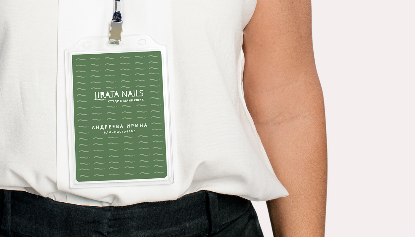
Фирменный бейдж / Company badge

Фирменная коробка, куда можно сложить сертификат)
Branded box where you can put the certificate)

Паттерны и бумага/ Patterns and paper.

Брендированный пакет с использованием логотипа бренда. Не стала делать аляпистые.
Branded package using the brand logo. I didn’t make lurid ones.


Наклейка-этикетка на лак с логотипом. Выбран вариант с логотипа с использованием просто слова "LIRATA".
Выше показаны разные варианты и компоновки логотипа.
Этот логотип лучше всего вписался на наклейку.
Sticker-label for varnish with logo. Selected option from the logo using just the word "LIRATA".
Above are the different variants and layouts of the logo.
This logo fits best on the sticker.

Этикетка на крем для рук/ hand cream label

Упаковка и этикетка на масло для ногтей и кутикул.
Хороша вещь для мастеров маникюра) Выполнена в черном и белом цвете.
В минималистичном стиле с логотипом "LIRATA".
Packaging and label for nail and cuticle oil.
A good thing for manicure masters) Made in black and white.
In a minimalistic style with the "LIRATA" logo.

Наклейка на бутыль жидкости для снятия лака. Она прозрачная.
Sticker on a bottle of nail polish remover. She is transparent.

В любом бизнесе так же необходима рабочая униформа для работников.
В данном случае униформа для работником ногтевой студии.
-Платки фирменные
- Футболка
- Фартук
- Сумка
In any business, work uniforms for employees are also necessary.
In this case, a uniform for a nail studio worker.
In this case, a uniform for a nail studio worker.
- Branded shawls
- T-shirt
- Apron
- Bag
- T-shirt
- Apron
- Bag


Футболка выполнена в зеленом фирменном цвете и черном. Так же сумочка в черном.
The t-shirt is made in green corporate color and black. Also a bag in black.


Ну и варианты различной наружной рекламы) Которая украсит интерьер и входную группу студии маникюра "ЛИРАТА".
Well, and options for various outdoor advertising) Which will decorate the interior and entrance group of the LIRATA manicure studio.

Оформление холла сногтевой студии "LIRATA".
Decoration of the hall of the nail studio "LIRATA".

Световая вывеска на ресепшене студии. Illuminated sign at the reception of the studio.

Световая вывеска на входе в студию.
Illuminated sign at the entrance to the studio.

Квадратная черная вывеска c логотипом.
Я старалась использовать разные варианты компоновки логотипа (горизонтальные, вертикальные, сокращенные и полные...).
Square black sign with logo.
I tried to use different layout options for the logo (horizontal, vertical, abbreviated and full...).

Отзыв клиента Тани о проделанной мной работе.
Feedback from Tanya's client about the work I have done.)
Actually it turned out great! Thanks a lot!

СПАСИБО ЗА ПРОСМОТР МОЕГО ПРОЕКТА!
РАБОТАЮ А РЕЗУЛЬТАТ! КРЕАТИВНАЯ УПАКОВКА ВАШЕГО БРЕНДА!
Для заказа проекта вы можете написать мне в сообщения на этом сайте или в любой удобный мессенджер ниже.
THANK YOU FOR VIEWING MY PROJECT!
I WORK AND THE RESULT! CREATIVE PACKAGING FOR YOUR BRAND!
To order a project, you can write to me in messages on this site or in any convenient messenger below.
БРЕНДДИЗАЙНЕР/ ГРАФИЧЕСКИЙ ДИЗАЙНЕР
E-mail: fly89@bk.ru


