
Apple Watch Campaign
For this project, I had to pick a popular brand and create a set of advertisements that would be on a billboard, bus station, and a magazine. I decided on Apple because I love the Apple Watch and wanted to see what I could create. This advertising campaign is my favorite. To this day I am still happy with how it turned out.
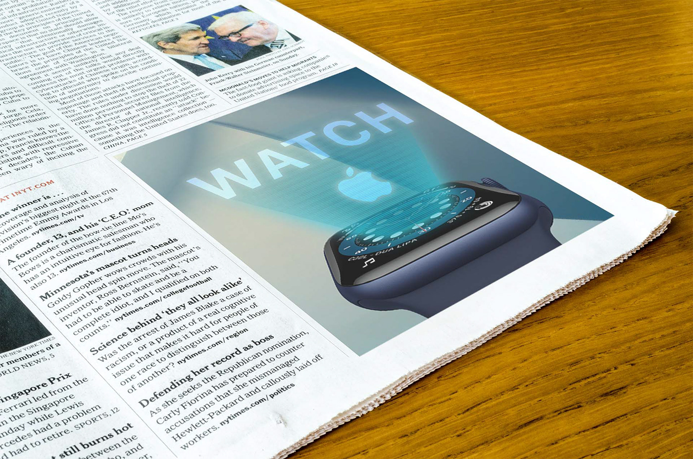
For my next advertisement, I wanted to create a futuristic look for the watch. I decided to make a hologram coming from the Apple Watch. The watch color was blue; I made blue my color palette for this ad. After finding a simple yet bold background, I went in and started to design the hologram. For the hologram, I found a vector that would place over the watch. However, it was too dark. Luckily I was able to decrease the opacity and make it look realistic. Lastly, I went in and added the Apple type and logo. I made the type white and then added a light blue hue to the text and logo. To finish it all up, I blurred the type to make it seem more like a hologram.

For the double Apple Watch facing themselves, I started with a galaxy background that would complement the faces on the watches. From my art classes, I know opposite colors can complement each other. The deep purple and bright orange corresponded with each other well. I also chose a galaxy in the middle so the Apple Watches would look like they are connected with the stars. I mirrored the watches rather than flipping them. I believe that added a reflection effect. For the type in this ad, I wanted to keep it simple but make it stand out. Making the Apple-type white looked unrelated to the image. Instead, I turned it black and added a white hue around the style and logo.

The last advertisement was the multiple Apple Watches lined up. For this ad, I had a specific look I wanted to achieve. When looking at Apple Watch advertisements, I noticed that some watches featured the lunar phases. I wanted to incorporate this in my ad with different watch faces. Of course, I found a background and an image of a watch. After that, I went in a cleared the watch faces, then I researched and found different moon faces. I then put other dates correlated with the lunar phase shown on that specific date and the name of the moon phase. After incorporating the moons, I noticed I needed to angle them to make them look more believable.


